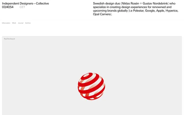
Preview image. Unlock full-res
Architectural Blueprint Precision
Color palette
Supporting palette color for small decorative accents when the core palette needs contrast. Do not promote it to the primary CTA color
Primary background for all page content and navigation areas
Dark borders and separators for elevated surfaces and inverted UI. Do not promote it to the primary CTA color
Subtle border colors, particularly for horizontal dividers and section separations
Secondary text, muted links, and less prominent borders. Provides visual relief from Ink Black
Descriptive body text, badge text, and hairline borders for less prominent components
Typography
- Weights
- 200, 400
- Sizes
- 12px, 17px, 24px, 44px, 60px
- Line height
- 1, 1.07, 1.17, 1.33, 1.45, 1.65
- Letter spacing
- -0.0550em at 60px, -0.0460em at 44px, -0.0400em at 24px, -0.0320em at 17px, -0.0100em at 12px
- Fallback
- Helvetica Neue, Arial
The primary typeface for all text. Its range of light weights and precise letter-spacing supports the minimalist and refined aesthetic. Weight 200 is used for large, impactful headlines, offering a sense of quiet authority, while weight 400 is ideal for body text and navigation, maintaining clarity without imposing visual weight.
Spacing & shape
Components
Text uses universnextpro weight 400, size 17px, Ink Black. Hover and active states are visually indicated by a hairline Ink Black border-bottom appearing below the text.
Invisible background (rgba(0, 0, 0, 0)), 8px border-radius applied to containing element. Image area has a 1px solid Ink Black border. Padding is implicitly handled by grid gaps. Text uses universnextpro with Caption Gray for descriptive text and Ink Black for titles.
Invisible background (rgba(0, 0, 0, 0)), text color is Caption Gray (#767676) at 12px universnextpro. No explicit padding or border on the badge itself.
Text is Ink Black or Muted Stone, universnextpro. Interactive. The primary visual cue for interaction is a 1px Ink Black border appearing on hover or focus.
Guidelines
- Prioritize Ink Black (#000000) for all primary text, headings, and significant borders to maintain high contrast and visual weight.
- Use Canvas White (#ffffff) as the overarching background for all primary surfaces to enforce a clean, spacious aesthetic.
- Employ universnextpro with specific, subtle letter-spacing values to control visual density, especially for headings at larger sizes.
- Define interactive states primarily through border changes, using Ink Black (#000000) for active borders and Muted Stone (#adadad) for subtle hints.
- Apply 8px border-radius to all structural elements like cards and image containers for a consistent, soft edge.
- Utilize Dividing Ash (#ededed) for hairline borders that provide visual separation without adding significant weight.
- Maintain a comfortable density with an element gap of 16px and allow for larger section gaps of 200px to emphasize spaciousness.
- Avoid using highly saturated colors for functional UI elements; reserve high chroma for designated decorative accents like the Red Dot accent.
- Do not introduce strong drop shadows or complex gradients; the system relies on flat surfaces and clean lines.
- Do not deviate from the universnextpro font family or its specified weights and letter-spacing values.
- Avoid dense, information-packed sections without sufficient white space; prioritize spaciousness and clarity.
- Do not use ad-hoc spacing values; adhere to the 8px base unit with defined gaps (16px elementGap, 200px sectionGap).
- Do not use different radius values for cards and buttons; ensure all rounded elements use 8px.
- Do not use #0000ee (browser default link blue); all links should conform to Ink Black or Muted Stone.
About this system
ShowHide
ID-C employs an architectural blueprint aesthetic, utilizing a monochromatic palette defined by stark black and white with a spectrum of grays. Typography is precise and understated, favoring a custom sans-serif with subtle letter-spacing for headlines to convey authority through restraint. The layout emphasizes clean lines, ample negative space, and modular content blocks, creating a sense of order and sophisticated simplicity. Interaction is indicated through subtle border changes rather than bold color shifts.
The page maintains a centered, fluid-width model that appears to breath within implied vertical constraints, though no explicit max-width is globally enforced, content sections are contained. The hero section features a prominent, centered headline with supporting text positioned below. A consistent rhythm is established by alternating blocks of content, often with a large vertical gap (200px) acting as a strong section divider. Content is frequently arranged in a grid-like fashion, showcasing work in 3-column card layouts. Navigation is a simple, fixed top bar, often with subtle border changes on hover.
The site uses a mix of tightly cropped product photography and illustrative product renders, usually against stark white or light gray backgrounds. Images are contained within rectangular frames, often with a 1px black border, and do not overlap. There's a notable absence of lifestyle photography or complex scenic visuals. Icons appear minimal, primarily outlined or filled in monochromatic tones matching the text, serving a functional rather than decorative role.
Reminiscent of AIGA, Chermayeff & Geismar & Haviv, Pentagram, Manual (design studio).
# ID—C — Style Reference
> Architectural Blueprint Precision

**Theme:** light

**Site:** https://id-c.se

ID-C employs an architectural blueprint aesthetic, utilizing a monochromatic palette defined by stark black and white with a spectrum of grays. Typography is precise and understated, favoring a custom sans-serif with subtle letter-spacing for headlines to convey authority through restraint. The layout emphasizes clean lines, ample negative space, and modular content blocks, creating a sense of order and sophisticated simplicity. Interaction is indicated through subtle border changes rather than bold color shifts.

## Tokens — Colors

| Name | Value | Token | Role |
|------|------|------|------|
| Red Dot Accent | `#ee3026` | `--color-red-dot-accent` | Supporting palette color for small decorative accents when the core palette needs contrast. Do not promote it to the primary CTA color |
| Canvas White | `#ffffff` | `--color-canvas-white` | Primary background for all page content and navigation areas |
| Ink Black | `#000000` | `--color-ink-black` | Dark borders and separators for elevated surfaces and inverted UI. Do not promote it to the primary CTA color |
| Dividing Ash | `#ededed` | `--color-dividing-ash` | Subtle border colors, particularly for horizontal dividers and section separations |
| Muted Stone | `#adadad` | `--color-muted-stone` | Secondary text, muted links, and less prominent borders. Provides visual relief from Ink Black |
| Caption Gray | `#767676` | `--color-caption-gray` | Descriptive body text, badge text, and hairline borders for less prominent components |

## Tokens — Typography

### universnextpro
- **Substitute:** Helvetica Neue, Arial
- **Weights:** 200, 400
- **Sizes:** 12px, 17px, 24px, 44px, 60px
- **Line height:** 1, 1.07, 1.17, 1.33, 1.45, 1.65
- **Letter spacing:** -0.0550em at 60px, -0.0460em at 44px, -0.0400em at 24px, -0.0320em at 17px, -0.0100em at 12px
- **Role:** The primary typeface for all text. Its range of light weights and precise letter-spacing supports the minimalist and refined aesthetic. Weight 200 is used for large, impactful headlines, offering a sense of quiet authority, while weight 400 is ideal for body text and navigation, maintaining clarity without imposing visual weight.

## Tokens — Type Scale

Perfect Fifth (1.5) from 24px base.

| Role | Size | Line height | Letter spacing |
|------|------|------|------|
| caption | 12px | 1.65 | -0.12px |
| body-sm | 17px | 1.45 | -0.54px |
| body | 24px | 1.33 | -0.96px |
| heading | 44px | 1.17 | -2.02px |
| display | 60px | 1.07 | -3.3px |

## Tokens — Spacing

- **Section gap:** 200px
- **Card padding:** 16px
- **Element gap:** 16px

## Tokens — Radius

- **Default:** 8px

## Layout

The page maintains a centered, fluid-width model that appears to breath within implied vertical constraints, though no explicit max-width is globally enforced, content sections are contained. The hero section features a prominent, centered headline with supporting text positioned below. A consistent rhythm is established by alternating blocks of content, often with a large vertical gap (200px) acting as a strong section divider. Content is frequently arranged in a grid-like fashion, showcasing work in 3-column card layouts. Navigation is a simple, fixed top bar, often with subtle border changes on hover.

## Imagery

The site uses a mix of tightly cropped product photography and illustrative product renders, usually against stark white or light gray backgrounds. Images are contained within rectangular frames, often with a 1px black border, and do not overlap. There's a notable absence of lifestyle photography or complex scenic visuals. Icons appear minimal, primarily outlined or filled in monochromatic tones matching the text, serving a functional rather than decorative role.

## Components

### Navigation Link
*Primary navigation items.*

Text uses universnextpro weight 400, size 17px, Ink Black. Hover and active states are visually indicated by a hairline Ink Black border-bottom appearing below the text.

### Work Entry Card
*Displays individual work portfolio pieces with associated metadata.*

Invisible background (rgba(0, 0, 0, 0)), 8px border-radius applied to containing element. Image area has a 1px solid Ink Black border. Padding is implicitly handled by grid gaps. Text uses universnextpro with Caption Gray for descriptive text and Ink Black for titles.

### Badge Information Tag
*Categorizes and describes work entries.*

Invisible background (rgba(0, 0, 0, 0)), text color is Caption Gray (#767676) at 12px universnextpro. No explicit padding or border on the badge itself.

### Ghost Border Button
*Secondary action or 'View All' links.*

Text is Ink Black or Muted Stone, universnextpro. Interactive. The primary visual cue for interaction is a 1px Ink Black border appearing on hover or focus.

## Guidelines

### Do

- Prioritize Ink Black (#000000) for all primary text, headings, and significant borders to maintain high contrast and visual weight.
- Use Canvas White (#ffffff) as the overarching background for all primary surfaces to enforce a clean, spacious aesthetic.
- Employ universnextpro with specific, subtle letter-spacing values to control visual density, especially for headings at larger sizes.
- Define interactive states primarily through border changes, using Ink Black (#000000) for active borders and Muted Stone (#adadad) for subtle hints.
- Apply 8px border-radius to all structural elements like cards and image containers for a consistent, soft edge.
- Utilize Dividing Ash (#ededed) for hairline borders that provide visual separation without adding significant weight.
- Maintain a comfortable density with an element gap of 16px and allow for larger section gaps of 200px to emphasize spaciousness.

### Don't

- Avoid using highly saturated colors for functional UI elements; reserve high chroma for designated decorative accents like the Red Dot accent.
- Do not introduce strong drop shadows or complex gradients; the system relies on flat surfaces and clean lines.
- Do not deviate from the universnextpro font family or its specified weights and letter-spacing values.
- Avoid dense, information-packed sections without sufficient white space; prioritize spaciousness and clarity.
- Do not use ad-hoc spacing values; adhere to the 8px base unit with defined gaps (16px elementGap, 200px sectionGap).
- Do not use different radius values for cards and buttons; ensure all rounded elements use 8px.
- Do not use #0000ee (browser default link blue); all links should conform to Ink Black or Muted Stone.

## Agent Prompt Guide

Quick Color Reference:
text: #000000
background: #ffffff
border: #000000
accent: #ee3026
primary action: no distinct CTA color

Example Component Prompts:
1. Create a navigational link: 'Work' with universnextpro weight 400, size 17px, Ink Black text. It should show a 1px solid Ink Black border-bottom on hover.
2. Create a portfolio item card: An image placeholder with a 1px Ink Black border, housed in an element with 8px radius. Below the image, include 'Nike x Hyperice' as a title using Ink Black text, universnextpro, and 'Brand identity, Packaging' as a badge using Caption Gray text, universnextpro size 12px, both aligned left.
3. Create a 'View all' link: Text 'View all' using Muted Stone (#adadad), universnextpro. The link should have a 1px Ink Black border appearing on hover, and use 16px padding on the left and right.
More like this









Keep what you find
A free account saves references to boards and can send you a weekly email of picks based on what you save.
To see every result, go Pro.