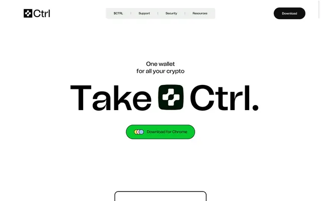
Preview image. Unlock full-res
Crisp monochrome canvas
Color palette
Green wash for highlight backgrounds, decorative bands, and soft emphasis behind content
Decorative card backgrounds, highlighted elements. A cheerful secondary accent often used for visual interest
Decorative card backgrounds, UI accents. A soft, muted chromatic for supplementary visual interest
Decorative card backgrounds, UI accents. A cool, muted chromatic for supplementary visual interest
Primary text, prominent borders, icon fills. Defines the strong contrast against light surfaces
Content backgrounds, button text on dark buttons, general canvas. Provides expansive negative space
Secondary text, solid button fills, card borders, active states. Functions as a slightly softer alternative to Absolute Black, maintaining high contrast
Main page background, subtle card surface. Acts as the foundational neutral canvas
Card backgrounds, navigation accents. Provides a slightly deeper neutral for layered surfaces
Neutral form states, badge text, and quiet UI feedback where color should stay understated. Do not promote it to the primary CTA color
Muted body text, helper text, inactive links, secondary borders. For less prominent textual information
Tertiary text, decorative borders. A slightly darker muted tone for subtle details
Typography
- Weights
- 500, 600
- Sizes
- 11px, 13px, 14px, 18px, 21px, 25px, 26px, 28px, 32px, 35px, 53px, 70px, 84px, 105px, 153px, 158px, 176px
- Line height
- 0.77, 0.8, 0.9, 1, 1.02, 1.06, 1.08, 1.13, 1.2, 1.25, 1.28, 1.3, 1.42, 1.5
- Letter spacing
- normal
- Fallback
- Inter
The sole typeface, used across all textual elements. Its consistent presence and varied weights create a cohesive, modern feel. The large, bold headlines (like 176px weight 600) establish a confident, almost graphic presence, while smaller sizes maintain clarity.
Spacing & shape
Components
Solid Graphite (#0f0f0f) background with Polar White (#ffffff) text. Features a 35.12px border radius, resulting in a pill shape. Padding is 0px vertical and 35.12px horizontal.
Transparent background (rgba(0,0,0,0)) with Graphite (#0f0f0f) text and a matching border. Square corners with 0px radius. Generous padding offers significant height: 43.9px vertical, 26.34-52.68px horizontal.
Transparent background with Graphite (#0f0f0f) text and border. Features an extreme 52.68px border radius for a full pill shape. Padding is 0px vertical and 35.12px horizontal.
Pebble Gray (#ecefec) background with 17.56px border radius and no shadow. Contains black text (Absolute Black #000000) for the question. Padding 0px.
Light Ash (#f9faf9) background with 17.56px border radius. Used for key information sections. Padding 0px.
Pebble Gray (#ecefec) background with 26.34px border radius. Padding of 35.12px vertical and 26.34px horizontal.
Sky Blue (#a7cbf6) background with 35.12px border radius. No padding specified, used for larger content blocks.
Light Ash (#eeeeee) background with Absolute Black (#000000) text and border. Features a 35.12px border radius. Padding 0px vertical, 35.12-57.07px horizontal.
Polar White (#ffffff) background with Absolute Black (#000000) text and border. Features an extreme 52.68px border radius. Padding 0px vertical, 43.9px horizontal.
Guidelines
- Prioritize Absolute Black (#000000) text on Polar White (#ffffff) or Light Ash (#f9faf9) backgrounds for all primary content to ensure high contrast and readability.
- Use Tomato Grotesk at weight 600 for all primary headings and weight 500 for body text and navigation, adjusting sizes according to the type scale.
- Apply 35.12px or 52.68px border-radius to interactive elements like buttons and inputs for a distinct, soft pill-like shape.
- Utilize Vivid Green (#05c92f), Sunshine Yellow (#fcea59), Blush Pink (#ffd0e2), and Sky Blue (#a7cbf6) exclusively as accent colors for headings or decorative card backgrounds, not for primary interface elements.
- Maintain generous spacing with a minimum element gap of 18px and section/card padding of 26px to ensure a spacious and uncluttered layout.
- Employ the Ghost Bordered Button style for secondary actions or navigation, explicitly outlining them with Graphite (#0f0f0f) borders and text and 0px radius.
- Avoid using multiple font families; adhere strictly to Tomato Grotesk across all textual elements.
- Do not introduce shadows for elevation; rely on color contrast and subtle background tints for depth and layering.
- Refrain from using accent colors for large background areas or primary text; reserve them for functional highlights or decorative touches.
- Do not deviate from the established border radii; maintain 17.56px for cards and 35.12-52.68px for buttons and inputs.
- Do not overcrowd sections; preserve the spacious density by adhering to the established section and element gaps.
- Avoid generic button styles that don't match the specific filled, ghost, or pill-bordered variants with their precise radii and color treatments.
- Do not use dark backgrounds for full sections; maintain the dominant light theme with white and light gray canvases.
About this system
ShowHide
Ctrl employs a high-contrast, minimalist interface with a strong focus on typography and subtle organic accents. Bold, large black text dominates white backdrops, establishing a clear visual hierarchy. Interactive elements are sparingly colored with vibrant, almost neon green and yellow, creating distinct focal points without overwhelming the monochrome base. Cards introduce soft, rounded corners and muted background tints, adding gentle variations to the otherwise stark presentation. The overall impression is one of crisp efficiency and modern simplicity, with functional accents.
The layout follows a contained, centered model, likely with a fixed maximum width for main content sections. The hero section features a full-bleed white background with a striking centered headline. Content is primarily arranged in vertical stacks of text, often with a large, feature-focused headline, followed by a sub-heading and call to action. Secondary sections introduce alternating content blocks, sometimes featuring a 2-column arrangement pairing text with visual elements (illustrations or product mockups). FAQ sections use vertically stacked, uniformly styled accordion cards. Navigation is handled by a minimal top bar with prominent branding and a 'Download' button, alongside smaller text links.
The visual language predominantly features abstract, geometric illustrations and product mockups (e.g., phone screen with wallet UI) for conceptual elements. When present, illustrations are typically organic in shape, outlined or filled with brand-specific accent colors (Vivid Green, Sunshine Yellow, Blush Pink, Sky Blue), and used decoratively around UI representations or as small, playful accents. Icons are generally outlined or filled with Absolute Black, maintaining the monochrome aesthetic. Imagery serves to add visual interest and explain concepts in a lighthearted, yet clear manner, without being overwhelming or detracting from the text-heavy messaging. Images are contained within defined areas, often with rounded corners, and do not typically bleed to the edges or overlap elements.
Reminiscent of Stripe, Linear, Figma, Notion.
# Secure and powerful crypto wallet | Ctrl Wallet — Style Reference
> Crisp monochrome canvas

**Theme:** light

**Site:** https://ctrl.xyz

Ctrl employs a high-contrast, minimalist interface with a strong focus on typography and subtle organic accents. Bold, large black text dominates white backdrops, establishing a clear visual hierarchy. Interactive elements are sparingly colored with vibrant, almost neon green and yellow, creating distinct focal points without overwhelming the monochrome base. Cards introduce soft, rounded corners and muted background tints, adding gentle variations to the otherwise stark presentation. The overall impression is one of crisp efficiency and modern simplicity, with functional accents.

## Tokens — Colors

| Name | Value | Token | Role |
|------|------|------|------|
| Vivid Green | `#05c92f` | `--color-vivid-green` | Green wash for highlight backgrounds, decorative bands, and soft emphasis behind content |
| Sunshine Yellow | `#fcea59` | `--color-sunshine-yellow` | Decorative card backgrounds, highlighted elements. A cheerful secondary accent often used for visual interest |
| Blush Pink | `#ffd0e2` | `--color-blush-pink` | Decorative card backgrounds, UI accents. A soft, muted chromatic for supplementary visual interest |
| Sky Blue | `#a7cbf6` | `--color-sky-blue` | Decorative card backgrounds, UI accents. A cool, muted chromatic for supplementary visual interest |
| Absolute Black | `#000000` | `--color-absolute-black` | Primary text, prominent borders, icon fills. Defines the strong contrast against light surfaces |
| Polar White | `#ffffff` | `--color-polar-white` | Content backgrounds, button text on dark buttons, general canvas. Provides expansive negative space |
| Graphite | `#0f0f0f` | `--color-graphite` | Secondary text, solid button fills, card borders, active states. Functions as a slightly softer alternative to Absolute Black, maintaining high contrast |
| Light Ash | `#f9faf9` | `--color-light-ash` | Main page background, subtle card surface. Acts as the foundational neutral canvas |
| Pebble Gray | `#ecefec` | `--color-pebble-gray` | Card backgrounds, navigation accents. Provides a slightly deeper neutral for layered surfaces |
| Slate Dust | `#eeeeee` | `--color-slate-dust` | Neutral form states, badge text, and quiet UI feedback where color should stay understated. Do not promote it to the primary CTA color |
| Muted Stone | `#5a585a` | `--color-muted-stone` | Muted body text, helper text, inactive links, secondary borders. For less prominent textual information |
| Deep Khaki | `#6e726e` | `--color-deep-khaki` | Tertiary text, decorative borders. A slightly darker muted tone for subtle details |

## Tokens — Typography

### Tomato Grotesk
- **Substitute:** Inter
- **Weights:** 500, 600
- **Sizes:** 11px, 13px, 14px, 18px, 21px, 25px, 26px, 28px, 32px, 35px, 53px, 70px, 84px, 105px, 153px, 158px, 176px
- **Line height:** 0.77, 0.8, 0.9, 1, 1.02, 1.06, 1.08, 1.13, 1.2, 1.25, 1.28, 1.3, 1.42, 1.5
- **Letter spacing:** normal
- **Role:** The sole typeface, used across all textual elements. Its consistent presence and varied weights create a cohesive, modern feel. The large, bold headlines (like 176px weight 600) establish a confident, almost graphic presence, while smaller sizes maintain clarity.

## Tokens — Type Scale

| Role | Size | Line height | Letter spacing |
|------|------|------|------|
| caption | 11px | 1.5 | — |
| subheading | 21px | 1.2 | — |
| heading-sm | 25px | 1.13 | — |
| heading | 35px | 1.08 | — |
| heading-lg | 70px | 0.9 | — |
| display | 176px | 0.77 | — |

## Tokens — Spacing

- **Section gap:** 26px
- **Card padding:** 26px
- **Element gap:** 18px

## Tokens — Radius

- **Buttons:** 35.12px
- **Inputs:** 35.12px
- **Cards:** 17.56px
- **largerButtons:** 52.68px

## Layout

The layout follows a contained, centered model, likely with a fixed maximum width for main content sections. The hero section features a full-bleed white background with a striking centered headline. Content is primarily arranged in vertical stacks of text, often with a large, feature-focused headline, followed by a sub-heading and call to action. Secondary sections introduce alternating content blocks, sometimes featuring a 2-column arrangement pairing text with visual elements (illustrations or product mockups). FAQ sections use vertically stacked, uniformly styled accordion cards. Navigation is handled by a minimal top bar with prominent branding and a 'Download' button, alongside smaller text links.

## Imagery

The visual language predominantly features abstract, geometric illustrations and product mockups (e.g., phone screen with wallet UI) for conceptual elements. When present, illustrations are typically organic in shape, outlined or filled with brand-specific accent colors (Vivid Green, Sunshine Yellow, Blush Pink, Sky Blue), and used decoratively around UI representations or as small, playful accents. Icons are generally outlined or filled with Absolute Black, maintaining the monochrome aesthetic. Imagery serves to add visual interest and explain concepts in a lighthearted, yet clear manner, without being overwhelming or detracting from the text-heavy messaging. Images are contained within defined areas, often with rounded corners, and do not typically bleed to the edges or overlap elements.

## Components

### Primary Filled Button
*Primary Call-to-action button, e.g., 'Download'.*

Solid Graphite (#0f0f0f) background with Polar White (#ffffff) text. Features a 35.12px border radius, resulting in a pill shape. Padding is 0px vertical and 35.12px horizontal.

### Ghost Bordered Button
*Secondary action or navigation item.*

Transparent background (rgba(0,0,0,0)) with Graphite (#0f0f0f) text and a matching border. Square corners with 0px radius. Generous padding offers significant height: 43.9px vertical, 26.34-52.68px horizontal.

### Pill Bordered Button
*Outline button with extreme rounded corners, typically for secondary actions.*

Transparent background with Graphite (#0f0f0f) text and border. Features an extreme 52.68px border radius for a full pill shape. Padding is 0px vertical and 35.12px horizontal.

### FAQ Accordion Card
*Content container for questions and answers, appearing as expandable sections.*

Pebble Gray (#ecefec) background with 17.56px border radius and no shadow. Contains black text (Absolute Black #000000) for the question. Padding 0px.

### Feature Highlight Card
*Prominent information display or feature showcase card.*

Light Ash (#f9faf9) background with 17.56px border radius. Used for key information sections. Padding 0px.

### Subtle Feature Card
*Card for supporting information or related features.*

Pebble Gray (#ecefec) background with 26.34px border radius. Padding of 35.12px vertical and 26.34px horizontal.

### Tinted Feature Card (Blue)
*Decorative or categorized feature card with a distinct color.*

Sky Blue (#a7cbf6) background with 35.12px border radius. No padding specified, used for larger content blocks.

### Input Field (Dark Border)
*Standard user input field.*

Light Ash (#eeeeee) background with Absolute Black (#000000) text and border. Features a 35.12px border radius. Padding 0px vertical, 35.12-57.07px horizontal.

### Search Input Field
*Input field for search functionality, with more rounded corners.*

Polar White (#ffffff) background with Absolute Black (#000000) text and border. Features an extreme 52.68px border radius. Padding 0px vertical, 43.9px horizontal.

## Guidelines

### Do

- Prioritize Absolute Black (#000000) text on Polar White (#ffffff) or Light Ash (#f9faf9) backgrounds for all primary content to ensure high contrast and readability.
- Use Tomato Grotesk at weight 600 for all primary headings and weight 500 for body text and navigation, adjusting sizes according to the type scale.
- Apply 35.12px or 52.68px border-radius to interactive elements like buttons and inputs for a distinct, soft pill-like shape.
- Utilize Vivid Green (#05c92f), Sunshine Yellow (#fcea59), Blush Pink (#ffd0e2), and Sky Blue (#a7cbf6) exclusively as accent colors for headings or decorative card backgrounds, not for primary interface elements.
- Maintain generous spacing with a minimum element gap of 18px and section/card padding of 26px to ensure a spacious and uncluttered layout.
- Employ the Ghost Bordered Button style for secondary actions or navigation, explicitly outlining them with Graphite (#0f0f0f) borders and text and 0px radius.

### Don't

- Avoid using multiple font families; adhere strictly to Tomato Grotesk across all textual elements.
- Do not introduce shadows for elevation; rely on color contrast and subtle background tints for depth and layering.
- Refrain from using accent colors for large background areas or primary text; reserve them for functional highlights or decorative touches.
- Do not deviate from the established border radii; maintain 17.56px for cards and 35.12-52.68px for buttons and inputs.
- Do not overcrowd sections; preserve the spacious density by adhering to the established section and element gaps.
- Avoid generic button styles that don't match the specific filled, ghost, or pill-bordered variants with their precise radii and color treatments.
- Do not use dark backgrounds for full sections; maintain the dominant light theme with white and light gray canvases.

## Agent Prompt Guide

Quick Color Reference:
text: #000000
background: #f9faf9
border: #0f0f0f
accent: #05c92f
primary action: #0f0f0f (filled action)

Example Component Prompts:

1. Create a Primary Filled Button for 'Download': background #0f0f0f, text #ffffff, border radius 35.12px, padding 0px vertical, 35.12px horizontal. Font Tomato Grotesk, 18px, weight 500.
2. Design an FAQ Accordion Card: background #ecefec, border radius 17.56px, no shadow. Headline 'How do I take part?' using Tomato Grotesk, 21px, weight 500, color #000000. Include a plus icon in #000000.
3. Implement a Ghost Bordered Nav Button for 'Support': background transparent, text #0f0f0f, border #0f0f0f, border radius 0px, padding 43.9px vertical, 26.34px horizontal. Font Tomato Grotesk, 14px, weight 500.
4. Build a Tinted Feature Card: background #a7cbf6, border radius 35.12px, no shadow. Placeholder text 'Create your wallet in seconds.' using Tomato Grotesk, 25px, weight 500, color #000000.
More like this







Keep what you find
A free account saves references to boards and can send you a weekly email of picks based on what you save.
To see every result, go Pro.