Preview image. Unlock full-res
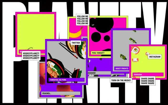
Neon Glitch Canvas: Fragmented text and pop colors splashed against a stark black backdrop.
Color palette
Prominent accent for borders, decorative frames, and visual noise. Creates a vibrant, rebellious contrast
Secondary accent for active states, highlights, and content containers. Provides a bright, techy counterpoint
Tertiary accent, often used for background fills within layered UI elements, adding depth and chromatic intensity
Primary background, dominant text color for badges, icon strokes
Primary text, badge backgrounds, high-contrast borders
Muted text against Ghost Canvas, subtle border color for UI elements
Typography
- Weights
- 400
- Sizes
- 10px, 20px
- Line height
- 1
- Letter spacing
- normal
- Fallback
- Arial Narrow, sans-serif
All textual content, from small labels to prominent headings. Its condensed nature supports dense, graphic layouts and adds to the system's sharp, direct tone.
Spacing & shape
Components
A square or rectangular panel with a 1px solid border of Shocking Pink (#ff0099), filled with UFO Green (#ccff00) or Midnight Void (#000000). No border-radius, maintaining a sharp, digital aesthetic. Used for primary graphic elements.
White background (#ffffff) with text in Electric Black (#040001). Features 1px Electric Black (#040001) border with 10px padding on top, right, and left, and 8px on the bottom. Square corners (0px radius). Example: 'FOLLOW ME', 'INSTAGRAM'.
White background (#ffffff) with Electric Black (#040001) text. No visible border, but the solid background creates contrast against the vibrant panel colors. Padding indicates a compact, content-dense approach. Example: 'TONKOTSU, NO PORK'.
A panel with a Toxic Lilac (#9900ff) fill, often nested behind or overlapping other panels. Features a 1px Midnight Void (#000000) border, enhancing its layered appearance. Used for visual breaks or background noise.
Neutral gray background (implied from screenshots, such as #d3d3d3) with a 1px border which could be Toxic Lilac (#9900ff) or Shocking Pink (#ff0099). These panels appear to float over background layers.
Guidelines
- Use Midnight Void (#000000) for all primary backgrounds.
- Apply 1px solid borders in Shocking Pink (#ff0099), Toxic Lilac (#9900ff), or Midnight Void (#000000) for all UI elements to enhance the layered, graphic feel.
- Maintain a 0px border-radius on all components and containers for a sharp aesthetic.
- Employ Ghost Canvas (#ffffff) for primary text and Electric Black (#040001) for secondary text or text within certain badges.
- Emphasize a compact layout with 10px padding for most interactable elements (top, right, left) and 8px padding on the bottom.
- Utilize Shocking Pink (#ff0099), UFO Green (#ccff00), and Toxic Lilac (#9900ff) as primary accent colors, interspersing them prominently across the interface.
- Leverage Helvetica Neue LT Condensed weight 400 for all typography, using its limited size range (10px, 20px) to establish hierarchy.
- Do not use any rounded corners; maintain hard edges across the entire design.
- Avoid subtle or pastel color palettes; stick to high-contrast, saturated neon and stark achromatic tones.
- Do not use letter-spacing other than normal; the condensed typeface already handles visual density.
- Refrain from using any drop shadows or complex elevation effects; instead, create visual depth through color layering and bold borders.
- Do not introduce gradients unless they are highly contrasting and contribute to a glitchy or fragmented aesthetic.
- Avoid soft, organic shapes or imagery; adhere to geometric forms and sharp cutouts.
- Do not introduce additional font families or weights beyond Helvetica Neue LT Condensed weight 400.
About this system
ShowHide
Seksy Planety uses a high-contrast, maximalist visual language, characterized by stark black backgrounds and white text, punctuated by electric neon accents of fuchsia, lime, and purple. UI elements appear as graphic overlays with thick, contrasting borders, creating a layered, collage-like aesthetic. Typography is bold and direct, emphasizing an immediate, almost frantic energy, while all components are sharp-edged, reflecting a raw, unpolished, digital-first sensibility.
The page prominently utilizes a full-bleed layout against a Midnight Void (#000000) background, with no defined pageMaxWidth, allowing elements to extend to the edges. The hero section is characterized by large, fragmented, white slab-serif typography (implied by brand name visual, not extracted) that is partially obscured by overlapping content panels. The overall layout is an unstructured, asynchronous collage of UI panels. Content is arranged in an overlapping, seemingly chaotic, but deliberately composed manner where various rectangular panels (in UFO Green, Toxic Lilac, neutral gray, and white) are stacked and skewed, creating a sense of depth and energetic disarray. Vertical spacing is implied by the stacking of these graphic elements rather than consistent section gaps. Navigation is not explicitly visible in the provided image snippets, suggesting a minimal or hidden navigation approach, or one integrated into the graphic elements themselves.
This system features a highly graphic and illustrative visual language. Imagery consists mainly of stylized, often isometric or abstract illustrations of objects (bananas, peaches, sushi, wine bottles) and black circular shapes, presented in a flat, vector-art style. These are typically contained within rectangular panels or freely floating within compositions. There is no photography, and instead, all visual content is highly stylized. Icons, when present (e.g., social media mentions implied by text), are likely filled or bold outlines given the overall aesthetic. Imagery serves purely decorative and atmospheric purposes, contributing to the maximalist, glitchy, and playful mood, and often forms part of the layered collage composition.
Reminiscent of Brutalism-inspired web designs, 90s Rave Flyer Art, Cyberpunk visuals, Memphis Group design.
# Seksy Planety — Style Reference
> Neon Glitch Canvas: Fragmented text and pop colors splashed against a stark black backdrop.

**Theme:** dark

**Site:** https://www.seksyplanety.com

Seksy Planety uses a high-contrast, maximalist visual language, characterized by stark black backgrounds and white text, punctuated by electric neon accents of fuchsia, lime, and purple. UI elements appear as graphic overlays with thick, contrasting borders, creating a layered, collage-like aesthetic. Typography is bold and direct, emphasizing an immediate, almost frantic energy, while all components are sharp-edged, reflecting a raw, unpolished, digital-first sensibility.

## Tokens — Colors

| Name | Value | Token | Role |
|------|------|------|------|
| Shocking Pink | `#ff0099` | `--color-shocking-pink` | Prominent accent for borders, decorative frames, and visual noise. Creates a vibrant, rebellious contrast |
| UFO Green | `#ccff00` | `--color-ufo-green` | Secondary accent for active states, highlights, and content containers. Provides a bright, techy counterpoint |
| Toxic Lilac | `#9900ff` | `--color-toxic-lilac` | Tertiary accent, often used for background fills within layered UI elements, adding depth and chromatic intensity |
| Midnight Void | `#000000` | `--color-midnight-void` | Primary background, dominant text color for badges, icon strokes |
| Ghost Canvas | `#ffffff` | `--color-ghost-canvas` | Primary text, badge backgrounds, high-contrast borders |
| Electric Black | `#040001` | `--color-electric-black` | Muted text against Ghost Canvas, subtle border color for UI elements |

## Tokens — Typography

### Helvetica Neue LT Condensed
- **Substitute:** Arial Narrow, sans-serif
- **Weights:** 400
- **Sizes:** 10px, 20px
- **Line height:** 1
- **Letter spacing:** normal
- **Role:** All textual content, from small labels to prominent headings. Its condensed nature supports dense, graphic layouts and adds to the system's sharp, direct tone.

## Tokens — Type Scale

| Role | Size | Line height | Letter spacing |
|------|------|------|------|
| caption | 10px | 1 | — |
| body | 20px | 1.1 | — |

## Tokens — Spacing

- **Section gap:** 48px
- **Card padding:** 10px
- **Element gap:** 10px

## Tokens — Radius

- **all:** 0px

## Layout

The page prominently utilizes a full-bleed layout against a Midnight Void (#000000) background, with no defined pageMaxWidth, allowing elements to extend to the edges. The hero section is characterized by large, fragmented, white slab-serif typography (implied by brand name visual, not extracted) that is partially obscured by overlapping content panels. The overall layout is an unstructured, asynchronous collage of UI panels. Content is arranged in an overlapping, seemingly chaotic, but deliberately composed manner where various rectangular panels (in UFO Green, Toxic Lilac, neutral gray, and white) are stacked and skewed, creating a sense of depth and energetic disarray. Vertical spacing is implied by the stacking of these graphic elements rather than consistent section gaps. Navigation is not explicitly visible in the provided image snippets, suggesting a minimal or hidden navigation approach, or one integrated into the graphic elements themselves.

## Imagery

This system features a highly graphic and illustrative visual language. Imagery consists mainly of stylized, often isometric or abstract illustrations of objects (bananas, peaches, sushi, wine bottles) and black circular shapes, presented in a flat, vector-art style. These are typically contained within rectangular panels or freely floating within compositions. There is no photography, and instead, all visual content is highly stylized. Icons, when present (e.g., social media mentions implied by text), are likely filled or bold outlines given the overall aesthetic. Imagery serves purely decorative and atmospheric purposes, contributing to the maximalist, glitchy, and playful mood, and often forms part of the layered collage composition.

## Components

### Basic Panel with Border
*Content container, visual card for information segregation.*

A square or rectangular panel with a 1px solid border of Shocking Pink (#ff0099), filled with UFO Green (#ccff00) or Midnight Void (#000000). No border-radius, maintaining a sharp, digital aesthetic. Used for primary graphic elements.

### Actionable Badge
*Interactive button-like element, status indicator, or label.*

White background (#ffffff) with text in Electric Black (#040001). Features 1px Electric Black (#040001) border with 10px padding on top, right, and left, and 8px on the bottom. Square corners (0px radius). Example: 'FOLLOW ME', 'INSTAGRAM'.

### Text Overlay Badge
*Informational overlay on content panels.*

White background (#ffffff) with Electric Black (#040001) text. No visible border, but the solid background creates contrast against the vibrant panel colors. Padding indicates a compact, content-dense approach. Example: 'TONKOTSU, NO PORK'.

### Layered Accent Panel
*Graphic background element, creating visual depth.*

A panel with a Toxic Lilac (#9900ff) fill, often nested behind or overlapping other panels. Features a 1px Midnight Void (#000000) border, enhancing its layered appearance. Used for visual breaks or background noise.

### Floating Content Panel
*Primary surface for graphics or short textual content.*

Neutral gray background (implied from screenshots, such as #d3d3d3) with a 1px border which could be Toxic Lilac (#9900ff) or Shocking Pink (#ff0099). These panels appear to float over background layers.

## Guidelines

### Do

- Use Midnight Void (#000000) for all primary backgrounds.
- Apply 1px solid borders in Shocking Pink (#ff0099), Toxic Lilac (#9900ff), or Midnight Void (#000000) for all UI elements to enhance the layered, graphic feel.
- Maintain a 0px border-radius on all components and containers for a sharp aesthetic.
- Employ Ghost Canvas (#ffffff) for primary text and Electric Black (#040001) for secondary text or text within certain badges.
- Emphasize a compact layout with 10px padding for most interactable elements (top, right, left) and 8px padding on the bottom.
- Utilize Shocking Pink (#ff0099), UFO Green (#ccff00), and Toxic Lilac (#9900ff) as primary accent colors, interspersing them prominently across the interface.
- Leverage Helvetica Neue LT Condensed weight 400 for all typography, using its limited size range (10px, 20px) to establish hierarchy.

### Don't

- Do not use any rounded corners; maintain hard edges across the entire design.
- Avoid subtle or pastel color palettes; stick to high-contrast, saturated neon and stark achromatic tones.
- Do not use letter-spacing other than normal; the condensed typeface already handles visual density.
- Refrain from using any drop shadows or complex elevation effects; instead, create visual depth through color layering and bold borders.
- Do not introduce gradients unless they are highly contrasting and contribute to a glitchy or fragmented aesthetic.
- Avoid soft, organic shapes or imagery; adhere to geometric forms and sharp cutouts.
- Do not introduce additional font families or weights beyond Helvetica Neue LT Condensed weight 400.

## Agent Prompt Guide

Quick Color Reference:
text: #ffffff
background: #000000
border: #ff0099
accent: #ccff00
primary action: no distinct CTA color

Example Component Prompts:
Create a hero section: Midnight Void background (#000000). Headline in large white text (Helvetica Neue LT Condensed weight 400). Overlap with a UFO Green panel (#ccff00), 1px Shocking Pink border (#ff0099), containing a 'FOLLOW ME' Actionable Badge (Ghost Canvas background #ffffff, Electric Black text #040001, 1px Electric Black border #040001, 10px top/right/left padding, 8px bottom padding, 0px radius).
Create an information card: Toxic Lilac Panel (#9900ff) with 1px Midnight Void border (#000000). Overlay with a Text Overlay Badge (Ghost Canvas background #ffffff, Electric Black text #040001, 10px top/right/left padding, 8px bottom padding, 0px radius) displaying 'POOL TONIGHT?'.
Create a content block: Fill a UFO Green panel (#ccff00) with a 1px Shocking Pink border (#ff0099). Within this panel, place a 'TWITTER' Actionable Badge (Ghost Canvas background #ffffff, Electric Black text #040001, 1px Electric Black border #040001, 10px top/right/left padding, 8px bottom padding, 0px radius) and a smaller, layered accent panel of Toxic Lilac (#9900ff), slightly offset.
More like this







Keep what you find
A free account saves references to boards and can send you a weekly email of picks based on what you save.
To see every result, go Pro.