Preview image. Unlock full-res
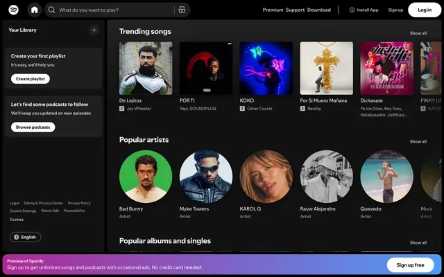
Midnight command center, where content glows against a deep, dark stage.
Color palette
Various content thumbnail backgrounds, part of the diverse color palette used for album arts/genre representation.
Various content thumbnail backgrounds.
Various content thumbnail backgrounds.
Various content thumbnail backgrounds.
Various content thumbnail backgrounds.
Various content thumbnail backgrounds.
Various content thumbnail backgrounds.
Prominent accent for success states and active elements like the 'Sign up free' button.
Background for the informational banner at the bottom, creating a vibrant call to action.
Primary background for pages and large content areas, setting the overall dark theme.
Background for secondary panels and embedded UI elements, slightly lighter than the canvas to create subtle depth.
Background for content cards, offering a distinction from the canvas and panel backgrounds.
Background for input fields, providing a slightly darker cavity against surrounding surfaces.
Top-level background in some contexts, and for text against very light elements.
Primary text color for headings, body, and interactive elements, ensuring high contrast against dark backgrounds.
Secondary text, icons, and inactive elements, providing visual hierarchy.
Muted text for helper copy, borders, and subtle interactive states.
Placeholder text in input fields.
Typography
- Weights
- 400
- Sizes
- 11px, 12px, 13px, 14px, 16px
- Line height
- 1.2, 1.33, 1.5
- Letter spacing
- normal
- Fallback
- Arial
Used for most body text, buttons, navigation links, and input elements, providing a consistent modern sans-serif voice across the UI.
- Weights
- 700
- Sizes
- 24px
- Line height
- 1.2
- Letter spacing
- normal
- Fallback
- Arial Black
Exclusively for prominent headings like 'Trending songs' or 'Your Library', emphasizing content categories with a bold, impactful font.
Spacing & shape
Components
Transparent background button with Secondary Gray text (#b3b3b3) and a matching 1px border. Features 9999px border-radius and 12px padding on all sides. Used for secondary actions and links.
Transparent background button with Primary White text (#ffffff) and no border, 0px border-radius, no padding. Used for high-contrast inline links.
Transparent background button with Muted Graphite text (#73777c) and a matching 1px border. Features 9999px border-radius and no padding. Used for less prominent interactive elements.
White background button with Overlay Black text (#000000), 0px border-radius, and 16px padding on all sides. Used for primary calls to action.
Transparent background card with 6px border-radius, no box-shadow, and 12px padding on all sides. Used for displaying individual items like songs or artists.
Transparent background card with 0px border-radius and no box-shadow, no padding. Used for displaying images without additional styling.
Input field with Dark Surface background (#313131), Primary White text (#ffffff), 500px border-radius, and 12px vertical padding, 48px left padding, 96px right padding. Characterized by its pill shape.
Card with black background (#000000), white text (#ffffff), 6px border-radius, and 12px padding. Used in the sidebar for actions like 'Create playlist'.
Bottom-fixed banner with a linear gradient from rgb(175, 40, 150) to rgb(80, 155, 245), white text (#ffffff) and a prominent 'Sign up free' button. Features 6px border-radius for the banner itself and a 9999px radius for the button.
Guidelines
- Maintain high contrast text #ffffff on dark backgrounds, using #121212 as the primary canvas.
- Apply 9999px border-radius to all interactive buttons and tags, such as 'Log in' and 'Create playlist' buttons.
- Use 6px border-radius for all content cards, images, and nav elements to visually separate content blocks.
- Utilize 'SpotifyMixUI' at 14px 400 weight for general body text and navigation items for consistency.
- Employ 'SpotifyMixUITitle' at 24px 700 weight for all main section headings like 'Trending songs'.
- Separate main content sections with a 32px vertical gap.
- Incorporate subtle depth through background color layering: #121212 for canvas, #292929 for panels, and #1f1f1f for content cards.
- Do not use subtle drop shadows for elevation; instead, rely on distinct background color shifts between surfaces.
- Avoid using highly saturated colors for large text blocks; reserve them for interactive elements, highlights, or distinct content backgrounds.
- Do not break the 1085px max-width content constraint for main sections of the page.
- Do not use generic square or slightly rounded button shapes; all buttons should either be pill-shaped (9999px radius) or completely unrounded text links.
- Avoid mixing font families; exclusively use 'SpotifyMixUI' and 'SpotifyMixUITitle' to maintain typographic consistency.
- Do not use bright white as a background for primary content areas; backgrounds should be from the dark neutral palette.
- Do not apply padding to images directly within content cards; padding should be reserved for the card container.
About this system
ShowHide
The Spotify UI is a 'midnight command center' aesthetic, built on a dark gray canvas with deeply saturated accents. It creates a focused, immersive experience where content takes center stage, reminiscent of a stage bathed in theatrical lighting. The primary visual tension arises from the interplay of near-black backgrounds, high-contrast white typography, and vibrant, often gradient, splashes of color that highlight interactive elements and content categories. The extensive use of 9999px rounded corners for primary interactive elements contrasts with the sharper 6px radii for content cards, adding a subtle touch of approachability to a largely utilitarian dark theme.
The page uses a maximum content width of 1085px. The main layout consists of a two-column structure: a fixed-width left sidebar (`nav`, ~200px) and a main content area to its right. The hero pattern is not explicitly present; instead, content sections begin immediately below the top header. Content is organized into distinct horizontal sections (e.g., 'Trending songs', 'Popular artists'), which use consistent vertical spacing (32px between sections) but without alternating background bands. Within these sections, content is arranged in horizontal scrolling carousels of cards or circular artist images. The navigation is a left-fixed sidebar, and a persistent dark header with a search bar and user actions. A fixed promotional banner appears at the very bottom, full-width.
This design primarily features content-driven imagery, such as album art and artist profile pictures. These images are typically cropped into squares for album art (within 6px rounded cards) or circles for artist profiles (indicating a 9999px radius crop). The imagery often carries its own vibrant colors, providing the main chromatic elements against the predominantly dark UI. There are no full-bleed marketing images or abstract graphics; instead, imagery serves to directly represent the media content itself. Icons are generally monochrome (white or #b3b3b3) and outlined, appearing in navigation and UI controls.
Reminiscent of Apple Music, Netflix, Disney+, Twitch.
# Spotify — Style Reference
> Midnight command center, where content glows against a deep, dark stage.

**Theme:** dark

**Site:** https://spotify.com

The Spotify UI is a 'midnight command center' aesthetic, built on a dark gray canvas with deeply saturated accents. It creates a focused, immersive experience where content takes center stage, reminiscent of a stage bathed in theatrical lighting. The primary visual tension arises from the interplay of near-black backgrounds, high-contrast white typography, and vibrant, often gradient, splashes of color that highlight interactive elements and content categories. The extensive use of 9999px rounded corners for primary interactive elements contrasts with the sharper 6px radii for content cards, adding a subtle touch of approachability to a largely utilitarian dark theme.

## Tokens — Colors

| Name | Value | Token | Role |
|------|------|------|------|
| Content Red | `#b85850` | `--color-content-red` | Various content thumbnail backgrounds, part of the diverse color palette used for album arts/genre representation. |
| Content Blue | `#5477af` | `--color-content-blue` | Various content thumbnail backgrounds. |
| Content Pink | `#8e69a3` | `--color-content-pink` | Various content thumbnail backgrounds. |
| Content Green Muted | `#508162` | `--color-content-green-muted` | Various content thumbnail backgrounds. |
| Content Red Vivid | `#dc392b` | `--color-content-red-vivid` | Various content thumbnail backgrounds. |
| Content Violet Vivid | `#0010c8` | `--color-content-violet-vivid` | Various content thumbnail backgrounds. |
| Content Orange Moderate | `#804800` | `--color-content-orange-moderate` | Various content thumbnail backgrounds. |
| Brand Success Green | `#1ed760` | `--color-brand-success-green` | Prominent accent for success states and active elements like the 'Sign up free' button. |
| Gradient Banner | `#af2896` | `--color-gradient-banner` | Background for the informational banner at the bottom, creating a vibrant call to action. |
| Canvas Night | `#121212` | `--color-canvas-night` | Primary background for pages and large content areas, setting the overall dark theme. |
| Surface Charcoal | `#292929` | `--color-surface-charcoal` | Background for secondary panels and embedded UI elements, slightly lighter than the canvas to create subtle depth. |
| Card Base | `#1f1f1f` | `--color-card-base` | Background for content cards, offering a distinction from the canvas and panel backgrounds. |
| Input Dark | `#333333` | `--color-input-dark` | Background for input fields, providing a slightly darker cavity against surrounding surfaces. |
| Overlay Black | `#000000` | `--color-overlay-black` | Top-level background in some contexts, and for text against very light elements. |
| Text Primary White | `#ffffff` | `--color-text-primary-white` | Primary text color for headings, body, and interactive elements, ensuring high contrast against dark backgrounds. |
| Text Secondary Gray | `#b3b3b3` | `--color-text-secondary-gray` | Secondary text, icons, and inactive elements, providing visual hierarchy. |
| Text Muted Graphite | `#73777c` | `--color-text-muted-graphite` | Muted text for helper copy, borders, and subtle interactive states. |
| Input Placeholder | `#c5c5c5` | `--color-input-placeholder` | Placeholder text in input fields. |

## Tokens — Typography

### SpotifyMixUI
- **Substitute:** Arial
- **Weights:** 400
- **Sizes:** 11px, 12px, 13px, 14px, 16px
- **Line height:** 1.2, 1.33, 1.5
- **Letter spacing:** normal
- **Role:** Used for most body text, buttons, navigation links, and input elements, providing a consistent modern sans-serif voice across the UI.

### SpotifyMixUITitle
- **Substitute:** Arial Black
- **Weights:** 700
- **Sizes:** 24px
- **Line height:** 1.2
- **Letter spacing:** normal
- **Role:** Exclusively for prominent headings like 'Trending songs' or 'Your Library', emphasizing content categories with a bold, impactful font.

## Tokens — Type Scale

Perfect Fifth (1.5) from 11px base.

| Role | Size | Line height | Letter spacing |
|------|------|------|------|
| caption | 11px | 1.5 | — |
| body-lg | 14px | 1.5 | — |
| heading | 24px | 1.2 | — |

## Tokens — Spacing

- **Max width:** 1085px
- **Section gap:** 32px
- **Card padding:** 12px
- **Element gap:** 8px

## Tokens — Radius

- **Buttons:** 9999px
- **Cards:** 6px
- **image:** 6px
- **input:** 500px
- **misc:** 2px

## Layout

The page uses a maximum content width of 1085px. The main layout consists of a two-column structure: a fixed-width left sidebar (`nav`, ~200px) and a main content area to its right. The hero pattern is not explicitly present; instead, content sections begin immediately below the top header. Content is organized into distinct horizontal sections (e.g., 'Trending songs', 'Popular artists'), which use consistent vertical spacing (32px between sections) but without alternating background bands. Within these sections, content is arranged in horizontal scrolling carousels of cards or circular artist images. The navigation is a left-fixed sidebar, and a persistent dark header with a search bar and user actions. A fixed promotional banner appears at the very bottom, full-width.

## Imagery

This design primarily features content-driven imagery, such as album art and artist profile pictures. These images are typically cropped into squares for album art (within 6px rounded cards) or circles for artist profiles (indicating a 9999px radius crop). The imagery often carries its own vibrant colors, providing the main chromatic elements against the predominantly dark UI. There are no full-bleed marketing images or abstract graphics; instead, imagery serves to directly represent the media content itself. Icons are generally monochrome (white or #b3b3b3) and outlined, appearing in navigation and UI controls.

## Components

### Primary Ghost Button
*Interactive Element*

Transparent background button with Secondary Gray text (#b3b3b3) and a matching 1px border. Features 9999px border-radius and 12px padding on all sides. Used for secondary actions and links.

### Text Link Button
*Interactive Element*

Transparent background button with Primary White text (#ffffff) and no border, 0px border-radius, no padding. Used for high-contrast inline links.

### Muted Ghost Button
*Interactive Element*

Transparent background button with Muted Graphite text (#73777c) and a matching 1px border. Features 9999px border-radius and no padding. Used for less prominent interactive elements.

### Primary Filled Button
*Interactive Element*

White background button with Overlay Black text (#000000), 0px border-radius, and 16px padding on all sides. Used for primary calls to action.

### Content Card
*Content Display*

Transparent background card with 6px border-radius, no box-shadow, and 12px padding on all sides. Used for displaying individual items like songs or artists.

### Image Card
*Content Display*

Transparent background card with 0px border-radius and no box-shadow, no padding. Used for displaying images without additional styling.

### Search Input Field
*Form Element*

Input field with Dark Surface background (#313131), Primary White text (#ffffff), 500px border-radius, and 12px vertical padding, 48px left padding, 96px right padding. Characterized by its pill shape.

### Library Action Card
*Navigation/Call to Action*

Card with black background (#000000), white text (#ffffff), 6px border-radius, and 12px padding. Used in the sidebar for actions like 'Create playlist'.

### Gradient Callout
*Promotional Banner*

Bottom-fixed banner with a linear gradient from rgb(175, 40, 150) to rgb(80, 155, 245), white text (#ffffff) and a prominent 'Sign up free' button. Features 6px border-radius for the banner itself and a 9999px radius for the button.

## Guidelines

### Do

- Maintain high contrast text #ffffff on dark backgrounds, using #121212 as the primary canvas.
- Apply 9999px border-radius to all interactive buttons and tags, such as 'Log in' and 'Create playlist' buttons.
- Use 6px border-radius for all content cards, images, and nav elements to visually separate content blocks.
- Utilize 'SpotifyMixUI' at 14px 400 weight for general body text and navigation items for consistency.
- Employ 'SpotifyMixUITitle' at 24px 700 weight for all main section headings like 'Trending songs'.
- Separate main content sections with a 32px vertical gap.
- Incorporate subtle depth through background color layering: #121212 for canvas, #292929 for panels, and #1f1f1f for content cards.

### Don't

- Do not use subtle drop shadows for elevation; instead, rely on distinct background color shifts between surfaces.
- Avoid using highly saturated colors for large text blocks; reserve them for interactive elements, highlights, or distinct content backgrounds.
- Do not break the 1085px max-width content constraint for main sections of the page.
- Do not use generic square or slightly rounded button shapes; all buttons should either be pill-shaped (9999px radius) or completely unrounded text links.
- Avoid mixing font families; exclusively use 'SpotifyMixUI' and 'SpotifyMixUITitle' to maintain typographic consistency.
- Do not use bright white as a background for primary content areas; backgrounds should be from the dark neutral palette.
- Do not apply padding to images directly within content cards; padding should be reserved for the card container.

## Agent Prompt Guide

### Quick Color Reference
- Text Primary: #ffffff
- Background Canvas: #121212
- CTA Button Background: #1ed760
- Primary Button Text: #000000
- Accent Gradient (Banner): linear-gradient(90deg, rgb(175, 40, 150), rgb(80, 155, 245))
- Secondary Text/Icons: #b3b3b3

### Example Component Prompts
1. Create a `Library Action Card`: background #000000, 6px radius, 12px padding. Headline 'Create your first playlist' with SpotifyMixUI 16px 400 weight #ffffff. Body text 'It's easy, we'll help you' with SpotifyMixUI 13px 400 weight #b3b3b3.  Include a 'Create playlist' button: background #ffffff, text #000000, 9999px radius, 12px padding.
2. Create a `Search Input Field`: background #333333, text #ffffff, placeholder #c5c5c5, 500px radius, 12px vertical padding, 48px left padding, 96px right padding. Use `SpotifyMixUI` 14px 400 for text and placeholder.
3. Create a `Trending Song Card`: background #1f1f1f, 6px radius, 12px padding. Image with 6px radius. Song title 'De Lejitos' with SpotifyMixUI 14px 400 weight #ffffff. Artist name 'Jay Wheeler' with SpotifyMixUI 12px 400 weight #b3b3b3.
4. Create the `Gradient Callout` banner at the bottom: background linear-gradient(90deg, rgb(175, 40, 150), rgb(80, 155, 245)), 6px radius. Text 'Sign up to get unlimited songs...' with SpotifyMixUI 13px 400 weight #ffffff. A 'Sign up free' button with background #1ed760, text #000000, 9999px radius, and 12px vertical padding on all sides with 16px horizontal padding.
More like this







Keep what you find
A free account saves references to boards and can send you a weekly email of picks based on what you save.
To see every result, go Pro.