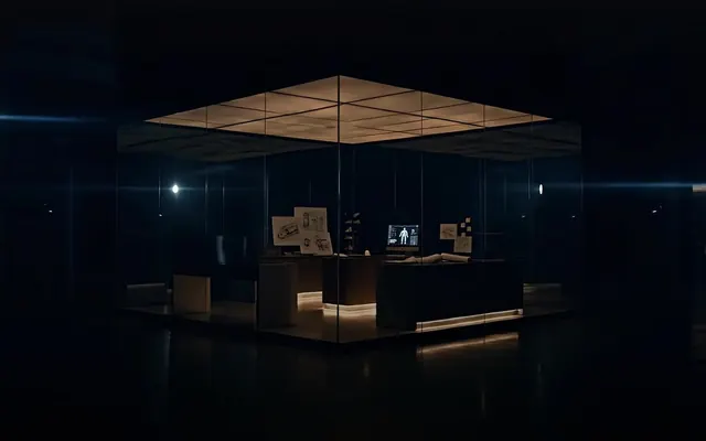
Preview image. Unlock full-res
Black canvas, sharp typography
Color palette
Page backgrounds, primary dark surfaces, text on light elements.
Primary text, critical UI elements, borders for ghost buttons — creating stark contrast against dark backgrounds.
Primary background for solid buttons, providing a subtle off-white alternative to pure white for interactive elements.
Secondary background for containers, slightly differentiated from the deepest black.
Subtle text, less prominent borders, and icons.
Badge backgrounds when slightly darker contrast is needed, secondary borders.
Tertiary text, descriptive labels, less emphasized information.
Fine print, less important body copy. Similar to Ash Accent but slightly lighter.
Placeholder text or disabled states, providing a further step down in visual hierarchy.
Background for transparent badges, providing a muted dark tint.
Typography
- Weights
- 300, 400, 500
- Sizes
- 10px, 11px, 12px, 13px, 14px, 15px, 16px, 18px, 20px, 22px, 30px, 32px, 54px, 58px, 115px, 128px
- Line height
- 1, 1.2, 1.4, 1.5
- Letter spacing
- -0.0500em, -0.0300em, -0.0250em, -0.0200em, 0.0300em, 0.0500em, 0.0700em, 0.0800em
- Fallback
- system-ui, sans-serif
Primary sans-serif for body text, navigation, and most UI elements. Its precise tracking and varied weights at numerous sizes provide significant typographic flexibility, maintaining clarity even at small scales.
- Weights
- 500
- Sizes
- 32px, 58px, 128px
- Line height
- 1, 1.2
- Letter spacing
- -0.0500em, -0.0250em
- Fallback
- serif
Exclusive for large headlines, this custom serif font and its distinct light weight (500) sets a tone of intellectual authority. The negative letter-spacing at display sizes creates a commanding, tightly-knit appearance, making headlines feel sculpted.
Spacing & shape
Elevation
Components
Rounded pill shape, #f5f5f0 background with #000000 text. Uses 9999px border-radius, 24px horizontal padding. Typography: VisueltPro, typically weight 400 for clarity.
Rounded pill shape. Transparent background, #ffffff text with a #ffffff border. Uses 9999px border-radius, 20px horizontal padding. Typography: VisueltPro, typically weight 400.
Perfectly circular with transparent background, #ffffff text/icon, and #ffffff border. Used for video controls. Radius implied by 0px padding and circular shape.
Transparent background, 0px border radius, no box shadow. Content relies on visual hierarchy rather than distinct container styling.
Transparent background, 10px border radius, no box shadow. Used for visually separating key content blocks, subtle rounded corners add distinction.
Rounded pill shape, rgba(200, 200, 200, 0.1) background with #ffffff text. Uses 9999px border-radius, 16px horizontal and 8px vertical padding. Typography: VisueltPro, weight 400, for clear labeling.
Rounded pill shape, transparent background with #ffffff text. Uses 9999px border-radius. Primarily used for inline or minimalist tagging, relying on text color for emphasis.
Guidelines
- Prioritize #000000 for backgrounds and #ffffff for primary text to maintain high contrast and dramatic impact.
- Use Bradford font exclusively for large headings (32px and above) with its distinct weight 500 and negative letter spacing (-0.0500em or -0.0250em).
- Apply 9999px border-radius to all interactive elements like buttons and badges for distinctive pill shapes.
- Utilize rgba(200, 200, 200, 0.1) for subtle, transparent badge backgrounds, ensuring text remains #ffffff.
- Maintain a clear visual hierarchy using VisueltPro's varied weights and sizes for body copy, navigation, and secondary UI elements, without relying on color for differentiation.
- Employ the negative letter-spacing values from the typography specification for precise text rendering at various sizes.
- Use 10px border-radius only for specific featured cards to provide a subtle visual differentiator against the predominant 0px radius.
- Avoid using highly saturated or chromatic colors; stick to the achromatic palette with #ffffff, #000000, and the various grays.
- Do not introduce sharp corners on buttons or badges; the 9999px radius is a signature visual element.
- Refrain from using Bradford font for body text or small UI elements; its use is reserved for large, impactful headlines.
- Do not add additional box-shadows beyond rgba(0, 0, 0, 0.35) 0px 10px 30px 0px for elevated elements and rgba(0, 0, 0, 0.15) 0px 4px 20px 0px for interactive button states.
- Avoid using multiple border styles or weights; maintain simple, thin borders for ghost elements or an absence of borders.
- Do not use generic system fonts in place of VisueltPro or Bradford; their unique characteristics are integral to the brand.
- Avoid excessive spacing that diminishes the dense, deliberate feel; element gaps should adhere to the provided '3-28px' range.
About this system
ShowHide
This design system evokes a sense of understated luxury and serious intent, reflecting a 'dark mode meets gallery space' aesthetic. A dramatic pure black background (#000000) provides a stark canvas for crisp white typography (#ffffff) and subtle, almost invisible components. The system primarily relies on meticulous typography with a custom serif for headlines and a custom sans-serif for body text, creating a strong sense of intellectual weight without visual overwhelm. Rounded lozenges (9999px radius) offer the only soft edges, contrasting sharply with the otherwise linear, rigid structure, suggesting pockets of approachable interaction within a rigorous framework.
The page primarily uses a full-bleed layout, where content sections stretch across the entire viewport width, particularly for hero areas. Inner content is often held within a maximum width but the containers do not explicitly define a pageMaxWidth. The hero section features centered, large typography against a dark background. Content sections follow a vertical rhythm, alternating between prominent headlines and multi-column layouts, often with text on one side and a large image card on the other. Navigation is a minimalist top bar with a primary action button, fading into the dark background. The layout feels spacious yet structured, emphasizing key statements and imagery.
The visual language is characterized by sophisticated, high-key photography of individuals, often seen in reflective or contemplative states, suggesting success and thought leadership. Images are full-bleed within the card containers, cropped dynamically, and occasionally feature subtle brand badges overlayed at specific corners. There is an absence of product screenshots or abstract graphics, focusing entirely on human subjects as the core visual narrative. The overall impression is one of aspirational portraiture combined with subtle documentary style, reinforcing a focus on people.
Reminiscent of Alinea, Relume Library, Linear, Stripe.
# Sequel — Style Reference
> Black canvas, sharp typography

**Theme:** dark

**Site:** https://sequel.co

This design system evokes a sense of understated luxury and serious intent, reflecting a 'dark mode meets gallery space' aesthetic. A dramatic pure black background (#000000) provides a stark canvas for crisp white typography (#ffffff) and subtle, almost invisible components. The system primarily relies on meticulous typography with a custom serif for headlines and a custom sans-serif for body text, creating a strong sense of intellectual weight without visual overwhelm. Rounded lozenges (9999px radius) offer the only soft edges, contrasting sharply with the otherwise linear, rigid structure, suggesting pockets of approachable interaction within a rigorous framework.

## Tokens — Colors

| Name | Value | Token | Role |
|------|------|------|------|
| Midnight Void | `#000000` | `--color-midnight-void` | Page backgrounds, primary dark surfaces, text on light elements. |
| Cloud Whisper | `#ffffff` | `--color-cloud-whisper` | Primary text, critical UI elements, borders for ghost buttons — creating stark contrast against dark backgrounds. |
| Slate Dust | `#f5f5f0` | `--color-slate-dust` | Primary background for solid buttons, providing a subtle off-white alternative to pure white for interactive elements. |
| Steel Gray | `#202020` | `--color-steel-gray` | Secondary background for containers, slightly differentiated from the deepest black. |
| Mist Gray | `#c0c0c0` | `--color-mist-gray` | Subtle text, less prominent borders, and icons. |
| Charcoal Tone | `#333333` | `--color-charcoal-tone` | Badge backgrounds when slightly darker contrast is needed, secondary borders. |
| Ash Accent | `#999999` | `--color-ash-accent` | Tertiary text, descriptive labels, less emphasized information. |
| Light Ash | `#cccccc` | `--color-light-ash` | Fine print, less important body copy. Similar to Ash Accent but slightly lighter. |
| Cadet Gray | `#b3b3b3` | `--color-cadet-gray` | Placeholder text or disabled states, providing a further step down in visual hierarchy. |
| Badge Overlay | `#333333` | `--color-badge-overlay` | Background for transparent badges, providing a muted dark tint. |

## Tokens — Typography

### VisueltPro
- **Substitute:** system-ui, sans-serif
- **Weights:** 300, 400, 500
- **Sizes:** 10px, 11px, 12px, 13px, 14px, 15px, 16px, 18px, 20px, 22px, 30px, 32px, 54px, 58px, 115px, 128px
- **Line height:** 1, 1.2, 1.4, 1.5
- **Letter spacing:** -0.0500em, -0.0300em, -0.0250em, -0.0200em, 0.0300em, 0.0500em, 0.0700em, 0.0800em
- **Role:** Primary sans-serif for body text, navigation, and most UI elements. Its precise tracking and varied weights at numerous sizes provide significant typographic flexibility, maintaining clarity even at small scales.

### Bradford
- **Substitute:** serif
- **Weights:** 500
- **Sizes:** 32px, 58px, 128px
- **Line height:** 1, 1.2
- **Letter spacing:** -0.0500em, -0.0250em
- **Role:** Exclusive for large headlines, this custom serif font and its distinct light weight (500) sets a tone of intellectual authority. The negative letter-spacing at display sizes creates a commanding, tightly-knit appearance, making headlines feel sculpted.

## Tokens — Type Scale

Major Third (1.25) from 10px base.

| Role | Size | Line height | Letter spacing |
|------|------|------|------|
| caption | 10px | 1.5 | 0.3px |
| heading | 18px | 1.2 | — |
| heading-lg | 20px | 1.2 | — |
| display-sm | 22px | 1.2 | — |
| display | 30px | 1 | — |
| display-lg | 32px | 1 | -0.8px |

## Tokens — Spacing

- **Section gap:** 47-76px
- **Card padding:** 0px
- **Element gap:** 3-28px

## Tokens — Radius

- **Buttons:** 9999px
- **Cards:** 10px
- **badges:** 9999px

## Tokens — Elevation

- **Interactive Button:** `rgba(0, 0, 0, 0.15) 0px 4px 20px 0px`
- **Elevated Badge/Element:** `rgba(0, 0, 0, 0.35) 0px 10px 30px 0px, rgba(255, 255, 255, 0.08) 0px 1px 0px 0px inset`

## Layout

The page primarily uses a full-bleed layout, where content sections stretch across the entire viewport width, particularly for hero areas. Inner content is often held within a maximum width but the containers do not explicitly define a pageMaxWidth. The hero section features centered, large typography against a dark background. Content sections follow a vertical rhythm, alternating between prominent headlines and multi-column layouts, often with text on one side and a large image card on the other. Navigation is a minimalist top bar with a primary action button, fading into the dark background. The layout feels spacious yet structured, emphasizing key statements and imagery.

## Imagery

The visual language is characterized by sophisticated, high-key photography of individuals, often seen in reflective or contemplative states, suggesting success and thought leadership. Images are full-bleed within the card containers, cropped dynamically, and occasionally feature subtle brand badges overlayed at specific corners. There is an absence of product screenshots or abstract graphics, focusing entirely on human subjects as the core visual narrative. The overall impression is one of aspirational portraiture combined with subtle documentary style, reinforcing a focus on people.

## Components

### CTA Button Group

### Lozenge Badge Collection

### Featured Category Cards

### Primary Lozenge Button
*Call to Action*

Rounded pill shape, #f5f5f0 background with #000000 text. Uses 9999px border-radius, 24px horizontal padding. Typography: VisueltPro, typically weight 400 for clarity.

### Ghost Lozenge Button
*Secondary Action*

Rounded pill shape. Transparent background, #ffffff text with a #ffffff border. Uses 9999px border-radius, 20px horizontal padding. Typography: VisueltPro, typically weight 400.

### Circular Play Button
*Media Playback*

Perfectly circular with transparent background, #ffffff text/icon, and #ffffff border. Used for video controls. Radius implied by 0px padding and circular shape.

### Standard Card
*Content container*

Transparent background, 0px border radius, no box shadow. Content relies on visual hierarchy rather than distinct container styling.

### Featured Card
*Prominent content container*

Transparent background, 10px border radius, no box shadow. Used for visually separating key content blocks, subtle rounded corners add distinction.

### Lozenge Badge
*Category/Tag*

Rounded pill shape, rgba(200, 200, 200, 0.1) background with #ffffff text. Uses 9999px border-radius, 16px horizontal and 8px vertical padding. Typography: VisueltPro, weight 400, for clear labeling.

### Subtle Pill Badge
*Secondary Category/Tag*

Rounded pill shape, transparent background with #ffffff text. Uses 9999px border-radius. Primarily used for inline or minimalist tagging, relying on text color for emphasis.

## Guidelines

### Do

- Prioritize #000000 for backgrounds and #ffffff for primary text to maintain high contrast and dramatic impact.
- Use Bradford font exclusively for large headings (32px and above) with its distinct weight 500 and negative letter spacing (-0.0500em or -0.0250em).
- Apply 9999px border-radius to all interactive elements like buttons and badges for distinctive pill shapes.
- Utilize rgba(200, 200, 200, 0.1) for subtle, transparent badge backgrounds, ensuring text remains #ffffff.
- Maintain a clear visual hierarchy using VisueltPro's varied weights and sizes for body copy, navigation, and secondary UI elements, without relying on color for differentiation.
- Employ the negative letter-spacing values from the typography specification for precise text rendering at various sizes.
- Use 10px border-radius only for specific featured cards to provide a subtle visual differentiator against the predominant 0px radius.

### Don't

- Avoid using highly saturated or chromatic colors; stick to the achromatic palette with #ffffff, #000000, and the various grays.
- Do not introduce sharp corners on buttons or badges; the 9999px radius is a signature visual element.
- Refrain from using Bradford font for body text or small UI elements; its use is reserved for large, impactful headlines.
- Do not add additional box-shadows beyond rgba(0, 0, 0, 0.35) 0px 10px 30px 0px for elevated elements and rgba(0, 0, 0, 0.15) 0px 4px 20px 0px for interactive button states.
- Avoid using multiple border styles or weights; maintain simple, thin borders for ghost elements or an absence of borders.
- Do not use generic system fonts in place of VisueltPro or Bradford; their unique characteristics are integral to the brand.
- Avoid excessive spacing that diminishes the dense, deliberate feel; element gaps should adhere to the provided '3-28px' range.

## Agent Prompt Guide

Quick Color Reference:
- Text: #ffffff
- Background: #000000
- CTA Button Background: #f5f5f0
- CTA Button Text: #000000
- Ghost Button Border: #ffffff
- Badge Background: rgba(200, 200, 200, 0.1)

Example Component Prompts:
1. Create a Primary Lozenge Button: background-color #f5f5f0, color #000000, border-radius 9999px, padding 0px 24px, font VisueltPro weight 400. Text: 'Build the future'.
2. Create a Ghost Lozenge Button: background-color transparent, color #ffffff, border 1px solid #ffffff, border-radius 9999px, padding 0px 20px, font VisueltPro weight 400. Text: 'Watch the film'.
3. Create a Featured Card: background-color transparent, border-radius 10px, box-shadow none, padding 0px 0px. Within it, use a full-bleed image and a Lozenge Badge: background-color rgba(200, 200, 200, 0.1), color #ffffff, border-radius 9999px, padding 8px 16px, font VisueltPro weight 400. Badge text: 'Founders'.
4. Create a large headline using Bradford font: color #ffffff, font-family Bradford, font-weight 500, font-size 128px, line-height 1.0, letter-spacing -0.0500em. Text: 'Your Legacy, Made'.
More like this





Keep what you find
A free account saves references to boards and can send you a weekly email of picks based on what you save.
To see every result, go Pro.