Preview image. Unlock full-res
Blockchain blueprint on bright canvas.
Color palette
Primary brand accent, used for prominent buttons and background elements – a cool purple gradient defines activity and focus; Variant of the primary brand accent gradient, used for specific directional highlights
Background for rich content sections, suggesting depth and premium content
Decorative illustration and icon color, denoting data or connectivity
Green decorative accent for icons, marks, and small graphic details
Decorative illustration and icon color, for playful or engaging elements
Smaller icon fills and secondary brand accents
Page backgrounds, card surfaces, ghost button text
Subtle section backgrounds, slightly elevated surfaces
Borders for inputs, cards, and ghost buttons; lightest neutral for separators
Dominant text color for headings and body content
Gray text accent for links, tags, and emphasized short phrases. Do not promote it to the primary CTA color
Muted text for navigation items and subtle details
Darkest background for high-contrast sections and text
Darker borders for UI elements on contrasting backgrounds
Typography
- Weights
- 400, 500, 600, 700
- Sizes
- 14px, 15px, 16px, 18px, 20px, 32px, 52px
- Line height
- 1.1, 1.2, 1.25, 1.3, 1.4, 1.5, 1.71, 2
- Letter spacing
- normal
- Fallback
- system-ui, sans-serif
Primary typeface for all UI elements, headings, body text, and interactive components. Its modern, sans-serif structure ensures readability across various content types, matching the product's functional nature.
Spacing & shape
Components
Text in Canvas White (#ffffff), background is Deep Space Gradient (`linear-gradient(to right in oklab, rgb(108, 0, 246) 0%, rgb(79, 70, 229) 100%)`), 8px border-radius, 8px vertical padding, 16px horizontal padding.
Text in Text Primary (#000000), transparent background, Outline Gray (#e5e7eb) border, 8px border-radius, 4px vertical padding, 8px horizontal padding.
Text in Canvas White (#ffffff), transparent background, Outline Gray (#e5e7eb) border, 4px border-radius, 4px vertical padding, 8px horizontal padding.
Text in Text Secondary Dark (#020618), transparent background, 1.67772e+07px border-radius (pill shape), 8px vertical padding, 16px horizontal padding.
Background Canvas White (#ffffff), 20px border-radius, subtle shadow: oklab(0.554391 -0.00887066 -0.039739 / 0.1) 0px 0px 24px 0px. Padding is flexible and often 20px, with internal gaps of 10px.
Transparent background, Text Primary (#000000) for text, Outline Gray (#e5e7eb) border (height implies 1px), 12px vertical padding, 12px horizontal padding. No border-radius is specified, suggesting sharp corners by default.
Guidelines
- Prioritize Canvas White (#ffffff) as the dominant background color for most page areas and content cards.
- Use Deep Space Gradient (`linear-gradient(to right in oklab, rgb(108, 0, 246) 0%, rgb(79, 70, 229) 100%)`) for primary calls-to-action to highlight interactive elements.
- Apply a 20px border-radius consistently to all content cards to maintain a soft, approachable aesthetic.
- Implement the subtle shadow `oklab(0.554391 -0.00887066 -0.039739 / 0.1) 0px 0px 24px 0px` for cards to provide minimal depth and separation.
- Utilize Inter font family for all text elements, leveraging its various weights (400, 500, 600, 700) to establish clear typographic hierarchy.
- Maintain a default element gap of 8px to ensure comfortable spacing between interactive components and text blocks.
- Use Outline Gray (#e5e7eb) for all neutral borders and dividers to maintain a light and crisp interface.
- Avoid using highly saturated colors for large background areas; reserve them for accents, icons, and illustrations only.
- Do not deviate from the Inter font family; introducing other typefaces will disrupt the established visual identity.
- Do not apply heavy or complex shadows; the design system favors subtle elevation for cards and components.
- Avoid arbitrary border-radius values; stick to the defined 8px for buttons and 20px for cards to maintain shape consistency.
- Do not clutter layouts with dense information; maintain comfortable spacing with a 40px section gap and 8px element gap.
- Do not use dark-themed backgrounds on Canvas White (#ffffff) unless for a dedicated, high-contrast section like the Dark Overlay Gradient (`linear-gradient(to right bottom in oklab, rgb(50, 30, 72) 0%, rgb(28, 16, 43) 100%)`).
- Avoid decorative gradients on text; gradients are reserved for larger background elements and interactive components.
About this system
ShowHide
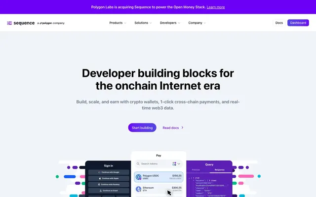
Sequence maintains a developer-centric aesthetic with a bright, spacious canvas that contrasts sharply with structured, card-based content. A cool-toned purple gradient defines its brand identity, appearing as accents and functional elements that draw attention. Typography is direct and legible, supporting a system built for clarity and quick information processing. Components are lightweight with subtle shadows, prioritizing functionality over heavy ornamentation.
The page primarily uses a full-bleed layout alternating between wide sections and centrally contained content, though a maximum content width is implied within many sections. The hero prominently features a centered headline over a background that transitions from a dark gradient behind a product demo. Sections employ clear vertical rhythm with a 40px gap. Content is often arranged in symmetrical blocks, and 2-column or 4-column card grids for presenting features or solutions. Navigation is handled by a sticky top bar, centered at medium sizes, with left-aligned branding and right-aligned actions (Dashboard button).
This site utilizes a blend of abstract, brand-colored illustrations and precise product screenshots. Illustrations are often dimensional, using the brand's vivid purples, blues, greens, and pinks (Ocean Blue, Mint Green, Bubblegum Pink) to add character and visual interest to background sections or alongside text. Product screenshots are typically centered, slightly elevated with a subtle shadow, and feature clean UI elements within mock devices, showcasing the product's functionality clearly without heavy lifestyle context. Icons are outlined or filled with a moderate stroke weight, adopting a mono-color style often in brand hues (Icon Violet) to complement the UI.
Reminiscent of Alchemy, Infura, Stripe, Vercel.
# Sequence — Style Reference
> Blockchain blueprint on bright canvas.

**Theme:** light

**Site:** https://light.so/home

Sequence maintains a developer-centric aesthetic with a bright, spacious canvas that contrasts sharply with structured, card-based content. A cool-toned purple gradient defines its brand identity, appearing as accents and functional elements that draw attention. Typography is direct and legible, supporting a system built for clarity and quick information processing. Components are lightweight with subtle shadows, prioritizing functionality over heavy ornamentation.

## Tokens — Colors

| Name | Value | Token | Role |
|------|------|------|------|
| Deep Space Gradient | `#6c00f6` | `--color-deep-space-gradient` | Primary brand accent, used for prominent buttons and background elements – a cool purple gradient defines activity and focus; Variant of the primary brand accent gradient, used for specific directional highlights |
| Dark Overlay Gradient | `#501e48` | `--color-dark-overlay-gradient` | Background for rich content sections, suggesting depth and premium content |
| Ocean Blue | `#51a2ff` | `--color-ocean-blue` | Decorative illustration and icon color, denoting data or connectivity |
| Mint Green | `#00d492` | `--color-mint-green` | Green decorative accent for icons, marks, and small graphic details |
| Bubblegum Pink | `#fb64b6` | `--color-bubblegum-pink` | Decorative illustration and icon color, for playful or engaging elements |
| Icon Violet | `#7f22fe` | `--color-icon-violet` | Smaller icon fills and secondary brand accents |
| Canvas White | `#ffffff` | `--color-canvas-white` | Page backgrounds, card surfaces, ghost button text |
| Ghost Gray | `#f1f5f9` | `--color-ghost-gray` | Subtle section backgrounds, slightly elevated surfaces |
| Outline Gray | `#e5e7eb` | `--color-outline-gray` | Borders for inputs, cards, and ghost buttons; lightest neutral for separators |
| Text Primary | `#000000` | `--color-text-primary` | Dominant text color for headings and body content |
| Text Secondary Dark | `#020618` | `--color-text-secondary-dark` | Gray text accent for links, tags, and emphasized short phrases. Do not promote it to the primary CTA color |
| Text Detail | `#90a1b9` | `--color-text-detail` | Muted text for navigation items and subtle details |
| Midnight Ink | `#0f172b` | `--color-midnight-ink` | Darkest background for high-contrast sections and text |
| Border Dark | `#1d293d` | `--color-border-dark` | Darker borders for UI elements on contrasting backgrounds |

## Tokens — Typography

### Inter
- **Substitute:** system-ui, sans-serif
- **Weights:** 400, 500, 600, 700
- **Sizes:** 14px, 15px, 16px, 18px, 20px, 32px, 52px
- **Line height:** 1.1, 1.2, 1.25, 1.3, 1.4, 1.5, 1.71, 2
- **Letter spacing:** normal
- **Role:** Primary typeface for all UI elements, headings, body text, and interactive components. Its modern, sans-serif structure ensures readability across various content types, matching the product's functional nature.

## Tokens — Type Scale

Perfect Fourth (1.333) from 16px base.

| Role | Size | Line height | Letter spacing |
|------|------|------|------|
| caption | 14px | 1.71 | — |
| body | 16px | 1.5 | — |
| subheading | 18px | 1.4 | — |
| heading | 20px | 1.3 | — |
| heading-lg | 32px | 1.25 | — |
| display | 52px | 1.1 | — |

## Tokens — Spacing

- **Section gap:** 40px
- **Card padding:** 20px
- **Element gap:** 8px

## Tokens — Radius

- **Buttons:** 8px
- **Cards:** 20px
- **input:** 0px
- **other:** 24px
- **tags:** 1.67772e+07px

## Layout

The page primarily uses a full-bleed layout alternating between wide sections and centrally contained content, though a maximum content width is implied within many sections. The hero prominently features a centered headline over a background that transitions from a dark gradient behind a product demo. Sections employ clear vertical rhythm with a 40px gap. Content is often arranged in symmetrical blocks, and 2-column or 4-column card grids for presenting features or solutions. Navigation is handled by a sticky top bar, centered at medium sizes, with left-aligned branding and right-aligned actions (Dashboard button).

## Imagery

This site utilizes a blend of abstract, brand-colored illustrations and precise product screenshots. Illustrations are often dimensional, using the brand's vivid purples, blues, greens, and pinks (Ocean Blue, Mint Green, Bubblegum Pink) to add character and visual interest to background sections or alongside text. Product screenshots are typically centered, slightly elevated with a subtle shadow, and feature clean UI elements within mock devices, showcasing the product's functionality clearly without heavy lifestyle context. Icons are outlined or filled with a moderate stroke weight, adopting a mono-color style often in brand hues (Icon Violet) to complement the UI.

## Components

### Primary Action Button
*Main call-to-action button, often with a gradient fill.*

Text in Canvas White (#ffffff), background is Deep Space Gradient (`linear-gradient(to right in oklab, rgb(108, 0, 246) 0%, rgb(79, 70, 229) 100%)`), 8px border-radius, 8px vertical padding, 16px horizontal padding.

### Ghost Button (Dark)
*Secondary action or navigation with subtle interactive cue.*

Text in Text Primary (#000000), transparent background, Outline Gray (#e5e7eb) border, 8px border-radius, 4px vertical padding, 8px horizontal padding.

### Ghost Button (Light Text)
*Secondary action or navigation on dark backgrounds.*

Text in Canvas White (#ffffff), transparent background, Outline Gray (#e5e7eb) border, 4px border-radius, 4px vertical padding, 8px horizontal padding.

### Pill Ghost Button
*Tertiary action or navigational button with pill shape for less emphasis.*

Text in Text Secondary Dark (#020618), transparent background, 1.67772e+07px border-radius (pill shape), 8px vertical padding, 16px horizontal padding.

### Content Card
*Container for features, solutions, or informational blocks.*

Background Canvas White (#ffffff), 20px border-radius, subtle shadow: oklab(0.554391 -0.00887066 -0.039739 / 0.1) 0px 0px 24px 0px. Padding is flexible and often 20px, with internal gaps of 10px.

### Input Field
*User input element.*

Transparent background, Text Primary (#000000) for text, Outline Gray (#e5e7eb) border (height implies 1px), 12px vertical padding, 12px horizontal padding. No border-radius is specified, suggesting sharp corners by default.

## Guidelines

### Do

- Prioritize Canvas White (#ffffff) as the dominant background color for most page areas and content cards.
- Use Deep Space Gradient (`linear-gradient(to right in oklab, rgb(108, 0, 246) 0%, rgb(79, 70, 229) 100%)`) for primary calls-to-action to highlight interactive elements.
- Apply a 20px border-radius consistently to all content cards to maintain a soft, approachable aesthetic.
- Implement the subtle shadow `oklab(0.554391 -0.00887066 -0.039739 / 0.1) 0px 0px 24px 0px` for cards to provide minimal depth and separation.
- Utilize Inter font family for all text elements, leveraging its various weights (400, 500, 600, 700) to establish clear typographic hierarchy.
- Maintain a default element gap of 8px to ensure comfortable spacing between interactive components and text blocks.
- Use Outline Gray (#e5e7eb) for all neutral borders and dividers to maintain a light and crisp interface.

### Don't

- Avoid using highly saturated colors for large background areas; reserve them for accents, icons, and illustrations only.
- Do not deviate from the Inter font family; introducing other typefaces will disrupt the established visual identity.
- Do not apply heavy or complex shadows; the design system favors subtle elevation for cards and components.
- Avoid arbitrary border-radius values; stick to the defined 8px for buttons and 20px for cards to maintain shape consistency.
- Do not clutter layouts with dense information; maintain comfortable spacing with a 40px section gap and 8px element gap.
- Do not use dark-themed backgrounds on Canvas White (#ffffff) unless for a dedicated, high-contrast section like the Dark Overlay Gradient (`linear-gradient(to right bottom in oklab, rgb(50, 30, 72) 0%, rgb(28, 16, 43) 100%)`).
- Avoid decorative gradients on text; gradients are reserved for larger background elements and interactive components.

## Agent Prompt Guide

Quick Color Reference:
text: #000000
background: #ffffff
border: #e5e7eb
accent: #6c00f6
primary action: no distinct CTA color

Example Component Prompts:
No distinct primary action color was observed; use the extracted neutral button treatments instead of inventing a filled CTA color.
2. Design a content card: A Canvas White (#ffffff) background, 20px border-radius, and the card shadow `oklab(0.554391 -0.00887066 -0.039739 / 0.1) 0px 0px 24px 0px`. Include a heading (Text Primary #000000, Inter weight 600, size 20px) and body text (Text Primary #000000, Inter weight 400, size 16px). Use 20px padding internally.
3. Make a Ghost Button with dark text: "Read docs" with a transparent background, Outline Gray (#e5e7eb) 1px border. Text in Text Primary (#000000), 8px border-radius, 4px vertical / 8px horizontal padding. Font: Inter, weight 500, size 16px.
More like this







Keep what you find
A free account saves references to boards and can send you a weekly email of picks based on what you save.
To see every result, go Pro.