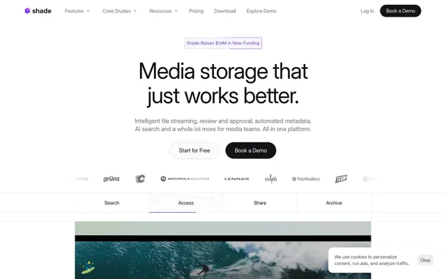
Preview image. Unlock full-res
High-contrast utility with violet accent. A clean white canvas underpins sharp black text and functional components, highlighted by a single, vivid violet.
Color palette
Subtle border accent for UI elements, supporting visual cues
Violet outline accent for tags, dividers, and focused UI edges. Do not promote it to the primary CTA color
Decorative background fills, active states, conical gradients for specific elements
Page backgrounds, card surfaces, UI elements requiring high contrast with text
Primary text, borders, high-contrast outlines, icons
Strong headings, button backgrounds, elevated surface backgrounds where text needs high contrast
Subtle background for UI elements, button box shadows, soft divider lines
Muted body text, secondary information, inactive states, subtle element backgrounds
Placeholder text, subtle box shadows, light borders
Hairline separators, very light element backgrounds, subtle shadow tints
Input text, input borders, less prominent body text
Cookie banner text, secondary button borders, button text
Typography
- Weights
- 400
- Sizes
- 10px, 14px, 16px, 18px, 20px, 21px, 24px, 28px, 32px, 36px, 40px, 48px, 56px, 72px
- Line height
- 1, 1.1, 1.15, 1.2, 1.22, 1.25, 1.3, 1.4, 1.43, 1.57
- Letter spacing
- -0.0300em at large sizes, -0.0100em at smaller sizes
Primary headings and body text, providing a distinctive, tightly spaced feel for key content. The custom features tune its appearance for legibility and aesthetic.
- Weights
- 400
- Sizes
- 12px
- Line height
- 1.2
- Letter spacing
- normal
Fallback for general UI text, links, and buttons, ensuring basic content readability without demanding specific font support. Used where Inter Display is not explicitly applied.
- Weights
- 400
- Sizes
- 14px
- Line height
- 1, 1.29
- Letter spacing
- -0.0400em at 14px, -0.0100em
Monospaced text for specific data points or code examples, offering a technical and precise feel. The tight letter-spacing emphasizes its distinct character.
- Weights
- 400, 500
- Sizes
- 12px, 14px, 16px
- Line height
- 1, 1.2, 1.5
- Letter spacing
- normal
- Fallback
- Inter
General body text, card content, and secondary button labels, providing a highly legible and versatile textual layer. This standard variant of Inter balances readability with the custom Inter Display.
Spacing & shape
Elevation
Components
Background: Coal Black (#131315), Text: Canvas White (#ffffff). Padding: 20px all sides. Border Radius: 20px. Uses a sharp, pronounced box-shadow below.
Background: Canvas White (#ffffff), Text: Midnight Ink (#000000). Border: 1px solid Midnight Ink (#000000). Padding: 20px all sides. Border Radius: 0px. A square, minimalist aesthetic.
Background: transparent, Text: Digital Violet Bold (#6941c6). Border: 1px solid Digital Violet Bold (#6941c6). Padding: 10px top/bottom, 15px left/right. Border Radius: 0px. Used for 'Shade Raises $14M in New Funding' banner.
Background: transparent, Text: Midnight Ink (#000000). Border: 1px solid Midnight Ink (#000000). Padding: 10px top/bottom, 20px/10px left/right. Border Radius: 0px.
Background: Canvas White (#ffffff), Text: Midnight Ink (#000000) for active, Steel Gray (#717173) for inactive. Border: 1px inset rgba(0,0,0,0.05). Underlines with a solid bar color.
Background: Canvas White (#ffffff). Border Radius: 14px. Box Shadow: inset 0px 0px 0px 1px rgba(0, 0, 0, 0.05). No padding defined, content is expected to dictate internal spacing.
Background: rgb(238, 238, 238), Text: Deep Gray (#444444), Border: 1px solid Deep Gray (#444444). Padding: 10px all sides. Border Radius: 8px.
Background: Coal Black (#131315). Text: rgb(0,0,238) (browser default link blue, not a brand choice). Radius: 20px. Padding: 10px top/bottom, 20px left/right.
Guidelines
- Prioritize Canvas White (#ffffff) for primary backgrounds and Coal Black (#131315) or Midnight Ink (#000000) for primary text to maintain high contrast.
- Use Inter Display for all headings, leveraging its full range of sizes and letter-spacing for visual impact and hierarchy.
- Apply a 20px border-radius for primary buttons and 14px for cards, ensuring consistent application of these distinct rounded corners.
- Emphasize interactive elements and call-to-actions with Digital Violet Bold (#6941c6) for borders or text, or Coal Black (#131315) for filled backgrounds.
- Maintain a clear elementGap of 10px for vertical rhythm between individual UI components.
- Employ the hard 8px 8px 0px 0px F1F1F1 shadow for buttons to give them a distinct, almost debossed appearance.
- Use Ghost Neutral buttons (transparent background, Midnight Ink border and text) for less prominent actions, reserving filled or accented buttons for key interactions.
- Avoid using multiple chromatic colors; restrict accents primarily to the Digital Violet palette.
- Do not introduce soft or subtle shadows where a hard, offset shadow is expected; adhere to the distinct shadow style on buttons.
- Refrain from using generic font families or weights when Inter Display or Aux Mono Regular are available for specific roles.
- Do not deviate from the established border radii of 0px for some interactive elements and 14px/20px/35px for others, as these are signature elements.
- Avoid introducing background gradients outside of the specified conic-gradient for special accent areas.
- Do not use generic gray scales for text when Steel Gray (#717173), Deep Gray (#444444), or Dark Gray (#333333) are available for semantic text roles.
- Do not use transparent or blurry backgrounds when solid color surfaces are the default. Sharp contrasts are key.
About this system
ShowHide
Shade employs a stark, high-contrast visual language with a focus on functional typography and precise spacing. The design uses a dominant neutral palette relieved by a single vibrant violet accent. Components feature sharp edges or large, bold radii, often with strong box shadows for emphasis, conveying a sense of directness and polished utility. Surfaces are generally flat, with subtle elevation coming from shadows rather than color shifts.
The page primarily uses a max-width contained model, with a consistent vertical rhythm. The hero section often features a centered headline over a white background with a secondary subheading and two action buttons (one filled, one outlined). Sections alternate between simple centered stacks of text, and two-column layouts featuring text on one side and a visual element (like a product screenshot or video frame) on the other. A notable element is a horizontal tab navigation using ghost buttons. Feature grids, if present, are likely simple 3-column structures. Ample white space creates a comfortable, airy density between content blocks. Navigation is a sticky top bar with a left-aligned logo and right-aligned links and buttons.
This design system uses a blend of tightly cropped product screenshots and high-quality photography, often with a subtle film grain or warm color grade, alongside a highly functional icon set. Lifestyle photography is present but primarily contained, never full-bleed, depicting people using technology or interacting in studio environments. Illustrations are minimal to none. Icons are typically outlined or filled, mostly monochrome (Midnight Ink or Canvas White), with a consistent stroke weight. Imagery serves mostly an explanatory or product showcase role, occasionally decorative for atmosphere, but never heavily stylized or abstract. The density is balanced, with imagery breaking up text-dominant sections, but not overwhelming the page.
Reminiscent of Figma, Linear, Webflow, Vercel.
# Shade — Style Reference
> High-contrast utility with violet accent. A clean white canvas underpins sharp black text and functional components, highlighted by a single, vivid violet.

**Theme:** light

**Site:** https://shade.inc

Shade employs a stark, high-contrast visual language with a focus on functional typography and precise spacing. The design uses a dominant neutral palette relieved by a single vibrant violet accent. Components feature sharp edges or large, bold radii, often with strong box shadows for emphasis, conveying a sense of directness and polished utility. Surfaces are generally flat, with subtle elevation coming from shadows rather than color shifts.

## Tokens — Colors

| Name | Value | Token | Role |
|------|------|------|------|
| Digital Violet Light | `#dacefd` | `--color-digital-violet-light` | Subtle border accent for UI elements, supporting visual cues |
| Digital Violet Bold | `#6941c6` | `--color-digital-violet-bold` | Violet outline accent for tags, dividers, and focused UI edges. Do not promote it to the primary CTA color |
| Digital Violet Vivid | `#855cf8` | `--color-digital-violet-vivid` | Decorative background fills, active states, conical gradients for specific elements |
| Canvas White | `#ffffff` | `--color-canvas-white` | Page backgrounds, card surfaces, UI elements requiring high contrast with text |
| Midnight Ink | `#000000` | `--color-midnight-ink` | Primary text, borders, high-contrast outlines, icons |
| Coal Black | `#131315` | `--color-coal-black` | Strong headings, button backgrounds, elevated surface backgrounds where text needs high contrast |
| Light Fog | `#f1f1f1` | `--color-light-fog` | Subtle background for UI elements, button box shadows, soft divider lines |
| Steel Gray | `#717173` | `--color-steel-gray` | Muted body text, secondary information, inactive states, subtle element backgrounds |
| Stone Gray | `#a0a0a0` | `--color-stone-gray` | Placeholder text, subtle box shadows, light borders |
| Warm Gray | `#d0d0d0` | `--color-warm-gray` | Hairline separators, very light element backgrounds, subtle shadow tints |
| Deep Gray | `#444444` | `--color-deep-gray` | Input text, input borders, less prominent body text |
| Dark Gray | `#333333` | `--color-dark-gray` | Cookie banner text, secondary button borders, button text |

## Tokens — Typography

### Inter Display
- **Weights:** 400
- **Sizes:** 10px, 14px, 16px, 18px, 20px, 21px, 24px, 28px, 32px, 36px, 40px, 48px, 56px, 72px
- **Line height:** 1, 1.1, 1.15, 1.2, 1.22, 1.25, 1.3, 1.4, 1.43, 1.57
- **Letter spacing:** -0.0300em at large sizes, -0.0100em at smaller sizes
- **Role:** Primary headings and body text, providing a distinctive, tightly spaced feel for key content. The custom features tune its appearance for legibility and aesthetic.

### sans-serif
- **Weights:** 400
- **Sizes:** 12px
- **Line height:** 1.2
- **Letter spacing:** normal
- **Role:** Fallback for general UI text, links, and buttons, ensuring basic content readability without demanding specific font support. Used where Inter Display is not explicitly applied.

### Aux Mono Regular
- **Weights:** 400
- **Sizes:** 14px
- **Line height:** 1, 1.29
- **Letter spacing:** -0.0400em at 14px, -0.0100em
- **Role:** Monospaced text for specific data points or code examples, offering a technical and precise feel. The tight letter-spacing emphasizes its distinct character.

### Inter
- **Substitute:** Inter
- **Weights:** 400, 500
- **Sizes:** 12px, 14px, 16px
- **Line height:** 1, 1.2, 1.5
- **Letter spacing:** normal
- **Role:** General body text, card content, and secondary button labels, providing a highly legible and versatile textual layer. This standard variant of Inter balances readability with the custom Inter Display.

## Tokens — Type Scale

Perfect Fourth (1.333) from 14px base.

| Role | Size | Line height | Letter spacing |
|------|------|------|------|
| caption | 10px | 1.43 | — |
| body | 14px | 1.29 | -0.48px |
| subheading | 18px | 1.22 | — |
| heading-sm | 24px | 1.25 | — |
| heading | 32px | 1.4 | — |
| heading-lg | 40px | 1.15 | — |
| display | 56px | 1.1 | -1.68px |

## Tokens — Spacing

- **Section gap:** 100px
- **Card padding:** 20px
- **Element gap:** 10px

## Tokens — Radius

- **Default:** 9px
- **Buttons:** 20px
- **Cards:** 14px
- **input:** 9px
- **largeButtons:** 35px

## Tokens — Elevation

- **Primary Filled Button:** `rgb(241, 241, 241) 8px 8px 0px 0px`
- **Link/Other with Shadow:** `rgba(226, 226, 227, 0.5) 10px 10px 0px -2px`
- **Button Soft Shadow:** `rgba(19, 19, 21, 0.12) 0px 1px 4px 0px`
- **Card Inset Border:** `rgba(0, 0, 0, 0.05) 0px 0px 0px 1px inset`

## Layout

The page primarily uses a max-width contained model, with a consistent vertical rhythm. The hero section often features a centered headline over a white background with a secondary subheading and two action buttons (one filled, one outlined). Sections alternate between simple centered stacks of text, and two-column layouts featuring text on one side and a visual element (like a product screenshot or video frame) on the other. A notable element is a horizontal tab navigation using ghost buttons. Feature grids, if present, are likely simple 3-column structures. Ample white space creates a comfortable, airy density between content blocks. Navigation is a sticky top bar with a left-aligned logo and right-aligned links and buttons.

## Imagery

This design system uses a blend of tightly cropped product screenshots and high-quality photography, often with a subtle film grain or warm color grade, alongside a highly functional icon set. Lifestyle photography is present but primarily contained, never full-bleed, depicting people using technology or interacting in studio environments. Illustrations are minimal to none. Icons are typically outlined or filled, mostly monochrome (Midnight Ink or Canvas White), with a consistent stroke weight. Imagery serves mostly an explanatory or product showcase role, occasionally decorative for atmosphere, but never heavily stylized or abstract. The density is balanced, with imagery breaking up text-dominant sections, but not overwhelming the page.

## Components

### Primary Filled Button
*Main call-to-action button for initiating key flows.*

Background: Coal Black (#131315), Text: Canvas White (#ffffff). Padding: 20px all sides. Border Radius: 20px. Uses a sharp, pronounced box-shadow below.

### Secondary Outlined Button
*Secondary call-to-action, less prominent than the filled primary.*

Background: Canvas White (#ffffff), Text: Midnight Ink (#000000). Border: 1px solid Midnight Ink (#000000). Padding: 20px all sides. Border Radius: 0px. A square, minimalist aesthetic.

### Ghost Accent Button
*Minimal impact button, often for navigation or secondary actions, using brand accent.*

Background: transparent, Text: Digital Violet Bold (#6941c6). Border: 1px solid Digital Violet Bold (#6941c6). Padding: 10px top/bottom, 15px left/right. Border Radius: 0px. Used for 'Shade Raises $14M in New Funding' banner.

### Ghost Neutral Button
*Minimal impact button, for subtle interactive elements or navigation.*

Background: transparent, Text: Midnight Ink (#000000). Border: 1px solid Midnight Ink (#000000). Padding: 10px top/bottom, 20px/10px left/right. Border Radius: 0px.

### Search/Navigation Tab
*Interactive tabs for filtering or navigating content sections.*

Background: Canvas White (#ffffff), Text: Midnight Ink (#000000) for active, Steel Gray (#717173) for inactive. Border: 1px inset rgba(0,0,0,0.05). Underlines with a solid bar color.

### Product Feature Card
*Displaying product features or content blocks.*

Background: Canvas White (#ffffff). Border Radius: 14px. Box Shadow: inset 0px 0px 0px 1px rgba(0, 0, 0, 0.05). No padding defined, content is expected to dictate internal spacing.

### Default Input Field
*Standard text input element.*

Background: rgb(238, 238, 238), Text: Deep Gray (#444444), Border: 1px solid Deep Gray (#444444). Padding: 10px all sides. Border Radius: 8px.

### Small Pill Button
*Compact interactive element or tag, typically for meta-information or minor actions.*

Background: Coal Black (#131315). Text: rgb(0,0,238) (browser default link blue, not a brand choice). Radius: 20px. Padding: 10px top/bottom, 20px left/right.

## Guidelines

### Do

- Prioritize Canvas White (#ffffff) for primary backgrounds and Coal Black (#131315) or Midnight Ink (#000000) for primary text to maintain high contrast.
- Use Inter Display for all headings, leveraging its full range of sizes and letter-spacing for visual impact and hierarchy.
- Apply a 20px border-radius for primary buttons and 14px for cards, ensuring consistent application of these distinct rounded corners.
- Emphasize interactive elements and call-to-actions with Digital Violet Bold (#6941c6) for borders or text, or Coal Black (#131315) for filled backgrounds.
- Maintain a clear elementGap of 10px for vertical rhythm between individual UI components.
- Employ the hard 8px 8px 0px 0px F1F1F1 shadow for buttons to give them a distinct, almost debossed appearance.
- Use Ghost Neutral buttons (transparent background, Midnight Ink border and text) for less prominent actions, reserving filled or accented buttons for key interactions.

### Don't

- Avoid using multiple chromatic colors; restrict accents primarily to the Digital Violet palette.
- Do not introduce soft or subtle shadows where a hard, offset shadow is expected; adhere to the distinct shadow style on buttons.
- Refrain from using generic font families or weights when Inter Display or Aux Mono Regular are available for specific roles.
- Do not deviate from the established border radii of 0px for some interactive elements and 14px/20px/35px for others, as these are signature elements.
- Avoid introducing background gradients outside of the specified conic-gradient for special accent areas.
- Do not use generic gray scales for text when Steel Gray (#717173), Deep Gray (#444444), or Dark Gray (#333333) are available for semantic text roles.
- Do not use transparent or blurry backgrounds when solid color surfaces are the default. Sharp contrasts are key.

## Agent Prompt Guide

### Quick Color Reference
* text: #000000
* background: #ffffff
* border: #000000
* accent: #6941c6
* primary action: #131315 (filled action)

### 3-5 Example Component Prompts
* Create a Primary Action Button: #131315 background, #ffffff text, 9999px radius, compact pill padding. Use this filled treatment for the main CTA.
* **Feature Card with Inset Border:** Create a card with background #ffffff, 14px radius, box-shadow rgba(0, 0, 0, 0.05) 0px 0px 0px 1px inset. Inside, add a 24px Inter Display heading and 14px Inter body text.
* **Accent Banner with Ghost Button:** Create a banner section with subtle Digital Violet Light (#dacefd) background, containing a text label in Inter 14px #6941c6. Include a 'Shade Raises $14M in New Funding' Ghost Accent Button: background transparent, text #6941c6, border 1px solid #6941c6, 10px top/bottom, 15px left/right padding, 0px radius.
* **Standard Input Field:** Design an input field with background #eeeeee, text #444444, border 1px solid #444444, 8px radius, 10px padding.
* **Navigation Tab:** Create a navigation tab component. Active tab: background #ffffff, text #000000, border-bottom 2px solid #6941c6. Inactive tab: background #ffffff, text #717173, no border-bottom.
More like this







Keep what you find
A free account saves references to boards and can send you a weekly email of picks based on what you save.
To see every result, go Pro.