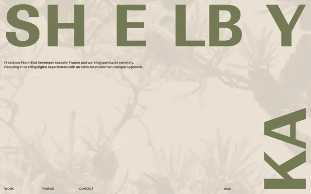
Preview image. Unlock full-res
Earthy editorial grid
Color palette
Muted headings, secondary text. Provides a softer contrast against the Canvas Parchment
Page backgrounds, large content areas, default surface. The primary light background that anchors the entire aesthetic
Primary text color, bold headings, borders for interactive elements. This deep, desaturated green acts as the dominant dark element
Alternating section background, subtle warm tint
Alternating section background, cool grey tint
Subtle background element, creates slight depth
Alternative dark text or background accent
Deepest dark tone, used sparingly for strong contrast
Typography
- Weights
- 400, 700
- Sizes
- 24px, 83px, 158px, 265px
- Line height
- 0.9, 1, 1.2
- Fallback
- Anton
Headline typeface, used for hero branding and dominant page titles. Its custom letterforms and large scales create a strong, architectural impact.
- Weights
- 500, 600, 700
- Sizes
- 10px, 11px, 14px, 16px, 20px
- Line height
- 1, 1.2, 1.25, 1.3
- Fallback
- Inter
Body copy, navigation, and secondary headings. A modern sans-serif that provides clear readability and anchors the system's functional text.
Spacing & shape
Components
Text in Switzer, size 14px, weight 500, Ashwood Grove color. On hover/active, a Ashwood Grove border appears along one edge (exact edge not specified, but visual implies bottom).
Ranade typeface, size up to 265px, Ashwood Grove color, with significant letter-spacing (implied by 'S h e l b y Ka y' spelling) and 0.90 line-height.
Padded implicitly by 20px on multiple sides. Text uses Switzer, Ashwood Grove for primary, Forest Whisper for secondary.
Features a border in Ashwood Grove when interactive, and a text overlay for project identifier. Implied padding of 7px on some edges for content.
A very subtle border, likely 1px, in Ashwood Grove or a slightly lighter neutral defined by the context.
Switzer, size 14px (or smaller), Ashwood Grove color.
Guidelines
- Prioritize Canvas Parchment (#efe6d9) as the base background for most content, establishing a light, airy canvas.
- Use Ashwood Grove (#393c2a) as the primary text color for all main body content and bold headings to ensure strong contrast and consistency.
- Headlines, especially hero elements, should leverage the Ranade typeface at extremely large scales (158px or 265px) with a 0.90 line-height to create visual drama.
- Maintain a sense of generous whitespace; use a sectionGap of 36px and elementGap of 12px to keep content uncongested.
- When introducing color accents, use Forest Whisper (#737955) for muted headings or secondary text, providing a soft contrast.
- Design interactive elements (like navigation links) by outlining with Ashwood Grove (#393c2a) rather than filling, maintaining a lightweight feel.
- Employ `normal` letter-spacing for both Ranade and Switzer typefaces by default, avoiding tight tracking even at large sizes.
- Avoid heavy shadows or gradients on interactive elements; rely on border color and text changes for states.
- Do not introduce strong, saturated colors that deviate from the muted greens and beige-grays, as they will clash with the established palette.
- Avoid small text sizes for body copy; the smallest legible body text should be Switzer 14px.
- Do not use highly contrasting or vibrant imagery; content images should be muted or monochromatic to fit the overall subdued tone.
- Avoid highly decorative or script typefaces; stick to the clean, modern aesthetic of Switzer and abstract forms of Ranade.
- Do not apply rounded corners to elements; maintain sharp, crisp edges throughout the design system.
- Do not use dark backgrounds for entire pages; the design system is firmly rooted in a light theme with varying neutral surface tones.
About this system
ShowHide
Shelby Kay's design system uses an earthy, modern-editorial aesthetic, combining a restrained palette of muted greens and beiges with stark, super-sized typography. The visual language emphasizes large negative space and a grid-like organization, creating an atmosphere of quiet confidence and refined utility. Color is primarily used for deep background contrast and subtle accentuation, allowing strong typographic forms to dominate the hierarchy. Components are minimal, relying on borders and text color variations rather than heavy fills or shadows.
Reminiscent of Aline.io, Made by Folk, Studio—JQ, Garden Studio.
# Shelby Kay — Style Reference
> Earthy editorial grid

**Theme:** light

**Site:** https://shelbykay.dev

Shelby Kay's design system uses an earthy, modern-editorial aesthetic, combining a restrained palette of muted greens and beiges with stark, super-sized typography. The visual language emphasizes large negative space and a grid-like organization, creating an atmosphere of quiet confidence and refined utility. Color is primarily used for deep background contrast and subtle accentuation, allowing strong typographic forms to dominate the hierarchy. Components are minimal, relying on borders and text color variations rather than heavy fills or shadows.

## Tokens — Colors

| Name | Value | Token | Role |
|------|------|------|------|
| Forest Whisper | `#737955` | `--color-forest-whisper` | Muted headings, secondary text. Provides a softer contrast against the Canvas Parchment |
| Canvas Parchment | `#efe6d9` | `--color-canvas-parchment` | Page backgrounds, large content areas, default surface. The primary light background that anchors the entire aesthetic |
| Ashwood Grove | `#393c2a` | `--color-ashwood-grove` | Primary text color, bold headings, borders for interactive elements. This deep, desaturated green acts as the dominant dark element |
| Soft Sienna | `#d6b292` | `--color-soft-sienna` | Alternating section background, subtle warm tint |
| Dusty Rose | `#afa199` | `--color-dusty-rose` | Alternating section background, cool grey tint |
| Slate Mist | `#7b8785` | `--color-slate-mist` | Subtle background element, creates slight depth |
| Dark Bark | `#454931` | `--color-dark-bark` | Alternative dark text or background accent |
| Deep Mocha | `#2c1c03` | `--color-deep-mocha` | Deepest dark tone, used sparingly for strong contrast |

## Tokens — Typography

### Ranade
- **Substitute:** Anton
- **Weights:** 400, 700
- **Sizes:** 24px, 83px, 158px, 265px
- **Line height:** 0.9, 1, 1.2
- **Role:** Headline typeface, used for hero branding and dominant page titles. Its custom letterforms and large scales create a strong, architectural impact.

### Switzer
- **Substitute:** Inter
- **Weights:** 500, 600, 700
- **Sizes:** 10px, 11px, 14px, 16px, 20px
- **Line height:** 1, 1.2, 1.25, 1.3
- **Role:** Body copy, navigation, and secondary headings. A modern sans-serif that provides clear readability and anchors the system's functional text.

## Tokens — Type Scale

| Role | Size | Line height | Letter spacing |
|------|------|------|------|
| caption | 10px | 1 | — |
| body | 14px | 1.25 | — |
| heading-sm | 20px | 1.2 | — |
| heading | 24px | 1.2 | — |
| heading-lg | 83px | 0.9 | — |
| display | 265px | 0.9 | — |

## Tokens — Spacing

- **Section gap:** 36px
- **Card padding:** 20px
- **Element gap:** 12px

## Tokens — Radius

- **Default:** 0px

## Components

### Navigation Link
*Primary navigation item*

Text in Switzer, size 14px, weight 500, Ashwood Grove color. On hover/active, a Ashwood Grove border appears along one edge (exact edge not specified, but visual implies bottom).

### Hero Title
*Main branding on the landing page*

Ranade typeface, size up to 265px, Ashwood Grove color, with significant letter-spacing (implied by 'S h e l b y Ka y' spelling) and 0.90 line-height.

### Text Block Container
*Grouped text content*

Padded implicitly by 20px on multiple sides. Text uses Switzer, Ashwood Grove for primary, Forest Whisper for secondary.

### Work Showcase Card
*Thumbnail for portfolio projects*

Features a border in Ashwood Grove when interactive, and a text overlay for project identifier. Implied padding of 7px on some edges for content.

### Section Separator Rule
*Visual division between content sections*

A very subtle border, likely 1px, in Ashwood Grove or a slightly lighter neutral defined by the context.

### Footer/Copyright Text
*Small print information*

Switzer, size 14px (or smaller), Ashwood Grove color.

## Guidelines

### Do

- Prioritize Canvas Parchment (#efe6d9) as the base background for most content, establishing a light, airy canvas.
- Use Ashwood Grove (#393c2a) as the primary text color for all main body content and bold headings to ensure strong contrast and consistency.
- Headlines, especially hero elements, should leverage the Ranade typeface at extremely large scales (158px or 265px) with a 0.90 line-height to create visual drama.
- Maintain a sense of generous whitespace; use a sectionGap of 36px and elementGap of 12px to keep content uncongested.
- When introducing color accents, use Forest Whisper (#737955) for muted headings or secondary text, providing a soft contrast.
- Design interactive elements (like navigation links) by outlining with Ashwood Grove (#393c2a) rather than filling, maintaining a lightweight feel.
- Employ `normal` letter-spacing for both Ranade and Switzer typefaces by default, avoiding tight tracking even at large sizes.

### Don't

- Avoid heavy shadows or gradients on interactive elements; rely on border color and text changes for states.
- Do not introduce strong, saturated colors that deviate from the muted greens and beige-grays, as they will clash with the established palette.
- Avoid small text sizes for body copy; the smallest legible body text should be Switzer 14px.
- Do not use highly contrasting or vibrant imagery; content images should be muted or monochromatic to fit the overall subdued tone.
- Avoid highly decorative or script typefaces; stick to the clean, modern aesthetic of Switzer and abstract forms of Ranade.
- Do not apply rounded corners to elements; maintain sharp, crisp edges throughout the design system.
- Do not use dark backgrounds for entire pages; the design system is firmly rooted in a light theme with varying neutral surface tones.

## Agent Prompt Guide

Quick Color Reference:
text: #393c2a
background: #efe6d9
border: #393c2a
accent: #737955
primary action: no distinct CTA color

Example Component Prompts:
1. Create a hero section with a Canvas Parchment background (#efe6d9). The main title 'S h e l b y' should use Ranade, 265px, line-height 0.90, color Ashwood Grove (#393c2a). Below it, add body text 'Freelance Front-End Developer' in Switzer, 16px, line-height 1.20, Ashwood Grove (#393c2a).
2. Design a navigation link for 'Work'. Text should be Switzer, 14px, weight 500, color Ashwood Grove (#393c2a). On hover, add a 1px bottom border in Ashwood Grove (#393c2a).
3. Create a portfolio item thumbnail. The image should be a square, no radius. Below the image, include 'INT #04–04' as a link using Switzer, 14px, weight 500, color Ashwood Grove (#393c2a). Encapsulate this within an interactive element that shows a 1px border of Ashwood Grove (#393c2a) on hover/focus.
More like this









Keep what you find
A free account saves references to boards and can send you a weekly email of picks based on what you save.
To see every result, go Pro.