Preview image. Unlock full-res
Digital boutique showcase
Color palette
Primary action backgrounds, interactive icons, selected states, brand logo
Violet supporting accent for decorative details and low-frequency emphasis. Do not promote it to the primary CTA color
Page backgrounds, card surfaces, ghost button backgrounds
Primary text, strong borders, icons
Hairline borders, subtle dividers, inactive states
Secondary text, link text, navigation items
Loader text, tertiary informational text, placeholder text
Placeholder text in input fields
Typography
- Weights
- 400
- Sizes
- 9px, 11px, 12px, 14px, 16px
- Line height
- 1.29, 1.33, 1.38
- Letter spacing
- -0.0580em (9px), -0.0440em (11px), -0.0310em (12px), -0.0170em (14px), -0.0140em (16px)
- Fallback
- Inter
Body text, card descriptions, general UI labels – a workhorse sans-serif with subtle compact tracking that creates a precise, information-dense feel.
- Weights
- 400
- Sizes
- 11px, 12px
- Line height
- 1.33
- Letter spacing
- -0.0180em (11px), -0.0170em (12px)
- Fallback
- Inter
Used for compact UI elements and icons where slightly increased emphasis is needed without increasing weight.
- Weights
- 400, 700
- Sizes
- 10px, 14px
- Line height
- 1.2, 1.57, 1.71
- Letter spacing
- -0.0230em
- Fallback
- Poppins
Accent text for banners and links, and primary brand typography. Its unique letterforms give a distinct brand voice.
- Weights
- 400, 700
- Sizes
- 10px, 14px
- Line height
- 1.2, 1.57, 1.71
- Letter spacing
- -0.0230em
- Fallback
- Poppins
Bold variant for Shopify Sans, used specifically for the 'Shop' logo mark and other brand-critical emphasis.
- Weights
- 400
- Sizes
- 12px
- Line height
- 1.33
- Letter spacing
- -0.0170em
- Fallback
- Inter
Used for specific body text elements requiring clear distinction, such as bolded links or section titles, without a heavy visual presence.
Spacing & shape
Elevation
Components
Transparent background, Ink Black text, 9999px border-radius, 4px padding in all directions. No visible border unless specified by context.
White background, Ink Black text, a Subtle Gray border. Radius is 22.8092px, with 11.4046px padding on all sides. Features a soft Violet Shadow.
White background, Ink Black text, 30px border-radius, with a 2px vertical and 16px horizontal padding. Borders are transparent white for a ghost effect on light backgrounds.
Transparent background, Ink Black text, 0px border-radius, 12px padding on all sides. Functionally a text button with a larger hit area.
Transparent background, 0px border-radius, no shadow or padding by default. Visual separation achieved through image cropping and underlying shadow effects from parent containers.
Transparent background, Ink Black text, 1e+07px (pill shape) border radius. 4px vertical padding, 48px right padding, 20px left padding. Suggests a long, rounded search bar.
Uses Shop Violet as background, white icon. Part of the search input field. Padding matches the overall input field's height.
Guidelines
- Use Canvas (#ffffff) sparingly as a primary action background, preferring Shop Violet (#5433eb) for true calls to action to maintain brand distinction.
- Apply GTStandard-MRegular for all main body content and instructional text, utilizing the specified letter-spacing for each size to maintain compact readability.
- Employ the 11.4046px radius for product image containers within cards to provide a soft-edged visual.
- Ensure interactive elements such as buttons and form fields primarily use the 22.8092px or 1e+07px (pill shape) border radii for consistency.
- Maintain an elementGap of 8px between closely related UI components to ensure comfortable spacing within compact layouts.
- Utilize Muted Text (#707070) for descriptive labels and secondary information, reserving Ink Black (#000000) for primary headlines and critical text.
- Apply the Violet Shadow (rgba(69, 36, 219, 0.34) 0px 4px 24px 0px) to interactive and elevated components, especially buttons, to provide distinct depth.
- Do not use generic system fonts; always map to the specified GTStandard or Shopify Sans families or their substitutes.
- Avoid using Ink Black (#000000) as a prominent background color; it is reserved for text, borders, and accents.
- Do not deviate from the established letter-spacing values from GTStandard-MRegular typographic scale; they are critical for the brand’s compact text aesthetic.
- Do not introduce new border radii beyond the defined set (8px, 11.4046px, 17.1064px, 22.8092px, 28px, 32px, 9999px) to maintain a consistent visual language.
- Do not use highly saturated colors other than Shop Violet (#5433eb); the system relies on a monochrome base with one distinct accent.
- Avoid large, impactful hero images; imagery should be contained within cards or product visuals.
- Do not use hard, sharp shadows; all elevation should be achieved using the soft, diffused Violet Shadow.
About this system
ShowHide
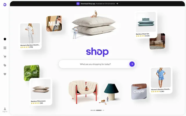
Shop's design system evokes a digital boutique atmosphere: clean, spacious white surfaces present product cards and information with minimal distraction allowing the content to breathe. A distinctive vivid violet acts as a signature accent, punctuating interactive elements and branding. Typography is compact and precise, maintaining a high information density without feeling cramped, while subtle shadows give elements a soft lift.
The page maintains a centered, contained layout, likely with a maximum width, creating ample white space around content. The hero section features a prominent brand logo ('shop') and a central search bar. Product displays are arranged in a dynamic, slightly overlapping grid of rounded cards, giving a curated, editorial feel rather than a rigid structure. A left-hand persistent navigation sidebar uses small, monochromatic icons. Sections are visually distinct through large vertical spacing rather than explicit dividers.
This system primarily uses product-focused photography and minimal, abstract graphics. Photography is typically studio-shot, with products isolated on white or light backgrounds, often with soft, diffused lighting. Imagery in cards is contained, with a soft 11.4046px border radius, and often appears to float with a subtle shadow. Icons are monochromatic, typically Ink Black filled or outlined, with Shop Violet used for active states or branding. Imagery serves to showcase products and provide visual cues rather than create an overarching atmosphere.
Reminiscent of Glossier, Stripe, Apple (e-commerce), Canva.
# Shop — Style Reference
> Digital boutique showcase

**Theme:** light

**Site:** https://shop.app

Shop's design system evokes a digital boutique atmosphere: clean, spacious white surfaces present product cards and information with minimal distraction allowing the content to breathe. A distinctive vivid violet acts as a signature accent, punctuating interactive elements and branding. Typography is compact and precise, maintaining a high information density without feeling cramped, while subtle shadows give elements a soft lift.

## Tokens — Colors

| Name | Value | Token | Role |
|------|------|------|------|
| Shop Violet | `#5433eb` | `--color-shop-violet` | Primary action backgrounds, interactive icons, selected states, brand logo |
| Violet Shadow | `#c0b5f3` | `--color-violet-shadow` | Violet supporting accent for decorative details and low-frequency emphasis. Do not promote it to the primary CTA color |
| Canvas | `#ffffff` | `--color-canvas` | Page backgrounds, card surfaces, ghost button backgrounds |
| Ink Black | `#000000` | `--color-ink-black` | Primary text, strong borders, icons |
| Subtle Gray | `#ebebeb` | `--color-subtle-gray` | Hairline borders, subtle dividers, inactive states |
| Muted Text | `#707070` | `--color-muted-text` | Secondary text, link text, navigation items |
| Soft Gray | `#c9cbcc` | `--color-soft-gray` | Loader text, tertiary informational text, placeholder text |
| Placeholder Text | `#7b7b7b` | `--color-placeholder-text` | Placeholder text in input fields |

## Tokens — Typography

### GTStandard-MRegular
- **Substitute:** Inter
- **Weights:** 400
- **Sizes:** 9px, 11px, 12px, 14px, 16px
- **Line height:** 1.29, 1.33, 1.38
- **Letter spacing:** -0.0580em (9px), -0.0440em (11px), -0.0310em (12px), -0.0170em (14px), -0.0140em (16px)
- **Role:** Body text, card descriptions, general UI labels – a workhorse sans-serif with subtle compact tracking that creates a precise, information-dense feel.

### GTStandard-MMedium
- **Substitute:** Inter
- **Weights:** 400
- **Sizes:** 11px, 12px
- **Line height:** 1.33
- **Letter spacing:** -0.0180em (11px), -0.0170em (12px)
- **Role:** Used for compact UI elements and icons where slightly increased emphasis is needed without increasing weight.

### Shopify Sans
- **Substitute:** Poppins
- **Weights:** 400, 700
- **Sizes:** 10px, 14px
- **Line height:** 1.2, 1.57, 1.71
- **Letter spacing:** -0.0230em
- **Role:** Accent text for banners and links, and primary brand typography. Its unique letterforms give a distinct brand voice.

### Shopify Sans
- **Substitute:** Poppins
- **Weights:** 400, 700
- **Sizes:** 10px, 14px
- **Line height:** 1.2, 1.57, 1.71
- **Letter spacing:** -0.0230em
- **Role:** Bold variant for Shopify Sans, used specifically for the 'Shop' logo mark and other brand-critical emphasis.

### GTStandard-MSemibold
- **Substitute:** Inter
- **Weights:** 400
- **Sizes:** 12px
- **Line height:** 1.33
- **Letter spacing:** -0.0170em
- **Role:** Used for specific body text elements requiring clear distinction, such as bolded links or section titles, without a heavy visual presence.

## Tokens — Type Scale

Major Second (1.125) from 14px base.

| Role | Size | Line height | Letter spacing |
|------|------|------|------|
| caption | 11px | 1.33 | — |
| body-sm | 12px | 1.33 | — |
| body | 14px | 1.33 | — |
| body-lg | 16px | 1.33 | — |

## Tokens — Spacing

- **Section gap:** 40px
- **Card padding:** 16px
- **Element gap:** 8px

## Tokens — Radius

- **Buttons:** 22.8092px
- **Inputs:** 1e+07px
- **Cards:** 11.4046px
- **display:** 32px
- **large:** 28px
- **other:** 8px

## Tokens — Elevation

- **Rounded White Button:** `rgba(69, 36, 219, 0.34) 0px 4px 24px 0px`

## Layout

The page maintains a centered, contained layout, likely with a maximum width, creating ample white space around content. The hero section features a prominent brand logo ('shop') and a central search bar. Product displays are arranged in a dynamic, slightly overlapping grid of rounded cards, giving a curated, editorial feel rather than a rigid structure. A left-hand persistent navigation sidebar uses small, monochromatic icons. Sections are visually distinct through large vertical spacing rather than explicit dividers.

## Imagery

This system primarily uses product-focused photography and minimal, abstract graphics. Photography is typically studio-shot, with products isolated on white or light backgrounds, often with soft, diffused lighting. Imagery in cards is contained, with a soft 11.4046px border radius, and often appears to float with a subtle shadow. Icons are monochromatic, typically Ink Black filled or outlined, with Shop Violet used for active states or branding. Imagery serves to showcase products and provide visual cues rather than create an overarching atmosphere.

## Components

### Ghost Button
*Secondary action or navigational link.*

Transparent background, Ink Black text, 9999px border-radius, 4px padding in all directions. No visible border unless specified by context.

### Rounded White Button
*General utility button, often found in modals or forms.*

White background, Ink Black text, a Subtle Gray border. Radius is 22.8092px, with 11.4046px padding on all sides. Features a soft Violet Shadow.

### Pill Button
*Prominent action or filter button.*

White background, Ink Black text, 30px border-radius, with a 2px vertical and 16px horizontal padding. Borders are transparent white for a ghost effect on light backgrounds.

### Flat Square Button
*Icon-only button or small inline action.*

Transparent background, Ink Black text, 0px border-radius, 12px padding on all sides. Functionally a text button with a larger hit area.

### Product Card
*Displays individual product items.*

Transparent background, 0px border-radius, no shadow or padding by default. Visual separation achieved through image cropping and underlying shadow effects from parent containers.

### Search Input
*Primary search functionality.*

Transparent background, Ink Black text, 1e+07px (pill shape) border radius. 4px vertical padding, 48px right padding, 20px left padding. Suggests a long, rounded search bar.

### Pill Search Submit Button
*Submit button for the search input.*

Uses Shop Violet as background, white icon. Part of the search input field. Padding matches the overall input field's height.

## Guidelines

### Do

- Use Canvas (#ffffff) sparingly as a primary action background, preferring Shop Violet (#5433eb) for true calls to action to maintain brand distinction.
- Apply GTStandard-MRegular for all main body content and instructional text, utilizing the specified letter-spacing for each size to maintain compact readability.
- Employ the 11.4046px radius for product image containers within cards to provide a soft-edged visual.
- Ensure interactive elements such as buttons and form fields primarily use the 22.8092px or 1e+07px (pill shape) border radii for consistency.
- Maintain an elementGap of 8px between closely related UI components to ensure comfortable spacing within compact layouts.
- Utilize Muted Text (#707070) for descriptive labels and secondary information, reserving Ink Black (#000000) for primary headlines and critical text.
- Apply the Violet Shadow (rgba(69, 36, 219, 0.34) 0px 4px 24px 0px) to interactive and elevated components, especially buttons, to provide distinct depth.

### Don't

- Do not use generic system fonts; always map to the specified GTStandard or Shopify Sans families or their substitutes.
- Avoid using Ink Black (#000000) as a prominent background color; it is reserved for text, borders, and accents.
- Do not deviate from the established letter-spacing values from GTStandard-MRegular typographic scale; they are critical for the brand’s compact text aesthetic.
- Do not introduce new border radii beyond the defined set (8px, 11.4046px, 17.1064px, 22.8092px, 28px, 32px, 9999px) to maintain a consistent visual language.
- Do not use highly saturated colors other than Shop Violet (#5433eb); the system relies on a monochrome base with one distinct accent.
- Avoid large, impactful hero images; imagery should be contained within cards or product visuals.
- Do not use hard, sharp shadows; all elevation should be achieved using the soft, diffused Violet Shadow.

## Agent Prompt Guide

Quick Color Reference:
- text: #000000
- background: #ffffff
- border: #ebebeb
- accent: #5433eb
- primary action: #5433eb (filled action)

Example Component Prompts:
- Create a 'Pill Search Submit Button': background #5433eb, Ink Black (#000000) text (or white icon equivalent), matching search input height, pill-shaped radius (1e+07px).
- Create a 'Rounded White Button' for a secondary action: white background (#ffffff), Subtle Gray border (#ebebeb), Ink Black text (#000000) at 12px GTStandard-MRegular (weight 400, letter-spacing -0.0310em), 22.8092px radius, 11.4046px padding, with Violet Shadow.
- Create a 'Product Card' showing an image and text: transparent background, 11.4046px radius for the image container, Ink Black (#000000) text at 14px GTStandard-MRegular (weight 400, letter-spacing -0.0170em) for product title, Muted Text (#707070) for price/details at 12px GTStandard-MRegular (weight 400, letter-spacing -0.0310em). Card appears to float with subtle elevation given by its parent.
- Create a 'Ghost Button' with the label 'Sign In': transparent background, Ink Black (#000000) text centered, 9999px radius, 4px padding in all directions, no visible border.
More like this








Keep what you find
A free account saves references to boards and can send you a weekly email of picks based on what you save.
To see every result, go Pro.