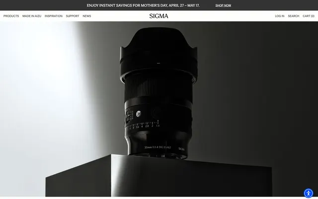
Preview image. Unlock full-res
Precision engineered, high-contrast monochrome
Color palette
Primary action backgrounds, interactive elements, branding accents — a singular vibrant color to signify interactivity
Page backgrounds, card surfaces, text elements on dark backgrounds
Primary text, critical borders, icons, input text. Used for strong contrast
Secondary text, dark navigation backgrounds, subtle borders, input placeholder text
Muted text, helper text, less prominent links, input borders
Disabled states, faint icon details, ghost button borders
Typography
- Weights
- 400
- Sizes
- 13px, 16px
- Line height
- 1.1, 1.2, 1.25, 1.54
- Letter spacing
- -0.31em at 13px, 0.005em at 16px
General body text, navigation links, and button labels. Its clean, sans-serif form ensures readability in functional UI areas.
- Weights
- 400
- Sizes
- 16px, 24px
- Line height
- 1.1, 1.25
- Letter spacing
- 0.003em at 16px, 0.005em at 24px
Subheadings and featured product descriptions, adding a touch of classic sophistication without being ornate. The serif grounds longer text blocks.
- Weights
- 400
- Sizes
- 48px, 88px
- Line height
- 1.1, 1.25
- Letter spacing
- 0.001em at 48px, 0.002em at 88px
- Fallback
- Palatino
Prominent headings and display text for hero sections, conveying authority and product focus. Its relatively loose tracking maintains a premium feel.
- Weights
- 400
- Sizes
- 13px
- Line height
- 1.2
- Letter spacing
- normal
Accessibility text and fallback for small UI elements, ensuring universal legibility.
- Weights
- 500
- Sizes
- 14px
- Line height
- 1.14
- Letter spacing
- -0.004em
- Fallback
- Open Sans
Specific, smaller body text applications where a slightly more condensed feel is desired, with a subtle negative letter-spacing for tightness.
- Weights
- 400
- Sizes
- 16px
- Line height
- 1.2
Times — detected in extracted data but not described by AI
Spacing & shape
Elevation
Components
Transparent background, Charcoal Gray (#333333) text and border. No padding, giving it a minimalist, text-link like appearance. Border radius 0px.
Solid Charcoal Gray (#333333) background with Canvas White (#ffffff) text. Padding of 11px vertical, 15px horizontal. Border radius 0px.
Solid Cadet Blue (#0048ff) background. Content color Ink Black (#000000). Circular shape with 50% border radius. No explicit padding.
Transparent background, Silver Mist (#999999) text and border. No padding, Border radius 0px.
Canvas White (#ffffff) background, Ink Black (#000000) text. Border is a 1px solid Cool Gray (#707070) for normal state. Padding 7px vertical, 11px horizontal. Border radius 1px.
Uses Sigma Sans, weight 400, size 13px. Charcoal Gray text (#333333), no explicit background or border, implying a text-only link within a navigation bar.
Guidelines
- Prioritize high visual contrast between text (Ink Black #000000, Charcoal Gray #333333) and backgrounds (Canvas White #ffffff) for all informational elements.
- Use Cadet Blue (#0048ff) exclusively for primary interactive elements, ensuring it stands out against the achromatic palette.
- Maintain a border-radius of 0px for most buttons and visual containers to reinforce a precise, engineered aesthetic.
- Apply Sigma Serif head for all primary marketing headlines (sizes 48px, 88px) with their specified letter-spacing to convey impact.
- Use 1px borders sparingly for subtle separation, favoring hard edges and direct contrast over extensive use of outlines.
- Employ consistent 16px element gaps for spacing between distinct inline items, ensuring a comfortable data density.
- Ensure all input fields have a 1px border radius and a Cool Gray (#707070) border when not focused, signaling a slightly framed but clean input area.
- Avoid using multiple chromatic colors; limit color accents strictly to Cadet Blue (#0048ff) for critical interaction.
- Do not use soft, rounded corners for primary UI components or buttons, as the system favors sharp, defined edges.
- Do not introduce extensive drop shadows or complex elevation schemes; rely on direct background changes and contrast for visual layering.
- Do not use highly decorative or script fonts; stick to the defined Sigma Sans and Sigma Serif families for all text.
- Avoid large, uncontained images; always ensure product photography is precisely cropped and presented against clear backgrounds.
- Do not create excessive visual noise with gradients or complex background patterns; keep surfaces clean and solid.
- Do not use overly large padding or element gaps that would reduce the sense of precision and density.
About this system
ShowHide
Sigma presents a sophisticated, high-contrast aesthetic emphasizing product photography against a mostly achromatic interface. Typography is reserved yet impactful, combining custom sans-serif and serif fonts for a classic yet modern feel. Visual hierarchy is achieved through stark black and white contrasts, with a single vivid blue for primary interactive elements, reserving color for action and brand emphasis. Components are sharp-edged and minimalist, reflecting precision and technical excellence.
The page primarily employs a max-width contained layout for content, but hero sections frequently use a full-bleed dark background with centered product imagery. There's a consistent vertical rhythm with sections clearly delineated by background color changes (white to dark). Content is often arranged in centered stacks for headlines and body text, emphasizing product information. Feature sections may use implicit grids for product display. A sticky top navigation bar remains present.
Imagery primarily features product photography: tight crops of lenses and cameras, often against dark, stark, or reflective monochrome backgrounds. The products are presented in high detail, well-lit, and isolated, emphasizing their form and precision. No lifestyle photography is used. Icons are monochromatic, either Ink Black (#000000) or Cool Gray (#707070), with a clean, outlined style. Imagery serves to showcase products as the central focus.
Reminiscent of Leica Camera, Bang & Olufsen, Apple, Hasselblad.
# Sigmaphoto — Style Reference
> Precision engineered, high-contrast monochrome

**Theme:** light

**Site:** https://www.sigmaphoto.com

Sigma presents a sophisticated, high-contrast aesthetic emphasizing product photography against a mostly achromatic interface. Typography is reserved yet impactful, combining custom sans-serif and serif fonts for a classic yet modern feel. Visual hierarchy is achieved through stark black and white contrasts, with a single vivid blue for primary interactive elements, reserving color for action and brand emphasis. Components are sharp-edged and minimalist, reflecting precision and technical excellence.

## Tokens — Colors

| Name | Value | Token | Role |
|------|------|------|------|
| Cadet Blue | `#0048ff` | `--color-cadet-blue` | Primary action backgrounds, interactive elements, branding accents — a singular vibrant color to signify interactivity |
| Canvas White | `#ffffff` | `--color-canvas-white` | Page backgrounds, card surfaces, text elements on dark backgrounds |
| Ink Black | `#000000` | `--color-ink-black` | Primary text, critical borders, icons, input text. Used for strong contrast |
| Charcoal Gray | `#333333` | `--color-charcoal-gray` | Secondary text, dark navigation backgrounds, subtle borders, input placeholder text |
| Cool Gray | `#707070` | `--color-cool-gray` | Muted text, helper text, less prominent links, input borders |
| Silver Mist | `#999999` | `--color-silver-mist` | Disabled states, faint icon details, ghost button borders |

## Tokens — Typography

### Sigma Sans
- **Weights:** 400
- **Sizes:** 13px, 16px
- **Line height:** 1.1, 1.2, 1.25, 1.54
- **Letter spacing:** -0.31em at 13px, 0.005em at 16px
- **Role:** General body text, navigation links, and button labels. Its clean, sans-serif form ensures readability in functional UI areas.

### Sigma Serif
- **Weights:** 400
- **Sizes:** 16px, 24px
- **Line height:** 1.1, 1.25
- **Letter spacing:** 0.003em at 16px, 0.005em at 24px
- **Role:** Subheadings and featured product descriptions, adding a touch of classic sophistication without being ornate. The serif grounds longer text blocks.

### Sigma Serif head
- **Substitute:** Palatino
- **Weights:** 400
- **Sizes:** 48px, 88px
- **Line height:** 1.1, 1.25
- **Letter spacing:** 0.001em at 48px, 0.002em at 88px
- **Role:** Prominent headings and display text for hero sections, conveying authority and product focus. Its relatively loose tracking maintains a premium feel.

### Arial
- **Weights:** 400
- **Sizes:** 13px
- **Line height:** 1.2
- **Letter spacing:** normal
- **Role:** Accessibility text and fallback for small UI elements, ensuring universal legibility.

### Metropolis
- **Substitute:** Open Sans
- **Weights:** 500
- **Sizes:** 14px
- **Line height:** 1.14
- **Letter spacing:** -0.004em
- **Role:** Specific, smaller body text applications where a slightly more condensed feel is desired, with a subtle negative letter-spacing for tightness.

### Times
- **Weights:** 400
- **Sizes:** 16px
- **Line height:** 1.2
- **Role:** Times — detected in extracted data but not described by AI

## Tokens — Type Scale

Golden Ratio (1.618) from 16px base.

| Role | Size | Line height | Letter spacing |
|------|------|------|------|
| caption | 13px | 1.2 | -0.31px |
| body | 16px | 1.25 | 0.005em |
| subheading | 24px | 1.25 | 0.005em |
| heading | 48px | 1.1 | 0.001em |
| display | 88px | 1.25 | 0.002em |

## Tokens — Spacing

- **Section gap:** 24px
- **Card padding:** 15px
- **Element gap:** 16px

## Tokens — Radius

- **Inputs:** 1px

## Tokens — Elevation

- **Product Display Object:** `rgba(0, 0, 0, 0.5) -2px 0px 5px 0px`

## Layout

The page primarily employs a max-width contained layout for content, but hero sections frequently use a full-bleed dark background with centered product imagery. There's a consistent vertical rhythm with sections clearly delineated by background color changes (white to dark). Content is often arranged in centered stacks for headlines and body text, emphasizing product information. Feature sections may use implicit grids for product display. A sticky top navigation bar remains present.

## Imagery

Imagery primarily features product photography: tight crops of lenses and cameras, often against dark, stark, or reflective monochrome backgrounds. The products are presented in high detail, well-lit, and isolated, emphasizing their form and precision. No lifestyle photography is used. Icons are monochromatic, either Ink Black (#000000) or Cool Gray (#707070), with a clean, outlined style. Imagery serves to showcase products as the central focus.

## Components

### Ghost Button
*Secondary action or discrete navigation trigger.*

Transparent background, Charcoal Gray (#333333) text and border. No padding, giving it a minimalist, text-link like appearance. Border radius 0px.

### Solid Button (Dark)
*Standard action button for primary or important actions.*

Solid Charcoal Gray (#333333) background with Canvas White (#ffffff) text. Padding of 11px vertical, 15px horizontal. Border radius 0px.

### Blue Circular Button
*Distinctive interactive element, possibly for a specific function like an accessibility toggle.*

Solid Cadet Blue (#0048ff) background. Content color Ink Black (#000000). Circular shape with 50% border radius. No explicit padding.

### Muted Ghost Button
*An action button with lower visual emphasis, for less critical functions.*

Transparent background, Silver Mist (#999999) text and border. No padding, Border radius 0px.

### Standard Input Field
*Form input element for text entry.*

Canvas White (#ffffff) background, Ink Black (#000000) text. Border is a 1px solid Cool Gray (#707070) for normal state. Padding 7px vertical, 11px horizontal. Border radius 1px.

### Header Navigation Link
*Primary navigation item in the header.*

Uses Sigma Sans, weight 400, size 13px. Charcoal Gray text (#333333), no explicit background or border, implying a text-only link within a navigation bar.

## Guidelines

### Do

- Prioritize high visual contrast between text (Ink Black #000000, Charcoal Gray #333333) and backgrounds (Canvas White #ffffff) for all informational elements.
- Use Cadet Blue (#0048ff) exclusively for primary interactive elements, ensuring it stands out against the achromatic palette.
- Maintain a border-radius of 0px for most buttons and visual containers to reinforce a precise, engineered aesthetic.
- Apply Sigma Serif head for all primary marketing headlines (sizes 48px, 88px) with their specified letter-spacing to convey impact.
- Use 1px borders sparingly for subtle separation, favoring hard edges and direct contrast over extensive use of outlines.
- Employ consistent 16px element gaps for spacing between distinct inline items, ensuring a comfortable data density.
- Ensure all input fields have a 1px border radius and a Cool Gray (#707070) border when not focused, signaling a slightly framed but clean input area.

### Don't

- Avoid using multiple chromatic colors; limit color accents strictly to Cadet Blue (#0048ff) for critical interaction.
- Do not use soft, rounded corners for primary UI components or buttons, as the system favors sharp, defined edges.
- Do not introduce extensive drop shadows or complex elevation schemes; rely on direct background changes and contrast for visual layering.
- Do not use highly decorative or script fonts; stick to the defined Sigma Sans and Sigma Serif families for all text.
- Avoid large, uncontained images; always ensure product photography is precisely cropped and presented against clear backgrounds.
- Do not create excessive visual noise with gradients or complex background patterns; keep surfaces clean and solid.
- Do not use overly large padding or element gaps that would reduce the sense of precision and density.

## Agent Prompt Guide

Quick Color Reference:
text: #000000
background: #ffffff
border: #333333
accent: #0048ff
primary action: #0048ff (filled action)

Example Component Prompts:
1. Create a hero section: full-width dark background. Headline 'EXPLORE THE NEW GENERATION' using Sigma Serif head at 88px, Ink Black (#000000), letter-spacing 0.002em, centered. Subtext 'Unleashing unparalleled optical performance' using Sigma Serif at 24px, Ink Black (#000000), centered. Include a prominent product image centered within the dark background.
2. Create a Call to Action button: Solid Cadet Blue (#0048ff) background, Canvas White (#ffffff) text 'LEARN MORE' using Sigma Sans at 16px, weight 400, border-radius 0px, padding 11px vertical, 15px horizontal.
3. Create a secondary navigation link: Text 'PRODUCT CATEGORIES' using Sigma Sans at 13px, weight 400, Charcoal Gray (#333333), border-radius 0px, no background.
4. Create a text input field: Canvas White (#ffffff) background, 1px solid Cool Gray (#707070) border, 1px border-radius. Placeholder text 'Search' in Cool Gray (#707070) using Sigma Sans 16px, weight 400. Text input should be Ink Black (#000000).
More like this








Keep what you find
A free account saves references to boards and can send you a weekly email of picks based on what you save.
To see every result, go Pro.