Preview image. Unlock full-res
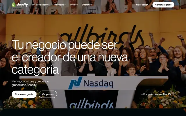
Deep Forest Canvas — a digital workspace layered in rich, dark greens and grays, where vivid accents illuminate interactive elements.

Color palette
Key interactive elements, branding, and active states—a vibrant signal against the dark palette.
Subtle background gradient for internal sections, establishing depth.
Atmospheric radial gradient for background accent, creating a luminous focal point.
Concentric radial gradient for background accent, lending a subtle glow.
Vivid, multi-color gradient used sparingly for eye-catching brand elements.
Deep, layered gradient for background elements, providing robust depth.
Complex radial gradient for textured backgrounds, suggesting submerged environments.
Highlighting specific information or calls to attention within body text.
Primary page background, deep canvas.
Dominant text color for primary headings on light surfaces, also used for outlines and shadows.
Primary text color on dark backgrounds, interactive elements, and essential UI highlights.
Card backgrounds and secondary surfaces, creating a subtle layer over the canvas.
Subtle borders and separators, providing structure without harsh contrast.
Secondary text and informational elements, softer than primary white text.
Card borders and subtle divisions on dark backgrounds.
Deep, almost black background for specific sections, adding tonal variation.
Navigation backgrounds and selected card states.
Tertiary body text and meta-information.
Less prominent headings and descriptive text.
Typography
- Weights
- 330, 400, 500, 550, 600
- Sizes
- 14px, 16px, 18px, 20px, 24px, 28px, 48px, 55px, 70px, 96px
- Line height
- 0.83, 0.96, 1, 1.14, 1.16, 1.25, 1.28, 1.4, 1.49, 1.5
- Letter spacing
- 0.0150em, 0.0200em, 0.0400em
- Fallback
- Helvetica Neue, Arial
Primary display and content font. Display sizes use lighter weights like 330 for an approachable, modern feel, while body text uses 400-500 for high readability on dark backgrounds.
- Weights
- 400, 420, 450, 550
- Sizes
- 12px, 14px, 16px, 18px, 20px
- Line height
- 1, 1.2, 1.29, 1.43, 1.5, 1.56
- Letter spacing
- 0.0600em
- Fallback
- Inter, Roboto
Secondary functional font for UI elements, navigation, and detailed information, ensuring legibility at smaller sizes with its optimized variable weights.
Spacing & shape
Elevation
Components
Pill-shaped button with 'Lunar White' background and 'Forest Black' text, 9999px border-radius, 8px vertical and 20px horizontal padding. Primary button uses this stark contrast to stand out.
Outlined button with 'Lunar White' border, transparent background, 'Lunar White' text, 9999px border-radius, 12px vertical and 24px horizontal padding. Used for alternative actions like 'Watch video'.
Implicit button with transparent background and 'Lunar White' text, 9999px border-radius, 12px vertical and 24px horizontal padding, no explicit border. Used for light calls to action or navigation elements.
Dark card with 'Charcoal Slate' background, 12px border-radius. Features a soft inner shadow of rgba(255, 255, 255, 0.03) inset at the top, and subtle outer shadows for depth.
Card with transparent background, 4px border-radius, and a subtle border of rgba(255, 255, 255, 0.03) inset at the top. Contains minimal padding (4px) for tight content groupings.
Uses 'NeueHaasGrotesk' at 70px (or 96px for max display), weight 330, with a 'Lunar White' color. Letter spacing provides ample room for readability, often against dark photographic backgrounds.
Text link using 'Inter-Variable', 14px, weight 400, in 'Lunar White', often with 'Emerald Interactive' text when active. Uses 10px padding for spacious menu presentation.
Guidelines
- Use 'Canvas Midnight' (#02090a) as the default page background to maintain consistent brand depth.
- Apply 'Emerald Interactive' (#36f4a4) exclusively for primary calls to action, active navigation states, and key interactive elements to create clear affordances.
- Employ the 'NeueHaasGrotesk' light weights (330-400) for all headlines (28px and above) to achieve a sophisticated, restrained authority.
- Maintain a clear visual hierarchy by contrasting 'Lunar White' (#ffffff) text on dark backgrounds for primary content and 'Steel Gray' (#a1a1aa) for secondary or tertiary information.
- Utilize 9999px border-radius for all primary and secondary buttons to ensure recognizably interactive pill shapes.
- Implement the card shadow `rgba(0, 0, 0, 0.1) 0px 8px 8px 0px, ..., rgba(255, 255, 255, 0.03) 0px 1px 0px 0px inset` for elevated content cards on dark surfaces.
- Ensure generous vertical spacing between sections, aiming for a minimum of 'sectionGap' (24px) or larger, to prevent content from feeling cramped.
- Avoid using bright, saturated colors for backgrounds or large areas; restrict chromatic colors to accents and interactive elements.
- Do not deviate from the specified font families 'NeueHaasGrotesk' and 'Inter-Variable' or their designated weights/sizes for body and heading text.
- Refrain from using heavy, opaque shadows for general elevation; rely instead on tonal shifts between surfaces like 'Canvas Midnight' and 'Charcoal Slate'.
- Do not break the 9999px pill button radius for primary interactive elements, as this is a key brand identifier.
- Do not introduce additional gray tones that are not part of the established neutral palette, as this will disrupt the subtle dark layering.
- Avoid using 'Emerald Interactive' (#36f4a4) for large blocks of text or purely decorative elements, as its vivacity should signal interaction or brand identity.
- Do not use generic system borders; always specify exact border colors from the neutral palette like 'Border Ash' (#e5e7eb) for subtle separation.
About this system
ShowHide
Shopify's dark theme presents as a deep, sophisticated digital canvas, evoking the feeling of a high-tech control center. Surfaces articulate depth through subtle shifts in near-black greens and grays, avoiding heavy shadows in favor of tonal variations and crisp white accents. The typography pairs large, authoritative headlines with spacious body text, ensuring clarity even against saturated backgrounds. The design prioritizes direct utility with distinct interactive elements using pure white and a vibrant green, guiding the user's eye without visual clutter.
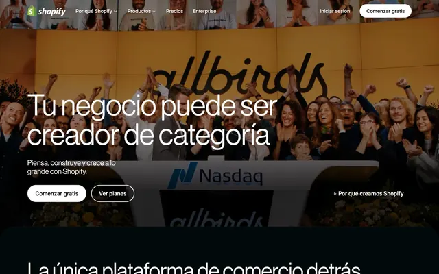
The layout is primarily a max-width contained design on a dark canvas, utilizing 'pageMaxWidth' for content blocks though the background is full-bleed. The hero section often features a large, often dark-overlayed image or video background with a prominent, centered headline and call-to-action buttons. Subsequent sections alternate between text-heavy content and multi-column visual sections, commonly using 2-column or 3-column card grids for features and examples. Vertical rhythm is established through consistent 'sectionGap' (24px) between content blocks and cards. Navigation is a fixed top bar on a 'Deep Teal' background, with minimal elements.
This site utilizes a blend of aspirational photography and product-oriented photography. Hero sections often feature high-quality, full-bleed lifestyle or event photography, sometimes with a dark overlay to maintain legibility of white text. Interior sections showcase product screenshots of the Shopify platform itself, often displaying e-commerce site examples. Imagery is generally contained within defined sections or cards, occasionally bleeding out to create visual interest. There is a strong preference for product imagery that highlights the diversity and success of businesses using Shopify, focusing on tangible results rather than abstract concepts. Icons are minimal, utilizing outlined styles in white or 'Emerald Interactive' to complement the dark UI.
Reminiscent of Figma, Notion, Vercel, Stripe.
# Shopify — Style Reference
> Deep Forest Canvas — a digital workspace layered in rich, dark greens and grays, where vivid accents illuminate interactive elements.

**Theme:** dark

**Site:** https://shopify.com

Shopify's dark theme presents as a deep, sophisticated digital canvas, evoking the feeling of a high-tech control center. Surfaces articulate depth through subtle shifts in near-black greens and grays, avoiding heavy shadows in favor of tonal variations and crisp white accents. The typography pairs large, authoritative headlines with spacious body text, ensuring clarity even against saturated backgrounds. The design prioritizes direct utility with distinct interactive elements using pure white and a vibrant green, guiding the user's eye without visual clutter.

## Tokens — Colors

| Name | Value | Token | Role |
|------|------|------|------|
| Emerald Interactivel | `#36f4a4` | `--color-emerald-interactivel` | Key interactive elements, branding, and active states—a vibrant signal against the dark palette. |
| Gradient Forest 1 | `#244749` | `--color-gradient-forest-1` | Subtle background gradient for internal sections, establishing depth. |
| Gradient Interstellar Blue | `#1260ff` | `--color-gradient-interstellar-blue` | Atmospheric radial gradient for background accent, creating a luminous focal point. |
| Gradient Radiant Teal | `#157076` | `--color-gradient-radiant-teal` | Concentric radial gradient for background accent, lending a subtle glow. |
| Gradient Aura | `#5fd5b6` | `--color-gradient-aura` | Vivid, multi-color gradient used sparingly for eye-catching brand elements. |
| Gradient Deep Forest | `#0a2c30` | `--color-gradient-deep-forest` | Deep, layered gradient for background elements, providing robust depth. |
| Gradient Submerged | `#3e4646` | `--color-gradient-submerged` | Complex radial gradient for textured backgrounds, suggesting submerged environments. |
| Accent Cyan | `#30deee` | `--color-accent-cyan` | Highlighting specific information or calls to attention within body text. |
| Canvas Midnight | `#02090a` | `--color-canvas-midnight` | Primary page background, deep canvas. |
| Forest Black | `#000000` | `--color-forest-black` | Dominant text color for primary headings on light surfaces, also used for outlines and shadows. |
| Lunar White | `#ffffff` | `--color-lunar-white` | Primary text color on dark backgrounds, interactive elements, and essential UI highlights. |
| Charcoal Slate | `#041e18` | `--color-charcoal-slate` | Card backgrounds and secondary surfaces, creating a subtle layer over the canvas. |
| Border Ash | `#e5e7eb` | `--color-border-ash` | Subtle borders and separators, providing structure without harsh contrast. |
| Steel Gray | `#a1a1aa` | `--color-steel-gray` | Secondary text and informational elements, softer than primary white text. |
| Off Black | `#1e2c31` | `--color-off-black` | Card borders and subtle divisions on dark backgrounds. |
| Subtle Violet | `#010624` | `--color-subtle-violet` | Deep, almost black background for specific sections, adding tonal variation. |
| Deep Teal | `#072720` | `--color-deep-teal` | Navigation backgrounds and selected card states. |
| Text Grey | `#99b3ad` | `--color-text-grey` | Tertiary body text and meta-information. |
| Mid Grey | `#71717a` | `--color-mid-grey` | Less prominent headings and descriptive text. |

## Tokens — Typography

### NeueHaasGrotesk
- **Substitute:** Helvetica Neue, Arial
- **Weights:** 330, 400, 500, 550, 600
- **Sizes:** 14px, 16px, 18px, 20px, 24px, 28px, 48px, 55px, 70px, 96px
- **Line height:** 0.83, 0.96, 1, 1.14, 1.16, 1.25, 1.28, 1.4, 1.49, 1.5
- **Letter spacing:** 0.0150em, 0.0200em, 0.0400em
- **Role:** Primary display and content font. Display sizes use lighter weights like 330 for an approachable, modern feel, while body text uses 400-500 for high readability on dark backgrounds.

### Inter-Variable
- **Substitute:** Inter, Roboto
- **Weights:** 400, 420, 450, 550
- **Sizes:** 12px, 14px, 16px, 18px, 20px
- **Line height:** 1, 1.2, 1.29, 1.43, 1.5, 1.56
- **Letter spacing:** 0.0600em
- **Role:** Secondary functional font for UI elements, navigation, and detailed information, ensuring legibility at smaller sizes with its optimized variable weights.

## Tokens — Type Scale

Perfect Fourth (1.333) from 16px base.

| Role | Size | Line height | Letter spacing |
|------|------|------|------|
| caption | 12px | 1 | 0.06em |
| body-sm | 14px | 1.5 | 0.04em |
| body | 16px | 1.5 | 0.02em |
| subheading | 20px | 1.4 | 0.015em |
| heading-sm | 28px | 1.28 | — |
| heading | 48px | 1.16 | — |
| heading-lg | 55px | 1.14 | — |
| display | 96px | 0.96 | — |

## Tokens — Spacing

- **Section gap:** 24px
- **Card padding:** 16px
- **Element gap:** 16px

## Tokens — Radius

- **Default:** 4px
- **Buttons:** 9999px
- **Cards:** 12px
- **large:** 20px
- **medium:** 8px
- **pill:** 340px

## Tokens — Elevation

- **Card Surface:** `rgba(0, 0, 0, 0.1) 0px 8px 8px 0px, rgba(0, 0, 0, 0.1) 0px 4px 4px 0px, rgba(0, 0, 0, 0.1) 0px 2px 2px 0px, rgba(0, 0, 0, 0.1) 0px 0px 0px 1px, rgba(255, 255, 255, 0.03) 0px 1px 0px 0px inset`
- **List Item/Tooltip:** `rgba(0, 0, 0, 0.2) 10px 13px 12px 2px`
- **Button Focus/Hover:** `rgba(255, 255, 255, 0.05) 0px 1px 2px 0px, rgba(255, 255, 255, 0.04) 0px 1px 0px 0px inset`
- **Header/Floating Card:** `rgba(5, 24, 19, 0.05) 0px 20px 60px 0px, rgb(19, 59, 50) 0px 1px 0px 0px inset`

## Layout

The layout is primarily a max-width contained design on a dark canvas, utilizing 'pageMaxWidth' for content blocks though the background is full-bleed. The hero section often features a large, often dark-overlayed image or video background with a prominent, centered headline and call-to-action buttons. Subsequent sections alternate between text-heavy content and multi-column visual sections, commonly using 2-column or 3-column card grids for features and examples. Vertical rhythm is established through consistent 'sectionGap' (24px) between content blocks and cards. Navigation is a fixed top bar on a 'Deep Teal' background, with minimal elements.

## Imagery

This site utilizes a blend of aspirational photography and product-oriented photography. Hero sections often feature high-quality, full-bleed lifestyle or event photography, sometimes with a dark overlay to maintain legibility of white text. Interior sections showcase product screenshots of the Shopify platform itself, often displaying e-commerce site examples. Imagery is generally contained within defined sections or cards, occasionally bleeding out to create visual interest. There is a strong preference for product imagery that highlights the diversity and success of businesses using Shopify, focusing on tangible results rather than abstract concepts. Icons are minimal, utilizing outlined styles in white or 'Emerald Interactive' to complement the dark UI.

## Components

### Primary CTA Button
*Call to action*

Pill-shaped button with 'Lunar White' background and 'Forest Black' text, 9999px border-radius, 8px vertical and 20px horizontal padding. Primary button uses this stark contrast to stand out.

### Secondary Outlined Button
*Secondary action*

Outlined button with 'Lunar White' border, transparent background, 'Lunar White' text, 9999px border-radius, 12px vertical and 24px horizontal padding. Used for alternative actions like 'Watch video'.

### Ghost Button
*Minimal interaction*

Implicit button with transparent background and 'Lunar White' text, 9999px border-radius, 12px vertical and 24px horizontal padding, no explicit border. Used for light calls to action or navigation elements.

### Card Surface
*Content container*

Dark card with 'Charcoal Slate' background, 12px border-radius. Features a soft inner shadow of rgba(255, 255, 255, 0.03) inset at the top, and subtle outer shadows for depth.

### Nav Card
*Informational link container*

Card with transparent background, 4px border-radius, and a subtle border of rgba(255, 255, 255, 0.03) inset at the top. Contains minimal padding (4px) for tight content groupings.

### Hero Headline
*Dominant page title*

Uses 'NeueHaasGrotesk' at 70px (or 96px for max display), weight 330, with a 'Lunar White' color. Letter spacing provides ample room for readability, often against dark photographic backgrounds.

### Navigation Link
*Top-level navigation item*

Text link using 'Inter-Variable', 14px, weight 400, in 'Lunar White', often with 'Emerald Interactive' text when active. Uses 10px padding for spacious menu presentation.

## Guidelines

### Do

- Use 'Canvas Midnight' (#02090a) as the default page background to maintain consistent brand depth.
- Apply 'Emerald Interactive' (#36f4a4) exclusively for primary calls to action, active navigation states, and key interactive elements to create clear affordances.
- Employ the 'NeueHaasGrotesk' light weights (330-400) for all headlines (28px and above) to achieve a sophisticated, restrained authority.
- Maintain a clear visual hierarchy by contrasting 'Lunar White' (#ffffff) text on dark backgrounds for primary content and 'Steel Gray' (#a1a1aa) for secondary or tertiary information.
- Utilize 9999px border-radius for all primary and secondary buttons to ensure recognizably interactive pill shapes.
- Implement the card shadow `rgba(0, 0, 0, 0.1) 0px 8px 8px 0px, ..., rgba(255, 255, 255, 0.03) 0px 1px 0px 0px inset` for elevated content cards on dark surfaces.
- Ensure generous vertical spacing between sections, aiming for a minimum of 'sectionGap' (24px) or larger, to prevent content from feeling cramped.

### Don't

- Avoid using bright, saturated colors for backgrounds or large areas; restrict chromatic colors to accents and interactive elements.
- Do not deviate from the specified font families 'NeueHaasGrotesk' and 'Inter-Variable' or their designated weights/sizes for body and heading text.
- Refrain from using heavy, opaque shadows for general elevation; rely instead on tonal shifts between surfaces like 'Canvas Midnight' and 'Charcoal Slate'.
- Do not break the 9999px pill button radius for primary interactive elements, as this is a key brand identifier.
- Do not introduce additional gray tones that are not part of the established neutral palette, as this will disrupt the subtle dark layering.
- Avoid using 'Emerald Interactive' (#36f4a4) for large blocks of text or purely decorative elements, as its vivacity should signal interaction or brand identity.
- Do not use generic system borders; always specify exact border colors from the neutral palette like 'Border Ash' (#e5e7eb) for subtle separation.

## Agent Prompt Guide

### Quick Color Reference
- Text Primary: #ffffff (Lunar White)
- Background Base: #02090a (Canvas Midnight)
- CTA Background: #ffffff (Lunar White)
- CTA Text: #000000 (Forest Black)
- Border/Divider: #e5e7eb (Border Ash)
- Accent: #36f4a4 (Emerald Interactive)

### 3-5 Example Component Prompts
1. **Create a hero section:** use `Canvas Midnight` as background. Headline 'Tu negocio puede ser el creador de una nueva categoría' using `NeueHaasGrotesk` at 70px, weight 330, `Lunar White`, `lineHeight` 1.14. Subtext 'Piensa, construye y crece a lo grande con Shopify.' using `NeueHaasGrotesk` at 18px, weight 400, `Steel Gray`, `lineHeight` 1.49. Primary CTA button with text 'Comenzar gratis' using `Primary CTA Button` component, and a secondary action button 'Ver planes' using `Secondary Outlined Button` component.
2. **Generate a feature card:** Background `Charcoal Slate` with `Card Surface` shadow and 12px `cards` radius. Title 'Crea tiendas personalizables' using `NeueHaasGrotesk` at 24px, weight 500, `Lunar White`, with `letterSpacing` 0.015em. Body text 'Personaliza cada aspecto de tu tienda, desde el diseño hasta la función.' using `NeueHaasGrotesk` at 16px, weight 400, `Text Grey`, `lineHeight` 1.5. Incorporate a small icon in `Emerald Interactive`.
3. **Design a navigation bar:** Use `Deep Teal` as the background. Primary links 'Por qué Shopify', 'Productos', 'Precios', 'Enterprise' using `Navigation Link` component. Set active link 'Productos' with `Emerald Interactive` text. Include a 'Comenzar gratis' `Primary CTA Button` and 'Iniciar sesión' `Ghost Button`.
More like this







Keep what you find
A free account saves references to boards and can send you a weekly email of picks based on what you save.
To see every result, go Pro.