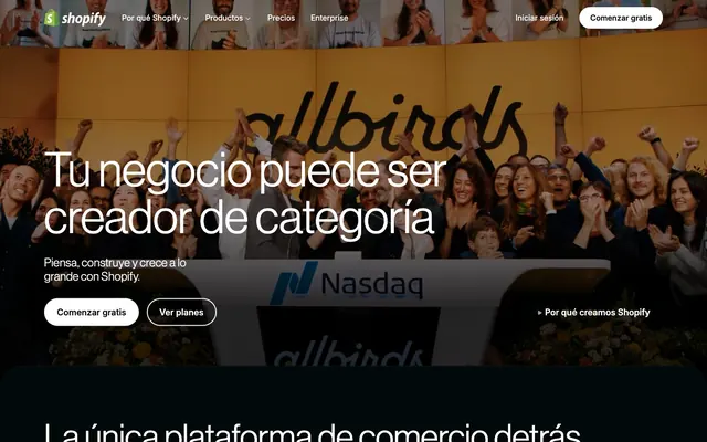
Preview image. Unlock full-res
Midnight Command Center: A sophisticated dark interface, both precise and dynamically lit.

Color palette
Accent for active navigation items, highlighted text, link emphasis
Supporting palette color with insufficient usage evidence for a stronger role. Extracted usage does not support a distinct primary control color.
Gradient for background embellishment
Decorative gradient for backgrounds
Footer background, secondary text, button text on light backgrounds
Primary canvas background for most sections
Card backgrounds, elevated surface background
Card borders, subtle dividers
Secondary background for deeply elevated cards or panels
Distinct card background, used sparingly for emphasis
Navigation background, specific card background
Primary text color, button backgrounds, interactive text
Muted text, secondary information, disabled states
Primary border color, subtle highlight for inactive elements
Tertiary body text, less prominent links
Background gradient for sections
Subtle background gradient for dark surfaces
Complex radial background gradient for visual depth
Typography
- Weights
- 330, 400, 500, 550, 600
- Sizes
- 14px, 16px, 18px, 20px, 24px, 28px, 48px, 55px, 70px, 96px
- Line height
- 0.83, 0.96, 1, 1.14, 1.16, 1.25, 1.28, 1.4, 1.49, 1.5
- Letter spacing
- 0.015, 0.02, 0.04, -0.72, -0.83, -1.05, -1.44
- Fallback
- Helvetica Neue, Aktiv Grotesk
Primary display and content font. Its range of weights allows for nuanced hierarchy, making headlines authoritative at larger sizes and body text highly legible. The 'ss03' feature is vital for consistent digit and character rendering.
- Weights
- 400, 420, 450, 550
- Sizes
- 12px, 14px, 16px, 18px, 20px
- Line height
- 1, 1.2, 1.29, 1.43, 1.5, 1.56
- Letter spacing
- 0.072, 0.084, 0.096, 0.108, 0.12
- Fallback
- Inter
Supportive functional text, used for navigation, buttons, and detailed information. Its legibility at smaller sizes and controlled letter-spacing ensure clarity in interactive elements. The 'ss03' feature provides consistent digit styling.
Spacing & shape
Elevation
Components
Filled button with `Snowdrift` background, `Pitch Black` text at NeueHaasGrotesk weight 600. `9999px` border-radius for a pill shape. Padding is `8px` vertical and `20px` horizontal.
Ghost button with `oklab(0.999994 0.0000455678 0.0000200868 / 0.2)` background, `Snowdrift` text at Inter-Variable weight 550, `Cloud Mist` border, `4px` border-radius. Padding is `12px` vertical and `16px` horizontal.
Ghost button with transparent background, `Snowdrift` text at NeueHaasGrotesk weight 500, `Snowdrift` border, `9999px` border-radius. Padding is `12px` vertical and `24px` horizontal.
Card with `Charcoal Grey` background, `12px` border-radius, and a pronounced shadow: `rgba(0,0,0,0.1) 0px 8px 8px, rgba(0,0,0,0.1) 0px 4px 4px, rgba(0,0,0,0.1) 0px 2px 2px, rgba(0,0,0,0.1) 0px 0px 0px 1px, rgba(255,255,255,0.03) 0px 1px 0px 0px inset`.
Card with transparent background, `4px` border-radius, `Snowdrift` text, and subtle shadows for interactivity and depth: `rgba(255,255,255,0.03) 0px 0.929px 0px 0px inset, rgba(0,0,0,0.1) 0px 0px 0px 0.929px, rgba(0,0,0,0.1) 0px 1.858px 1.858px 0px, rgba(0,0,0,0.1) 0px 3.717px 3.717px 0px`.
Card with `Charcoal Grey` background, `0px` border-radius, and no shadow. Padding is `0px`.
Card with `Snowdrift` background, `8px` border-radius, and no shadow. Padding is `16px` on all sides.
Guidelines
- Use `Deep Ocean` (#02090a) as the default canvas background for most sections to maintain a consistent dark theme.
- Accent interactive elements with `Jade Glow` (#36f4a4) for emphasis, such as active navigation items or highlighted links.
- Apply a `9999px` border-radius from the 'radius' token for all primary and ghost buttons to achieve a consistent pill shape.
- Employ `NeueHaasGrotesk` with `weight 330` for large display headings (e.g., 70px, 96px) to create a sophisticated, restrained presence, rather than strong visual shouting.
- Utilize `Snowdrift` (#ffffff) for primary text on dark backgrounds and for backgrounds of filled buttons.
- For cards and elevated surfaces, use `Charcoal Grey` (#061a1c) with the specified card shadow to delineate distinct content blocks.
- Set text color to `Ash Grey` (#a1a1aa) for secondary information, muted links, or disabled states to indicate diminished priority.
- Avoid using bright, saturated colors for full sections or large background areas; reserve these for accents and dynamic elements.
- Do not deviate from the `9999px` pill shape for buttons or `12px` for cards, as these radii are central to the brand's identity.
- Refrain from heavy, intense shadows on `Deep Ocean` backgrounds, as the system relies on subtle shadow progressions and background color shifts for depth.
- Do not use `Pitch Black` (#000000) for primary canvas backgrounds; it is intended for the footer and specific text elements to achieve high contrast.
- Avoid using `Inter-Variable` for large display headings; its optimized legibility is for functional, smaller text sizes below 20px.
- Never use `Snowdrift` (#ffffff) as the primary background for full page sections, as it is mainly for text, buttons, and specific elevated overlays.
- Do not introduce additional accent colors; stick to `Jade Glow` (#36f4a4) for emphasis against the dark background.
About this system
ShowHide
Shopify's visual design embodies a 'midnight command center' aesthetic, contrasting deep, near-black surfaces with crisp, luminous text. The use of a vivid, slightly desaturated green as the primary accent color injects a dynamic energy against the dark backdrop, appearing precisely where interactivity or emphasis is needed. Typography, featuring a custom variable font 'NeueHaasGrotesk', maintains clarity and a subtle technical feel, further enhanced by precise letter-spacing. Shadows are subtle but add discernible depth, creating a refined, multi-layered dark interface.
The layout is primarily a max-width contained structure, with some full-bleed sections, particularly for hero banners and background visuals. The hero section features a full-bleed dark background with a centered, prominent headline and calls to action. Section rhythm is driven by consistent vertical spacing and alternating background colors (dark canvas vs. slightly darker cards or gradient sections), creating visual breaks. Content is arranged in alternating text-left/image-right or centered stacks, with card grids appearing for feature showcases. The site is text-dominant in informational blocks but uses large hero images for visual impact. A sticky top navigation bar provides consistent access.
This design primarily uses photography within contained card elements or as large, immersive background elements often overlaid with dark gradients. Product photography is typically lifestyle-oriented, showcasing human interaction or aspirational scenes, often desaturated or subtly tinted to blend with the dark interface. Illustrations are minimal, hinted at by abstract graphic patterns in background gradients. Icons are typically mono-color, in `Snowdrift` or `Jade Glow`, outlining essential functions. Images serve both decorative atmosphere and explanatory content roles, creating an engaging visual narrative without overwhelming the UI.
Reminiscent of Vercel, Linear, Stripe, GitHub.
# Shopify — Style Reference
> Midnight Command Center: A sophisticated dark interface, both precise and dynamically lit.

**Theme:** dark

**Site:** https://www.shopify.com

Shopify's visual design embodies a 'midnight command center' aesthetic, contrasting deep, near-black surfaces with crisp, luminous text. The use of a vivid, slightly desaturated green as the primary accent color injects a dynamic energy against the dark backdrop, appearing precisely where interactivity or emphasis is needed. Typography, featuring a custom variable font 'NeueHaasGrotesk', maintains clarity and a subtle technical feel, further enhanced by precise letter-spacing. Shadows are subtle but add discernible depth, creating a refined, multi-layered dark interface.

## Tokens — Colors

| Name | Value | Token | Role |
|------|------|------|------|
| Jade Glow | `#36f4a4` | `--color-jade-glow` | Accent for active navigation items, highlighted text, link emphasis |
| Aurora Blue | `#1260ff` | `--color-aurora-blue` | Supporting palette color with insufficient usage evidence for a stronger role. Extracted usage does not support a distinct primary control color. |
| Mystic Teal | `#157076` | `--color-mystic-teal` | Gradient for background embellishment |
| Synthwave Sunset | `#5fd5b6` | `--color-synthwave-sunset` | Decorative gradient for backgrounds |
| Pitch Black | `#000000` | `--color-pitch-black` | Footer background, secondary text, button text on light backgrounds |
| Deep Ocean | `#02090a` | `--color-deep-ocean` | Primary canvas background for most sections |
| Charcoal Grey | `#061a1c` | `--color-charcoal-grey` | Card backgrounds, elevated surface background |
| Steel Gaze | `#1e2c31` | `--color-steel-gaze` | Card borders, subtle dividers |
| Twilight Indigo | `#000a10` | `--color-twilight-indigo` | Secondary background for deeply elevated cards or panels |
| Abyssal Violet | `#010624` | `--color-abyssal-violet` | Distinct card background, used sparingly for emphasis |
| Dark Forest | `#072720` | `--color-dark-forest` | Navigation background, specific card background |
| Snowdrift | `#ffffff` | `--color-snowdrift` | Primary text color, button backgrounds, interactive text |
| Ash Grey | `#a1a1aa` | `--color-ash-grey` | Muted text, secondary information, disabled states |
| Cloud Mist | `#e5e7eb` | `--color-cloud-mist` | Primary border color, subtle highlight for inactive elements |
| Muted Sage | `#99b3ad` | `--color-muted-sage` | Tertiary body text, less prominent links |
| Deep Sea Gradient | `#244749` | `--color-deep-sea-gradient` | Background gradient for sections |
| Dark Inlet Gradient | `#0a2c30` | `--color-dark-inlet-gradient` | Subtle background gradient for dark surfaces |
| Chromatic Orb Gradient | `#3e4646` | `--color-chromatic-orb-gradient` | Complex radial background gradient for visual depth |

## Tokens — Typography

### NeueHaasGrotesk
- **Substitute:** Helvetica Neue, Aktiv Grotesk
- **Weights:** 330, 400, 500, 550, 600
- **Sizes:** 14px, 16px, 18px, 20px, 24px, 28px, 48px, 55px, 70px, 96px
- **Line height:** 0.83, 0.96, 1, 1.14, 1.16, 1.25, 1.28, 1.4, 1.49, 1.5
- **Letter spacing:** 0.015, 0.02, 0.04, -0.72, -0.83, -1.05, -1.44
- **Role:** Primary display and content font. Its range of weights allows for nuanced hierarchy, making headlines authoritative at larger sizes and body text highly legible. The 'ss03' feature is vital for consistent digit and character rendering.

### Inter-Variable
- **Substitute:** Inter
- **Weights:** 400, 420, 450, 550
- **Sizes:** 12px, 14px, 16px, 18px, 20px
- **Line height:** 1, 1.2, 1.29, 1.43, 1.5, 1.56
- **Letter spacing:** 0.072, 0.084, 0.096, 0.108, 0.12
- **Role:** Supportive functional text, used for navigation, buttons, and detailed information. Its legibility at smaller sizes and controlled letter-spacing ensure clarity in interactive elements. The 'ss03' feature provides consistent digit styling.

## Tokens — Type Scale

Perfect Fourth (1.333) from 16px base.

| Role | Size | Line height | Letter spacing |
|------|------|------|------|
| caption | 12px | 1.5 | 0.072em |
| body-sm | 14px | 1.5 | 0.015em |
| body | 16px | 1.5 | 0.02em |
| subheading | 20px | 1.4 | 0.04em |
| heading-sm | 24px | 1.25 | -0.36px |
| heading | 28px | 1.28 | -0.42px |
| heading-lg | 48px | 1.16 | -0.72px |
| display | 96px | 0.96 | -1.44px |

## Tokens — Spacing

- **Section gap:** 24px
- **Card padding:** 13px
- **Element gap:** 12px

## Tokens — Radius

- **Buttons:** 9999px
- **Inputs:** 4px
- **Cards:** 12px
- **avatars:** 340px
- **media:** 8px

## Tokens — Elevation

- **Hero Card (Dark Elevated):** `rgba(0,0,0,0.1) 0px 8px 8px, rgba(0,0,0,0.1) 0px 4px 4px, rgba(0,0,0,0.1) 0px 2px 2px, rgba(0,0,0,0.1) 0px 0px 0px 1px, rgba(255,255,255,0.03) 0px 1px 0px 0px inset`
- **Interactive Card (Light Border):** `rgba(255,255,255,0.03) 0px 0.929px 0px 0px inset, rgba(0,0,0,0.1) 0px 0px 0px 0.929px, rgba(0,0,0,0.1) 0px 1.858px 1.858px 0px, rgba(0,0,0,0.1) 0px 3.717px 3.717px 0px`
- **Button:** `rgba(255, 255, 255, 0.05) 0px 1px 2px 0px, rgba(255, 255, 255, 0.04) 0px 1px 0px 0px inset`
- **List Item with Shadow:** `rgba(0, 0, 0, 0.2) 10px 13px 12px 2px`

## Layout

The layout is primarily a max-width contained structure, with some full-bleed sections, particularly for hero banners and background visuals. The hero section features a full-bleed dark background with a centered, prominent headline and calls to action. Section rhythm is driven by consistent vertical spacing and alternating background colors (dark canvas vs. slightly darker cards or gradient sections), creating visual breaks. Content is arranged in alternating text-left/image-right or centered stacks, with card grids appearing for feature showcases. The site is text-dominant in informational blocks but uses large hero images for visual impact. A sticky top navigation bar provides consistent access.

## Imagery

This design primarily uses photography within contained card elements or as large, immersive background elements often overlaid with dark gradients. Product photography is typically lifestyle-oriented, showcasing human interaction or aspirational scenes, often desaturated or subtly tinted to blend with the dark interface. Illustrations are minimal, hinted at by abstract graphic patterns in background gradients. Icons are typically mono-color, in `Snowdrift` or `Jade Glow`, outlining essential functions. Images serve both decorative atmosphere and explanatory content roles, creating an engaging visual narrative without overwhelming the UI.

## Components

### Primary Filled Button
*Interactive element*

Filled button with `Snowdrift` background, `Pitch Black` text at NeueHaasGrotesk weight 600. `9999px` border-radius for a pill shape. Padding is `8px` vertical and `20px` horizontal.

### Ghost Button (Subtle)
*Interactive element*

Ghost button with `oklab(0.999994 0.0000455678 0.0000200868 / 0.2)` background, `Snowdrift` text at Inter-Variable weight 550, `Cloud Mist` border, `4px` border-radius. Padding is `12px` vertical and `16px` horizontal.

### Ghost Button (Outlined)
*Interactive element*

Ghost button with transparent background, `Snowdrift` text at NeueHaasGrotesk weight 500, `Snowdrift` border, `9999px` border-radius. Padding is `12px` vertical and `24px` horizontal.

### Hero Card (Dark Elevated)
*Information display*

Card with `Charcoal Grey` background, `12px` border-radius, and a pronounced shadow: `rgba(0,0,0,0.1) 0px 8px 8px, rgba(0,0,0,0.1) 0px 4px 4px, rgba(0,0,0,0.1) 0px 2px 2px, rgba(0,0,0,0.1) 0px 0px 0px 1px, rgba(255,255,255,0.03) 0px 1px 0px 0px inset`.

### Interactive Card (Light Border)
*Interactive element*

Card with transparent background, `4px` border-radius, `Snowdrift` text, and subtle shadows for interactivity and depth: `rgba(255,255,255,0.03) 0px 0.929px 0px 0px inset, rgba(0,0,0,0.1) 0px 0px 0px 0.929px, rgba(0,0,0,0.1) 0px 1.858px 1.858px 0px, rgba(0,0,0,0.1) 0px 3.717px 3.717px 0px`.

### Content Card (Minimal)
*Content container*

Card with `Charcoal Grey` background, `0px` border-radius, and no shadow. Padding is `0px`.

### Overlay Card (Light)
*Information display*

Card with `Snowdrift` background, `8px` border-radius, and no shadow. Padding is `16px` on all sides.

## Guidelines

### Do

- Use `Deep Ocean` (#02090a) as the default canvas background for most sections to maintain a consistent dark theme.
- Accent interactive elements with `Jade Glow` (#36f4a4) for emphasis, such as active navigation items or highlighted links.
- Apply a `9999px` border-radius from the 'radius' token for all primary and ghost buttons to achieve a consistent pill shape.
- Employ `NeueHaasGrotesk` with `weight 330` for large display headings (e.g., 70px, 96px) to create a sophisticated, restrained presence, rather than strong visual shouting.
- Utilize `Snowdrift` (#ffffff) for primary text on dark backgrounds and for backgrounds of filled buttons.
- For cards and elevated surfaces, use `Charcoal Grey` (#061a1c) with the specified card shadow to delineate distinct content blocks.
- Set text color to `Ash Grey` (#a1a1aa) for secondary information, muted links, or disabled states to indicate diminished priority.

### Don't

- Avoid using bright, saturated colors for full sections or large background areas; reserve these for accents and dynamic elements.
- Do not deviate from the `9999px` pill shape for buttons or `12px` for cards, as these radii are central to the brand's identity.
- Refrain from heavy, intense shadows on `Deep Ocean` backgrounds, as the system relies on subtle shadow progressions and background color shifts for depth.
- Do not use `Pitch Black` (#000000) for primary canvas backgrounds; it is intended for the footer and specific text elements to achieve high contrast.
- Avoid using `Inter-Variable` for large display headings; its optimized legibility is for functional, smaller text sizes below 20px.
- Never use `Snowdrift` (#ffffff) as the primary background for full page sections, as it is mainly for text, buttons, and specific elevated overlays.
- Do not introduce additional accent colors; stick to `Jade Glow` (#36f4a4) for emphasis against the dark background.

## Agent Prompt Guide

**Quick Color Reference**
- text: #ffffff (Snowdrift)
- background: #02090a (Deep Ocean)
- border: #e5e7eb (Cloud Mist)
- accent: #36f4a4 (Jade Glow)
- primary action: #ffffff (filled action)

**3 Example Component Prompts**
1. Create a hero section with a `Deep Ocean` background. A `display` size heading should use `NeueHaasGrotesk` at `weight 330`, color `Snowdrift`, and `letterSpacing -1.44px`. Below the heading, include a 'Comenzar gratis' button: `Snowdrift` background, `Pitch Black` text at `NeueHaasGrotesk weight 600`, `9999px` radius, `8px 20px` padding. Next to it, a 'Ver planes' ghost button: transparent background, `Snowdrift` text at `NeueHaasGrotesk weight 500`, `Snowdrift` border, `9999px` radius, `12px 24px` padding.
2. Design a feature card displaying product imagery. Use a `Charcoal Grey` background, `12px` border-radius. The card should have the 'Hero Card (Dark Elevated)' shadow style. Inside, use a `heading-sm` size title in `Snowdrift` and `body-sm` text in `Ash Grey` (#a1a1aa). The card should have `13px` internal padding.
3. Implement a navigation item with a `Deep Forest` background. For active items, set text color to `Jade Glow` (#36f4a4) using `Inter-Variable weight 550` at `body-sm` size, with `0.084px` letter-spacing. Inactive items use `Ash Grey` text at the same typography settings.
More like this








Keep what you find
A free account saves references to boards and can send you a weekly email of picks based on what you save.
To see every result, go Pro.