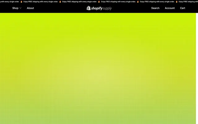
Preview image. Unlock full-res
Pixelated streetwear on raw concrete

Color palette
Hyperlink text, small product detail accents, decorative icon fills
Green text accent for links, tags, and emphasized short phrases. Do not promote it to the primary CTA color
Dominant color of the gradient used for hero backgrounds and full-bleed sections
Page backgrounds, heading text, primary text on light surfaces
Decorative borders, inactive elements, subtle text on dark backgrounds
Muted body text, placeholder text
Input borders and placeholder text
Secondary background surfaces and borders on dark themes
Header and footer dividers, subtle visual separation
Typography
- Weights
- 400, 450, 500, 700
- Sizes
- 12px, 14px, 16px, 18px, 20px, 22px, 36px
- Line height
- 1.17, 1.18, 1.25, 1.33, 1.4, 1.43, 1.5, 1.56
- Letter spacing
- -0.12, -0.14, -0.16, -0.18, -0.2, -0.22, -0.36
- Fallback
- Inter
The primary font for all content, from body text to most headings. Its variable nature handles diverse typographic needs with a subtle, modern feel. Letter spacing is subtly tight for most uses, with a slight negative tracking for larger sizes.
- Weights
- 800
- Sizes
- 32px
- Line height
- 1
- Letter spacing
- 0
- Fallback
- Open Sans
Used for bold, impactful display text, particularly in headers and key brand statements. Its extreme weight and tight line height create a striking, almost condensed presence.
- Weights
- 450
- Sizes
- 22px
- Line height
- 1.18
- Letter spacing
- 0
- Fallback
- Roboto Mono
A monospace-like font for specific textual elements, adding a technical or code-like aesthetic. Its 22px size with 1.18 line height provides clear readability for short phrases.
Spacing & shape
Elevation
Components
Text in Canvas Black (#000000) or Ghostly Gray (#e5e7eb) with no background or padding. Border is 1px solid Ghostly Gray to delineate an active state or subtle interaction.
Rounded shape with transparent background and white text. Text is #FFFFFF and padding is 16px around all sides.
A very subtle, almost transparent pill-shaped button with gray text and a matching gray border. Colors are #ababab for text and border, with a near-transparent background.
A stark, unrounded button with black text on a white background. It has generous horizontal padding and no border radius. Background is #FFFFFF, text #000000, with 16px vertical and 48px horizontal padding.
A frameless, shadowless card with a transparent background. Padding is intentionally zero, allowing content to dictate spacing. Text may inherit surrounding context colors.
A text input with a black background, white text for input, and a subtle gray border (#999999). Vertical padding is 20px, left padding 24px, and there's no border radius.
Guidelines
- Prioritize Canvas Black (#000000) for all main page and section backgrounds.
- Use Accent Green (#6fc992) for interactive links and subtle product description accents.
- Employ the linear gradient `linear-gradient(to top, rgb(164, 208, 107), rgb(206, 220, 46), rgb(201, 243, 0))` for hero sections and full-bleed brand statements.
- Apply Inter-Variable as the primary typeface for all textual content, adjusting weights and letter-spacing as per the type scale.
- Construct call-to-action buttons with a stark #FFFFFF background and #000000 text, using 0px border-radius.
- Maintain a grid-like visual texture with thin #e5e7eb or #3d3f40 dividers for content separation, especially on dark surfaces.
- Utilize 0px border-radius across most components for a sharp, angular aesthetic.
- Avoid generic drop shadows; use them only as explicitly specified for interactive elements like the button shadow `rgba(0, 0, 0, 0.1) 0px 0px 8px 0px`.
- Do not introduce soft bezier curves or organic shapes; maintain a geometric and angular sensibility.
- Refrain from using pastel or desaturated color palettes; lean into high contrast and vivid color pops.
- Do not add extra padding or spacing around product cards; they should appear flush with surrounding content.
- Avoid applying excessive rounded corners; the default is 0px for most elements.
- Do not deviate from the specified Inter-Variable letter-spacing values, particularly the negative tracking at larger sizes.
- Do not use generic system fonts; always map to one of the specified brand typefaces (Inter-Variable, Grtsk-Bold-Tera, Fraktion).
About this system
ShowHide
Shopify Supply is a digital storefront with a distinct glitch-art, anti-establishment attitude. It combines bold, highly-tracked typography and a dark, almost gritty background with unexpected neon green and yellow accents. The visual system prioritizes sharp contrasts and unconventional styling, using minimal rounded corners and pervasive grid-like textures to evoke a raw, early-internet aesthetic meeting modern streetwear design. Components are largely borderless or subtly outlined, creating a sense of weightlessness on a dense dark canvas.
The page primarily uses a max-width contained layout of 1245px, centered on a Canvas Black background. The hero section is often a full-bleed gradient with a large centered headline and prominent call-to-action. Content sections typically alternate between a continuous dark background and sections that use the Surface Dark Gray with light text. There's a strong emphasis on grid-like compositions, with product cards arranged in multiple columns. Vertical spacing is consistent with the `sectionGap` (64px) providing clear breaks. Navigation is a sticky top bar with minimal links and iconic search/account/cart actions.
The visual language is a blend of product photography and pixel art. Photography features tightly cropped product shots often against white or neutral backgrounds, focusing on the item itself rather than lifestyle context. Some images incorporate a raw, almost deconstructed feel. Illustrations are exclusively pixel art, often brand characters or small decorative elements, lending a retro, glitch-art aesthetic. Icons are simple, outlined, and monochromatic, matching the overall starkness. Imagery serves both decorative atmosphere (pixel art) and direct product showcasing (photography), existing in a relatively text-dominant layout but with key hero sections featuring large-scale graphics or gradient backgrounds.
Reminiscent of Stripe, Are.na, Framer, Glossier.
# Shopify Supply — Style Reference
> Pixelated streetwear on raw concrete

**Theme:** dark

**Site:** https://shopify.supply

Shopify Supply is a digital storefront with a distinct glitch-art, anti-establishment attitude. It combines bold, highly-tracked typography and a dark, almost gritty background with unexpected neon green and yellow accents. The visual system prioritizes sharp contrasts and unconventional styling, using minimal rounded corners and pervasive grid-like textures to evoke a raw, early-internet aesthetic meeting modern streetwear design. Components are largely borderless or subtly outlined, creating a sense of weightlessness on a dense dark canvas.

## Tokens — Colors

| Name | Value | Token | Role |
|------|------|------|------|
| Accent Green | `#6fc992` | `--color-accent-green` | Hyperlink text, small product detail accents, decorative icon fills |
| Vivid Green | `#d0f224` | `--color-vivid-green` | Green text accent for links, tags, and emphasized short phrases. Do not promote it to the primary CTA color |
| Background Grid Light Green | `#a4d06b` | `--color-background-grid-light-green` | Dominant color of the gradient used for hero backgrounds and full-bleed sections |
| Canvas Black | `#000000` | `--color-canvas-black` | Page backgrounds, heading text, primary text on light surfaces |
| Ghostly Gray | `#e5e7eb` | `--color-ghostly-gray` | Decorative borders, inactive elements, subtle text on dark backgrounds |
| Text Gray | `#ababab` | `--color-text-gray` | Muted body text, placeholder text |
| Input Gray | `#999999` | `--color-input-gray` | Input borders and placeholder text |
| Surface Dark Gray | `#1e2939` | `--color-surface-dark-gray` | Secondary background surfaces and borders on dark themes |
| Header Divider | `#3d3f40` | `--color-header-divider` | Header and footer dividers, subtle visual separation |

## Tokens — Typography

### Inter-Variable
- **Substitute:** Inter
- **Weights:** 400, 450, 500, 700
- **Sizes:** 12px, 14px, 16px, 18px, 20px, 22px, 36px
- **Line height:** 1.17, 1.18, 1.25, 1.33, 1.4, 1.43, 1.5, 1.56
- **Letter spacing:** -0.12, -0.14, -0.16, -0.18, -0.2, -0.22, -0.36
- **Role:** The primary font for all content, from body text to most headings. Its variable nature handles diverse typographic needs with a subtle, modern feel. Letter spacing is subtly tight for most uses, with a slight negative tracking for larger sizes.

### Grtsk-Bold-Tera
- **Substitute:** Open Sans
- **Weights:** 800
- **Sizes:** 32px
- **Line height:** 1
- **Letter spacing:** 0
- **Role:** Used for bold, impactful display text, particularly in headers and key brand statements. Its extreme weight and tight line height create a striking, almost condensed presence.

### Fraktion
- **Substitute:** Roboto Mono
- **Weights:** 450
- **Sizes:** 22px
- **Line height:** 1.18
- **Letter spacing:** 0
- **Role:** A monospace-like font for specific textual elements, adding a technical or code-like aesthetic. Its 22px size with 1.18 line height provides clear readability for short phrases.

## Tokens — Type Scale

| Role | Size | Line height | Letter spacing |
|------|------|------|------|
| caption | 12px | 1.5 | -0.12px |
| body-sm | 14px | 1.43 | -0.14px |
| body | 16px | 1.5 | -0.16px |
| subheading-sm | 18px | 1.33 | -0.18px |
| subheading | 20px | 1.25 | -0.2px |
| heading-sm | 22px | 1.18 | -0.22px |
| display-sm | 32px | 1 | — |
| heading | 36px | 1.17 | -0.36px |

## Tokens — Spacing

- **Max width:** 1245px
- **Section gap:** 64px
- **Card padding:** 0px
- **Element gap:** 16px

## Tokens — Radius

- **buttonSmall:** 1.67772e+07px
- **none:** 0px

## Tokens — Elevation

- **Pill Ghost Button:** `rgba(0, 0, 0, 0.1) 0px 0px 8px 0px`

## Layout

The page primarily uses a max-width contained layout of 1245px, centered on a Canvas Black background. The hero section is often a full-bleed gradient with a large centered headline and prominent call-to-action. Content sections typically alternate between a continuous dark background and sections that use the Surface Dark Gray with light text. There's a strong emphasis on grid-like compositions, with product cards arranged in multiple columns. Vertical spacing is consistent with the `sectionGap` (64px) providing clear breaks. Navigation is a sticky top bar with minimal links and iconic search/account/cart actions.

## Imagery

The visual language is a blend of product photography and pixel art. Photography features tightly cropped product shots often against white or neutral backgrounds, focusing on the item itself rather than lifestyle context. Some images incorporate a raw, almost deconstructed feel. Illustrations are exclusively pixel art, often brand characters or small decorative elements, lending a retro, glitch-art aesthetic. Icons are simple, outlined, and monochromatic, matching the overall starkness. Imagery serves both decorative atmosphere (pixel art) and direct product showcasing (photography), existing in a relatively text-dominant layout but with key hero sections featuring large-scale graphics or gradient backgrounds.

## Components

### Ghost Navigation Link
*Primary navigation and subtle interactive elements.*

Text in Canvas Black (#000000) or Ghostly Gray (#e5e7eb) with no background or padding. Border is 1px solid Ghostly Gray to delineate an active state or subtle interaction.

### Pill Ghost Button
*Secondary action button for interactive elements.*

Rounded shape with transparent background and white text. Text is #FFFFFF and padding is 16px around all sides.

### Pill Faded Button
*Tertiary action with reduced visual emphasis.*

A very subtle, almost transparent pill-shaped button with gray text and a matching gray border. Colors are #ababab for text and border, with a near-transparent background.

### Shop Now Button
*Prominent call-to-action button within hero sections or product displays.*

A stark, unrounded button with black text on a white background. It has generous horizontal padding and no border radius. Background is #FFFFFF, text #000000, with 16px vertical and 48px horizontal padding.

### Product Card
*Container for showcasing products, designed to be visually clean.*

A frameless, shadowless card with a transparent background. Padding is intentionally zero, allowing content to dictate spacing. Text may inherit surrounding context colors.

### Text Input Dark
*User input fields on dark backgrounds.*

A text input with a black background, white text for input, and a subtle gray border (#999999). Vertical padding is 20px, left padding 24px, and there's no border radius.

## Guidelines

### Do

- Prioritize Canvas Black (#000000) for all main page and section backgrounds.
- Use Accent Green (#6fc992) for interactive links and subtle product description accents.
- Employ the linear gradient `linear-gradient(to top, rgb(164, 208, 107), rgb(206, 220, 46), rgb(201, 243, 0))` for hero sections and full-bleed brand statements.
- Apply Inter-Variable as the primary typeface for all textual content, adjusting weights and letter-spacing as per the type scale.
- Construct call-to-action buttons with a stark #FFFFFF background and #000000 text, using 0px border-radius.
- Maintain a grid-like visual texture with thin #e5e7eb or #3d3f40 dividers for content separation, especially on dark surfaces.
- Utilize 0px border-radius across most components for a sharp, angular aesthetic.

### Don't

- Avoid generic drop shadows; use them only as explicitly specified for interactive elements like the button shadow `rgba(0, 0, 0, 0.1) 0px 0px 8px 0px`.
- Do not introduce soft bezier curves or organic shapes; maintain a geometric and angular sensibility.
- Refrain from using pastel or desaturated color palettes; lean into high contrast and vivid color pops.
- Do not add extra padding or spacing around product cards; they should appear flush with surrounding content.
- Avoid applying excessive rounded corners; the default is 0px for most elements.
- Do not deviate from the specified Inter-Variable letter-spacing values, particularly the negative tracking at larger sizes.
- Do not use generic system fonts; always map to one of the specified brand typefaces (Inter-Variable, Grtsk-Bold-Tera, Fraktion).

## Agent Prompt Guide

**Quick Color Reference:**
- text: #e5e7eb
- background: #000000
- border: #e5e7eb
- accent: #6fc992
- primary action: no distinct CTA color

**3-5 Example Component Prompts:**
1. Create a primary navigation link: text 'Shop' using Inter-Variable weight 450, 16px, #e5e7eb, with a 1px #e5e7eb bottom border on active states. Padding for the link should be 0px.
2. Design a product card for a collection: no background, 0px padding, no border-radius. Product title (e.g., 'The MVP Crew') uses Inter-Variable weight 500, 18px, #e5e7eb. Price (e.g., 'USD $59.00') uses Inter-Variable weight 400, 16px, #e5e7eb. Include a 'Shop now' link using Accent Green (#6fc992) Inter-Variable weight 400, 14px.
3. Build a large hero section: background using the 'Background Grid Light Green' gradient. Centered headline 'COMMIT TO THE DRIP' using Grtsk-Bold-Tera weight 800, 32px, Canvas Black (#000000). Subtext 'Get a little something for the liquid lovers, bug bashers, and full-stack shippers.' uses Inter-Variable weight 400, 16px, #e5e7eb. Below, a 'Shop now' button with #000000 text on a #FFFFFF background, 0px border-radius, and 16px vertical, 48px horizontal padding.
4. Layout a text input on a dark surface: background #000000, text #ffffff, placeholder text in Input Gray (#999999). Border 1px solid #999999, 0px border-radius. Padding 20px top/bottom, 24px left.
More like this









Keep what you find
A free account saves references to boards and can send you a weekly email of picks based on what you save.
To see every result, go Pro.