Preview image. Unlock full-res
Vibrant billboard minimalism.
Color palette
Primary accent surface for headline blocks – bold background for prominent text
Secondary accent surface for headline blocks – vibrant background for prominent text
Dark borders and separators for elevated surfaces and inverted UI. Do not promote it to the primary CTA color
Page backgrounds, surface background for list items
Typography
- Weights
- 300, 400
- Sizes
- 29px, 32px, 67px, 173px
- Line height
- 0.9, 1.2
- Letter spacing
- -1.5px at 173px, -0.48px at 32px, -0.43px at 29px
- Fallback
- Helvetica Neue
Dominant display font for headlines and prominent interactive elements. Its condensed structure and tight letter-spacing at large sizes contribute to the direct, billboard-like aesthetic. Weight 300 for emphasis, 400 for general text.
- Weights
- 400
- Sizes
- 29px
- Line height
- 1.1, 1.44
- Letter spacing
- normal
- Fallback
- Playfair Display
Subordinate text and details, providing a classic, serif counterpoint to the bold sans-serif headlines. Normal letter-spacing offers readability for body-like content.
Spacing & shape
Components
Plain #000000 text at 29px Tex Gyre Heros, weight 400. Subtle underline appears on hover (implied by border evidence).
Tex Gyre Heros, 29px or 32px, mostly weight 400, #000000 text. Items are underlined with a 1px #000000 solid border on hover/active states, and have 253px padding-bottom to separate content heavily.
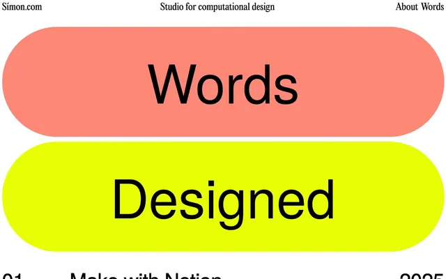
Set on a Sunset Blush (#fd8878) background with an extremely rounded 720px border-radius. Features large Tex Gyre Heros text, 173px, weight 400, #000000 color, with -1.5px letter-spacing. Padding a minimum of 95px top/bottom and 32px left/right.
Set on an Electric Yellow (#e8fe04) background with an extremely rounded 720px border-radius. Features large Tex Gyre Heros text, 173px, weight 400, #000000 color, with -1.5px letter-spacing. Padding a minimum of 95px top/bottom and 32px left/right.
Guidelines
- Prioritize high contrast: Always render #000000 text on Canvas White (#ffffff) or Electric Yellow (#e8fe04) / Sunset Blush (#fd8878) backgrounds.
- Use Tex Gyre Heros for all headlines and prominent text, varying weight between 300 and 400 based on emphasis.
- Employ Editorial New only for supportive, descriptive text or small footnotes, always at weight 400.
- Apply the extreme 720px border-radius only to large, block-level background elements, creating a 'pill' shape.
- Define interactive elements with a 1px solid #000000 border on hover, ensuring clear visual feedback.
- Maintain generous vertical spacing with 95px between major sections and 253px for long list item separations, creating a spacious, relaxed rhythm.
- Use distinct, vibrant color blocks (Sunset Blush or Electric Yellow) to highlight key words or section titles.
- Avoid using multiple font families for headlines or primary content; stick to Tex Gyre Heros for impact.
- Do not introduce gradients or shadows; the surface treatment is purposefully flat and stark.
- Do not deviate from the core monochromatic palette with additional chromatic colors, beyond Sunset Blush and Electric Yellow.
- Do not use small, subtle radii; either use the extreme 720px or keep corners sharp.
- Avoid decorative imagery or complex illustrations; the visual system is text-dominant and stark.
- Do not center text unless it's a primary display block; content generally aligns left.
- Refrain from using lightweight fonts for small text that needs to be highly readable; save fine weights for large display, and use Editorial New 400 for body.
About this system
ShowHide
Simon Riisnæs Emmen's design system is an unapologetic exploration of high-contrast typography and bold, simple color blocking. It uses stark black text on primary colored surfaces to create an assertive, almost confrontational visual impact. Elements are defined by strong horizontal and vertical lines, with extremely rounded shapes providing a playful counterpoint to the otherwise rigid structure. The overall impression is one of directness and creative confidence, relying on fundamental design principles rather than elaborate ornamentation.
The page exhibits a full-bleed layout, taking the full width of the viewport without a max-width container, though internal padding defines content areas. The hero section features large, colorful 'pill-shaped' blocks with centered, oversized text. Subsequent sections present content as a vertically stacked list of items, each separated by a prominent horizontal rule and generous padding. There's a strong emphasis on consistent vertical rhythm and clear visual separation between content blocks, with text generally aligned to the left within the page's implied content area.
This design system primarily relies on pure UI and typography; there is no discernible visual language for photography or complex illustrations. Iconography (if present) is expected to be simple, outlined, and monochromatic (#000000 on #ffffff). The content itself seems to be the primary visual element, often presented as bold text blocks within colored shapes or as simple list items.
Reminiscent of Are.na, Brutalist Websites, The Browser Company (Arc browser website).
# Simon Riisnæs Emmen — Style Reference
> Vibrant billboard minimalism.

**Theme:** light

**Site:** https://xn--smon-vpa.com

Simon Riisnæs Emmen's design system is an unapologetic exploration of high-contrast typography and bold, simple color blocking. It uses stark black text on primary colored surfaces to create an assertive, almost confrontational visual impact. Elements are defined by strong horizontal and vertical lines, with extremely rounded shapes providing a playful counterpoint to the otherwise rigid structure. The overall impression is one of directness and creative confidence, relying on fundamental design principles rather than elaborate ornamentation.

## Tokens — Colors

| Name | Value | Token | Role |
|------|------|------|------|
| Sunset Blush | `#fd8878` | `--color-sunset-blush` | Primary accent surface for headline blocks – bold background for prominent text |
| Electric Yellow | `#e8fe04` | `--color-electric-yellow` | Secondary accent surface for headline blocks – vibrant background for prominent text |
| Midnight Ink | `#000000` | `--color-midnight-ink` | Dark borders and separators for elevated surfaces and inverted UI. Do not promote it to the primary CTA color |
| Canvas White | `#ffffff` | `--color-canvas-white` | Page backgrounds, surface background for list items |

## Tokens — Typography

### Tex Gyre Heros
- **Substitute:** Helvetica Neue
- **Weights:** 300, 400
- **Sizes:** 29px, 32px, 67px, 173px
- **Line height:** 0.9, 1.2
- **Letter spacing:** -1.5px at 173px, -0.48px at 32px, -0.43px at 29px
- **Role:** Dominant display font for headlines and prominent interactive elements. Its condensed structure and tight letter-spacing at large sizes contribute to the direct, billboard-like aesthetic. Weight 300 for emphasis, 400 for general text.

### Editorial New
- **Substitute:** Playfair Display
- **Weights:** 400
- **Sizes:** 29px
- **Line height:** 1.1, 1.44
- **Letter spacing:** normal
- **Role:** Subordinate text and details, providing a classic, serif counterpoint to the bold sans-serif headlines. Normal letter-spacing offers readability for body-like content.

## Tokens — Type Scale

| Role | Size | Line height | Letter spacing |
|------|------|------|------|
| body | 29px | 1.44 | — |
| subheading | 32px | 1.2 | -0.48px |
| heading | 67px | 0.9 | -1px |
| display | 173px | 0.9 | -1.5px |

## Tokens — Spacing

- **Section gap:** 95px
- **Card padding:** 6px
- **Element gap:** 6px

## Tokens — Radius

- **Default:** 0px
- **displayBlocks:** 720px

## Layout

The page exhibits a full-bleed layout, taking the full width of the viewport without a max-width container, though internal padding defines content areas. The hero section features large, colorful 'pill-shaped' blocks with centered, oversized text. Subsequent sections present content as a vertically stacked list of items, each separated by a prominent horizontal rule and generous padding. There's a strong emphasis on consistent vertical rhythm and clear visual separation between content blocks, with text generally aligned to the left within the page's implied content area.

## Imagery

This design system primarily relies on pure UI and typography; there is no discernible visual language for photography or complex illustrations. Iconography (if present) is expected to be simple, outlined, and monochromatic (#000000 on #ffffff). The content itself seems to be the primary visual element, often presented as bold text blocks within colored shapes or as simple list items.

## Components

### Header Navigation Link
*Interactive text link in the page header.*

Plain #000000 text at 29px Tex Gyre Heros, weight 400. Subtle underline appears on hover (implied by border evidence).

### Main Navigation/List Item
*Interactive element for the main content list, indicating projects or articles.*

Tex Gyre Heros, 29px or 32px, mostly weight 400, #000000 text. Items are underlined with a 1px #000000 solid border on hover/active states, and have 253px padding-bottom to separate content heavily.

### Headline Display Block - Words
*Primary attention-grabbing headline element, visually distinct product name.*

Set on a Sunset Blush (#fd8878) background with an extremely rounded 720px border-radius. Features large Tex Gyre Heros text, 173px, weight 400, #000000 color, with -1.5px letter-spacing. Padding a minimum of 95px top/bottom and 32px left/right.

### Headline Display Block - Designed
*Secondary attention-grabbing headline element, visually distinct product noun.*

Set on an Electric Yellow (#e8fe04) background with an extremely rounded 720px border-radius. Features large Tex Gyre Heros text, 173px, weight 400, #000000 color, with -1.5px letter-spacing. Padding a minimum of 95px top/bottom and 32px left/right.

## Guidelines

### Do

- Prioritize high contrast: Always render #000000 text on Canvas White (#ffffff) or Electric Yellow (#e8fe04) / Sunset Blush (#fd8878) backgrounds.
- Use Tex Gyre Heros for all headlines and prominent text, varying weight between 300 and 400 based on emphasis.
- Employ Editorial New only for supportive, descriptive text or small footnotes, always at weight 400.
- Apply the extreme 720px border-radius only to large, block-level background elements, creating a 'pill' shape.
- Define interactive elements with a 1px solid #000000 border on hover, ensuring clear visual feedback.
- Maintain generous vertical spacing with 95px between major sections and 253px for long list item separations, creating a spacious, relaxed rhythm.
- Use distinct, vibrant color blocks (Sunset Blush or Electric Yellow) to highlight key words or section titles.

### Don't

- Avoid using multiple font families for headlines or primary content; stick to Tex Gyre Heros for impact.
- Do not introduce gradients or shadows; the surface treatment is purposefully flat and stark.
- Do not deviate from the core monochromatic palette with additional chromatic colors, beyond Sunset Blush and Electric Yellow.
- Do not use small, subtle radii; either use the extreme 720px or keep corners sharp.
- Avoid decorative imagery or complex illustrations; the visual system is text-dominant and stark.
- Do not center text unless it's a primary display block; content generally aligns left.
- Refrain from using lightweight fonts for small text that needs to be highly readable; save fine weights for large display, and use Editorial New 400 for body.

## Agent Prompt Guide

Quick Color Reference:
text: #000000
background: #ffffff
border: #000000
accent: no distinct accent color
primary action: no distinct CTA color

Example Component Prompts:
1. Create a Header Navigation Link: Use Tex Gyre Heros, weight 400, size 29px, color #000000, with a 1px solid #000000 bottom border on hover.
2. Design a Headline Display Block with 'Words' text: #fd8878 background, 720px border-radius. Text is 'Words', Tex Gyre Heros, 173px, weight 400, #000000 color, letter-spacing -1.5px. Padding 95px vertical, 32px horizontal.
3. Create a Main List Item: #ffffff background, Tex Gyre Heros, 29px, weight 400, #000000 text. Include a 1px solid #000000 bottom border, and 253px padding-bottom for separation. Item reads '01 Make with Notion 2025'.
More like this









Keep what you find
A free account saves references to boards and can send you a weekly email of picks based on what you save.
To see every result, go Pro.