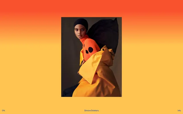
Preview image. Unlock full-res
Shifting theatrical backdrop.
Color palette
Supporting palette color for small decorative accents when the core palette needs contrast.
Vivid accent background for specific portfolio sections, providing a high-saturation, energetic shift from adjacent colors
Deep, muted red background for specific portfolio sections, adding a warm and earthy tone
Vivid gold background for specific portfolio sections, providing a rich, autumnal accent
Intense, vivid red background for specific portfolio sections, commanding attention
Warm, moderate orange background for particular portfolio content, suggesting natural warmth
Dark borders and separators for elevated surfaces and inverted UI. Do not promote it to the primary CTA color
Dominant background for the underlying canvas, appearing when richer color sections are not present or act as a default page fill
Hairline borders, dividers, input outlines, and card edges on light surfaces. Do not promote it to the primary CTA color
Pale, near-achromatic background for portfolio sections, creating a soft, understated visual break
Typography
- Weights
- 400
- Sizes
- 16px
- Line height
- 1, 1.2
- Fallback
- Helvetica Neue
The singular typeface for all content and UI elements, conveying a consistent, modern editorial tone. Its presence at a single weight highlights the content and photography without typographic competition.
Spacing & shape
Components
Text in Pure White (#ffffff) with a 1px border in Pure White (#ffffff), no background or padding. Emphasizes content over interactive elements.
Completely borderless and shadowless card with no padding, allowing the image to dominate the visual space. Relies on the background color shifts to delineate content blocks. The inner image is often bordered by Black Ink (#000000).
Displays 'Simone Sniekers' at 16px, weight 400 (Neue Haas Grotesk / Helvetica Neue), in Black Ink (#000000) against light backgrounds or Pure White (#ffffff) against dark/colored backgrounds, with a line-height of 1.2.
Text is 16px, weight 400 (Neue Haas Grotesk / Helvetica Neue), with a line-height of 1.0. Color depends on context: Black Ink (#000000) on light backgrounds, Pure White (#ffffff) on dark/colored backgrounds.
Guidelines
- Use full-bleed background colors for distinct page sections, shifting between a vibrant palette and a restrained, almost achromatic set.
- Prioritize large-scale, unadorned photography as the central content, with UI elements acting as minimal overlays.
- Employ Neue Haas Grotesk (or Helvetica Neue) at 16px in weight 400 for all text, maintaining a consistent, understated typographic voice.
- Delineate interactive text regions with a simple 1px border in #ffffff when on dark backgrounds, or #000000 on light backgrounds.
- Maintain strict absence of border-radius or box-shadows on all components to preserve a flat, editorial aesthetic.
- Use color purely for background statements and text contrast; avoid decorative or illustrative color. The page background is the primary color vehicle.
- Employ 0px padding and margin on core content blocks like image cards, allowing images to extend to the visual edge of their containers.
- Do not introduce multiple font families or weights; stick to Neue Haas Grotesk 400 for all text.
- Avoid using box-shadows or any form of elevation except for subtle border shifts for interaction states.
- Do not add superfluous padding or margins around images within image cards; let them fill the available space.
- Do not introduce small, decorative UI elements or complex layouts; the design is about large content blocks and background color shifts.
- Avoid any chromatic colors for text or borders unless it is one of the designated background accent colors used as text in rare cases.
- Do not use generic 'info', 'success', 'warning' semantic colors; the palette is exclusively brand and neutral tied to editorial sections.
- Do not break the flat aesthetic with gradients or complex visual effects on components; gradients are reserved for the full-page background only.
About this system
ShowHide
Simone Sniekers' visual identity is a theatrical canvas for large-scale photography, characterized by bold, shifting background colors that act as dynamic stage backdrops. Minimalist typography and components recede to highlight the imagery, creating an immersive, editorial feel. The frequent full-page background color changes define each section as a distinct act within a larger portfolio narrative. White text and borders provide stark contrast against the vivid, unpredictable color shifts.
The page operates on a full-bleed, responsive model where each major section takes on a distinct background color, creating a dynamic progression down the page. There is no fixed max-width, allowing content to stretch across the viewport. The hero section prominently features a full-bleed gradient background that frames a central portfolio image. Subsequent sections alternate between large editorial photographs and minimal text, with wide vertical spacing (e.g., 48px) between these blocks. Content is generally centered or implicitly aligned by the full-bleed imagery, avoiding complex grid structures in favor of sequential, large-format presentations. Navigation is minimal, typically confined to small text links placed discretely at the bottom of the viewport or within the footer area, ensuring an uninterrupted focus on the visual content.
This site features high-quality, professional photography, primarily editorial fashion and stylistic still lifes. Images are presented full-bleed within their sections or contained within a subtle border, serving as the absolute focal point of each content block. The treatment is direct and impactful, with strong stylistic choices in the photography itself, rather than complex digital manipulation on the site. There are no illustrations or abstract graphics; it's a showcase of photographic work. Iconography is absent, reinforcing a text-light, image-dominant presentation where visuals convey meaning and atmosphere.
Reminiscent of AIGA Eye on Design, The Brand Identity, Vogue.com (editorial archives), Actual Source.
# Simone Sniekers — Style Reference
> Shifting theatrical backdrop.

**Theme:** mixed

**Site:** https://www.simonesniekers.com

Simone Sniekers' visual identity is a theatrical canvas for large-scale photography, characterized by bold, shifting background colors that act as dynamic stage backdrops. Minimalist typography and components recede to highlight the imagery, creating an immersive, editorial feel. The frequent full-page background color changes define each section as a distinct act within a larger portfolio narrative. White text and borders provide stark contrast against the vivid, unpredictable color shifts.

## Tokens — Colors

| Name | Value | Token | Role |
|------|------|------|------|
| Ember Gradient | `#f9532d` | `--color-ember-gradient` | Supporting palette color for small decorative accents when the core palette needs contrast. |
| Accelerator Yellow | `#eae800` | `--color-accelerator-yellow` | Vivid accent background for specific portfolio sections, providing a high-saturation, energetic shift from adjacent colors |
| Desert Rose | `#926560` | `--color-desert-rose` | Deep, muted red background for specific portfolio sections, adding a warm and earthy tone |
| Harvest Gold | `#d0a43e` | `--color-harvest-gold` | Vivid gold background for specific portfolio sections, providing a rich, autumnal accent |
| Fiery Crimson | `#e01365` | `--color-fiery-crimson` | Intense, vivid red background for specific portfolio sections, commanding attention |
| Ginger Bread | `#b18759` | `--color-ginger-bread` | Warm, moderate orange background for particular portfolio content, suggesting natural warmth |
| Black Ink | `#000000` | `--color-black-ink` | Dark borders and separators for elevated surfaces and inverted UI. Do not promote it to the primary CTA color |
| Winter Mist | `#bcbcbc` | `--color-winter-mist` | Dominant background for the underlying canvas, appearing when richer color sections are not present or act as a default page fill |
| Pure White | `#ffffff` | `--color-pure-white` | Hairline borders, dividers, input outlines, and card edges on light surfaces. Do not promote it to the primary CTA color |
| Cloud Gray | `#cccbbb` | `--color-cloud-gray` | Pale, near-achromatic background for portfolio sections, creating a soft, understated visual break |

## Tokens — Typography

### Neue Haas Grotesk
- **Substitute:** Helvetica Neue
- **Weights:** 400
- **Sizes:** 16px
- **Line height:** 1, 1.2
- **Role:** The singular typeface for all content and UI elements, conveying a consistent, modern editorial tone. Its presence at a single weight highlights the content and photography without typographic competition.

## Tokens — Spacing

- **Section gap:** 48px
- **Card padding:** 0px
- **Element gap:** 16px

## Tokens — Radius

- **none:** 0px

## Layout

The page operates on a full-bleed, responsive model where each major section takes on a distinct background color, creating a dynamic progression down the page. There is no fixed max-width, allowing content to stretch across the viewport. The hero section prominently features a full-bleed gradient background that frames a central portfolio image. Subsequent sections alternate between large editorial photographs and minimal text, with wide vertical spacing (e.g., 48px) between these blocks. Content is generally centered or implicitly aligned by the full-bleed imagery, avoiding complex grid structures in favor of sequential, large-format presentations. Navigation is minimal, typically confined to small text links placed discretely at the bottom of the viewport or within the footer area, ensuring an uninterrupted focus on the visual content.

## Imagery

This site features high-quality, professional photography, primarily editorial fashion and stylistic still lifes. Images are presented full-bleed within their sections or contained within a subtle border, serving as the absolute focal point of each content block. The treatment is direct and impactful, with strong stylistic choices in the photography itself, rather than complex digital manipulation on the site. There are no illustrations or abstract graphics; it's a showcase of photographic work. Iconography is absent, reinforcing a text-light, image-dominant presentation where visuals convey meaning and atmosphere.

## Components

### Ghost Navigation Button
*Tertiary navigation element, typically found in footers or global info sections.*

Text in Pure White (#ffffff) with a 1px border in Pure White (#ffffff), no background or padding. Emphasizes content over interactive elements.

### Image Card
*Primary content display for portfolio pieces.*

Completely borderless and shadowless card with no padding, allowing the image to dominate the visual space. Relies on the background color shifts to delineate content blocks. The inner image is often bordered by Black Ink (#000000).

### Header Title
*Main brand identification and page title.*

Displays 'Simone Sniekers' at 16px, weight 400 (Neue Haas Grotesk / Helvetica Neue), in Black Ink (#000000) against light backgrounds or Pure White (#ffffff) against dark/colored backgrounds, with a line-height of 1.2.

### Information Link
*General links for contact and external profiles.*

Text is 16px, weight 400 (Neue Haas Grotesk / Helvetica Neue), with a line-height of 1.0. Color depends on context: Black Ink (#000000) on light backgrounds, Pure White (#ffffff) on dark/colored backgrounds.

## Guidelines

### Do

- Use full-bleed background colors for distinct page sections, shifting between a vibrant palette and a restrained, almost achromatic set.
- Prioritize large-scale, unadorned photography as the central content, with UI elements acting as minimal overlays.
- Employ Neue Haas Grotesk (or Helvetica Neue) at 16px in weight 400 for all text, maintaining a consistent, understated typographic voice.
- Delineate interactive text regions with a simple 1px border in #ffffff when on dark backgrounds, or #000000 on light backgrounds.
- Maintain strict absence of border-radius or box-shadows on all components to preserve a flat, editorial aesthetic.
- Use color purely for background statements and text contrast; avoid decorative or illustrative color. The page background is the primary color vehicle.
- Employ 0px padding and margin on core content blocks like image cards, allowing images to extend to the visual edge of their containers.

### Don't

- Do not introduce multiple font families or weights; stick to Neue Haas Grotesk 400 for all text.
- Avoid using box-shadows or any form of elevation except for subtle border shifts for interaction states.
- Do not add superfluous padding or margins around images within image cards; let them fill the available space.
- Do not introduce small, decorative UI elements or complex layouts; the design is about large content blocks and background color shifts.
- Avoid any chromatic colors for text or borders unless it is one of the designated background accent colors used as text in rare cases.
- Do not use generic 'info', 'success', 'warning' semantic colors; the palette is exclusively brand and neutral tied to editorial sections.
- Do not break the flat aesthetic with gradients or complex visual effects on components; gradients are reserved for the full-page background only.

## Agent Prompt Guide

Quick Color Reference:
text: #000000
background: #bcbcbc
border: #000000
accent: #eae800 (Accelerator Yellow)
primary action: no distinct CTA color

Example Component Prompts:
1. Create a full-screen, full-bleed hero section with a linear-gradient(135deg, #f9532d, #ffc451) background. Include a centered image, with the title 'Simone Sniekers' below it using Neue Haas Grotesk 400 at 16px, line-height 1.2, in Pure White (#ffffff).
2. Design a portfolio section with the background color #eae800 (Accelerator Yellow). It should contain a large, full-width image with a thin 1px Black Ink (#000000) border, and below it, an image caption in Black Ink (#000000) using Neue Haas Grotesk 400 at 16px, line-height 1.2.
3. Create a footer with a Black Ink (#000000) background. Include a ghost navigation button for 'Info' with text and border in Pure White (#ffffff), Neue Haas Grotesk 400 at 16px, line-height 1.0, with no padding or additional styling, positioned to the right. A similar ghost button '0%' is on the left. The artist credit 'Simone Sniekers' is centered at the bottom of the page in Pure White (#ffffff) text and same font styles.
More like this







Keep what you find
A free account saves references to boards and can send you a weekly email of picks based on what you save.
To see every result, go Pro.