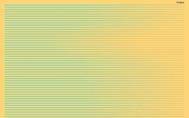
Preview image. Unlock full-res
sunny minimal exhibition
Color palette
Dominant page background and primary surface color, providing a warm, inviting foundation for all content
Navigation borders, active text states, and decorative elements; acts as the sole chromatic accent on the amber background; Background for full-width decorative elements and banners, blending the Jade Accent with the warmer tones of the canvas
Primary text, headings, and significant borders, establishing strong contrast against the warm canvas
Typography
- Weights
- 400, 700
- Sizes
- 16px, 23px, 24px, 147px
- Line height
- 1, 1.15, 1.22
- Letter spacing
- -0.0250em at 147px, -0.0200em at 24px
- Fallback
- Arial
Used for all primary headings, body text, navigation elements, and links. Its semi-bold weights create a sense of directness in an otherwise sparse layout.
- Weights
- 400
- Sizes
- 20px, 21px
- Line height
- 1.15, 1.2, 1.3
- Letter spacing
- normal
- Fallback
- Georgia
Used sparingly for italicized or more traditional text elements, providing a subtle counterpoint to the dominant sans-serif.
Spacing & shape
Components
Text uses Untitled Sans, weight 400, color Midnight Ink (#171717). No explicit padding listed, but context around 'Index' implies compact spacing, possibly a small margin-top of 5px and margin-bottom of 7px. No border or background.
A thin, prominent border. Color is Jade Accent (#81d6b9). Used below navigation text, often filling the width of the navigation area, with a substantial top padding of 35px.
Untitled Sans, weight 700, size 147px, line height 1.0, color Midnight Ink (#171717), letter-spacing -0.025em. Typically centered or left-aligned, occupying significant visual space.
Untitled Sans, weight 400, size 23px, line height 1.22, color Midnight Ink (#171717). Paragraphs have a 23px margin-bottom.
Signifier, weight 400, size 20px, line height 1.3, color Midnight Ink (#171717).
Guidelines
- Always use Amber Canvas (#fcd579) as the dominant background color for pages and sections.
- Apply Midnight Ink (#171717) for all primary text, headings, and strong UI boundaries.
- Reserve Jade Accent (#81d6b9) exclusively for active navigation states, borders that indicate interaction, or limited decorative stripes.
- Utilize Untitled Sans for all primary textual content, varying weights (400, 700) and sizes (16px-147px) to establish hierarchy.
- Implement tight letter-spacing for large headlines (-0.025em at 147px) to maintain visual density.
- Maintain a compact element spacing of 5px between closely related items, and generous section spacing of 35px for visual breathing room.
- Do not introduce new chromatic colors; stick to Amber Canvas, Midnight Ink, and Jade Accent.
- Avoid using drop shadows or complex elevation; the design relies on stark contrast and flat surfaces.
- Do not use letter spacing on Signifier font; it should always be 'normal'.
- Avoid excessive imagery; when images are used, treat them as carefully composed elements within the layout.
- Do not use rounded corners; all UI elements should maintain sharp, 0px radii.
- Do not deviate from the specified font families; avoid system defaults or alternative sans-serif/serif fonts.
About this system
ShowHide
Sing-Sing's visual system evokes a playful yet sophisticated modernity, built on a sparse layout and bold, contrasting color. A vibrant, sun-drenched yellow serves as the expansive canvas, punctuated by sharp black typography and a singular teal accent. The design feels like a curated exhibition space, where content is deliberately placed and given ample room to breathe, suggesting value through restraint and striking color choices.
The page uses a full-bleed layout, where the Amber Canvas background extends edge-to-edge. Content appears to be centered within this expansive space, often in simple, large blocks. The hero section features a very large, centered headline directly on the colored background. Section rhythm is minimal, relying on clear visual breaks rather than explicit dividers, allowing the large headlines and images to dictate the flow. The main body content tends to be single-column or two-column sections, with text and imagery given ample individual space, creating an airy, uncrowded feel. Navigation is a minimalist top-right 'Index' link, opening into an overlay or expanded menu.
Imagery primarily consists of curated, somewhat abstracted artistic photographs or product shots, often showcasing interesting textures or compositions rather than explicit narratives. They are treated as embedded content blocks, flush with the Amber Canvas background and containing their own visual interest. There is a strong sense of a contained, editorial aesthetic. Icons are not a prominent feature, suggesting pure UI over symbolic graphics.
Reminiscent of AIGA, Frank, Chimero, Studio Airport, Build in Public (Li Jin).
# Sing-sing — Style Reference
> sunny minimal exhibition

**Theme:** light

**Site:** https://sing-sing.co

Sing-Sing's visual system evokes a playful yet sophisticated modernity, built on a sparse layout and bold, contrasting color. A vibrant, sun-drenched yellow serves as the expansive canvas, punctuated by sharp black typography and a singular teal accent. The design feels like a curated exhibition space, where content is deliberately placed and given ample room to breathe, suggesting value through restraint and striking color choices.

## Tokens — Colors

| Name | Value | Token | Role |
|------|------|------|------|
| Amber Canvas | `#fcd579` | `--color-amber-canvas` | Dominant page background and primary surface color, providing a warm, inviting foundation for all content |
| Jade Accent | `#81d6b9` | `--color-jade-accent` | Navigation borders, active text states, and decorative elements; acts as the sole chromatic accent on the amber background; Background for full-width decorative elements and banners, blending the Jade Accent with the warmer tones of the canvas |
| Midnight Ink | `#171717` | `--color-midnight-ink` | Primary text, headings, and significant borders, establishing strong contrast against the warm canvas |

## Tokens — Typography

### untitledsans
- **Substitute:** Arial
- **Weights:** 400, 700
- **Sizes:** 16px, 23px, 24px, 147px
- **Line height:** 1, 1.15, 1.22
- **Letter spacing:** -0.0250em at 147px, -0.0200em at 24px
- **Role:** Used for all primary headings, body text, navigation elements, and links. Its semi-bold weights create a sense of directness in an otherwise sparse layout.

### signifier
- **Substitute:** Georgia
- **Weights:** 400
- **Sizes:** 20px, 21px
- **Line height:** 1.15, 1.2, 1.3
- **Letter spacing:** normal
- **Role:** Used sparingly for italicized or more traditional text elements, providing a subtle counterpoint to the dominant sans-serif.

## Tokens — Type Scale

| Role | Size | Line height | Letter spacing |
|------|------|------|------|
| body | 16px | 1.15 | — |
| subheading | 24px | 1.15 | -0.48px |
| display | 147px | 1 | -3.675px |

## Tokens — Spacing

- **Section gap:** 35px
- **Card padding:** 23px
- **Element gap:** 5px

## Tokens — Radius

- **none:** 0px

## Layout

The page uses a full-bleed layout, where the Amber Canvas background extends edge-to-edge. Content appears to be centered within this expansive space, often in simple, large blocks. The hero section features a very large, centered headline directly on the colored background. Section rhythm is minimal, relying on clear visual breaks rather than explicit dividers, allowing the large headlines and images to dictate the flow. The main body content tends to be single-column or two-column sections, with text and imagery given ample individual space, creating an airy, uncrowded feel. Navigation is a minimalist top-right 'Index' link, opening into an overlay or expanded menu.

## Imagery

Imagery primarily consists of curated, somewhat abstracted artistic photographs or product shots, often showcasing interesting textures or compositions rather than explicit narratives. They are treated as embedded content blocks, flush with the Amber Canvas background and containing their own visual interest. There is a strong sense of a contained, editorial aesthetic. Icons are not a prominent feature, suggesting pure UI over symbolic graphics.

## Components

### Primary Navigation Link (Default)
*Interactive text link within the main navigation.*

Text uses Untitled Sans, weight 400, color Midnight Ink (#171717). No explicit padding listed, but context around 'Index' implies compact spacing, possibly a small margin-top of 5px and margin-bottom of 7px. No border or background.

### Navigation Divider (Active State)
*Subtle visual indicator for active or highlighted navigation items.*

A thin, prominent border. Color is Jade Accent (#81d6b9). Used below navigation text, often filling the width of the navigation area, with a substantial top padding of 35px.

### Decorative Headline
*Large, attention-grabbing text for main titles or section headers.*

Untitled Sans, weight 700, size 147px, line height 1.0, color Midnight Ink (#171717), letter-spacing -0.025em. Typically centered or left-aligned, occupying significant visual space.

### Body Text Block (Untitled Sans)
*Standard body copy for general information.*

Untitled Sans, weight 400, size 23px, line height 1.22, color Midnight Ink (#171717). Paragraphs have a 23px margin-bottom.

### Body Text Block (Signifier)
*Secondary body copy or descriptive text, often with a more traditional feel.*

Signifier, weight 400, size 20px, line height 1.3, color Midnight Ink (#171717).

## Guidelines

### Do

- Always use Amber Canvas (#fcd579) as the dominant background color for pages and sections.
- Apply Midnight Ink (#171717) for all primary text, headings, and strong UI boundaries.
- Reserve Jade Accent (#81d6b9) exclusively for active navigation states, borders that indicate interaction, or limited decorative stripes.
- Utilize Untitled Sans for all primary textual content, varying weights (400, 700) and sizes (16px-147px) to establish hierarchy.
- Implement tight letter-spacing for large headlines (-0.025em at 147px) to maintain visual density.
- Maintain a compact element spacing of 5px between closely related items, and generous section spacing of 35px for visual breathing room.

### Don't

- Do not introduce new chromatic colors; stick to Amber Canvas, Midnight Ink, and Jade Accent.
- Avoid using drop shadows or complex elevation; the design relies on stark contrast and flat surfaces.
- Do not use letter spacing on Signifier font; it should always be 'normal'.
- Avoid excessive imagery; when images are used, treat them as carefully composed elements within the layout.
- Do not use rounded corners; all UI elements should maintain sharp, 0px radii.
- Do not deviate from the specified font families; avoid system defaults or alternative sans-serif/serif fonts.

## Agent Prompt Guide

Quick Color Reference:
- text: #171717
- background: #fcd579
- border: #171717
- accent: #81d6b9
- primary action: no distinct CTA color

Example Component Prompts:

1. Create a hero banner: background Amber Canvas (#fcd579). Headline 'Sing Sing' in Midnight Ink (#171717), using untitledsans weight 700, size 147px, line height 1.0, letter-spacing -0.025em. Place a 'Index' navigation link at top right in Midnight Ink (#171717) using untitledsans weight 400, size 16px.
2. Design a multi-line paragraph of informative text: uses Signifier font weight 400, size 20px, line height 1.3, color Midnight Ink (#171717). Ensure a 23px margin-bottom for the paragraph.
3. Implement a navigation item: text 'Studio' in untitledsans weight 400, size 16px, color Midnight Ink (#171717). Below it, optionally add a 1px border spanning the width of the navigation container, color Jade Accent (#81d6b9).
4. Create a full-width header for a section: background Amber Canvas (#fcd579). Place 'Collaborative studio based in Los Angeles, CA' in Midnight Ink (#171717), using untitledsans weight 400, size 23px, line height 1.22, with 23px margin-bottom.
More like this









Keep what you find
A free account saves references to boards and can send you a weekly email of picks based on what you save.
To see every result, go Pro.