Preview image. Unlock full-res
Midnight command center, high-contrast; functionality through dark surfaces and illuminated accents.
Color palette
Distinctive background accent for special sections like navigation, content blocks — signifies emphasis or a change in atmosphere
Violet outline accent for tags, dividers, and focused UI edges. Do not promote it to the primary CTA color
Violet outline accent for tags, dividers, and focused UI edges. Do not promote it to the primary CTA color
Primary page background, component backgrounds, ghost button borders (neutral)
Subtle ghost button background
Secondary surface background, subtle dividers
Primary text, prominent borders, icon fills, ghost button text
Subtle text, less prominent borders, tertiary surface backgrounds
Typography
- Weights
- 400, 700
- Sizes
- 16px, 32px
- Line height
- 1.2
- Letter spacing
- normal
- Fallback
- Arial
General body text and subheadings. Its clean, utilitarian nature provides a stable base against the more decorative display fonts, ensuring readability in information-dense sections.
- Weights
- 200, 500, 600
- Sizes
- 11px, 12px, 14px, 15px
- Line height
- 1, 1.13, 2
- Letter spacing
- 0.1em
- Fallback
- Montserrat
Secondary display font for headings and calls to action. Its wide letter-spacing creates a deliberate, almost typographic poster-like feel, establishing a distinct visual voice.
- Weights
- 400, 500, 700
- Sizes
- 11px, 14px, 15px
- Line height
- 1, 2.15
- Letter spacing
- 0.05em
- Fallback
- Noto Sans JP
Japanese body text and navigation. A critical component for conveying brand identity in bilingual contexts, ensuring consistent high-quality rendering of Japanese characters with a slightly expanded tracking.
- Weights
- 400
- Sizes
- 16px
- Line height
- 1
- Letter spacing
- 0.2em
- Fallback
- Oswald
Decorative accent text, potentially for labels or minor headings. Its extremely wide letter-spacing acts as a pure design element rather than a primary content vehicle, demanding attention through its sparse appearance.
Spacing & shape
Components
Transparent background, 'White Frost' text (#ffffff), no visible border. Minimalist and blends into the dark canvas, relying on active states for discoverability. Uses Helvetica Neue, 16px.
Transparent background, 'White Frost' text (#ffffff), but featuring a 'Midnight Canvas' (black) border. This variant offers a slightly more defined presence while maintaining a 'ghost' aesthetic. Uses 27.5px border radius if observed.
Transparent background, 'White Frost' text (#ffffff), 'Midnight Canvas' (black) border, with a fully circular shape (100% border-radius). Used for visually distinct, often icon-only interactions. The current example has no padding.
Semi-transparent 'White Frost' (25% opacity) background, 'White Frost' text (#ffffff), rounded corners at 27.5px. Provides a low-contrast interactive element that is slightly more prominent than a pure ghost button.
Background can be 'Midnight Canvas' (#000000) or 'Ignition Orange' (#5a1501). Text primarily 'White Frost' (#ffffff) using Helvetica Neue at normal letter spacing. Contains links and announcements, often full-width.
Background set to 'Ignition Orange' (#5a1501) with 'White Frost' (#ffffff) text. Used to break up the dominant dark background and highlight specific content or periods, often seen in navigation or special feature blocks.
Guidelines
- Always default to 'Midnight Canvas' (#000000) as the background for new sections.
- Use 'White Frost' (#ffffff) for all primary text and critical UI elements against dark backgrounds.
- Apply 'Ignition Orange' (#5a1501) sparingly for high-impact background sections or thematic content blocks, never for small interactive elements.
- Utilize a 27.5px border-radius for interactive buttons and forms to unify their appearance, except for fully circular elements, which use 1440px.
- Employ the 'Termina' font with 0.1em letter-spacing for major headings and display text to establish a distinct brand voice.
- Ensure interactive elements primarily use ghost or outlined styles, with solid fills reserved for subtle, secondary actions.
- Maintain a clear visual hierarchy by limiting prominent chromatic accents to 'Digital Violet' (#4554ac) for decorative purposes or 'Action Violet' (#5262be) for active text states.
- Avoid using multiple saturated colors; color should be highly controlled and primarily achromatic with a single brand accent.
- Do not use '#e8e9ed' for primary text; it is reserved for subtle secondary text or background elements.
- Do not introduce new typefaces; only 'Helvetica Neue', 'Termina', 'source-han-sans-japanese', and 'Glodok' are permitted.
- Avoid heavy shadows or gradients; interfaces should feel flat and direct.
- Do not create filled buttons unless specifically using the 'Subtle Ghost Button (Filled)' variant with 25% white opacity.
- Refrain from using tight letter-spacing for 'Termina' or 'Glodok'; their identity is defined by open tracking.
- Do not use 'Ignition Orange' (#5a1501) for small text or icons directly interacting with content, as it functions best as a background accent.
About this system
ShowHide
The SIRUP 5th Anniversary site presents a 'midnight command center' aesthetic, characterized by a deep black canvas punctuated by a single vibrant orange accent. Typography is a key identifier, mixing a system sans-serif for body text with several custom display fonts that feature wide letter-spacing. UI elements are dense and dark, with ghost buttons that blend into the background, hinting at interactive states through subtle borders and text color changes. The overall impression is one of intense focus and a strong, almost understated graphic sensibility.
The page primarily follows a full-bleed layout, where sections extend to the edge of the viewport. Content within these sections is often centered, forming distinct vertical blocks. The hero section is full-bleed dark with centered text. Section rhythm is established through alternating background colors, particularly the prominent 'Ignition Orange' (#5a1501) blocks interspersed with the primary 'Midnight Canvas' (#000000) background. Content arrangement leans towards centered stacks for main information and vertically-oriented lists or grids, allowing abundant whitespace for emphasis. Navigation is primarily a sticky header with a compact, ghost-button style that integrates seamlessly into the dark background.
This site features a 'no imagery, pure UI' approach. Visuals are entirely driven by typography, color blocks, and UI elements. The only visual content comes from small icons which appear to be monochrome or use the accent colors. There is a strong emphasis on stark, graphic presentation rather than photographic or illustrative content conveying mood or information.
Reminiscent of A-Trak, The Weeknd (Album Sites), Rostam, HYPERBEAST.
# SIRUP 5th Anniversary Special Site — Style Reference
> Midnight command center, high-contrast; functionality through dark surfaces and illuminated accents.

**Theme:** dark

**Site:** https://sirup.online/5th

The SIRUP 5th Anniversary site presents a 'midnight command center' aesthetic, characterized by a deep black canvas punctuated by a single vibrant orange accent. Typography is a key identifier, mixing a system sans-serif for body text with several custom display fonts that feature wide letter-spacing. UI elements are dense and dark, with ghost buttons that blend into the background, hinting at interactive states through subtle borders and text color changes. The overall impression is one of intense focus and a strong, almost understated graphic sensibility.

## Tokens — Colors

| Name | Value | Token | Role |
|------|------|------|------|
| Ignition Orange | `#5a1501` | `--color-ignition-orange` | Distinctive background accent for special sections like navigation, content blocks — signifies emphasis or a change in atmosphere |
| Digital Violet | `#4554ac` | `--color-digital-violet` | Violet outline accent for tags, dividers, and focused UI edges. Do not promote it to the primary CTA color |
| Action Violet | `#5262be` | `--color-action-violet` | Violet outline accent for tags, dividers, and focused UI edges. Do not promote it to the primary CTA color |
| Midnight Canvas | `#000000` | `--color-midnight-canvas` | Primary page background, component backgrounds, ghost button borders (neutral) |
| Ghost Fill Grey | `#404040` | `--color-ghost-fill-grey` | Subtle ghost button background |
| Muted Ash | `#666666` | `--color-muted-ash` | Secondary surface background, subtle dividers |
| White Frost | `#ffffff` | `--color-white-frost` | Primary text, prominent borders, icon fills, ghost button text |
| Smoke Gray | `#e8e9ed` | `--color-smoke-gray` | Subtle text, less prominent borders, tertiary surface backgrounds |

## Tokens — Typography

### Helvetica Neue
- **Substitute:** Arial
- **Weights:** 400, 700
- **Sizes:** 16px, 32px
- **Line height:** 1.2
- **Letter spacing:** normal
- **Role:** General body text and subheadings. Its clean, utilitarian nature provides a stable base against the more decorative display fonts, ensuring readability in information-dense sections.

### Termina
- **Substitute:** Montserrat
- **Weights:** 200, 500, 600
- **Sizes:** 11px, 12px, 14px, 15px
- **Line height:** 1, 1.13, 2
- **Letter spacing:** 0.1em
- **Role:** Secondary display font for headings and calls to action. Its wide letter-spacing creates a deliberate, almost typographic poster-like feel, establishing a distinct visual voice.

### source-han-sans-japanese
- **Substitute:** Noto Sans JP
- **Weights:** 400, 500, 700
- **Sizes:** 11px, 14px, 15px
- **Line height:** 1, 2.15
- **Letter spacing:** 0.05em
- **Role:** Japanese body text and navigation. A critical component for conveying brand identity in bilingual contexts, ensuring consistent high-quality rendering of Japanese characters with a slightly expanded tracking.

### Glodok
- **Substitute:** Oswald
- **Weights:** 400
- **Sizes:** 16px
- **Line height:** 1
- **Letter spacing:** 0.2em
- **Role:** Decorative accent text, potentially for labels or minor headings. Its extremely wide letter-spacing acts as a pure design element rather than a primary content vehicle, demanding attention through its sparse appearance.

## Tokens — Type Scale

Major Second (1.125) from 14px base.

| Role | Size | Line height | Letter spacing |
|------|------|------|------|
| caption | 11px | 1.13 | — |
| body-sm | 12px | 1.13 | — |
| body | 14px | 1.13 | — |
| body-lg | 15px | 1.13 | — |

## Tokens — Spacing

- **Section gap:** 75px
- **Card padding:** 18px
- **Element gap:** 4px

## Tokens — Radius

- **Default:** 2.5px
- **Buttons:** 27.5px
- **circular:** 1440px

## Layout

The page primarily follows a full-bleed layout, where sections extend to the edge of the viewport. Content within these sections is often centered, forming distinct vertical blocks. The hero section is full-bleed dark with centered text. Section rhythm is established through alternating background colors, particularly the prominent 'Ignition Orange' (#5a1501) blocks interspersed with the primary 'Midnight Canvas' (#000000) background. Content arrangement leans towards centered stacks for main information and vertically-oriented lists or grids, allowing abundant whitespace for emphasis. Navigation is primarily a sticky header with a compact, ghost-button style that integrates seamlessly into the dark background.

## Imagery

This site features a 'no imagery, pure UI' approach. Visuals are entirely driven by typography, color blocks, and UI elements. The only visual content comes from small icons which appear to be monochrome or use the accent colors. There is a strong emphasis on stark, graphic presentation rather than photographic or illustrative content conveying mood or information.

## Components

### Ghost Button (Text)
*Primary Call to Action, Navigation*

Transparent background, 'White Frost' text (#ffffff), no visible border. Minimalist and blends into the dark canvas, relying on active states for discoverability. Uses Helvetica Neue, 16px.

### Ghost Button (Outlined)
*Secondary Call to Action, Interactive elements*

Transparent background, 'White Frost' text (#ffffff), but featuring a 'Midnight Canvas' (black) border. This variant offers a slightly more defined presence while maintaining a 'ghost' aesthetic. Uses 27.5px border radius if observed.

### Circular Ghost Button
*Iconic Navigation, Close buttons*

Transparent background, 'White Frost' text (#ffffff), 'Midnight Canvas' (black) border, with a fully circular shape (100% border-radius). Used for visually distinct, often icon-only interactions. The current example has no padding.

### Subtle Ghost Button (Filled)
*Tertiary Call to Action, Toggle states*

Semi-transparent 'White Frost' (25% opacity) background, 'White Frost' text (#ffffff), rounded corners at 27.5px. Provides a low-contrast interactive element that is slightly more prominent than a pure ghost button.

### Navigation Bar
*Global Navigation, Announcements*

Background can be 'Midnight Canvas' (#000000) or 'Ignition Orange' (#5a1501). Text primarily 'White Frost' (#ffffff) using Helvetica Neue at normal letter spacing. Contains links and announcements, often full-width.

### Text Content Block (Orange Accent)
*Highlight sections, Thematic dividers*

Background set to 'Ignition Orange' (#5a1501) with 'White Frost' (#ffffff) text. Used to break up the dominant dark background and highlight specific content or periods, often seen in navigation or special feature blocks.

## Guidelines

### Do

- Always default to 'Midnight Canvas' (#000000) as the background for new sections.
- Use 'White Frost' (#ffffff) for all primary text and critical UI elements against dark backgrounds.
- Apply 'Ignition Orange' (#5a1501) sparingly for high-impact background sections or thematic content blocks, never for small interactive elements.
- Utilize a 27.5px border-radius for interactive buttons and forms to unify their appearance, except for fully circular elements, which use 1440px.
- Employ the 'Termina' font with 0.1em letter-spacing for major headings and display text to establish a distinct brand voice.
- Ensure interactive elements primarily use ghost or outlined styles, with solid fills reserved for subtle, secondary actions.
- Maintain a clear visual hierarchy by limiting prominent chromatic accents to 'Digital Violet' (#4554ac) for decorative purposes or 'Action Violet' (#5262be) for active text states.

### Don't

- Avoid using multiple saturated colors; color should be highly controlled and primarily achromatic with a single brand accent.
- Do not use '#e8e9ed' for primary text; it is reserved for subtle secondary text or background elements.
- Do not introduce new typefaces; only 'Helvetica Neue', 'Termina', 'source-han-sans-japanese', and 'Glodok' are permitted.
- Avoid heavy shadows or gradients; interfaces should feel flat and direct.
- Do not create filled buttons unless specifically using the 'Subtle Ghost Button (Filled)' variant with 25% white opacity.
- Refrain from using tight letter-spacing for 'Termina' or 'Glodok'; their identity is defined by open tracking.
- Do not use 'Ignition Orange' (#5a1501) for small text or icons directly interacting with content, as it functions best as a background accent.

## Agent Prompt Guide

Quick Color Reference:
- text: #ffffff
- background: #000000
- border: #000000 (neutral for ghost buttons)
- accent: #5a1501
- primary action: no distinct CTA color

Example Component Prompts:
- Create a section divider: 'Ignition Orange' (#5a1501) background, with 'White Frost' (#ffffff) text 'SIRUP 2017-2022' using Termina font at 15px, letterSpacing 0.1em.
- Design a ghost interaction button: 'White Frost' (#ffffff) text 'ROOTS PLAYLIST' on a transparent background, with a #000000 border-top, Helvetica Neue 16px, border-radius 27.5px.
- Build a navigation item: 'White Frost' (#ffffff) text 'SIRUP OFFICIAL SITE' using source-han-sans-japanese 14px, letterSpacing 0.05em, within a 'Midnight Canvas' (#000000) background strip.
- Create a subtle ghost button for a menu close: 'Action Violet' (#5262be) text 'CLOSE' with a transparent background, no border, Helvetica Neue 16px.
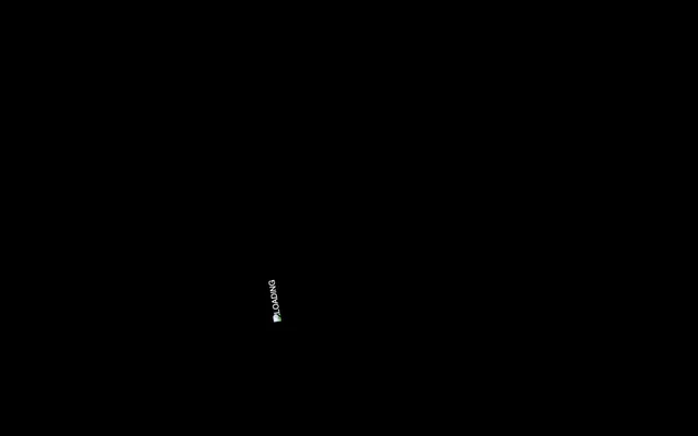
- Render a prominent brand text: 'Digital Violet' (#4554ac) text 'LOADING' using Glodok font at 16px, letterSpacing 0.2em, on a 'Midnight Canvas' (#000000) background.
More like this






Keep what you find
A free account saves references to boards and can send you a weekly email of picks based on what you save.
To see every result, go Pro.