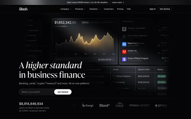
Preview image. Unlock full-res
Midnight Ledger, Obsidian Surfaces
Color palette
Decorative highlights, subtle hover effects, linear gradients for elevated elements. Provides a touch of luxury and prestige
Page background, deepest surface level. Creates a sense of depth and seriousness
Elevated card backgrounds, deeper shadows. A subtle lift from the main background
Primary surface background, such as panels and main content areas
Subtle background for card, button, and other interactive elements, providing a soft lift
Component backgrounds, such as card details and selected states. Less saturated than Charcoal Canvas
Muted secondary text, placeholder text, subtle borders. For less prominent information
Tertiary text, subtle icons, inactive navigation items. Lower hierarchy content
Helper text, slightly more prominent than Stone Text
Less important body text, slight relief from pure white
Dominant body text, strong contrast against dark backgrounds. Also used for outlined borders
Primary headings, active states, emphasized text, and button backgrounds. The brightest element
Typography
- Weights
- 300, 400, 500, 600, 700
- Sizes
- 12px, 13px, 14px, 15px, 16px, 18px, 20px, 24px, 32px, 48px, 52px
- Line height
- 1, 1.13, 1.25, 1.33, 1.38, 1.43, 1.5, 1.56
- Letter spacing
- -0.007, -0.007, -0.013, -0.013, -0.02, -0.02, -0.022, -0.025, -0.025, -0.04, -0.04
- Fallback
- system-ui
Primary typeface for all UI elements, body text, and functional components. Its clean, sans-serif design maintains legibility and a modern, technical feel across various densities and scales.
- Weights
- 400, 500
- Sizes
- 32px, 52px, 64px, 88px
- Line height
- 1, 1.13, 1.25
- Letter spacing
- 0.01, 0.01, 0.01, 0.01
- Fallback
- Playfair Display
Decorative display typeface for large, impactful headlines and hero text. The serif design provides an air of traditional luxury and authority, contrasting with the utilitarian Inter.
Spacing & shape
Components
backgroundColor: rgba(0, 0, 0, 0), color: Pure White (#ffffff), border: none, borderRadius: 0px, padding: 20px 0px.
backgroundColor: Pure White (#ffffff), color: Charcoal Canvas (#08080a), border: none, borderRadius: 9999px, padding: 0px 32px.
backgroundColor: rgba(0, 0, 0, 0), color: Pure White (#ffffff), border: 1px solid Pure White (#ffffff), borderRadius: 9999px, padding: 6px 10px.
backgroundColor: rgba(0, 0, 0, 0), color: Pure White (#ffffff), border: none, borderRadius: 4px, padding: 0px 8px.
backgroundColor: rgba(0, 0, 0, 0), borderRadius: 10px, boxShadow: none, padding: 0px.
backgroundColor: rgba(0, 0, 0, 0), color: Pure White (#ffffff), border: 1px solid Pure White (#ffffff), borderRadius: 9999px, padding: 10px 20px.
Guidelines
- Use Midnight Ink (#000000) as the base background for most pages to establish the dark theme.
- Prioritize Inter for all functional text: body, navigation, buttons, and forms, ensuring high legibility.
- Apply Ivy Presto for large headlines (above 32px) to introduce a classic, authoritative counterpoint to Inter.
- Maintain a compact density using 6px for elementGap and 16px as a multiplier for internal component spacing.
- Incorporate subtle Golden Gradient (#cc9166) on hover states or as a background for elevated, interactive elements, never as a solid background color.
- Use Pure White (#ffffff) for primary text and active states to ensure strong contrast and draw attention.
- Round corners with a 10px radius for cards and general content blocks, and 9999px for pill-shaped buttons and inputs.
- Avoid using bright, saturated colors for backgrounds or large areas, as the system relies on subtle tonal differences.
- Do not use Ivy Presto for body text or small UI elements; reserve it for large display headings.
- Do not break the dark canvas and dark surface hierarchy by introducing light-mode components.
- Refrain from heavy shadows or strong outlines; elevate elements through subtle background shifts and internal padding.
- Do not introduce additional font families or decorative elements that disrupt the high-contrast, professional aesthetic.
- Avoid arbitrary uses of Pure White (#ffffff) for backgrounds; reserve it for primary text and calls to action.
- Do not use gradients for body text or small icons; they are reserved for decorative accents and elevated visuals.
About this system
ShowHide
Slash adopts a high-contrast dark mode aesthetic for business finance: black canvases, subtly layered dark gray surfaces, and a striking white primary text. Inter typography provides utilitarian clarity, while Ivy Presto adds a touch of classic sophistication to display headlines. The system minimizes color, primarily using off-white for interaction and a warm, golden gradient for subtle accents and visual depth on elevated elements.
The page adheres to a max-width of 1216px, primarily featuring a centered content model. The hero section often presents a centered headline (Ivy Presto) over a dark, full-bleed background, with a prominent product screenshot or abstract graphic. Sections are demarcated by consistent vertical spacing of 160px, maintaining a spacious rhythm. Content often alternates between text-dominant blocks and graphical elements, including 2-column layouts for text-plus-visuals, and 3-column card grids for features. Navigation is a sticky top bar with a left-aligned logo and right-aligned actions.
This system primarily uses product screenshots and abstract, ethereal graphics. Product screenshots are typically contained within dark, rounded cards, sometimes with a soft blur. Abstract graphics often feature metallic or translucent elements with soft, golden gradients and refractions, creating depth and a premium feel. Icons are monochrome, generally outlined or filled in White Frost. Imagery serves both decorative atmosphere (abstracts) and explanatory content (product UI examples). The density is balanced, with imagery often integrated into information blocks rather than dominating the page.
Reminiscent of Ramp, Mercury, Brex, Stripe.
# Slash — Style Reference
> Midnight Ledger, Obsidian Surfaces

**Theme:** dark

**Site:** https://www.slash.com

Slash adopts a high-contrast dark mode aesthetic for business finance: black canvases, subtly layered dark gray surfaces, and a striking white primary text. Inter typography provides utilitarian clarity, while Ivy Presto adds a touch of classic sophistication to display headlines. The system minimizes color, primarily using off-white for interaction and a warm, golden gradient for subtle accents and visual depth on elevated elements.

## Tokens — Colors

| Name | Value | Token | Role |
|------|------|------|------|
| Golden Gradient | `#cc9166` | `--color-golden-gradient` | Decorative highlights, subtle hover effects, linear gradients for elevated elements. Provides a touch of luxury and prestige |
| Midnight Ink | `#000000` | `--color-midnight-ink` | Page background, deepest surface level. Creates a sense of depth and seriousness |
| Obsidian Surface | `#030304` | `--color-obsidian-surface` | Elevated card backgrounds, deeper shadows. A subtle lift from the main background |
| Charcoal Canvas | `#08080a` | `--color-charcoal-canvas` | Primary surface background, such as panels and main content areas |
| Pewter Accent | `#121317` | `--color-pewter-accent` | Subtle background for card, button, and other interactive elements, providing a soft lift |
| Slate Gray | `#1c1d22` | `--color-slate-gray` | Component backgrounds, such as card details and selected states. Less saturated than Charcoal Canvas |
| Ash Text | `#5e616e` | `--color-ash-text` | Muted secondary text, placeholder text, subtle borders. For less prominent information |
| Stone Text | `#777a88` | `--color-stone-text` | Tertiary text, subtle icons, inactive navigation items. Lower hierarchy content |
| Silver Text | `#acafb9` | `--color-silver-text` | Helper text, slightly more prominent than Stone Text |
| Porcelain Text | `#cdcdcd` | `--color-porcelain-text` | Less important body text, slight relief from pure white |
| White Frost | `#e2e3e9` | `--color-white-frost` | Dominant body text, strong contrast against dark backgrounds. Also used for outlined borders |
| Pure White | `#ffffff` | `--color-pure-white` | Primary headings, active states, emphasized text, and button backgrounds. The brightest element |

## Tokens — Typography

### Inter
- **Substitute:** system-ui
- **Weights:** 300, 400, 500, 600, 700
- **Sizes:** 12px, 13px, 14px, 15px, 16px, 18px, 20px, 24px, 32px, 48px, 52px
- **Line height:** 1, 1.13, 1.25, 1.33, 1.38, 1.43, 1.5, 1.56
- **Letter spacing:** -0.007, -0.007, -0.013, -0.013, -0.02, -0.02, -0.022, -0.025, -0.025, -0.04, -0.04
- **Role:** Primary typeface for all UI elements, body text, and functional components. Its clean, sans-serif design maintains legibility and a modern, technical feel across various densities and scales.

### Ivy Presto
- **Substitute:** Playfair Display
- **Weights:** 400, 500
- **Sizes:** 32px, 52px, 64px, 88px
- **Line height:** 1, 1.13, 1.25
- **Letter spacing:** 0.01, 0.01, 0.01, 0.01
- **Role:** Decorative display typeface for large, impactful headlines and hero text. The serif design provides an air of traditional luxury and authority, contrasting with the utilitarian Inter.

## Tokens — Type Scale

Augmented Fourth (1.414) from 16px base.

| Role | Size | Line height | Letter spacing |
|------|------|------|------|
| caption | 12px | 1.5 | -0.007em |
| body-sm | 14px | 1.43 | -0.013em |
| body | 16px | 1.38 | -0.02em |
| subheading | 20px | 1.33 | -0.022em |
| heading | 32px | 1.25 | -0.025em |
| heading-lg | 48px | 1.13 | -0.04em |
| display | 88px | 1 | 0.01em |

## Tokens — Spacing

- **Max width:** 1216px
- **Section gap:** 160px
- **Card padding:** 32px
- **Element gap:** 6px

## Tokens — Radius

- **md:** 10px
- **none:** 0px
- **pill:** 9999px
- **sm:** 2px

## Layout

The page adheres to a max-width of 1216px, primarily featuring a centered content model. The hero section often presents a centered headline (Ivy Presto) over a dark, full-bleed background, with a prominent product screenshot or abstract graphic. Sections are demarcated by consistent vertical spacing of 160px, maintaining a spacious rhythm. Content often alternates between text-dominant blocks and graphical elements, including 2-column layouts for text-plus-visuals, and 3-column card grids for features. Navigation is a sticky top bar with a left-aligned logo and right-aligned actions.

## Imagery

This system primarily uses product screenshots and abstract, ethereal graphics. Product screenshots are typically contained within dark, rounded cards, sometimes with a soft blur. Abstract graphics often feature metallic or translucent elements with soft, golden gradients and refractions, creating depth and a premium feel. Icons are monochrome, generally outlined or filled in White Frost. Imagery serves both decorative atmosphere (abstracts) and explanatory content (product UI examples). The density is balanced, with imagery often integrated into information blocks rather than dominating the page.

## Components

### Ghost Navigation Link
*Navigation links and subtle interactive text.*

backgroundColor: rgba(0, 0, 0, 0), color: Pure White (#ffffff), border: none, borderRadius: 0px, padding: 20px 0px.

### Pill Primary Button
*Main call-to-action buttons.*

backgroundColor: Pure White (#ffffff), color: Charcoal Canvas (#08080a), border: none, borderRadius: 9999px, padding: 0px 32px.

### Pill Ghost Button
*Secondary action buttons, less prominent than primary.*

backgroundColor: rgba(0, 0, 0, 0), color: Pure White (#ffffff), border: 1px solid Pure White (#ffffff), borderRadius: 9999px, padding: 6px 10px.

### Sharp Ghost Text Button
*Minimal interactive elements without strong visual weight.*

backgroundColor: rgba(0, 0, 0, 0), color: Pure White (#ffffff), border: none, borderRadius: 4px, padding: 0px 8px.

### Card Standard
*Container for content sections.*

backgroundColor: rgba(0, 0, 0, 0), borderRadius: 10px, boxShadow: none, padding: 0px.

### Pill Input Field
*Form input fields.*

backgroundColor: rgba(0, 0, 0, 0), color: Pure White (#ffffff), border: 1px solid Pure White (#ffffff), borderRadius: 9999px, padding: 10px 20px.

## Guidelines

### Do

- Use Midnight Ink (#000000) as the base background for most pages to establish the dark theme.
- Prioritize Inter for all functional text: body, navigation, buttons, and forms, ensuring high legibility.
- Apply Ivy Presto for large headlines (above 32px) to introduce a classic, authoritative counterpoint to Inter.
- Maintain a compact density using 6px for elementGap and 16px as a multiplier for internal component spacing.
- Incorporate subtle Golden Gradient (#cc9166) on hover states or as a background for elevated, interactive elements, never as a solid background color.
- Use Pure White (#ffffff) for primary text and active states to ensure strong contrast and draw attention.
- Round corners with a 10px radius for cards and general content blocks, and 9999px for pill-shaped buttons and inputs.

### Don't

- Avoid using bright, saturated colors for backgrounds or large areas, as the system relies on subtle tonal differences.
- Do not use Ivy Presto for body text or small UI elements; reserve it for large display headings.
- Do not break the dark canvas and dark surface hierarchy by introducing light-mode components.
- Refrain from heavy shadows or strong outlines; elevate elements through subtle background shifts and internal padding.
- Do not introduce additional font families or decorative elements that disrupt the high-contrast, professional aesthetic.
- Avoid arbitrary uses of Pure White (#ffffff) for backgrounds; reserve it for primary text and calls to action.
- Do not use gradients for body text or small icons; they are reserved for decorative accents and elevated visuals.

## Agent Prompt Guide

Quick Color Reference:
text: #ffffff
background: #000000
border: #e2e3e9
accent: #cc9166
primary action: #ffffff (filled action)

Example Component Prompts:
1. Create a Primary Action Button: #ffffff background, #000000 text, 9999px radius, compact pill padding. Use this filled treatment for the main CTA.
2. Design a Feature Card: Slate Gray (#1c1d22) background, borderRadius 10px. Title 'Marketing Agencies' in Inter weight 600, 24px, lineHeight 1.25, letterSpacing -0.025, Pure White (#ffffff). Body text ‘Transaction History’ in Inter weight 400, 16px, lineHeight 1.38, letterSpacing -0.02, White Frost (#e2e3e9). Add an icon rendered in Silver Text (#acafb9).
3. Build a Pill Input Field: Background transparent, border 1px solid Pure White (#ffffff), borderRadius 9999px, padding 10px 20px. Placeholder text 'What's your email?' in Ash Text (#5e616e) Inter weight 400, 16px. User input text in Pure White (#ffffff) Inter weight 400, 16px.
More like this







Keep what you find
A free account saves references to boards and can send you a weekly email of picks based on what you save.
To see every result, go Pro.