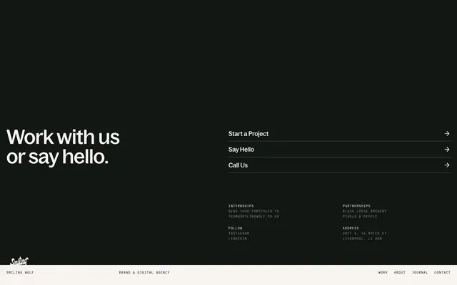
Preview image. Unlock full-res
monochromatic editorial precision
Color palette
Dark borders and separators for elevated surfaces and inverted UI. Do not promote it to the primary CTA color
Page backgrounds, card surfaces, secondary text on dark backgrounds. Creates a soft, almost tactile canvas
Dark section backgrounds, primary text on light backgrounds, elevated surface background. Provides strong contrast against lighter text and elements
Subtle border colors, secondary text elements. Offers a lighter shade within the dark tonal range
Tertiary text, subtle separators, disabled states. A low-contrast neutral for supporting information
Typography
- Weights
- 385, 400, 520
- Sizes
- 14px, 20px, 59px, 63px
- Line height
- 0.98, 1, 1.15, 1.4
- Letter spacing
- 0.0100em, 0.0100em, -0.0100em, -0.0200em
- Fallback
- serif
Primary headings and body text, conveying a distinctive and precise brand voice. The tight letter-spacing and custom features contribute to a refined, almost type-specimen feel. Weights 400 and 520 are used for prominent headings, while 385 is for lighter body text.
- Weights
- 400
- Sizes
- 9px, 10px
- Line height
- 1.6
- Letter spacing
- 0.1000em, 0.1000em
- Fallback
- monospace
Small labels, metadata, and structured information where monospaced precision is desired. The generous letter-spacing enhances readability at small sizes.
- Weights
- 400
- Sizes
- 12px
- Line height
- 1.2
- Fallback
- Arial
System fallback for small utility text like navigation links or ancillary information where a robust, universally available sans-serif is appropriate.
Spacing & shape
Components
Uses Ink Black (#000000) or Paper White (#f7f3f0) text, with no explicit underline by default. On interaction, it may underline or change color to reinforce clickability. Radius is implicitly 4px when used as a wider interactive block.
No background fill. Uses Ink Black (#000000) for text and a 1px border. Padding is implicitly driven by content and line height, with inner vertical spacing of 4px and horizontal of 8px. Border radius is 4px. Example: 'Start a Project' buttons.
Text in Ink Black (#000000) on a Charcoal (#131713) background, with a 1px Ink Black (#000000) border separating items. Internal row gap is 10px. Elements have a 4px radius.
A container with no explicit border or shadow, relying on content and negative space (#f7f3f0 background implied for surrounding canvas). Images inside have a 4px border radius. Padding around content in the card is 20px on left/right. Body text within the card uses Charcoal (#131713).
Text links in Ink Black (#000000) or Paper White (#f7f3f0) on a contrasting background. Uses `sans-serif` at 12px weight 400. Horizontal element gaps are 10px.
Guidelines
- Use Ink Black (#000000) for primary text on Paper White (#f7f3f0) backgrounds and Paper White (#f7f3f0) on Charcoal (#131713) backgrounds to maintain high contrast.
- Apply `Bagoss Standard` `letter-spacing: -0.0100em` for all large headings (59px and 63px) to create a tight, editorial feel.
- Maintain a default border radius of 4px for all interactive elements and media containers.
- Implement consistent vertical spacing of 60px between major sections to ensure ample breathing room.
- Use `General Grotesque Mono` with `letter-spacing: 0.1000em` for small utilitarian text like tags or meta information to enhance legibility at small sizes.
- Utilize a ghost button style with a 1px Ink Black (#000000) border for secondary actions, avoiding filled buttons unless explicitly defined.
- Avoid arbitrary color usage; stick to the defined black, white, and gray palette for UI elements.
- Do not use generic sans-serif fonts for headlines; `Bagoss Standard` is essential for brand identity.
- Resist adding unnecessary shadows or complex gradients; the design relies on flat surfaces and high contrast.
- Do not vary border radii; a consistent 4px radius is applied across all shapely elements.
- Avoid tight vertical spacing in sections; ensure a minimum `sectionGap` of 60px.
- Do not introduce strong accent colors for interactive elements unless proven by explicit brand guidelines outside this system. The system uses achromatic feedback.
About this system
ShowHide
Smiling Wolf employs a minimalist, high-contrast aesthetic reminiscent of print editorial design. A stark visual dialogue between near-black and off-white creates a sense of gravitas and directness. Typography, featuring custom fonts, is treated with precision, utilizing subtle letter-spacing adjustments and specific ligatures to convey detail and craft. The UI is largely monochromatic, relying on robust typographic hierarchy and precise spacing to define structure rather than color or extensive visual ornamentation. Components are understated, often presented as text-based interactive elements or subtle outlined cards.
The page primarily employs a max-width contained layout, though specific sections (like the 'Work with us' section) can be full-bleed with a dark background. The hero section features a centered, large headline over a dark background. Content arrangement often utilizes contrasting background blocks, with text-heavy sections or lists having defined vertical rhythm. A fluid column-based layout is implied for project showcases, adapting to available space for image and description blocks. The navigation is a sticky top bar with minimal links and a footer that uses a stacked, bordered list of links.
This site predominantly uses embedded product images and stylized photography within content areas rather than large decorative hero visuals. Imagery, when present, tends to be contained and presented with a 4px border radius. There's a suggestive use of highly stylized visual content in project showcases, often with a subtle desaturated or tinted quality, making the UI itself the primary visual focus. Icons are minimalistic, likely outline-based, colored with Ink Black.
Reminiscent of Huge Inc., Fantasy, B-Reel, Basic Agency.
# Smiling Wolf — Style Reference
> monochromatic editorial precision

**Theme:** light

**Site:** https://www.smilingwolf.co.uk

Smiling Wolf employs a minimalist, high-contrast aesthetic reminiscent of print editorial design. A stark visual dialogue between near-black and off-white creates a sense of gravitas and directness. Typography, featuring custom fonts, is treated with precision, utilizing subtle letter-spacing adjustments and specific ligatures to convey detail and craft. The UI is largely monochromatic, relying on robust typographic hierarchy and precise spacing to define structure rather than color or extensive visual ornamentation. Components are understated, often presented as text-based interactive elements or subtle outlined cards.

## Tokens — Colors

| Name | Value | Token | Role |
|------|------|------|------|
| Ink Black | `#000000` | `--color-ink-black` | Dark borders and separators for elevated surfaces and inverted UI. Do not promote it to the primary CTA color |
| Paper White | `#f7f3f0` | `--color-paper-white` | Page backgrounds, card surfaces, secondary text on dark backgrounds. Creates a soft, almost tactile canvas |
| Charcoal | `#131713` | `--color-charcoal` | Dark section backgrounds, primary text on light backgrounds, elevated surface background. Provides strong contrast against lighter text and elements |
| Muted Ash | `#bebcb9` | `--color-muted-ash` | Subtle border colors, secondary text elements. Offers a lighter shade within the dark tonal range |
| Stone Gray | `#858582` | `--color-stone-gray` | Tertiary text, subtle separators, disabled states. A low-contrast neutral for supporting information |

## Tokens — Typography

### Bagoss Standard
- **Substitute:** serif
- **Weights:** 385, 400, 520
- **Sizes:** 14px, 20px, 59px, 63px
- **Line height:** 0.98, 1, 1.15, 1.4
- **Letter spacing:** 0.0100em, 0.0100em, -0.0100em, -0.0200em
- **Role:** Primary headings and body text, conveying a distinctive and precise brand voice. The tight letter-spacing and custom features contribute to a refined, almost type-specimen feel. Weights 400 and 520 are used for prominent headings, while 385 is for lighter body text.

### General Grotesque Mono
- **Substitute:** monospace
- **Weights:** 400
- **Sizes:** 9px, 10px
- **Line height:** 1.6
- **Letter spacing:** 0.1000em, 0.1000em
- **Role:** Small labels, metadata, and structured information where monospaced precision is desired. The generous letter-spacing enhances readability at small sizes.

### sans-serif
- **Substitute:** Arial
- **Weights:** 400
- **Sizes:** 12px
- **Line height:** 1.2
- **Role:** System fallback for small utility text like navigation links or ancillary information where a robust, universally available sans-serif is appropriate.

## Tokens — Type Scale

Golden Ratio (1.618) from 14px base.

| Role | Size | Line height | Letter spacing |
|------|------|------|------|
| label | 10px | 1.6 | 1px |
| body | 14px | 1.4 | 0.14px |
| subheading | 20px | 1.15 | 0.2px |
| display-sm | 59px | 1 | -0.59px |
| display | 63px | 0.98 | -1.26px |

## Tokens — Spacing

- **Section gap:** 60px
- **Card padding:** 20px
- **Element gap:** 10px

## Tokens — Radius

- **Default:** 4px
- **Buttons:** 4px
- **Cards:** 4px

## Layout

The page primarily employs a max-width contained layout, though specific sections (like the 'Work with us' section) can be full-bleed with a dark background. The hero section features a centered, large headline over a dark background. Content arrangement often utilizes contrasting background blocks, with text-heavy sections or lists having defined vertical rhythm. A fluid column-based layout is implied for project showcases, adapting to available space for image and description blocks. The navigation is a sticky top bar with minimal links and a footer that uses a stacked, bordered list of links.

## Imagery

This site predominantly uses embedded product images and stylized photography within content areas rather than large decorative hero visuals. Imagery, when present, tends to be contained and presented with a 4px border radius. There's a suggestive use of highly stylized visual content in project showcases, often with a subtle desaturated or tinted quality, making the UI itself the primary visual focus. Icons are minimalistic, likely outline-based, colored with Ink Black.

## Components

### Text Link
*Navigation, inline actions, and footer links*

Uses Ink Black (#000000) or Paper White (#f7f3f0) text, with no explicit underline by default. On interaction, it may underline or change color to reinforce clickability. Radius is implicitly 4px when used as a wider interactive block.

### Ghost Button
*Secondary calls to action and interactive elements displayed as text links with subtle borders.*

No background fill. Uses Ink Black (#000000) for text and a 1px border. Padding is implicitly driven by content and line height, with inner vertical spacing of 4px and horizontal of 8px. Border radius is 4px. Example: 'Start a Project' buttons.

### Footer Item
*Structured list items in the footer*

Text in Ink Black (#000000) on a Charcoal (#131713) background, with a 1px Ink Black (#000000) border separating items. Internal row gap is 10px. Elements have a 4px radius.

### Featured Project Card
*Showcasing project previews*

A container with no explicit border or shadow, relying on content and negative space (#f7f3f0 background implied for surrounding canvas). Images inside have a 4px border radius. Padding around content in the card is 20px on left/right. Body text within the card uses Charcoal (#131713).

### Navigation Bar
*Main site navigation*

Text links in Ink Black (#000000) or Paper White (#f7f3f0) on a contrasting background. Uses `sans-serif` at 12px weight 400. Horizontal element gaps are 10px.

## Guidelines

### Do

- Use Ink Black (#000000) for primary text on Paper White (#f7f3f0) backgrounds and Paper White (#f7f3f0) on Charcoal (#131713) backgrounds to maintain high contrast.
- Apply `Bagoss Standard` `letter-spacing: -0.0100em` for all large headings (59px and 63px) to create a tight, editorial feel.
- Maintain a default border radius of 4px for all interactive elements and media containers.
- Implement consistent vertical spacing of 60px between major sections to ensure ample breathing room.
- Use `General Grotesque Mono` with `letter-spacing: 0.1000em` for small utilitarian text like tags or meta information to enhance legibility at small sizes.
- Utilize a ghost button style with a 1px Ink Black (#000000) border for secondary actions, avoiding filled buttons unless explicitly defined.

### Don't

- Avoid arbitrary color usage; stick to the defined black, white, and gray palette for UI elements.
- Do not use generic sans-serif fonts for headlines; `Bagoss Standard` is essential for brand identity.
- Resist adding unnecessary shadows or complex gradients; the design relies on flat surfaces and high contrast.
- Do not vary border radii; a consistent 4px radius is applied across all shapely elements.
- Avoid tight vertical spacing in sections; ensure a minimum `sectionGap` of 60px.
- Do not introduce strong accent colors for interactive elements unless proven by explicit brand guidelines outside this system. The system uses achromatic feedback.

## Agent Prompt Guide

Quick Color Reference:
text: #000000
background: #f7f3f0
border: #000000
accent: no distinct accent color
primary action: no distinct CTA color

Example Component Prompts:
1. Create a dark hero section with a large heading: `Charcoal (#131713)` background. Headline: `Work with us or say hello.` in `Paper White (#f7f3f0)`, `Bagoss Standard` `display` size (63px), weight 520, `letter-spacing -1.26px`. Below it, a ghost button: `Start a Project` in `Paper White (#f7f3f0)`, 1px `Paper White (#f7f3f0)` border, 4px radius, `Bagoss Standard` `subheading` size (20px), weight 400.
2. Create a footer section: `Charcoal (#131713)` background. Inner content: Vertical list of links, each using `Ink Black (#000000)` border, 1px thick, font `General Grotesque Mono` `label` size (10px), `letter-spacing 1px`, `Paper White (#f7f3f0)` text. The list items have `rowGap: 10px`.
More like this









Keep what you find
A free account saves references to boards and can send you a weekly email of picks based on what you save.
To see every result, go Pro.