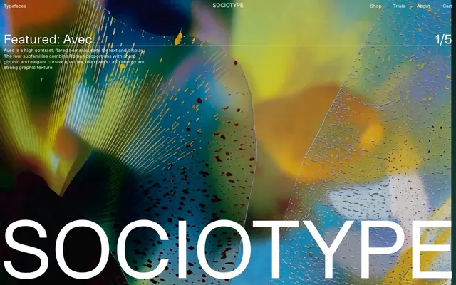
Preview image. Unlock full-res
Editorial White Canvas
Color palette
Page backgrounds, card surfaces, primary text on dark hero sections
Primary text, borders, active states for ghost buttons and navigation, accent markings
Muted text, secondary information, placeholder text, inactive link borders
Subtle dividers, borders between content sections
Tertiary text, list item borders
Typography
- Weights
- 400
- Sizes
- 11px, 12px, 13px, 14px, 16px, 18px, 26px, 40px
- Line height
- 1, 1.13, 1.19, 1.22, 1.29, 1.31, 1.33, 1.38
- Letter spacing
- 0.015, 0.025, 0.04, 0.05, 0.08
Main Onsite — detected in extracted data but not described by AI
- Weights
- 400
- Sizes
- 251px
- Line height
- 1.25
- Letter spacing
- 0.0800em at 11px, 0.0500em at 12px, 0.0400em at 13px, 0.0250em at 14px, 0.0150em at 16px, 0.0150em at 18px
- Fallback
- system-ui, sans-serif
Primary typeface for all body text, navigation, buttons, and smaller headings. Its regular weight ensures readability while maintaining a modern, understated presence.
- Weights
- 400
- Sizes
- 251px
- Line height
- 1.25
- Letter spacing
- 0.0010em
- Fallback
- serif
Display typeface for featured headlines and typographic showcases. Its unique character defines the brand's aesthetic in a large, impactful way.
- Weights
- 400
- Sizes
- 251px
- Line height
- 1.25
- Letter spacing
- 0.0010em
- Fallback
- serif
Alternative display typeface, used for specific typographic showcases. Shares the overall expressive, impactful role of Avec Sharp.
- Weights
- 400
- Sizes
- 251px
- Line height
- 1.25
- Letter spacing
- 0.0010em
- Fallback
- serif
Alternative display typeface, used for specific typographic showcases. Expands the brand's visual range for showcasing different font styles.
- Weights
- 400
- Sizes
- 251px
- Line height
- 1.25
- Letter spacing
- 0.0010em
- Fallback
- serif
Alternative display typeface with ligatures, used for specific typographic showcases. Highlights the intricate details of font design.
- Weights
- 400
- Sizes
- 251px
- Line height
- 1.25
- Letter spacing
- 0.0010em
- Fallback
- serif
Alternative display typeface, used for specific typographic showcases. Contributes to the diverse presentation of font families.
Spacing & shape
Components
Text in Ink Black or Canvas White, with a 1px bottom border of the same color. No background fill or padding. This gives buttons a lightweight, integrated feel with the surrounding text.
Text in Medium Gray, with a 1px bottom border of the same color. No background fill or padding. Used for less prominent interactive elements.
Completely transparent background, no borders, no box shadow, with 0px border-radius. Content manages its own spacing and visual hierarchy. Features a text block with 'Onsite' typography, 14px size, Ink Black color, 0.025em letter spacing, and a 1px Ink Black bottom border for 'More Info' link.
Transparent background, placeholder/text in Medium Gray (#818181), with a thin 1px bottom border in Medium Gray.
Guidelines
- Prioritize Ink Black (#000000) for all primary text and interactive element outlines on default light backgrounds.
- Use Canvas White (#ffffff) as the dominant page, card, and footer background, establishing a clean, expansive aesthetic.
- Maintain a strict 0px border-radius for all components, including buttons, cards, and input fields, for a sharp, precise feel.
- Implement interactive elements primarily as ghost buttons or underlined text, with minimal visual styling beyond color and text decoration transitions.
- Structure content with ample vertical spacing, leveraging the implied section gap of 120px to create distinct content blocks.
- Employ the Onsite font for all functional text under 'display' sizes, ensuring consistency in body, navigation, and button labels.
- Utilize Avec Sharp, Ceno, Meso, Gestura, or Rework fonts exclusively for large, impactful display typography to showcase different font characteristics.
- Avoid using saturated background colors or heavy fills for interactive elements; stick to the achromatic palette.
- Do not introduce shadows or significant elevation on cards or buttons; elements should appear flat against the canvas.
- Refrain from applying rounded corners to any UI elements; all corners should be sharp 0px radius.
- Do not use highly contrasting accent colors for calls to action; rely on text weight, size, and subtle border changes for emphasis.
- Avoid dense, clustered layouts; allow generous empty space around content sections and individual elements.
- Do not deviate from the specified typefaces Onsite, Avec Sharp, Ceno, Meso, Gestura, or Rework; no other typefaces are part of this system.
- Do not use generic system fonts or default browser styles for links; ensure all interactive text uses the defined ghost button or underlined styles.
About this system
ShowHide
Sociotype presents as a serious, editorial platform for typography, characterized by an expansive white canvas, precise black typography, and highly controlled spacing. Interaction elements are almost entirely ghosted or underlined, relying on a subtle shift to black for active states. The visual weight is carried by the large, expressive font specimens and carefully structured content blocks, rather than decorative colors or heavy UI components.
The page maintains a full-bleed structure without a fixed maximum width for its main content, allowing elements to span the entire viewport. The hero section often features a large-scale, sometimes abstract image or graphic background with centered, prominent type specimen alongside informative text. Content sections below the hero typically follow a two-column layout with text on one side and associated visuals or another type specimen on the other. Navigation is a minimalist top bar with ghosted links, and a very large, eye-catching text (Sociotype) floats over the hero graphic. Vertical rhythm is established through generous, consistent section gaps, creating a spacious, editorial flow rather than a dense grid.
This design system relies heavily on large-scale typographic specimen imagery and abstract, sometimes vibrant, graphic backgrounds behind hero sections. Photography is absent. Illustrations are primarily abstract, organic, and colorful, serving as striking backdrops that contrast with the monochrome UI. Icons, if present, are minimal vector outlines, like the 'Cart' icon, suggesting a thin stroke weight. The imagery serves a decorative, atmospheric role, often full-bleed in hero sections, providing visual intrigue without distracting from the UI or text.
Reminiscent of Fonts.com, Future Fonts, Pangram Pangram, Grilli Type.
# Sociotype — Style Reference
> Editorial White Canvas

**Theme:** light

**Site:** https://socio-type.com

Sociotype presents as a serious, editorial platform for typography, characterized by an expansive white canvas, precise black typography, and highly controlled spacing. Interaction elements are almost entirely ghosted or underlined, relying on a subtle shift to black for active states. The visual weight is carried by the large, expressive font specimens and carefully structured content blocks, rather than decorative colors or heavy UI components.

## Tokens — Colors

| Name | Value | Token | Role |
|------|------|------|------|
| Canvas White | `#ffffff` | `--color-canvas-white` | Page backgrounds, card surfaces, primary text on dark hero sections |
| Ink Black | `#000000` | `--color-ink-black` | Primary text, borders, active states for ghost buttons and navigation, accent markings |
| Medium Gray | `#818181` | `--color-medium-gray` | Muted text, secondary information, placeholder text, inactive link borders |
| Light Gray | `#d6d6d6` | `--color-light-gray` | Subtle dividers, borders between content sections |
| Faded Gray | `#9d9d9d` | `--color-faded-gray` | Tertiary text, list item borders |

## Tokens — Typography

### Main Onsite
- **Weights:** 400
- **Sizes:** 11px, 12px, 13px, 14px, 16px, 18px, 26px, 40px
- **Line height:** 1, 1.13, 1.19, 1.22, 1.29, 1.31, 1.33, 1.38
- **Letter spacing:** 0.015, 0.025, 0.04, 0.05, 0.08
- **Role:** Main Onsite — detected in extracted data but not described by AI

### Onsite
- **Substitute:** system-ui, sans-serif
- **Weights:** 400
- **Sizes:** 251px
- **Line height:** 1.25
- **Letter spacing:** 0.0800em at 11px, 0.0500em at 12px, 0.0400em at 13px, 0.0250em at 14px, 0.0150em at 16px, 0.0150em at 18px
- **Role:** Primary typeface for all body text, navigation, buttons, and smaller headings. Its regular weight ensures readability while maintaining a modern, understated presence.

### Avec Sharp
- **Substitute:** serif
- **Weights:** 400
- **Sizes:** 251px
- **Line height:** 1.25
- **Letter spacing:** 0.0010em
- **Role:** Display typeface for featured headlines and typographic showcases. Its unique character defines the brand's aesthetic in a large, impactful way.

### Ceno
- **Substitute:** serif
- **Weights:** 400
- **Sizes:** 251px
- **Line height:** 1.25
- **Letter spacing:** 0.0010em
- **Role:** Alternative display typeface, used for specific typographic showcases. Shares the overall expressive, impactful role of Avec Sharp.

### Meso
- **Substitute:** serif
- **Weights:** 400
- **Sizes:** 251px
- **Line height:** 1.25
- **Letter spacing:** 0.0010em
- **Role:** Alternative display typeface, used for specific typographic showcases. Expands the brand's visual range for showcasing different font styles.

### Gestura
- **Substitute:** serif
- **Weights:** 400
- **Sizes:** 251px
- **Line height:** 1.25
- **Letter spacing:** 0.0010em
- **Role:** Alternative display typeface with ligatures, used for specific typographic showcases. Highlights the intricate details of font design.

### Rework
- **Substitute:** serif
- **Weights:** 400
- **Sizes:** 251px
- **Line height:** 1.25
- **Letter spacing:** 0.0010em
- **Role:** Alternative display typeface, used for specific typographic showcases. Contributes to the diverse presentation of font families.

## Tokens — Type Scale

| Role | Size | Line height | Letter spacing |
|------|------|------|------|
| caption | 11px | 1.38 | 0.88px |
| body | 14px | 1.29 | 0.35px |
| heading | 26px | 1.13 | 0.26px |
| display-sm | 40px | 1 | 0.6px |
| display | 251px | 1.25 | 2.51px |

## Tokens — Spacing

- **Section gap:** 120px
- **Card padding:** 0px
- **Element gap:** 12px

## Tokens — Radius

- **none:** 0px

## Layout

The page maintains a full-bleed structure without a fixed maximum width for its main content, allowing elements to span the entire viewport. The hero section often features a large-scale, sometimes abstract image or graphic background with centered, prominent type specimen alongside informative text. Content sections below the hero typically follow a two-column layout with text on one side and associated visuals or another type specimen on the other. Navigation is a minimalist top bar with ghosted links, and a very large, eye-catching text (Sociotype) floats over the hero graphic. Vertical rhythm is established through generous, consistent section gaps, creating a spacious, editorial flow rather than a dense grid.

## Imagery

This design system relies heavily on large-scale typographic specimen imagery and abstract, sometimes vibrant, graphic backgrounds behind hero sections. Photography is absent. Illustrations are primarily abstract, organic, and colorful, serving as striking backdrops that contrast with the monochrome UI. Icons, if present, are minimal vector outlines, like the 'Cart' icon, suggesting a thin stroke weight. The imagery serves a decorative, atmospheric role, often full-bleed in hero sections, providing visual intrigue without distracting from the UI or text.

## Components

### Ghost Button - Inactive
*Navigational and call-to-action link styling*

Text in Ink Black or Canvas White, with a 1px bottom border of the same color. No background fill or padding. This gives buttons a lightweight, integrated feel with the surrounding text.

### Ghost Button - Muted
*Secondary actions or menu items*

Text in Medium Gray, with a 1px bottom border of the same color. No background fill or padding. Used for less prominent interactive elements.

### Featured Card
*Displaying prominent typefaces without visual distraction*

Completely transparent background, no borders, no box shadow, with 0px border-radius. Content manages its own spacing and visual hierarchy. Features a text block with 'Onsite' typography, 14px size, Ink Black color, 0.025em letter spacing, and a 1px Ink Black bottom border for 'More Info' link.

### Text Input
*User input for forms (e.g., newsletter signup)*

Transparent background, placeholder/text in Medium Gray (#818181), with a thin 1px bottom border in Medium Gray.

## Guidelines

### Do

- Prioritize Ink Black (#000000) for all primary text and interactive element outlines on default light backgrounds.
- Use Canvas White (#ffffff) as the dominant page, card, and footer background, establishing a clean, expansive aesthetic.
- Maintain a strict 0px border-radius for all components, including buttons, cards, and input fields, for a sharp, precise feel.
- Implement interactive elements primarily as ghost buttons or underlined text, with minimal visual styling beyond color and text decoration transitions.
- Structure content with ample vertical spacing, leveraging the implied section gap of 120px to create distinct content blocks.
- Employ the Onsite font for all functional text under 'display' sizes, ensuring consistency in body, navigation, and button labels.
- Utilize Avec Sharp, Ceno, Meso, Gestura, or Rework fonts exclusively for large, impactful display typography to showcase different font characteristics.

### Don't

- Avoid using saturated background colors or heavy fills for interactive elements; stick to the achromatic palette.
- Do not introduce shadows or significant elevation on cards or buttons; elements should appear flat against the canvas.
- Refrain from applying rounded corners to any UI elements; all corners should be sharp 0px radius.
- Do not use highly contrasting accent colors for calls to action; rely on text weight, size, and subtle border changes for emphasis.
- Avoid dense, clustered layouts; allow generous empty space around content sections and individual elements.
- Do not deviate from the specified typefaces Onsite, Avec Sharp, Ceno, Meso, Gestura, or Rework; no other typefaces are part of this system.
- Do not use generic system fonts or default browser styles for links; ensure all interactive text uses the defined ghost button or underlined styles.

## Agent Prompt Guide

Quick Color Reference:
text: #000000
background: #ffffff
border: #000000
accent: no distinct accent color
primary action: no distinct CTA color

Example Component Prompts:
1. Create a top navigation bar: Canvas White background, Ink Black ghost text links in Onsite font at 14px (letter-spacing 0.35px). Each link should have a 1px Ink Black bottom border on hover. Spacing between links is 50px right margin. Global top-left brand text 'SOCIOTYPE' in Ink Black. Top-right utilitarian links 'Shop', 'Trials', 'About', 'Cart (0)'.
2. Design a featured typeface section: Canvas White background. Headline 'Featured: [Typeface Name]' in Onsite 40px (letter-spacing 0.6px), Ink Black. Followed by descriptive body text in Onsite 14px (letter-spacing 0.35px), Ink Black. A 'More Info →' ghost button (Ink Black text and 1px bottom border, Onsite 14px, letter-spacing 0.35px).
3. Create a prominent typeface showcase block: Avec Sharp 251px (letter-spacing 2.51px) in Ink Black on a Canvas White background. Ensure no padding or border-radius, maintaining a sharp edge.
More like this









Keep what you find
A free account saves references to boards and can send you a weekly email of picks based on what you save.
To see every result, go Pro.