Preview image. Unlock full-res
Gallery Wall Clarity — sharp, focused elements on an austere white surface, with text as art.
Color palette
Page backgrounds, large content areas, primary surfaces
Primary text, borders, decorative strokes, navigation links. Creates strong contrast against Canvas White for maximum legibility
Typography
- Weights
- 350, 400
- Sizes
- 13px
- Line height
- 1.6, 1.75, 1.8
- Letter spacing
- normal
- Fallback
- Lora
Captions, body text, meta information, and descriptive content. Its nuanced serif forms add a touch of refined character to otherwise minimal layouts.
- Weights
- 400
- Sizes
- 15px
- Line height
- 1.65
- Letter spacing
- normal
- Fallback
- Inter
Functional UI text, navigation links, and compact interface labels. Provides a clean, modern contrast to the serif font for system-level clarity.
Spacing & shape
Components
Text links using '-apple-system' font at 15px, weight 400, color Ink Black on Canvas White background. No explicit hover state provided, implied text color change.
A frameless block with a 0px border radius, typically with an internal element gap of 13px and top/bottom padding of 19px, content aligned within pageMaxWidth.
Uses 'Self Modern Book' for headlines ('SOMETHI𝔑G ELSE') and subtitles ('a shapeshifting studio'), both in Ink Black. Sizes and line heights are adjusted dynamically but emphasize vertical stacking.
Set in 'Self Modern Book', 13px, weight 350 or 400, Ink Black text on Canvas White. Text is often contained within a narrow column for readability.
Styled as a navigational link using '-apple-system' font, 15px, weight 400, Ink Black, underscoring its functional purpose.
Guidelines
- Prioritize Canvas White (#ffffff) as the dominant background, ensuring ample negative space around all elements.
- Use Ink Black (#000000) for all primary text and UI borders to maintain high contrast and graphic clarity.
- Employ 'Self Modern Book' (or Lora) for all descriptive text, captions, and brand-specific titles at 13px with varying line heights (1.6 to 1.8).
- Apply '-apple-system' (or Inter) for all functional UI elements, navigation, and sparse system text at 15px, weight 400.
- Maintain a clear pageMaxWidth of 1200px for central content, framing it with generous side margins.
- Use an elementGap of 13px for subtle spacing between related items within a block and 19px for internal padding of content sections.
- Avoid decorative borders or shadows on content blocks; elevation is created through spacing and content framing.
- Do not introduce additional saturated colors; the palette is strictly achromatic to maintain a graphic, gallery-like feel.
- Do not use heavy shadows or gradients; the design relies on flat surfaces and high contrast, not dimensional realism.
- Avoid dense, wall-to-wall layouts; negative space is a key component of visual rhythm.
- Do not use generic system fonts for prominent display text that should have character; embrace the serif 'Self Modern Book' for personality.
- Do not deviate from the defined letter spacing for display texts, which is 'normal', indicating no custom tracking.
- Avoid varying border radii; all corners should remain sharp and angular (0px radius) to reinforce the graphic aesthetic.
About this system
ShowHide
SOMETHING ELSE operates with a minimalist graphic studio aesthetic: stark white planes provide an infinite canvas for precise typography and monochromatic design elements. The visual system emphasizes negative space, allowing content to breathe with high contrast and intentional visual pauses. Typography serves as the primary decorative and informational element, with a distinctive serif for branding titles and a clean sans-serif for functional UI. The overall impression is one of restrained confidence and clarity, prioritizing content over elaborate UI components.
The page adheres to a centered, max-width contained layout (approximately 1200px) with generous white space on either side. The header is minimal, featuring the brand name and navigation links in opposing corners. Content sections, such as project showcases, appear as large, self-contained blocks centered on the page. Each project block typically comprises a large image or graphic composition followed by a concise textual description. There's a consistent vertical rhythm of spacing between the primary content blocks and the footer, creating distinct visual pauses. The footer is also minimal, containing only copyright information and contact links, mirroring the sparse header.
The site's visual language is dominated by contained, focused graphic compositions or singular pieces of creative work. Imagery takes the form of artwork or branding examples, always presented within defined bounding boxes on a white canvas. There is an absence of lifestyle photography or complex illustrations; the imagery itself is the content, acting as a visual artifact. Icons are minimal, represented by simple single-color symbols (e.g. '@' for contact). The role of imagery is primarily to showcase portfolio work, serving as the central focus of each project entry. Visually, it is balanced, allowing the work to speak for itself without heavy surrounding graphics.
Reminiscent of AIGA Design Archives, Pentagram, Actual Source.
# SOMETHI𝔑G ELSE — Style Reference
> Gallery Wall Clarity — sharp, focused elements on an austere white surface, with text as art.

**Theme:** light

**Site:** https://somethingelse.works

SOMETHING ELSE operates with a minimalist graphic studio aesthetic: stark white planes provide an infinite canvas for precise typography and monochromatic design elements. The visual system emphasizes negative space, allowing content to breathe with high contrast and intentional visual pauses. Typography serves as the primary decorative and informational element, with a distinctive serif for branding titles and a clean sans-serif for functional UI. The overall impression is one of restrained confidence and clarity, prioritizing content over elaborate UI components.

## Tokens — Colors

| Name | Value | Token | Role |
|------|------|------|------|
| Canvas White | `#ffffff` | `--color-canvas-white` | Page backgrounds, large content areas, primary surfaces |
| Ink Black | `#000000` | `--color-ink-black` | Primary text, borders, decorative strokes, navigation links. Creates strong contrast against Canvas White for maximum legibility |

## Tokens — Typography

### Self Modern Book
- **Substitute:** Lora
- **Weights:** 350, 400
- **Sizes:** 13px
- **Line height:** 1.6, 1.75, 1.8
- **Letter spacing:** normal
- **Role:** Captions, body text, meta information, and descriptive content. Its nuanced serif forms add a touch of refined character to otherwise minimal layouts.

### -apple-system
- **Substitute:** Inter
- **Weights:** 400
- **Sizes:** 15px
- **Line height:** 1.65
- **Letter spacing:** normal
- **Role:** Functional UI text, navigation links, and compact interface labels. Provides a clean, modern contrast to the serif font for system-level clarity.

## Tokens — Spacing

- **Max width:** 1200px
- **Section gap:** 48px
- **Card padding:** 19px
- **Element gap:** 13px

## Tokens — Radius

- **none:** 0px

## Layout

The page adheres to a centered, max-width contained layout (approximately 1200px) with generous white space on either side. The header is minimal, featuring the brand name and navigation links in opposing corners. Content sections, such as project showcases, appear as large, self-contained blocks centered on the page. Each project block typically comprises a large image or graphic composition followed by a concise textual description. There's a consistent vertical rhythm of spacing between the primary content blocks and the footer, creating distinct visual pauses. The footer is also minimal, containing only copyright information and contact links, mirroring the sparse header.

## Imagery

The site's visual language is dominated by contained, focused graphic compositions or singular pieces of creative work. Imagery takes the form of artwork or branding examples, always presented within defined bounding boxes on a white canvas. There is an absence of lifestyle photography or complex illustrations; the imagery itself is the content, acting as a visual artifact. Icons are minimal, represented by simple single-color symbols (e.g. '@' for contact). The role of imagery is primarily to showcase portfolio work, serving as the central focus of each project entry. Visually, it is balanced, allowing the work to speak for itself without heavy surrounding graphics.

## Components

### Navigation Link
*Top-level navigation and footer links*

Text links using '-apple-system' font at 15px, weight 400, color Ink Black on Canvas White background. No explicit hover state provided, implied text color change.

### Block Content Wrapper
*Primary container for imagery and textual content*

A frameless block with a 0px border radius, typically with an internal element gap of 13px and top/bottom padding of 19px, content aligned within pageMaxWidth.

### Title & Subtitle Stack
*Brand and project identity displayed prominently*

Uses 'Self Modern Book' for headlines ('SOMETHI𝔑G ELSE') and subtitles ('a shapeshifting studio'), both in Ink Black. Sizes and line heights are adjusted dynamically but emphasize vertical stacking.

### Project Description Text
*Detailed textual descriptions for portfolio items*

Set in 'Self Modern Book', 13px, weight 350 or 400, Ink Black text on Canvas White. Text is often contained within a narrow column for readability.

### Footer Contact Link
*Email contact address in the footer*

Styled as a navigational link using '-apple-system' font, 15px, weight 400, Ink Black, underscoring its functional purpose.

## Guidelines

### Do

- Prioritize Canvas White (#ffffff) as the dominant background, ensuring ample negative space around all elements.
- Use Ink Black (#000000) for all primary text and UI borders to maintain high contrast and graphic clarity.
- Employ 'Self Modern Book' (or Lora) for all descriptive text, captions, and brand-specific titles at 13px with varying line heights (1.6 to 1.8).
- Apply '-apple-system' (or Inter) for all functional UI elements, navigation, and sparse system text at 15px, weight 400.
- Maintain a clear pageMaxWidth of 1200px for central content, framing it with generous side margins.
- Use an elementGap of 13px for subtle spacing between related items within a block and 19px for internal padding of content sections.
- Avoid decorative borders or shadows on content blocks; elevation is created through spacing and content framing.

### Don't

- Do not introduce additional saturated colors; the palette is strictly achromatic to maintain a graphic, gallery-like feel.
- Do not use heavy shadows or gradients; the design relies on flat surfaces and high contrast, not dimensional realism.
- Avoid dense, wall-to-wall layouts; negative space is a key component of visual rhythm.
- Do not use generic system fonts for prominent display text that should have character; embrace the serif 'Self Modern Book' for personality.
- Do not deviate from the defined letter spacing for display texts, which is 'normal', indicating no custom tracking.
- Avoid varying border radii; all corners should remain sharp and angular (0px radius) to reinforce the graphic aesthetic.

## Agent Prompt Guide

Quick Color Reference: text: #000000, background: #ffffff, border: #000000, accent: no distinct accent color, primary action: no distinct CTA color

Example Component Prompts:
1. Create a header: Canvas White background. 'SOMETHI𝔑G ELSE' title using 'Self Modern Book' weight 400, Ink Black. Navigation links 'Index' and 'Info' in '-apple-system' weight 400, 15px, Ink Black, placed in corners.
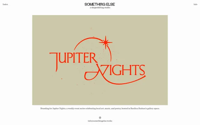
2. Create a project display block: Centered on Canvas White background, 19px top and bottom padding. Display a large image within a 1200px max-width, followed by 'Branding for Jupiter Nights...' text using 'Self Modern Book' weight 350, 13px, Ink Black, with 13px elementGap from the image.
3. Create a footer: Canvas White background. 'info@somethingelse.works' link using '-apple-system' weight 400, 15px, Ink Black, centered.
More like this










Keep what you find
A free account saves references to boards and can send you a weekly email of picks based on what you save.
To see every result, go Pro.