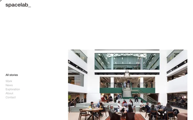
Preview image. Unlock full-res
Architectural blueprint on white marble
Color palette
Primary brand accent, button backgrounds, active card states. This muted, deep tone provides authority without aggression
Page backgrounds, card surfaces, primary text on dark elements
Dark borders and separators for elevated surfaces and inverted UI. Do not promote it to the primary CTA color
Body text, secondary text, subtle card borders, default icon fill
Muted secondary text, inactive link states, hairline borders
Typography
- Weights
- 400
- Sizes
- 15px, 17px, 19px, 21px, 30px, 62px
- Line height
- 1, 1.07, 1.1, 1.15, 1.2
- Letter spacing
- 0.0110em
- Fallback
- Arial
The primary typeface for all content. Its crisp, neutral form supports the system's objective clarity. The wide range of sizes with consistent letter-spacing across all weights maintains a precise, consistent visual texture.
- Weights
- 400
- Sizes
- 17px
- Line height
- 1.2
- Letter spacing
- 0.011
HelveticaNeue-Light — detected in extracted data but not described by AI
Spacing & shape
Components
Solid filled button with Deep Violet background (#495472) and Canvas White (#ffffff) text. Features sharp, unrounded corners (0px radius) and generous padding (21px horizontal, 21px vertical). There is no border, creating a monolithic block. Uses Helvetica Neue 400 at an appropriate size with 0.0110em letter-spacing.
A vertical list of navigational links, with Ink Black (#000000) for active or primary links and Stone Gray (#b2b4b1) for secondary or inactive options. Each link has 21px of bottom margin and no visible border, maintaining a minimalist appearance. Uses Helvetica Neue 400.
A frameless content container with a transparent background (rgba(0,0,0,0)) and no shadow, creating a flat, integrated feel within the layout. It uses Ink Black (#000000) for primary content and includes significant horizontal padding (21px), but no vertical padding by default on title type elements, relying on the overall layout for vertical rhythm. Text uses Helvetica Neue.
A card designated for showcasing visuals, characterized by a truly circular shape (100% border-radius). The background is Deep Violet (#495472) and has no shadow. Heavy top padding (84px) and bottom padding (42px) with no horizontal padding, indicating an image-dominant display. The image itself would be contained within, likely cropped to fit the circle.
Text link using Stone Gray (#b2b4b1) on a light background, indicating a secondary or less prominent interactive element. This allows primary black text to stand out while still signaling interactivity. Uses Helvetica Neue 400.
Guidelines
- Prioritize Canvas White (#ffffff) as the dominant background, creating an expansive, gallery-like canvas for all content.
- Use Ink Black (#000000) for primary headings and prominent text elements to ensure high contrast and visual weight.
- Apply Deep Violet (#495472) exclusively for primary interactive elements like button backgrounds and active states, making actions deliberate and distinct.
- Maintain sharp, unrounded corners (0px radius) for all primary components like buttons and cards, reinforcing a precise, architectural aesthetic.
- Employ a consistent 21px `elementGap` and `cardPadding` for horizontal and some vertical spacing, establishing a clear and comfortable rhythm.
- Use Helvetica Neue 400 across all typographic elements with a consistent 0.0110em letter-spacing to ensure legibility and a unified, refined voice.
- Integrate Stone Gray (#b2b4b1) for less prominent text, inactive links, or subtle decorative lines to provide visual texture without competing with primary content.
- Avoid using rounded corners on any primary interactive elements or content containers; the system is defined by its sharp, clean edges.
- Do not introduce additional chromatic colors beyond the established Deep Violet (#495472) as the primary brand accent, to maintain a minimalist palette.
- Refrain from using shadows or gradients on interactive elements or surfaces; the design relies on flat, direct visual communication.
- Do not increase letter-spacing beyond 0.0110em for any text, as the system relies on tight, controlled typography for its crisp appearance.
- Avoid dense UI layouts; maintain generous negative space around elements and between sections to emphasize clarity and breathability.
- Do not use decorative background patterns or expressive textures; the design values clean, solid surfaces and high contrast.
- Avoid mixing typefaces; the design relies on the singular, precise character of Helvetica Neue for all textual expression.
About this system
ShowHide
Spacelab employs a stark, high-contrast visual language reminiscent of architectural blueprints or gallery spaces. Typography is critical, with a single, highly legible sans-serif used across all scales, grounding the design in clarity and precision. The visual field prioritizes ample negative space; elements are sparsely distributed, creating a sense of calm and order. A single muted violet-blue serves as the primary accent, providing a deep, grounding touch of color against an otherwise achromatic palette of black, white, and subtle grays. Component styling is minimalist and functional, relying on sharp edges and direct expression rather than ornamentation.
The page adheres to a maximal-width, side-aligned layout with no explicit pageMaxWidth, allowing content to stretch. The hero section features a prominent brand name and navigation vertically aligned to the left, occupying significant negative space adjacent to a large, compelling image. Content sections appear to be vertically stacked, defined by generous vertical spacing (42px `sectionGap`) and large visual blocks, often with a clear left-aligned typographic emphasis and a significant image on the right or below. The main layout seems to be a two-column division between navigation/branding (left, narrow) and content (right, wide), which then breaks into full-width content blocks. The rhythm is sparse and open, creating a sense of spaciousness and ease of focus.
The site heavily features high-resolution photography, specifically of architectural interiors and people within these spaces. Images are contained and often full-width or large-scale, acting as primary content blocks. When shown in component context, like the Circular Image Card, they are cropped precisely. There's an absence of decorative illustrations or abstract graphics. Photography is likely high-key but can include natural lighting, maintaining a realistic and professional aesthetic. Icons are minimal, likely monochromatic and vector-based, serving purely functional roles.
Reminiscent of Norm Architects, Archi.design, B&B Italia.
# Spacelab — Style Reference
> Architectural blueprint on white marble

**Theme:** light

**Site:** https://spacelab.co.uk

Spacelab employs a stark, high-contrast visual language reminiscent of architectural blueprints or gallery spaces. Typography is critical, with a single, highly legible sans-serif used across all scales, grounding the design in clarity and precision. The visual field prioritizes ample negative space; elements are sparsely distributed, creating a sense of calm and order. A single muted violet-blue serves as the primary accent, providing a deep, grounding touch of color against an otherwise achromatic palette of black, white, and subtle grays. Component styling is minimalist and functional, relying on sharp edges and direct expression rather than ornamentation.

## Tokens — Colors

| Name | Value | Token | Role |
|------|------|------|------|
| Deep Violet | `#495472` | `--color-deep-violet` | Primary brand accent, button backgrounds, active card states. This muted, deep tone provides authority without aggression |
| Canvas White | `#ffffff` | `--color-canvas-white` | Page backgrounds, card surfaces, primary text on dark elements |
| Ink Black | `#000000` | `--color-ink-black` | Dark borders and separators for elevated surfaces and inverted UI. Do not promote it to the primary CTA color |
| Graphite | `#2c2222` | `--color-graphite` | Body text, secondary text, subtle card borders, default icon fill |
| Stone Gray | `#b2b4b1` | `--color-stone-gray` | Muted secondary text, inactive link states, hairline borders |

## Tokens — Typography

### Helvetica Neue
- **Substitute:** Arial
- **Weights:** 400
- **Sizes:** 15px, 17px, 19px, 21px, 30px, 62px
- **Line height:** 1, 1.07, 1.1, 1.15, 1.2
- **Letter spacing:** 0.0110em
- **Role:** The primary typeface for all content. Its crisp, neutral form supports the system's objective clarity. The wide range of sizes with consistent letter-spacing across all weights maintains a precise, consistent visual texture.

### HelveticaNeue-Light
- **Weights:** 400
- **Sizes:** 17px
- **Line height:** 1.2
- **Letter spacing:** 0.011
- **Role:** HelveticaNeue-Light — detected in extracted data but not described by AI

## Tokens — Type Scale

Perfect Fourth (1.333) from 19px base.

| Role | Size | Line height | Letter spacing |
|------|------|------|------|
| caption | 15px | 1 | 0.011em |
| body-sm | 17px | 1.2 | 0.011em |
| body | 19px | 1.1 | 0.011em |
| subheading | 21px | 1.15 | 0.011em |
| heading | 30px | 1.2 | 0.011em |
| display | 62px | 1.07 | 0.011em |

## Tokens — Spacing

- **Section gap:** 42px
- **Card padding:** 21px
- **Element gap:** 21px

## Tokens — Radius

- **Buttons:** 0px
- **Cards:** 0px
- **none:** 0px
- **small:** 4px

## Layout

The page adheres to a maximal-width, side-aligned layout with no explicit pageMaxWidth, allowing content to stretch. The hero section features a prominent brand name and navigation vertically aligned to the left, occupying significant negative space adjacent to a large, compelling image. Content sections appear to be vertically stacked, defined by generous vertical spacing (42px `sectionGap`) and large visual blocks, often with a clear left-aligned typographic emphasis and a significant image on the right or below. The main layout seems to be a two-column division between navigation/branding (left, narrow) and content (right, wide), which then breaks into full-width content blocks. The rhythm is sparse and open, creating a sense of spaciousness and ease of focus.

## Imagery

The site heavily features high-resolution photography, specifically of architectural interiors and people within these spaces. Images are contained and often full-width or large-scale, acting as primary content blocks. When shown in component context, like the Circular Image Card, they are cropped precisely. There's an absence of decorative illustrations or abstract graphics. Photography is likely high-key but can include natural lighting, maintaining a realistic and professional aesthetic. Icons are minimal, likely monochromatic and vector-based, serving purely functional roles.

## Components

### Primary Action Button
*Interactive element*

Solid filled button with Deep Violet background (#495472) and Canvas White (#ffffff) text. Features sharp, unrounded corners (0px radius) and generous padding (21px horizontal, 21px vertical). There is no border, creating a monolithic block. Uses Helvetica Neue 400 at an appropriate size with 0.0110em letter-spacing.

### Navigation Link List
*Navigation element*

A vertical list of navigational links, with Ink Black (#000000) for active or primary links and Stone Gray (#b2b4b1) for secondary or inactive options. Each link has 21px of bottom margin and no visible border, maintaining a minimalist appearance. Uses Helvetica Neue 400.

### Feature Card
*Content display*

A frameless content container with a transparent background (rgba(0,0,0,0)) and no shadow, creating a flat, integrated feel within the layout. It uses Ink Black (#000000) for primary content and includes significant horizontal padding (21px), but no vertical padding by default on title type elements, relying on the overall layout for vertical rhythm. Text uses Helvetica Neue.

### Circular Image Card
*Visual content display*

A card designated for showcasing visuals, characterized by a truly circular shape (100% border-radius). The background is Deep Violet (#495472) and has no shadow. Heavy top padding (84px) and bottom padding (42px) with no horizontal padding, indicating an image-dominant display. The image itself would be contained within, likely cropped to fit the circle.

### Subtle Link Text
*Secondary navigation or semantic link*

Text link using Stone Gray (#b2b4b1) on a light background, indicating a secondary or less prominent interactive element. This allows primary black text to stand out while still signaling interactivity. Uses Helvetica Neue 400.

## Guidelines

### Do

- Prioritize Canvas White (#ffffff) as the dominant background, creating an expansive, gallery-like canvas for all content.
- Use Ink Black (#000000) for primary headings and prominent text elements to ensure high contrast and visual weight.
- Apply Deep Violet (#495472) exclusively for primary interactive elements like button backgrounds and active states, making actions deliberate and distinct.
- Maintain sharp, unrounded corners (0px radius) for all primary components like buttons and cards, reinforcing a precise, architectural aesthetic.
- Employ a consistent 21px `elementGap` and `cardPadding` for horizontal and some vertical spacing, establishing a clear and comfortable rhythm.
- Use Helvetica Neue 400 across all typographic elements with a consistent 0.0110em letter-spacing to ensure legibility and a unified, refined voice.
- Integrate Stone Gray (#b2b4b1) for less prominent text, inactive links, or subtle decorative lines to provide visual texture without competing with primary content.

### Don't

- Avoid using rounded corners on any primary interactive elements or content containers; the system is defined by its sharp, clean edges.
- Do not introduce additional chromatic colors beyond the established Deep Violet (#495472) as the primary brand accent, to maintain a minimalist palette.
- Refrain from using shadows or gradients on interactive elements or surfaces; the design relies on flat, direct visual communication.
- Do not increase letter-spacing beyond 0.0110em for any text, as the system relies on tight, controlled typography for its crisp appearance.
- Avoid dense UI layouts; maintain generous negative space around elements and between sections to emphasize clarity and breathability.
- Do not use decorative background patterns or expressive textures; the design values clean, solid surfaces and high contrast.
- Avoid mixing typefaces; the design relies on the singular, precise character of Helvetica Neue for all textual expression.

## Agent Prompt Guide

Quick Color Reference:
text: #000000
background: #ffffff
border: #000000
accent: #495472
primary action: #495472 (filled action)

Example Component Prompts:
Create a primary navigation link: uses Helvetica Neue 400 at 19px, Ink Black (#000000), 0.0110em letter-spacing, with 21px bottom margin.
Create a hero section: Canvas White (#ffffff) background. Headline at 62px Helvetica Neue 400, Ink Black (#000000), 0.0110em letter-spacing, 1.07 line height. Align text left with significant negative space. Include a large, architectural photograph on the right.
Create a Primary Action Button: #495472 background, #ffffff text, 9999px radius, compact pill padding. Use this filled treatment for the main CTA.
Create a subtle informational link: uses Helvetica Neue 400 at 17px, Stone Gray (#b2b4b1), 0.0110em letter-spacing.
More like this









Keep what you find
A free account saves references to boards and can send you a weekly email of picks based on what you save.
To see every result, go Pro.