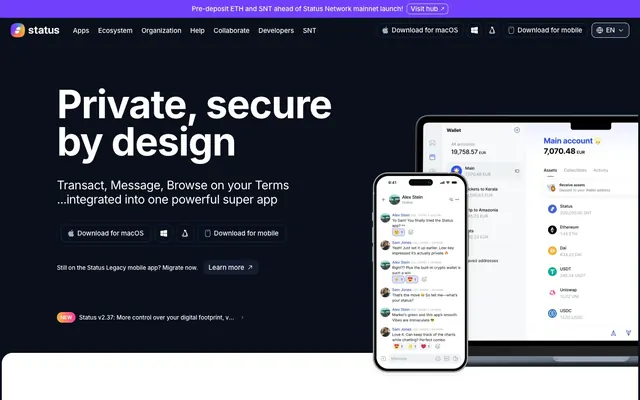
Preview image. Unlock full-res
Midnight Command Center: a dark interface on deep canvas, with precise white type and select vibrant accents.
Color palette
Violet text accent for links, tags, and emphasized short phrases. Do not promote it to the primary CTA color; Soft radial glow for atmospheric effects or subtle background highlights, tying into brand accent
Primary action background, indicating interactive elements and brand emphasis; Soft radial glow for atmospheric effects or subtle background highlights
Secondary accent for decorative icons or specific content highlights; Gradient for primary brand illustrations, combining blue, yellow, and magenta hues; Soft radial glow for atmospheric effects or subtle background highlights
Yellow text accent for links, tags, and emphasized short phrases; Soft radial glow for atmospheric effects or subtle background highlights
Primary background for pages and sections; sets the dark theme's foundation
Subtle borders and separators, providing structure without harsh lines on dark surfaces
Dominant text color for primary headings and body copy against dark backgrounds; background for light cards
Light neutral borders for components on dark backgrounds, offering subtle contrast
Background for secondary section and content cards, providing a distinct light surface within the dark theme
Background for elevated cards and deeper content blocks, creating a sense of depth on dark canvas
Muted text for secondary information, helper text, and subtle icon details
Primary text color for light-themed sections and cards
Background for specific interactive elements like ghost buttons on dark surfaces
Iconography and decorative elements, subtle text in navigation
Typography
- Weights
- 400, 500, 600, 700
- Sizes
- 11px, 13px, 15px, 16px, 19px, 27px, 64px, 88px
- Line height
- 0.95, 1.06, 1.19, 1.4, 1.42, 1.45, 1.47, 1.5
- Letter spacing
- -0.0210em, -0.0200em, -0.0160em, -0.0090em, -0.0050em, -0.0030em
- Fallback
- system-ui
The primary typeface for all text elements. Its versatility across weights and sizes supports everything from subtle captions to impactful display headings, maintaining a unified modern aesthetic across the interface. Tightly tracked larger sizes convey precision and gravitas, easing out for legibility at body sizes.
Spacing & shape
Elevation
Components
Text label in Cloud White (#ffffff) using Inter weight 400 at 16px. Border radius of 0px, no background, padding of 0px.
Text in Cloud White (#ffffff) with a 1px solid border in Ash (#1b273d) and 12px border radius. No fill background. Padding of 0px top/bottom and 16px left/right.
Text in Cloud White (#ffffff) on a filled background of Obsidian Grey (#131d2f). Border radius of 10px. Padding of 5px top/bottom and 8px left/right.
Text color in Cloud White (#ffffff) on a solid background of Lapis Glow (#2a4af5). Used for crucial interactive elements. Padding of 5px top/bottom and 8px left/right, 10px border radius.
Background in Light Mist (#f0f2f5) with a 20px border radius. Features a subtle shadow: rgba(9, 16, 28, 0.08) 0px 4px 20px 0px. Internal padding is variable, generally using a 48px base element gap for content.
Background in Cloud White (#ffffff) with a 24px border radius. No explicit shadow. Content is typically structured with 48px padding around.
Semi-transparent background in rgba(255, 255, 255, 0.2) with a 20px border radius. No shadow. Used for subtle announcements or contextual information.
Text color in Cloud White (#ffffff) using Inter weight 400 at 16px. No background or border, primarily text-based with 12px border radius on its container.
Guidelines
- Prioritize Deep Space (#09101c) for page backgrounds and Cloud White (#ffffff) for primary text and light surface areas to maintain the high-contrast dark theme.
- Apply Lapis Glow (#2a4af5) specifically for primary action buttons and highlight states to ensure immediate visual recognition of interactivity.
- Use Inter at 88px weight 700 with a letter spacing of -0.0210em for large, impactful display headings (display role).
- Employ a base border radius of 20px for cards and 12px for primary buttons and interactive elements, favoring slightly rounded corners over sharp edges.
- Maintain a clear functional distinction between text colors: Cloud White (#ffffff) for primary text, Quiet Fog (#647084) for secondary text, and Violet Plasma (#7140fd) for critical links or highlighted information.
- Utilize the subtle shadow rgba(9, 16, 28, 0.08) 0px 4px 20px 0px exclusively for elevated Product Feature Cards to signal a distinct layer of content.
- Ensure horizontal and vertical spacing between major sections adhere to 40px, while internal component spacing uses a smaller harmonious increment from the 4px base unit.
- Avoid using highly saturated colors for large background areas or extensive text blocks; these are reserved for accents and interactive elements.
- Do not introduce heavy, complex shadows or excessive gradients for general UI elements, as the design emphasizes a flat and clean aesthetic.
- Do not deviate from the Inter typeface; it is the sole font for all typographic needs.
- Do not create buttons with hard, unrounded corners; all interactive elements should adhere to the established radius tokens.
- Avoid using multiple foreground colors within a single text block unless for specific, semantic highlighting such as links or status updates.
- Do not use dark text on dark backgrounds; ensure sufficient contrast by always pairing Cloud White (#ffffff) or similar light colors with Deep Space (#09101c) and other dark neutrals.
- Do not apply the main card shadow to anything other than `Product Feature Card` and similar elevated content panels.
About this system
ShowHide
Status employs a dark, crypto-native aesthetic, evoking a secure, high-tech environment. The primary interface is a deep, near-black canvas, contrasted by crisp white typography for prominence and readability. UI elements often feature soft, subtle borders and a deliberate avoidance of strong shadows, lending a flat, yet layered, appearance. Vivid accent colors of purple and blue are reserved for interactive elements and brand highlights, creating clear focal points against the monochromatic base.
The page primarily uses a max-width contained model of 1224px, centered on the screen. The hero section is full-bleed and dark, featuring a large, centered headline and a split text-left/image-right arrangement for the primary call to action with device mockups. Subsequent sections alternate between the dark Deep Space canvas and lighter Light Mist or Cloud White backgrounds, creating a clear visual rhythm. Content is generally arranged in a two-column text-left/image-right or vertical stack pattern with generous vertical spacing (40px) between major content blocks. Feature sections often employ a 3-column card grid. The navigation is a sticky top bar, minimal and icon-driven, with text links only for primary routes.
The imagery strategy mixes product screenshots, abstract gradient forms, and stylized vector illustrations. Product screenshots are contained within device mockups (laptops, phones) and depicted with bright, high-key interfaces against the dark site background, directly showcasing functionality. Abstract gradient shapes serve as background elements or atmospheric flourishes, using the Spectrum Burst gradient for vibrant, dynamic effects. Icons are primarily outlined or subtly filled using brand and accent colors, appearing frequently in feature sections. The overall density of imagery is balanced, with large hero visuals giving way to more text-dominant sections punctuated by smaller illustrative icons and product views. Photography is absent.
Reminiscent of Solana, Ledger, Uniswap, Phantom Wallet.
# Status — Style Reference
> Midnight Command Center: a dark interface on deep canvas, with precise white type and select vibrant accents.

**Theme:** dark

**Site:** https://status.app

Status employs a dark, crypto-native aesthetic, evoking a secure, high-tech environment. The primary interface is a deep, near-black canvas, contrasted by crisp white typography for prominence and readability. UI elements often feature soft, subtle borders and a deliberate avoidance of strong shadows, lending a flat, yet layered, appearance. Vivid accent colors of purple and blue are reserved for interactive elements and brand highlights, creating clear focal points against the monochromatic base.

## Tokens — Colors

| Name | Value | Token | Role |
|------|------|------|------|
| Violet Plasma | `#7140fd` | `--color-violet-plasma` | Violet text accent for links, tags, and emphasized short phrases. Do not promote it to the primary CTA color; Soft radial glow for atmospheric effects or subtle background highlights, tying into brand accent |
| Lapis Glow | `#2a4af5` | `--color-lapis-glow` | Primary action background, indicating interactive elements and brand emphasis; Soft radial glow for atmospheric effects or subtle background highlights |
| Ocean Tint | `#2a799b` | `--color-ocean-tint` | Secondary accent for decorative icons or specific content highlights; Gradient for primary brand illustrations, combining blue, yellow, and magenta hues; Soft radial glow for atmospheric effects or subtle background highlights |
| Golden Rod | `#f6b03c` | `--color-golden-rod` | Yellow text accent for links, tags, and emphasized short phrases; Soft radial glow for atmospheric effects or subtle background highlights |
| Deep Space | `#09101c` | `--color-deep-space` | Primary background for pages and sections; sets the dark theme's foundation |
| Ash | `#1b273d` | `--color-ash` | Subtle borders and separators, providing structure without harsh lines on dark surfaces |
| Cloud White | `#ffffff` | `--color-cloud-white` | Dominant text color for primary headings and body copy against dark backgrounds; background for light cards |
| Off White | `#dce0e5` | `--color-off-white` | Light neutral borders for components on dark backgrounds, offering subtle contrast |
| Light Mist | `#f0f2f5` | `--color-light-mist` | Background for secondary section and content cards, providing a distinct light surface within the dark theme |
| Slate Fabric | `#3a4049` | `--color-slate-fabric` | Background for elevated cards and deeper content blocks, creating a sense of depth on dark canvas |
| Quiet Fog | `#647084` | `--color-quiet-fog` | Muted text for secondary information, helper text, and subtle icon details |
| Charcoal Black | `#000000` | `--color-charcoal-black` | Primary text color for light-themed sections and cards |
| Obsidian Grey | `#131d2f` | `--color-obsidian-grey` | Background for specific interactive elements like ghost buttons on dark surfaces |
| Steel Grey | `#a1abbd` | `--color-steel-grey` | Iconography and decorative elements, subtle text in navigation |

## Tokens — Typography

### Inter
- **Substitute:** system-ui
- **Weights:** 400, 500, 600, 700
- **Sizes:** 11px, 13px, 15px, 16px, 19px, 27px, 64px, 88px
- **Line height:** 0.95, 1.06, 1.19, 1.4, 1.42, 1.45, 1.47, 1.5
- **Letter spacing:** -0.0210em, -0.0200em, -0.0160em, -0.0090em, -0.0050em, -0.0030em
- **Role:** The primary typeface for all text elements. Its versatility across weights and sizes supports everything from subtle captions to impactful display headings, maintaining a unified modern aesthetic across the interface. Tightly tracked larger sizes convey precision and gravitas, easing out for legibility at body sizes.

## Tokens — Type Scale

| Role | Size | Line height | Letter spacing |
|------|------|------|------|
| caption | 11px | 1.45 | -0.11px |
| heading-sm | 19px | 1.42 | -0.38px |
| heading | 27px | 1.19 | -0.43px |
| heading-lg | 64px | 1.06 | -1.02px |
| display | 88px | 0.95 | -1.85px |

## Tokens — Spacing

- **Max width:** 1224px
- **Section gap:** 40px
- **Card padding:** 16px
- **Element gap:** 4px

## Tokens — Radius

- **Buttons:** 12px
- **Cards:** 20px
- **Images:** 24px
- **forms:** 12px
- **navigation:** 4px
- **tags:** 9999px

## Tokens — Elevation

- **Product Feature Card:** `rgba(9, 16, 28, 0.08) 0px 4px 20px 0px`
- **Link with subtle elevation:** `rgba(9, 16, 28, 0.04) 0px 2px 20px 0px`

## Layout

The page primarily uses a max-width contained model of 1224px, centered on the screen. The hero section is full-bleed and dark, featuring a large, centered headline and a split text-left/image-right arrangement for the primary call to action with device mockups. Subsequent sections alternate between the dark Deep Space canvas and lighter Light Mist or Cloud White backgrounds, creating a clear visual rhythm. Content is generally arranged in a two-column text-left/image-right or vertical stack pattern with generous vertical spacing (40px) between major content blocks. Feature sections often employ a 3-column card grid. The navigation is a sticky top bar, minimal and icon-driven, with text links only for primary routes.

## Imagery

The imagery strategy mixes product screenshots, abstract gradient forms, and stylized vector illustrations. Product screenshots are contained within device mockups (laptops, phones) and depicted with bright, high-key interfaces against the dark site background, directly showcasing functionality. Abstract gradient shapes serve as background elements or atmospheric flourishes, using the Spectrum Burst gradient for vibrant, dynamic effects. Icons are primarily outlined or subtly filled using brand and accent colors, appearing frequently in feature sections. The overall density of imagery is balanced, with large hero visuals giving way to more text-dominant sections punctuated by smaller illustrative icons and product views. Photography is absent.

## Components

### Navigation Link
*Primary navigation item in the header.*

Text label in Cloud White (#ffffff) using Inter weight 400 at 16px. Border radius of 0px, no background, padding of 0px.

### Ghost Button
*Secondary action button, typically for 'Download' or 'Learn More' actions.*

Text in Cloud White (#ffffff) with a 1px solid border in Ash (#1b273d) and 12px border radius. No fill background. Padding of 0px top/bottom and 16px left/right.

### Filled Action Button Light
*Primary calls to action on the dark hero, contrasting with the dark background.*

Text in Cloud White (#ffffff) on a filled background of Obsidian Grey (#131d2f). Border radius of 10px. Padding of 5px top/bottom and 8px left/right.

### Branded Action Button
*Main call to action, utilizing the brand's vibrant blue.*

Text color in Cloud White (#ffffff) on a solid background of Lapis Glow (#2a4af5). Used for crucial interactive elements. Padding of 5px top/bottom and 8px left/right, 10px border radius.

### Product Feature Card
*Displays key product features or benefits in a visually distinct manner.*

Background in Light Mist (#f0f2f5) with a 20px border radius. Features a subtle shadow: rgba(9, 16, 28, 0.08) 0px 4px 20px 0px. Internal padding is variable, generally using a 48px base element gap for content.

### Light Content Card
*General content container for information blocks within light sections.*

Background in Cloud White (#ffffff) with a 24px border radius. No explicit shadow. Content is typically structured with 48px padding around.

### Hero Message Card
*Informational overlay or banner within the dark hero section.*

Semi-transparent background in rgba(255, 255, 255, 0.2) with a 20px border radius. No shadow. Used for subtle announcements or contextual information.

### Footer Navigation Item
*Links within the footer for secondary navigation or legal information.*

Text color in Cloud White (#ffffff) using Inter weight 400 at 16px. No background or border, primarily text-based with 12px border radius on its container.

## Guidelines

### Do

- Prioritize Deep Space (#09101c) for page backgrounds and Cloud White (#ffffff) for primary text and light surface areas to maintain the high-contrast dark theme.
- Apply Lapis Glow (#2a4af5) specifically for primary action buttons and highlight states to ensure immediate visual recognition of interactivity.
- Use Inter at 88px weight 700 with a letter spacing of -0.0210em for large, impactful display headings (display role).
- Employ a base border radius of 20px for cards and 12px for primary buttons and interactive elements, favoring slightly rounded corners over sharp edges.
- Maintain a clear functional distinction between text colors: Cloud White (#ffffff) for primary text, Quiet Fog (#647084) for secondary text, and Violet Plasma (#7140fd) for critical links or highlighted information.
- Utilize the subtle shadow rgba(9, 16, 28, 0.08) 0px 4px 20px 0px exclusively for elevated Product Feature Cards to signal a distinct layer of content.
- Ensure horizontal and vertical spacing between major sections adhere to 40px, while internal component spacing uses a smaller harmonious increment from the 4px base unit.

### Don't

- Avoid using highly saturated colors for large background areas or extensive text blocks; these are reserved for accents and interactive elements.
- Do not introduce heavy, complex shadows or excessive gradients for general UI elements, as the design emphasizes a flat and clean aesthetic.
- Do not deviate from the Inter typeface; it is the sole font for all typographic needs.
- Do not create buttons with hard, unrounded corners; all interactive elements should adhere to the established radius tokens.
- Avoid using multiple foreground colors within a single text block unless for specific, semantic highlighting such as links or status updates.
- Do not use dark text on dark backgrounds; ensure sufficient contrast by always pairing Cloud White (#ffffff) or similar light colors with Deep Space (#09101c) and other dark neutrals.
- Do not apply the main card shadow to anything other than `Product Feature Card` and similar elevated content panels.

## Agent Prompt Guide

Quick Color Reference:
text: #ffffff
background: #09101c
border: #1b273d
accent: #7140fd
primary action: #2a4af5 (filled action)

Example Component Prompts:
Create a Hero Section: background Deep Space (#09101c). Headline 'Private, secure by design' in Cloud White (#ffffff), Inter weight 700 at 88px, letter-spacing -1.85px. Subtext 'Transact, Message, Browse on your Terms' in Cloud White (#ffffff), Inter weight 400 at 27px, letter-spacing -0.43px. Below, a Branded Action Button with 'Download for macOS'. To its right, a Ghost Button with 'Download for mobile iOS Android'.

Create a Product Feature Card: background Light Mist (#f0f2f5), 20px border radius, shadow rgba(9, 16, 28, 0.08) 0px 4px 20px 0px. Headline 'Open source' in Charcoal Black (#000000), Inter weight 600 at 19px, letter-spacing -0.38px. Body text 'Status is a community project...' in Quiet Fog (#647084), Inter weight 400 at 16px, letter-spacing -0.25px. Include a small icon in Ocean Tint (#2a799b).

Create a Navigation Bar: background Deep Space (#09101c), Cloud White (#ffffff) text for links like 'Apps' using Inter weight 400 at 16px. Include a Ghost Button for 'Download for macOS' and a subtle divider using Ash (#1b273d).
More like this







Keep what you find
A free account saves references to boards and can send you a weekly email of picks based on what you save.
To see every result, go Pro.