Preview image. Unlock full-res
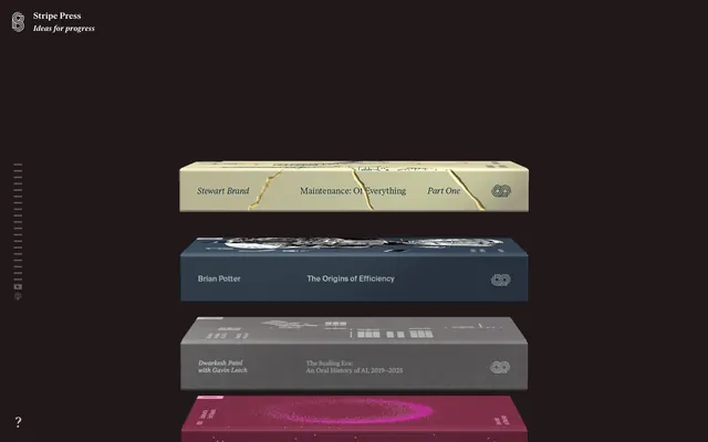
Library of Curated Volumes — each radiating its own quiet brilliance.
Color palette
Accent text and borders for specific 'book' modules, offering a softer, delicate counterpoint. Distinct identity.
Accent text and borders for specific 'book' modules, a cool, almost metallic bright. Distinct identity.
Accent text and borders for specific 'book' modules, a grounded, warm accent. Distinct identity.
Accent text and borders for specific 'book' modules, a bold and energetic marker. Distinct identity.
Accent text and borders for specific 'book' modules, a dark, rich, and mysterious tone. Distinct identity.
Primary page background, general surface. The canvas against which all other elements are presented, providing a deep, consistent visual anchor.
Background for certain interactive elements or sections, offering a slightly warmer, off-black variant for subtle depth contrast.
Text for light backgrounds (not currently prevalent but present in the data), subtle borders, icons. Used when maximum contrast is needed against lighter neutrals.
Primary text color against dark backgrounds, iconography, borders on dark elements. The main bright element that draws attention to content.
Subtle text and accents against dark backgrounds, providing slightly lower contrast than Digital White.
Decorative lines, muted borders, or backgrounds where a very light neutral is needed against a dark surface.
Typography
- Weights
- 400, 600
- Sizes
- 15px, 16px, 17px, 18px, 21px
- Line height
- 1, 1.2, 1.3, 1.5
- Letter spacing
- -0.3px at 15px, -0.32px at 16px, -0.36px at 18px, -0.42px at 21px
- Fallback
- Georgia
Headlines and prominent navigation items. Its refined form combined with a slightly larger letter-spacing provides a sense of considered elegance. The range of weights allows for hierarchy where 400 is dominant and 600 provides emphasis.
- Weights
- 400, 500
- Sizes
- 14px, 16px, 17px, 18px, 25px
- Line height
- 1, 1.2, 1.3, 1.4, 1.5
- Letter spacing
- -0.27px at 14px, -0.34px at 17px, -0.47px at 25px
- Fallback
- Lora
Body text, subheadings, and more detailed descriptions. The serif style lends an academic, timeless feel. Its slightly tighter letter-spacing ensures readability in longer passages.
Spacing & shape
Components
Represents an individual book. Features a background color typically distinct from the page (e.g., #131831, #6e665b, #4d1a28, #c1b676, #93935f), with title, author, and description text in a contrasting accent color (e.g., #dfc78, #ebadcb, #18185, #dee6ff, #e48244, #ff4445, #0b1743). Typography for title and author uses `Ivar Headline` and `Ivar Text` respectively, with line-heights adjusted to fit the book-spine metaphor. Borders are 0px, radius 0px, creating sharp, stacked block visuals. Padding is intentionally zero to contain the full 'book' graphic.
Text link within the header, typically using `Ivar Headline` at 15px weight 400. Color is `Digital White` (#ffffff) against the dark background. No explicit padding or border, relying on natural letter spacing and positioning for visual separation.
Vertical bar on the left side, indicating scroll position. Consists of small, rectangular elements (effectively buttons or indicators at 2px radius, with 5px vertical padding). Background is transparent, text color `Digital White` (#ffffff).
Input field for email subscription. Background color `rgba(0, 0, 0, 0.067)` (almost transparent dark), text `Ink Black` (#000000) (unlikely, likely text on light background), 0px border radius, with minimal padding (1px top/bottom, 2px right, 8px left). This suggests it appears on a lighter background section.
Links found in less prominent areas like the footer. Text color `Ink Black` (#000000) implying a white or very light background. Uses `Ivar Text` at smaller sizes.
Guidelines
- Prioritize `Deep Slate` (#222222) as the default page background for a consistent dark theme.
- Use `Digital White` (#ffffff) for all primary text against dark backgrounds, maintaining high contrast.
- Apply `Ivar Headline` at 15px weight 400 with `letter-spacing: 0.015em` for all navigation and prominent headers.
- Ensure all interactive elements (like book cards) have a distinct accent color for their text and a contrasting background, drawing from the `brand` group.
- Maintain a 0px border radius for most elements and a sharp 2px for subtle interactive components like scroll indicators, preserving the precise, angular aesthetic.
- Avoid generic button styles with borders or solid background colors, as buttons are primarily represented by the 'book' aesthetic.
- Do not introduce strong drop shadows, as the system relies on distinct background colors for depth and separation.
- Do not deviate from the `Ivar Headline` and `Ivar Text` fonts; custom typography is a core identity element.
- Refrain from using gradients on surfaces or text; this design relies on solid, distinct color blocks.
- Avoid highly rounded corners; the dominant shape is rectangular, with minimal 2px radii for specific components.
About this system
ShowHide
Stripe Press evokes the gravitas of a classic library reinterpreted for a digital age. Dominant dark surfaces create a hushed atmosphere, where content is spotlighted with precision. The color palette, rather than being unified, exists as a series of rich, distinct individual 'book spines' — each book module presenting a unique thematic combination of subdued background and a singular, vibrant accent. This creates a compelling visual tension between the system's austere background and the vivid yet controlled bursts of color on each item, giving each publication its own distinct visual identity within a consistent framework.
The page primarily uses a full-bleed dark background, creating an expansive, immersive environment. The main content area is centered and appears to stack individual 'book' modules vertically with minimal vertical spacing, creating the impression of an endlessly scrolling library shelf. The hero introduces the brand with a clear, left-aligned logo and title. A distinctive vertical scroll indicator is fixed to the left edge, reinforcing the sequential, scroll-driven interaction model. There is no strong grid structure for primary content beyond vertical stacking, as each 'book' object is a self-contained visual unit that fills its horizontal allocation. The subtle footer elements suggest a conventional two-column bottom alignment for supplementary links and information against a lighter background section.
The visual language is primarily product-focused, showcasing each 'book' as a distinct three-dimensional object, akin to physical book spines. These renders are highly detailed, featuring different textures, material properties (matte, metallic sheen, paper), and unique graphic design tailored to each publication. There is no photography of people or lifestyle; the focus is entirely on the artifacts. Imagery acts as the primary content differentiator and visual anchor, occupying significant space and presented in a stacked, sequential manner. Icons (e.g., the menu and scroll indicator) are minimal, monochromatic, and outline-based, serving purely functional roles without decorative embellishment.
Reminiscent of Are.na, Some literary magazines (e.g., The Paris Review online), Record label sites like Ghostly International, Portfolio sites of designers specializing in editorial.
# Stripe Press — Style Reference
> Library of Curated Volumes — each radiating its own quiet brilliance.

**Theme:** dark

**Site:** https://press.stripe.com

Stripe Press evokes the gravitas of a classic library reinterpreted for a digital age. Dominant dark surfaces create a hushed atmosphere, where content is spotlighted with precision. The color palette, rather than being unified, exists as a series of rich, distinct individual 'book spines' — each book module presenting a unique thematic combination of subdued background and a singular, vibrant accent. This creates a compelling visual tension between the system's austere background and the vivid yet controlled bursts of color on each item, giving each publication its own distinct visual identity within a consistent framework.

## Tokens — Colors

| Name | Value | Token | Role |
|------|------|------|------|
| Rose Bloom | `#ebadcb` | `--color-rose-bloom` | Accent text and borders for specific 'book' modules, offering a softer, delicate counterpoint. Distinct identity. |
| Cerulean Haze | `#dee6ff` | `--color-cerulean-haze` | Accent text and borders for specific 'book' modules, a cool, almost metallic bright. Distinct identity. |
| Terra Cotta | `#e48244` | `--color-terra-cotta` | Accent text and borders for specific 'book' modules, a grounded, warm accent. Distinct identity. |
| Crimson Blaze | `#ff4445` | `--color-crimson-blaze` | Accent text and borders for specific 'book' modules, a bold and energetic marker. Distinct identity. |
| Midnight Violet | `#0b1743` | `--color-midnight-violet` | Accent text and borders for specific 'book' modules, a dark, rich, and mysterious tone. Distinct identity. |
| Deep Slate | `#222222` | `--color-deep-slate` | Primary page background, general surface. The canvas against which all other elements are presented, providing a deep, consistent visual anchor. |
| Rich Mocha | `#201819` | `--color-rich-mocha` | Background for certain interactive elements or sections, offering a slightly warmer, off-black variant for subtle depth contrast. |
| Ink Black | `#000000` | `--color-ink-black` | Text for light backgrounds (not currently prevalent but present in the data), subtle borders, icons. Used when maximum contrast is needed against lighter neutrals. |
| Digital White | `#ffffff` | `--color-digital-white` | Primary text color against dark backgrounds, iconography, borders on dark elements. The main bright element that draws attention to content. |
| Ash Gray | `#d0d1d4` | `--color-ash-gray` | Subtle text and accents against dark backgrounds, providing slightly lower contrast than Digital White. |
| Pale Stone | `#dbdbdb` | `--color-pale-stone` | Decorative lines, muted borders, or backgrounds where a very light neutral is needed against a dark surface. |

## Tokens — Typography

### Ivar Headline
- **Substitute:** Georgia
- **Weights:** 400, 600
- **Sizes:** 15px, 16px, 17px, 18px, 21px
- **Line height:** 1, 1.2, 1.3, 1.5
- **Letter spacing:** -0.3px at 15px, -0.32px at 16px, -0.36px at 18px, -0.42px at 21px
- **Role:** Headlines and prominent navigation items. Its refined form combined with a slightly larger letter-spacing provides a sense of considered elegance. The range of weights allows for hierarchy where 400 is dominant and 600 provides emphasis.

### Ivar Text
- **Substitute:** Lora
- **Weights:** 400, 500
- **Sizes:** 14px, 16px, 17px, 18px, 25px
- **Line height:** 1, 1.2, 1.3, 1.4, 1.5
- **Letter spacing:** -0.27px at 14px, -0.34px at 17px, -0.47px at 25px
- **Role:** Body text, subheadings, and more detailed descriptions. The serif style lends an academic, timeless feel. Its slightly tighter letter-spacing ensures readability in longer passages.

## Tokens — Type Scale

Minor Second (1.067) from 17px base.

| Role | Size | Line height | Letter spacing |
|------|------|------|------|
| caption | 15px | 1.3 | — |
| body-sm | 16px | 1.3 | — |
| body | 17px | 1.3 | — |
| body-lg | 18px | 1.3 | — |
| heading-sm | 21px | 1.3 | — |

## Tokens — Spacing

- **Section gap:** 20-30px
- **Card padding:** 0px
- **Element gap:** 4-24px

## Tokens — Radius

- **all:** 2px

## Layout

The page primarily uses a full-bleed dark background, creating an expansive, immersive environment. The main content area is centered and appears to stack individual 'book' modules vertically with minimal vertical spacing, creating the impression of an endlessly scrolling library shelf. The hero introduces the brand with a clear, left-aligned logo and title. A distinctive vertical scroll indicator is fixed to the left edge, reinforcing the sequential, scroll-driven interaction model. There is no strong grid structure for primary content beyond vertical stacking, as each 'book' object is a self-contained visual unit that fills its horizontal allocation. The subtle footer elements suggest a conventional two-column bottom alignment for supplementary links and information against a lighter background section.

## Imagery

The visual language is primarily product-focused, showcasing each 'book' as a distinct three-dimensional object, akin to physical book spines. These renders are highly detailed, featuring different textures, material properties (matte, metallic sheen, paper), and unique graphic design tailored to each publication. There is no photography of people or lifestyle; the focus is entirely on the artifacts. Imagery acts as the primary content differentiator and visual anchor, occupying significant space and presented in a stacked, sequential manner. Icons (e.g., the menu and scroll indicator) are minimal, monochromatic, and outline-based, serving purely functional roles without decorative embellishment.

## Components

### Book Spine Cards Stack

### Stripe Press Header Logo + Tagline

### Scroll Progress Indicator

### Book Card (Generic)
*Informational display*

Represents an individual book. Features a background color typically distinct from the page (e.g., #131831, #6e665b, #4d1a28, #c1b676, #93935f), with title, author, and description text in a contrasting accent color (e.g., #dfc78, #ebadcb, #18185, #dee6ff, #e48244, #ff4445, #0b1743). Typography for title and author uses `Ivar Headline` and `Ivar Text` respectively, with line-heights adjusted to fit the book-spine metaphor. Borders are 0px, radius 0px, creating sharp, stacked block visuals. Padding is intentionally zero to contain the full 'book' graphic.

### Header Navigation Link
*Primary navigation*

Text link within the header, typically using `Ivar Headline` at 15px weight 400. Color is `Digital White` (#ffffff) against the dark background. No explicit padding or border, relying on natural letter spacing and positioning for visual separation.

### Scroll Indicator
*Global navigation/progress*

Vertical bar on the left side, indicating scroll position. Consists of small, rectangular elements (effectively buttons or indicators at 2px radius, with 5px vertical padding). Background is transparent, text color `Digital White` (#ffffff).

### Newsletter Subscribe Input
*Form Element*

Input field for email subscription. Background color `rgba(0, 0, 0, 0.067)` (almost transparent dark), text `Ink Black` (#000000) (unlikely, likely text on light background), 0px border radius, with minimal padding (1px top/bottom, 2px right, 8px left). This suggests it appears on a lighter background section.

### Subtle Text Link (Footer)
*Secondary navigation/information*

Links found in less prominent areas like the footer. Text color `Ink Black` (#000000) implying a white or very light background. Uses `Ivar Text` at smaller sizes.

## Guidelines

### Do

- Prioritize `Deep Slate` (#222222) as the default page background for a consistent dark theme.
- Use `Digital White` (#ffffff) for all primary text against dark backgrounds, maintaining high contrast.
- Apply `Ivar Headline` at 15px weight 400 with `letter-spacing: 0.015em` for all navigation and prominent headers.
- Ensure all interactive elements (like book cards) have a distinct accent color for their text and a contrasting background, drawing from the `brand` group.
- Maintain a 0px border radius for most elements and a sharp 2px for subtle interactive components like scroll indicators, preserving the precise, angular aesthetic.

### Don't

- Avoid generic button styles with borders or solid background colors, as buttons are primarily represented by the 'book' aesthetic.
- Do not introduce strong drop shadows, as the system relies on distinct background colors for depth and separation.
- Do not deviate from the `Ivar Headline` and `Ivar Text` fonts; custom typography is a core identity element.
- Refrain from using gradients on surfaces or text; this design relies on solid, distinct color blocks.
- Avoid highly rounded corners; the dominant shape is rectangular, with minimal 2px radii for specific components.

## Agent Prompt Guide

### Quick Color Reference
- Text (Dark BG): `#ffffff` (Digital White)
- Page Background: `#222222` (Deep Slate)
- Accent (Example 1): `#dfc78e` (Amber Parchment)
- Accent (Example 2): `#18185e` (Indigo Ink)
- Accent (Example 3): `#ebadcb` (Rose Bloom)

### 3-5 Example Component Prompts
1. Create a `Header Navigation Link`: Text 'About' in `Ivar Headline` font, 15px, weight 400, line-height 1.5, color `#ffffff` (Digital White), letter-spacing -0.3px.
2. Render a `Book Card` module: Background color `#131831`. Text 'The Origins of Efficiency' in `Ivar Headline` font, 18px, weight 400, line-height 1.3, color `#dee6ff` (Cerulean Haze), letter-spacing -0.36px. Below, 'Brian Potter' in `Ivar Text` font, 16px, weight 400, line-height 1.4, color `#dee6ff` (Cerulean Haze), letter-spacing -0.32px.
3. Design a `Scroll Indicator` item: Background transparent. `Digital White` (#ffffff) color for any internal icon/text. Border radius 2px. Padding 5px top/bottom. Dimensions and positioning should replicate the vertical sidebar on the left.
More like this







Keep what you find
A free account saves references to boards and can send you a weekly email of picks based on what you save.
To see every result, go Pro.