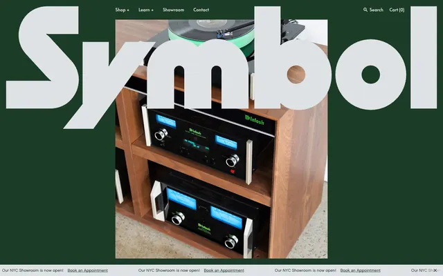
Preview image. Unlock full-res
Sculptural Typography on Forest Canvas: Letterforms as architecture, anchored by a deep green backdrop.
Color palette
Page backgrounds, section fills, hero backgrounds, subtle interactive element borders — creates a deep, immersive environment where products stand out
Informational links, decorative accents, border highlights — a vivid, cool accent used for functional cues
Orange outline accent for tags, dividers, and focused UI edges. Use as a supporting accent, not as a status color
Neutral form states, badge text, and quiet UI feedback where color should stay understated. Do not promote it to the primary CTA color
Accent text, specific icon fills, high-contrast states on light surfaces, subtle borders — provides maximum contrast against lighter neutrals
Product card backgrounds, modal surfaces — provides a clean, bright stage for product imagery and content
A subtle, warm background tint used sparingly for secondary content blocks or to alleviate visual fatigue from pure white
Typography
- Weights
- 400
- Sizes
- 13px, 15px, 16px
- Line height
- 1, 1.3, 1.31, 1.33, 1.5
- Letter spacing
- normal
- Fallback
- Georgia
Primary body text, labels, and sub-headings — characterized by its humanist, slightly condensed form for legibility at smaller sizes amid bold display type. Favored for its classic, refined feel.
- Weights
- 400
- Sizes
- 14px, 20px, 34px, 52px, 80px
- Line height
- 1, 1.13, 1.25, 1.26, 1.33
- Letter spacing
- -0.0200em
- Fallback
- Roboto Condensed
Headlines, display text, and prominent navigational elements — its bold, tightly-tracked presence creates a high-impact, architectural statement.
- Weights
- 400
- Sizes
- 11px, 13px, 15px
- Line height
- 1, 1.33
- Letter spacing
- normal
- Fallback
- Inter
Captions, meta-information, and secondary navigational items — a more compact and understated version for supporting text.
- Weights
- 400
- Sizes
- 15px
- Line height
- 1.33
- Letter spacing
- normal
- Fallback
- Roboto Condensed
Specialized links, often used within paragraphs for emphasis or specific contexts.
Spacing & shape
Components
Text-only buttons using Arctic Mist (#dfe2e5) text on a transparent background, no padding or border by default. Focus is on direct textual interaction, minimalist by design.
Text-based buttons with a Forest Canvas (#1c3c27) border and matching text, often seen with 20px left/right padding. These act as subtle calls to action or supplementary links.
Product cards feature a Polar White (#fffffd) background with sharp 0px corners, no shadow. Product imagery is contained within, paired with Arctic Mist (#dfe2e5) text for titles and prices. A subtle border of Forest Canvas (#1c3c27) often frames the card.
Input fields have a transparent background with Arctic Mist (#dfe2e5) text and a matching bottom border. Minimalist design prioritizes direct text input. Includes 20px top/bottom padding.
Small informational tags or labels, often 'Bestseller' or 'New Arrival', with a 9999px border-radius, giving them a pill shape. Text is Ink (#000000) on a light background, paired with a subtle border for definition.
Guidelines
- Prioritize SupremeLL-Bold for all major headings and display text, applying a tight letter-spacing of -0.0200em to maintain its distinctive, condensed feel.
- Use Forest Canvas (#1c3c27) as the primary background for most sections, creating a consistent, deep, and immersive brand experience.
- Employ Arctic Mist (#dfe2e5) for all primary body text, link text, and button text, ensuring legibility against the dark Forest Canvas.
- Keep all corners sharp with a 0px border-radius for product cards, input fields, and most structural components, reflecting a clean, unadorned aesthetic.
- Use Polar White (#fffffd) sparingly as a background for content cards where product presentation requires a bright, contrasting stage.
- Define interactive elements primarily through text color and subtle borders using Forest Canvas (#1c3c27) rather than filled backgrounds.
- Maintain a comfortable information density, using a base element gap of 20px to separate components and allow visual breathing room.
- Avoid using drop shadows or complex elevation schemes; rely on color contrast and typographic hierarchy to establish visual organization.
- Do not introduce new saturated accent colors outside of Link Blue (#447cf0) and Alert Red (#c72a00) to preserve the muted and sophisticated palette.
- Refrain from using heavily styled, filled buttons; all primary interactions should be text-based or rely on subtle outlined appearances.
- Do not deviate from the established 0px border-radius for main content blocks or 9999px for tags; rounded corners are not part of the core brand identity.
- Avoid generic stock photography; all imagery should focus on high-quality product shots, lifestyle imagery should be minimal or absent.
- Do not center text within large content blocks unless it is a primary headline or hero element; prefer left-aligned text for readability.
- Avoid dense, information-heavy sections; ensure generous spacing around text and components to maintain a premium feel.
About this system
ShowHide
Symbol Audio embodies a sophisticated industrial aesthetic, pairing a dominant forest green canvas with stark white typography and neutral product cards. Typography is a critical brand differentiator, utilizing custom display typefaces with extreme letter-spacing and substantial size to create an impactful, sculptural presence. Components are generally borderless and unadorned, relying on color contrast and the precision of typography to define elements. The overall feel is one of deliberate craftsmanship, reflecting the brand's focus on custom audio furniture.
The page primarily utilizes a full-bleed layout, where the Forest Canvas background extends edge-to-edge. Content within sections adheres to implied maximum widths, but the background color often fills the entire viewport width. The hero section is characterized by a full-bleed image or solid background with large, often sculptural, centered text overlay. Sections maintain a consistent vertical rhythm, often separated by the continuous Forest Canvas background. Content arrangement alternates between large centered headlines, and structured grids, such as 3-column product cards. The navigation is a classic top bar, appearing sticky at the top.
This site prominently features high-quality, professional product photography. Images are consistently full-bleed or tightly cropped product shots on pure white backgrounds, emphasizing the object without distracting context. There's an absence of lifestyle photography. Visuals are contained within sharp, 0px-radius boundaries. Icons, where present, are monochromatic and outlined, mirroring the minimalist interface style. Imagery primarily serves to showcase products, acting as direct content rather than decorative atmosphere. The density is image-heavy in product grids, with text playing a supporting role.
Reminiscent of Figma, Acme Co., Grovemade, Braun (product pages).
# Symbol Audio — Style Reference
> Sculptural Typography on Forest Canvas: Letterforms as architecture, anchored by a deep green backdrop.

**Theme:** dark

**Site:** https://www.symbolaudio.com

Symbol Audio embodies a sophisticated industrial aesthetic, pairing a dominant forest green canvas with stark white typography and neutral product cards. Typography is a critical brand differentiator, utilizing custom display typefaces with extreme letter-spacing and substantial size to create an impactful, sculptural presence. Components are generally borderless and unadorned, relying on color contrast and the precision of typography to define elements. The overall feel is one of deliberate craftsmanship, reflecting the brand's focus on custom audio furniture.

## Tokens — Colors

| Name | Value | Token | Role |
|------|------|------|------|
| Forest Canvas | `#1c3c27` | `--color-forest-canvas` | Page backgrounds, section fills, hero backgrounds, subtle interactive element borders — creates a deep, immersive environment where products stand out |
| Link Blue | `#447cf0` | `--color-link-blue` | Informational links, decorative accents, border highlights — a vivid, cool accent used for functional cues |
| Alert Red | `#c72a00` | `--color-alert-red` | Orange outline accent for tags, dividers, and focused UI edges. Use as a supporting accent, not as a status color |
| Arctic Mist | `#dfe2e5` | `--color-arctic-mist` | Neutral form states, badge text, and quiet UI feedback where color should stay understated. Do not promote it to the primary CTA color |
| Ink | `#000000` | `--color-ink` | Accent text, specific icon fills, high-contrast states on light surfaces, subtle borders — provides maximum contrast against lighter neutrals |
| Polar White | `#fffffd` | `--color-polar-white` | Product card backgrounds, modal surfaces — provides a clean, bright stage for product imagery and content |
| Mellow Yellow | `#fffcda` | `--color-mellow-yellow` | A subtle, warm background tint used sparingly for secondary content blocks or to alleviate visual fatigue from pure white |

## Tokens — Typography

### Chalet-LondonSixty
- **Substitute:** Georgia
- **Weights:** 400
- **Sizes:** 13px, 15px, 16px
- **Line height:** 1, 1.3, 1.31, 1.33, 1.5
- **Letter spacing:** normal
- **Role:** Primary body text, labels, and sub-headings — characterized by its humanist, slightly condensed form for legibility at smaller sizes amid bold display type. Favored for its classic, refined feel.

### SupremeLL-Bold
- **Substitute:** Roboto Condensed
- **Weights:** 400
- **Sizes:** 14px, 20px, 34px, 52px, 80px
- **Line height:** 1, 1.13, 1.25, 1.26, 1.33
- **Letter spacing:** -0.0200em
- **Role:** Headlines, display text, and prominent navigational elements — its bold, tightly-tracked presence creates a high-impact, architectural statement.

### Chalet-NewYorkSixty
- **Substitute:** Inter
- **Weights:** 400
- **Sizes:** 11px, 13px, 15px
- **Line height:** 1, 1.33
- **Letter spacing:** normal
- **Role:** Captions, meta-information, and secondary navigational items — a more compact and understated version for supporting text.

### SupremeLL-BoldFlat
- **Substitute:** Roboto Condensed
- **Weights:** 400
- **Sizes:** 15px
- **Line height:** 1.33
- **Letter spacing:** normal
- **Role:** Specialized links, often used within paragraphs for emphasis or specific contexts.

## Tokens — Type Scale

Perfect Fifth (1.5) from 15px base.

| Role | Size | Line height | Letter spacing |
|------|------|------|------|
| caption | 11px | 1 | — |
| body | 15px | 1.33 | — |
| subheading | 20px | 1.25 | -0.4px |
| heading | 34px | 1.26 | -0.68px |
| heading-lg | 52px | 1.13 | -1.04px |
| display | 80px | 1 | -1.6px |

## Tokens — Spacing

- **Section gap:** 40px
- **Card padding:** 20px
- **Element gap:** 20px

## Tokens — Radius

- **Default:** 0px
- **Buttons:** 0px
- **tagsAndBadges:** 9999px

## Layout

The page primarily utilizes a full-bleed layout, where the Forest Canvas background extends edge-to-edge. Content within sections adheres to implied maximum widths, but the background color often fills the entire viewport width. The hero section is characterized by a full-bleed image or solid background with large, often sculptural, centered text overlay. Sections maintain a consistent vertical rhythm, often separated by the continuous Forest Canvas background. Content arrangement alternates between large centered headlines, and structured grids, such as 3-column product cards. The navigation is a classic top bar, appearing sticky at the top.

## Imagery

This site prominently features high-quality, professional product photography. Images are consistently full-bleed or tightly cropped product shots on pure white backgrounds, emphasizing the object without distracting context. There's an absence of lifestyle photography. Visuals are contained within sharp, 0px-radius boundaries. Icons, where present, are monochromatic and outlined, mirroring the minimalist interface style. Imagery primarily serves to showcase products, acting as direct content rather than decorative atmosphere. The density is image-heavy in product grids, with text playing a supporting role.

## Components

### Bare Text Button
*Navigation and functional buttons*

Text-only buttons using Arctic Mist (#dfe2e5) text on a transparent background, no padding or border by default. Focus is on direct textual interaction, minimalist by design.

### Outlined Text Button
*Secondary navigation and ghost actions*

Text-based buttons with a Forest Canvas (#1c3c27) border and matching text, often seen with 20px left/right padding. These act as subtle calls to action or supplementary links.

### Product Card
*Display individual product listings*

Product cards feature a Polar White (#fffffd) background with sharp 0px corners, no shadow. Product imagery is contained within, paired with Arctic Mist (#dfe2e5) text for titles and prices. A subtle border of Forest Canvas (#1c3c27) often frames the card.

### Minimal Input Field
*Search and data entry fields*

Input fields have a transparent background with Arctic Mist (#dfe2e5) text and a matching bottom border. Minimalist design prioritizes direct text input. Includes 20px top/bottom padding.

### Product Tag
*Labels for product features or categories*

Small informational tags or labels, often 'Bestseller' or 'New Arrival', with a 9999px border-radius, giving them a pill shape. Text is Ink (#000000) on a light background, paired with a subtle border for definition.

## Guidelines

### Do

- Prioritize SupremeLL-Bold for all major headings and display text, applying a tight letter-spacing of -0.0200em to maintain its distinctive, condensed feel.
- Use Forest Canvas (#1c3c27) as the primary background for most sections, creating a consistent, deep, and immersive brand experience.
- Employ Arctic Mist (#dfe2e5) for all primary body text, link text, and button text, ensuring legibility against the dark Forest Canvas.
- Keep all corners sharp with a 0px border-radius for product cards, input fields, and most structural components, reflecting a clean, unadorned aesthetic.
- Use Polar White (#fffffd) sparingly as a background for content cards where product presentation requires a bright, contrasting stage.
- Define interactive elements primarily through text color and subtle borders using Forest Canvas (#1c3c27) rather than filled backgrounds.
- Maintain a comfortable information density, using a base element gap of 20px to separate components and allow visual breathing room.

### Don't

- Avoid using drop shadows or complex elevation schemes; rely on color contrast and typographic hierarchy to establish visual organization.
- Do not introduce new saturated accent colors outside of Link Blue (#447cf0) and Alert Red (#c72a00) to preserve the muted and sophisticated palette.
- Refrain from using heavily styled, filled buttons; all primary interactions should be text-based or rely on subtle outlined appearances.
- Do not deviate from the established 0px border-radius for main content blocks or 9999px for tags; rounded corners are not part of the core brand identity.
- Avoid generic stock photography; all imagery should focus on high-quality product shots, lifestyle imagery should be minimal or absent.
- Do not center text within large content blocks unless it is a primary headline or hero element; prefer left-aligned text for readability.
- Avoid dense, information-heavy sections; ensure generous spacing around text and components to maintain a premium feel.

## Agent Prompt Guide

Quick Color Reference:
text: #dfe2e5
background: #1c3c27
border: #1c3c27
accent: #447cf0
primary action: #1c3c27 (outlined action border)

Example Component Prompts:
1. Create an Outlined Primary Action: Transparent background, #1c3c27 border and text, 9999px radius, compact pill padding. Use it for the main CTA instead of a filled button.
2. Design a product listing card: Polar White (#fffffd) background, 0px border-radius, no shadow. Product title in Arctic Mist (#dfe2e5) using Chalet-LondonSixty at 15px. Price in Arctic Mist (#dfe2e5) at 13px.
3. Make a hero section: Forest Canvas (#1c3c27) full-bleed background. Centered headline 'Symbol' in Arctic Mist (#dfe2e5) using SupremeLL-Bold at 80px, letter-spacing -1.6px.
4. Create a 'New Arrival' product tag: pill-shaped (9999px border-radius), Ink (#000000) background, white text in Chalet-NewYorkSixty at 11px, weight 400, 4px padding.
5. Design a text input field: transparent background, Arctic Mist (#dfe2e5) text, 1px solid Arctic Mist (#dfe2e5) bottom border, 0px border-radius, Chalet-LondonSixty at 15px weight 400. Placeholder text is Arctic Mist (#dfe2e5) at 50% opacity.
More like this








Keep what you find
A free account saves references to boards and can send you a weekly email of picks based on what you save.
To see every result, go Pro.