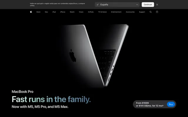
Preview image. Unlock full-res
Precision instrument in shadow — where meticulously crafted typography navigates high-contrast realms of light and dark.
Color palette
Background for primary call-to-action buttons, offering a strong, clear focal point.
Decorative accent for specific feature callouts or secondary branded elements, used sparingly.
Highlight color for special features or iconography, appearing as a vibrant burst.
Secondary accent color for specific product features or promotional highlights.
Subtle accent for badging or less prominent brand highlights.
Decorative background gradient used for abstract brand imagery or product showcases.
Energetic gradient for dynamic visual elements or calls to action.
Complex, deep gradient for hero backgrounds or immersive content sections.
Vibrant, attention-grabbing gradient for high-impact promotional elements.
Primary interactive element color for links and accent text in both light and dark contexts. This is the main action color.
Button backgrounds and active state indicators within dark theme, a brighter complement to Highlight Blue.
Primary background for dark sections, especially hero content and full-bleed product showcases, absorbing light to make products pop.
Secondary dark surface color and default text color for light theme content, offering a subtle lift from Pitch Black.
Text color on dark backgrounds, icon fills, and an alternative background for information-dense sections, providing extreme contrast.
Primary background color for light theme sections (e.g. legal text) and subtle contrast surfaces, nearly achromatic for maximum clarity.
Secondary text and placeholder color in dark contexts, providing a softer alternative to White for less prominent information.
Subtle, slightly darker background for deeply nested elements within dark sections, adding a layer of depth.
Interactive element backgrounds in dark mode for controls like dropdowns or hover states in navigation.
Tertiary text color for fine print or less emphasized details on dark backgrounds.
Typography
- Weights
- 300, 400, 600
- Sizes
- 12px, 14px, 17px, 18px, 20px, 24px, 44px
- Line height
- 1, 1.18, 1.24, 1.29, 1.33, 1.43, 1.47, 1.5, 1.83, 2.12, 2.41
- Letter spacing
- -0.027, -0.022, -0.019, -0.016, -0.01, -0.006, -0.003
- Fallback
- Inter
Versatile system font for body text, interface elements, and secondary headings. Its clarity and range of weights provide legibility across all contexts, with subtle negative letter-spacing for a refined, compact appearance.
- Weights
- 400, 600
- Sizes
- 17px, 19px, 20px, 21px, 24px, 28px, 32px, 40px, 48px, 56px, 64px, 80px
- Line height
- 1, 1.05, 1.06, 1.07, 1.08, 1.1, 1.13, 1.14, 1.17, 1.19, 1.21, 1.38, 1.4
- Letter spacing
- 0.004, 0.007, 0.009, 0.011, 0.012, -0.015, -0.009, -0.005, -0.003
- Fallback
- Inter
Optimized for larger text, headlines, and display purposes. Its wider apertures and tailored letter-spacing ensure maximum legibility at large sizes, delivering impact and clarity.
Spacing & shape
Components
Background: Interactive Blue (#0071e3), Text: Cloud White (#ffffff), Border Radius: 999px, Padding: 8px vertical, 18px horizontal (inferred from 999px radius and content fit). Displays `SF Pro Text` at 17px, weight 600, with letter-spacing -0.019em.
Background: transparent, Text: rgba(255, 255, 255, 0.8), Border: 0px, Border Radius: 999px. Used for contextual actions like 'España' or '+/-' controls.
Background: transparent, Text: Space Gray (#1d1d1f), Border: 0px, Border Radius: 0px. Used for internal navigation links like 'Overview', 'Tech Specs'.
Background: Pitch Black (#000000), Border Radius: 28px, Padding: 0px. Used for visual blocks that promote product features without a direct interactive element.
Background: Cloud White (#ffffff), Border Radius: 28px, Padding: 0px. Provides a clean backdrop for product details or textual content in light mode.
Background: Pitch Black (#000000), Text: Ghost White (#f5f5f7), Border-top: 1px solid Cool Gray (#86868b), Border Radius: 210px, Padding: 0px vertical, 42px right, 22px left. The high radius makes it appear like a pill-shaped button.
Background: transparent, Text: Ghost White (#f5f5f7), Border Radius: 0px, Padding: 0px. Used for subtle annotations like 'Now with M5, M5 Pro, and M5 Max.' under a headline.
Guidelines
- Prioritize SF Pro Display for headlines above 24px, and SF Pro Text for body copy and UI elements. Adhere to specified letter-spacing values to maintain visual tension.
- Use Pitch Black (#000000) as the canvas for hero sections and product-focused pages to maximize product visibility.
- Apply Highlight Blue (#0066cc) for all clickable text links and Interactive Blue (#0071e3) exclusively for primary CTA buttons.
- Maintain 28px border-radius for all informational cards and image containers, offering a soft yet substantial feel.
- Reserve 999px border-radius for small, interactive pill-shaped buttons and tags to distinguish them as distinct interactive elements.
- Employ Ghost White (#f5f5f7) as the background for content-heavy, textual sections to ensure readability and a shift in visual rhythm.
- Use a default element gap of 10px between inline interface elements and a section gap of 40px for comfortable content separation.
- Do not introduce new font families; strictly adhere to SF Pro Text and SF Pro Display.
- Avoid using excessive box-shadows; elevation is primarily achieved through background color shifts and content placement, not floating effects.
- Do not use highly saturated colors for large text blocks; reserve vivid hues for interactive accents and specific highlights.
- Do not deviate from the defined border radii; maintain consistency with 28px for cards and 999px for buttons.
- Avoid using any color outside the defined palette, especially for primary UI elements, to preserve brand integrity and visual coherence.
- Do not use background gradients on interactive buttons unless explicitly specified for a unique, high-impact component.
- Avoid placing too many interactive elements or links in close proximity; maintain comfortable element gaps to prevent visual clutter.
About this system
ShowHide
Apple's MacBook Pro design system evokes a sense of refined power and sophisticated restraint, like precision engineering under stadium lighting. It hinges on dynamic shifts between deep, immersive dark modes and crisp, information-focused light sections, creating visual tension. Product photography is paramount, often floating in pure black voids to emphasize form. Typography relies on the system's SF Pro family, using subtly varied weights and meticulous letter-spacing to build hierarchy without loud declarations. Interactive elements are marked by a signature vivid blue, cutting through the near-monochromatic palette for clear calls to action, while soft, large radii on cards and some buttons contrast with sharp button definitions.
The page primarily employs a max-width 980px contained layout, centered horizontally. The hero section, however, breaks this pattern, featuring full-bleed Pitch Black backgrounds for dramatic product showcases with centered headlines. Sections alternate between immersive dark product displays and clean, lighter content blocks for detailed information. Content is neatly arranged in stacks or simple two-column layouts, often with text presented prominently alongside or above imagery. The navigation is a sticky top bar, transforming between dark (product pages) and light (informational pages) themes, maintaining a clean and minimalist presence. Vertical spacing between sections is ample, providing a comfortable, unhurried reading experience.
The visual language is characterized by highly polished product photography, almost always against pure black backdrops, presenting the object itself as the hero. Products are often cropped tightly or shown floating, emphasizing their form and materiality without distracting lifestyle elements. Imagery is contained, never full-bleed, creating a focused, almost reverent presentation. Abstract gradients are used sparingly as decorative backgrounds to add dynamic energy behind text or subtle product details.
Reminiscent of Samsung, Google (Pixel), Microsoft Surface, Tesla.
# Apple — Style Reference
> Precision instrument in shadow — where meticulously crafted typography navigates high-contrast realms of light and dark.

**Theme:** dark

**Site:** https://www.apple.com/macbook-pro

Apple's MacBook Pro design system evokes a sense of refined power and sophisticated restraint, like precision engineering under stadium lighting. It hinges on dynamic shifts between deep, immersive dark modes and crisp, information-focused light sections, creating visual tension. Product photography is paramount, often floating in pure black voids to emphasize form. Typography relies on the system's SF Pro family, using subtly varied weights and meticulous letter-spacing to build hierarchy without loud declarations. Interactive elements are marked by a signature vivid blue, cutting through the near-monochromatic palette for clear calls to action, while soft, large radii on cards and some buttons contrast with sharp button definitions.

## Tokens — Colors

| Name | Value | Token | Role |
|------|------|------|------|
| Interactive Blue | `#0071e3` | `--color-interactive-blue` | Background for primary call-to-action buttons, offering a strong, clear focal point. |
| Accent Teal | `#00a1b3` | `--color-accent-teal` | Decorative accent for specific feature callouts or secondary branded elements, used sparingly. |
| Neon Violet | `#8668ff` | `--color-neon-violet` | Highlight color for special features or iconography, appearing as a vibrant burst. |
| Incandescent Orange | `#ed6300` | `--color-incandescent-orange` | Secondary accent color for specific product features or promotional highlights. |
| Muted Orange | `#b64400` | `--color-muted-orange` | Subtle accent for badging or less prominent brand highlights. |
| Sky Blue Gradient | `#e4f6e0` | `--color-sky-blue-gradient` | Decorative background gradient used for abstract brand imagery or product showcases. |
| Teal-Lime Gradient | `#35a98a` | `--color-teal-lime-gradient` | Energetic gradient for dynamic visual elements or calls to action. |
| Ocean Spectrum Gradient | `#bfebE0` | `--color-ocean-spectrum-gradient` | Complex, deep gradient for hero backgrounds or immersive content sections. |
| Rainbow Burst Gradient | `#0090f7` | `--color-rainbow-burst-gradient` | Vibrant, attention-grabbing gradient for high-impact promotional elements. |
| Highlight Blue | `#0066cc` | `--color-highlight-blue` | Primary interactive element color for links and accent text in both light and dark contexts. This is the main action color. |
| Vivid Blue | `#2997ff` | `--color-vivid-blue` | Button backgrounds and active state indicators within dark theme, a brighter complement to Highlight Blue. |
| Pitch Black | `#000000` | `--color-pitch-black` | Primary background for dark sections, especially hero content and full-bleed product showcases, absorbing light to make products pop. |
| Space Gray | `#1d1d1f` | `--color-space-gray` | Secondary dark surface color and default text color for light theme content, offering a subtle lift from Pitch Black. |
| Cloud White | `#ffffff` | `--color-cloud-white` | Text color on dark backgrounds, icon fills, and an alternative background for information-dense sections, providing extreme contrast. |
| Ghost White | `#f5f5f7` | `--color-ghost-white` | Primary background color for light theme sections (e.g. legal text) and subtle contrast surfaces, nearly achromatic for maximum clarity. |
| Cool Gray | `#86868b` | `--color-cool-gray` | Secondary text and placeholder color in dark contexts, providing a softer alternative to White for less prominent information. |
| Deep Graphite | `#161617` | `--color-deep-graphite` | Subtle, slightly darker background for deeply nested elements within dark sections, adding a layer of depth. |
| Storm Gray | `#333336` | `--color-storm-gray` | Interactive element backgrounds in dark mode for controls like dropdowns or hover states in navigation. |
| Dark Charcoal | `#424245` | `--color-dark-charcoal` | Tertiary text color for fine print or less emphasized details on dark backgrounds. |

## Tokens — Typography

### SF Pro Text
- **Substitute:** Inter
- **Weights:** 300, 400, 600
- **Sizes:** 12px, 14px, 17px, 18px, 20px, 24px, 44px
- **Line height:** 1, 1.18, 1.24, 1.29, 1.33, 1.43, 1.47, 1.5, 1.83, 2.12, 2.41
- **Letter spacing:** -0.027, -0.022, -0.019, -0.016, -0.01, -0.006, -0.003
- **Role:** Versatile system font for body text, interface elements, and secondary headings. Its clarity and range of weights provide legibility across all contexts, with subtle negative letter-spacing for a refined, compact appearance.

### SF Pro Display
- **Substitute:** Inter
- **Weights:** 400, 600
- **Sizes:** 17px, 19px, 20px, 21px, 24px, 28px, 32px, 40px, 48px, 56px, 64px, 80px
- **Line height:** 1, 1.05, 1.06, 1.07, 1.08, 1.1, 1.13, 1.14, 1.17, 1.19, 1.21, 1.38, 1.4
- **Letter spacing:** 0.004, 0.007, 0.009, 0.011, 0.012, -0.015, -0.009, -0.005, -0.003
- **Role:** Optimized for larger text, headlines, and display purposes. Its wider apertures and tailored letter-spacing ensure maximum legibility at large sizes, delivering impact and clarity.

## Tokens — Type Scale

Perfect Fourth (1.333) from 17px base.

| Role | Size | Line height | Letter spacing |
|------|------|------|------|
| caption | 12px | 1.5 | -0.48px |
| body-sm | 14px | 1.43 | -0.31px |
| body | 17px | 1.29 | -0.32px |
| subheading | 20px | 1.25 | -0.2px |
| heading-sm | 24px | 1.17 | -0.14px |
| heading | 44px | 1.05 | -0.13px |
| heading-lg | 56px | 1.07 | -0.73px |
| display | 80px | 1.05 | -0.45px |

## Tokens — Spacing

- **Max width:** 980px
- **Section gap:** 40px
- **Card padding:** 28px
- **Element gap:** 10px

## Tokens — Radius

- **Buttons:** 999px
- **Inputs:** 210px
- **Cards:** 28px
- **standard:** 10px

## Layout

The page primarily employs a max-width 980px contained layout, centered horizontally. The hero section, however, breaks this pattern, featuring full-bleed Pitch Black backgrounds for dramatic product showcases with centered headlines. Sections alternate between immersive dark product displays and clean, lighter content blocks for detailed information. Content is neatly arranged in stacks or simple two-column layouts, often with text presented prominently alongside or above imagery. The navigation is a sticky top bar, transforming between dark (product pages) and light (informational pages) themes, maintaining a clean and minimalist presence. Vertical spacing between sections is ample, providing a comfortable, unhurried reading experience.

## Imagery

The visual language is characterized by highly polished product photography, almost always against pure black backdrops, presenting the object itself as the hero. Products are often cropped tightly or shown floating, emphasizing their form and materiality without distracting lifestyle elements. Imagery is contained, never full-bleed, creating a focused, almost reverent presentation. Abstract gradients are used sparingly as decorative backgrounds to add dynamic energy behind text or subtle product details.

## Components

### Buy CTA Button
*Primary action button*

Background: Interactive Blue (#0071e3), Text: Cloud White (#ffffff), Border Radius: 999px, Padding: 8px vertical, 18px horizontal (inferred from 999px radius and content fit). Displays `SF Pro Text` at 17px, weight 600, with letter-spacing -0.019em.

### Ghost Nav Button (Dark)
*Secondary navigation and utility buttons in dark mode*

Background: transparent, Text: rgba(255, 255, 255, 0.8), Border: 0px, Border Radius: 999px. Used for contextual actions like 'España' or '+/-' controls.

### Ghost Nav Button (Light)
*Secondary navigation and utility buttons in light mode*

Background: transparent, Text: Space Gray (#1d1d1f), Border: 0px, Border Radius: 0px. Used for internal navigation links like 'Overview', 'Tech Specs'.

### Product Display Card (Dark)
*Container for product information and imagery in dark sections*

Background: Pitch Black (#000000), Border Radius: 28px, Padding: 0px. Used for visual blocks that promote product features without a direct interactive element.

### Product Display Card (Light)
*Container for product information and imagery in light sections*

Background: Cloud White (#ffffff), Border Radius: 28px, Padding: 0px. Provides a clean backdrop for product details or textual content in light mode.

### Elevated Input
*Interactive text input for search or selection*

Background: Pitch Black (#000000), Text: Ghost White (#f5f5f7), Border-top: 1px solid Cool Gray (#86868b), Border Radius: 210px, Padding: 0px vertical, 42px right, 22px left. The high radius makes it appear like a pill-shaped button.

### Contextual Badge (Ghost, Dark)
*Informational tags in dark contexts*

Background: transparent, Text: Ghost White (#f5f5f7), Border Radius: 0px, Padding: 0px. Used for subtle annotations like 'Now with M5, M5 Pro, and M5 Max.' under a headline.

## Guidelines

### Do

- Prioritize SF Pro Display for headlines above 24px, and SF Pro Text for body copy and UI elements. Adhere to specified letter-spacing values to maintain visual tension.
- Use Pitch Black (#000000) as the canvas for hero sections and product-focused pages to maximize product visibility.
- Apply Highlight Blue (#0066cc) for all clickable text links and Interactive Blue (#0071e3) exclusively for primary CTA buttons.
- Maintain 28px border-radius for all informational cards and image containers, offering a soft yet substantial feel.
- Reserve 999px border-radius for small, interactive pill-shaped buttons and tags to distinguish them as distinct interactive elements.
- Employ Ghost White (#f5f5f7) as the background for content-heavy, textual sections to ensure readability and a shift in visual rhythm.
- Use a default element gap of 10px between inline interface elements and a section gap of 40px for comfortable content separation.

### Don't

- Do not introduce new font families; strictly adhere to SF Pro Text and SF Pro Display.
- Avoid using excessive box-shadows; elevation is primarily achieved through background color shifts and content placement, not floating effects.
- Do not use highly saturated colors for large text blocks; reserve vivid hues for interactive accents and specific highlights.
- Do not deviate from the defined border radii; maintain consistency with 28px for cards and 999px for buttons.
- Avoid using any color outside the defined palette, especially for primary UI elements, to preserve brand integrity and visual coherence.
- Do not use background gradients on interactive buttons unless explicitly specified for a unique, high-impact component.
- Avoid placing too many interactive elements or links in close proximity; maintain comfortable element gaps to prevent visual clutter.

## Agent Prompt Guide

### Quick Color Reference
- Text (Dark BG): #ffffff (Cloud White)
- Text (Light BG): #1d1d1f (Space Gray)
- Background (Dark): #000000 (Pitch Black)
- Background (Light): #f5f5f7 (Ghost White)
- Primary CTA: #0071e3 (Interactive Blue)
- Link/Accent: #0066cc (Highlight Blue)

### 3-5 Example Component Prompts
1. **Hero Section (Dark):** Create a full-bleed hero section. Background: Pitch Black (#000000). Centered headline: 'Fast runs in the family.' (SF Pro Display, 80px, weight 600, Cloud White #ffffff, letter-spacing -0.45px). Below it, a subtext: 'Now with M5, M5 Pro, and M5 Max.' (SF Pro Text, 24px, weight 400, Cloud White #ffffff, letter-spacing -0.14px).
2. **Buy Button:** Generate a primary action button with the text 'Buy'. Background: Interactive Blue (#0071e3). Text color: Cloud White (#ffffff). Border radius: 999px. Padding: 8px vertical, 18px horizontal. Font: SF Pro Text, 17px, weight 600, letter-spacing -0.32px.
3. **Navigation Item (Dark):** Create a navigation link titled 'iPad'. Background: transparent. Text color: rgba(255, 255, 255, 0.8). Font: SF Pro Text, 17px, weight 400, letter-spacing -0.32px. No border or radius.
4. **Legal Text Section (Light):** Create a content section with legal disclaimers. Background: Ghost White (#f5f5f7). Body text: 'Indica que en país o región estás...' (SF Pro Text, 12px, weight 400, Space Gray #1d1d1f, letter-spacing -0.48px). Section gap: 40px.
More like this







Keep what you find
A free account saves references to boards and can send you a weekly email of picks based on what you save.
To see every result, go Pro.