Preview image. Unlock full-res
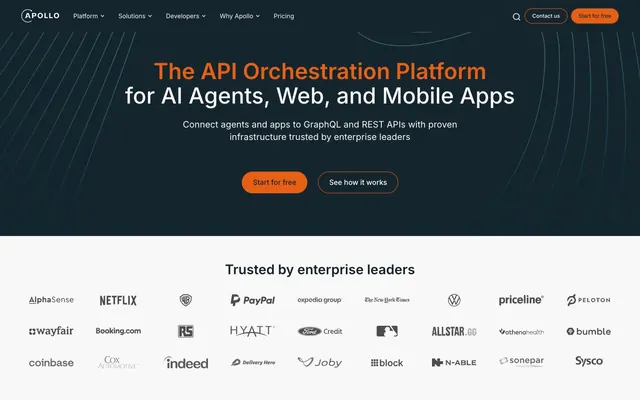
Deep space operations center: dark, high-contrast UI with a single vibrant accent for critical actions, like indicator lights on a mission control panel.
Color palette
Prominent call-to-action buttons, active states, and key interactive elements. Its vividness provides an unmistakable focal point against the dark base.
Primary background for dark sections, body text in light sections, and card surfaces. This near-black provides a deep base for content.
Default text color on dark backgrounds, primary background for light sections, and neutral UI elements. Its strong luminance provides readability.
Borders for cards and interactive elements across both light and dark backgrounds, providing subtle structural definition without harsh lines. Also used as background for light sections.
Subtle borders and dividers, indicating secondary separation. Its cool tone harmonizes with the dark primary colors.
Secondary background for light sections, providing a subtle differentiation from Comet Dust.
Background for secondary buttons, offering a muted interaction point that doesn't compete with Fusion Orange.
Typography
- Weights
- 400
- Sizes
- 12px, 14px, 16px, 20px, 24px, 30px, 38px, 50px
- Line height
- 0.94, 1, 1.1, 1.25, 1.3, 1.33, 1.4, 1.43, 1.5
- Letter spacing
- normal
- Fallback
- Inter
The primary typeface for all textual content, from body to display headings. Its wide range of weights and sizes supports a clear content hierarchy, maintaining a contemporary and readable aesthetic across the interface.
- Weights
- 500
- Sizes
- 18px
- Line height
- 1.25
- Letter spacing
- 0.0800em
- Fallback
- Fira Code
Used specifically for code snippets or technical annotations. Its monospace nature and distinct letter spacing clearly differentiates technical content from standard prose, reinforcing the developer-focused nature of the product.
Spacing & shape
Components
Fusion Orange (#e75e15) background with Comet Dust (#f8f8f8) text. Pill-shaped with a 999px border-radius, 8px vertical padding, 16px horizontal padding. Font is Inter 400.
Transparent background with Comet Dust (#f8f8f8) text. Pill-shaped with a 999px border-radius, 1px Fusion Orange (#e75e15) border, 8px vertical padding, 16px horizontal padding. Font is Inter 400.
Transparent background with Comet Dust (#f8f8f8) text. Pill-shaped with a 999px border-radius. Font is Inter 400.
Subtle Dark Gray (#254250) background with Comet Dust (#f8f8f8) text and a Nebula Gray (#e2e8f0) border. Rounded with an 8px border-radius, 4px padding. Font is Inter 400.
Inter 50px, weight 700 with Comet Dust (#f8f8f8) color and 1.25 line height.
Inter 20px, weight 400 with Comet Dust (#f8f8f8) color and 1.5 line height.
Midnight Ink (#15252d) background, Nebula Gray (#e2e8f0) border, 24px border-radius, 16px inner padding. Body text is Comet Dust (#f8f8f8).
Implied transparent background with a Comet Dust (#f8f8f8) fill for logos on light sections, or light backgrounds for dark section. Spacing of 48px between items.
Guidelines
- Prioritize Midnight Ink (#15252d) for prominent dark sections and Comet Dust (#f8f8f8) for text, ensuring high contrast (14.8:1) for readability.
- Use Fusion Orange (#e75e15) exclusively for primary calls-to-action and active states to maintain strong visual hierarchy and guide user attention.
- Apply a 999px border-radius to all buttons for a distinctive pill shape, contrasting with the 24px radius used for content cards.
- Maintain a clear content hierarchy using the Inter typeface, reserving weight 700 for display headlines and weight 400 for body text.
- Utilize 48px vertical spacing between major sections and 16px for internal card padding to establish comfortable density.
- Employ the Nebula Gray (#e2e8f0) color for all border elements to imply structure without strong visual interruption.
- Do not introduce additional vibrant colors; restrict accent colors to Fusion Orange (#e75e15) to preserve visual focus.
- Avoid using harsh shadows for elevation; rely on background color changes for surface differentiation if needed, or subtle borders.
- Do not deviate from the 999px border-radius for buttons or 24px for cards; these are signature shape identifiers.
- Refrain from using monospace fonts for general body text; Fira Code (500, 18px, 0.0800em letter spacing) is strictly for code examples.
- Do not use generic gray values; always refer to defined neutrals like Midnight Ink (#15252d), Nebula Gray (#e2e8f0), or Crater Gray (#9fb2bc).
- Avoid excessive use of text treatments like underlines or italics for emphasis; hierarchy is primarily managed through font size and weight.
About this system
ShowHide
Apollo's design system evokes a 'deep space operations center' feel, using a dark, desaturated palette with a single vibrant accent. The dominant near-black background and off-white text establish a high-contrast, technical atmosphere. Subtle use of a vivid orange for primary calls to action creates focused points of visual energy, preventing the dark interface from feeling monotonous. Sharp edges combined with deep, pill-shaped buttons introduce a tension between precision and approachability, reinforcing an infrastructure brand that is both powerful and user-friendly.
The site employs a mixed layout strategy: the hero section is full-width with text and calls-to-action centered over a dark, subtly textured background. Subsequent sections alternate between a dark background for feature blocks and a light background for 'trusted by' logos and testimonials, maintaining a consistent vertical rhythm. Content within sections is often structured with a maximum width, centered, or in two-column layouts featuring text on one side and a visual element (like a video player or card) on the other. A grid-like structure is used for client logos and testimonial cards. Vertical spacing is generous, creating breathing room between content blocks. The navigation is a sticky top bar, consistent across the site, with a search icon and prominent 'Contact us' and 'Start for free' buttons.
The visual language for imagery is primarily functional and supportive, not decorative. It includes: product screenshots or abstract graphics (like the faint 'shooting stars' pattern in the hero and video placeholders) which are contained within distinct sections. Photography consists of small, circular profile pictures for team members and testimonials, establishing human connection without large, lifestyle imagery. Icons appear as outlined or filled, primarily serving navigation and feature explanation. The overall density is text-dominant, with imagery acting as focused visual anchors for specific content blocks rather than full-bleed atmospheric elements.
Reminiscent of Vercel, Linear, Auth0.
# Apollographql — Style Reference
> Deep space operations center: dark, high-contrast UI with a single vibrant accent for critical actions, like indicator lights on a mission control panel.

**Theme:** mixed

**Site:** https://apollographql.com

Apollo's design system evokes a 'deep space operations center' feel, using a dark, desaturated palette with a single vibrant accent. The dominant near-black background and off-white text establish a high-contrast, technical atmosphere. Subtle use of a vivid orange for primary calls to action creates focused points of visual energy, preventing the dark interface from feeling monotonous. Sharp edges combined with deep, pill-shaped buttons introduce a tension between precision and approachability, reinforcing an infrastructure brand that is both powerful and user-friendly.

## Tokens — Colors

| Name | Value | Token | Role |
|------|------|------|------|
| Fusion Orange | `#e75e15` | `--color-fusion-orange` | Prominent call-to-action buttons, active states, and key interactive elements. Its vividness provides an unmistakable focal point against the dark base. |
| Midnight Ink | `#15252d` | `--color-midnight-ink` | Primary background for dark sections, body text in light sections, and card surfaces. This near-black provides a deep base for content. |
| Comet Dust | `#f8f8f8` | `--color-comet-dust` | Default text color on dark backgrounds, primary background for light sections, and neutral UI elements. Its strong luminance provides readability. |
| Nebula Gray | `#e2e8f0` | `--color-nebula-gray` | Borders for cards and interactive elements across both light and dark backgrounds, providing subtle structural definition without harsh lines. Also used as background for light sections. |
| Crater Gray | `#9fb2bc` | `--color-crater-gray` | Subtle borders and dividers, indicating secondary separation. Its cool tone harmonizes with the dark primary colors. |
| Off-White Cloud | `#efefef` | `--color-off-white-cloud` | Secondary background for light sections, providing a subtle differentiation from Comet Dust. |
| Subtle Dark Gray | `#254250` | `--color-subtle-dark-gray` | Background for secondary buttons, offering a muted interaction point that doesn't compete with Fusion Orange. |

## Tokens — Typography

### Inter
- **Substitute:** Inter
- **Weights:** 400
- **Sizes:** 12px, 14px, 16px, 20px, 24px, 30px, 38px, 50px
- **Line height:** 0.94, 1, 1.1, 1.25, 1.3, 1.33, 1.4, 1.43, 1.5
- **Letter spacing:** normal
- **Role:** The primary typeface for all textual content, from body to display headings. Its wide range of weights and sizes supports a clear content hierarchy, maintaining a contemporary and readable aesthetic across the interface.

### Fira Code
- **Substitute:** Fira Code
- **Weights:** 500
- **Sizes:** 18px
- **Line height:** 1.25
- **Letter spacing:** 0.0800em
- **Role:** Used specifically for code snippets or technical annotations. Its monospace nature and distinct letter spacing clearly differentiates technical content from standard prose, reinforcing the developer-focused nature of the product.

## Tokens — Type Scale

Minor Third (1.2) from 16px base.

| Role | Size | Line height | Letter spacing |
|------|------|------|------|
| caption | 12px | 1.5 | — |
| body-sm | 14px | 1.5 | — |
| body | 16px | 1.5 | — |
| subheading | 20px | 1.4 | — |
| heading | 24px | 1.33 | — |
| heading-lg | 30px | 1.3 | — |
| display | 38px | 1.25 | — |
| display-lg | 50px | 1.25 | — |

## Tokens — Spacing

- **Section gap:** 48px
- **Card padding:** 16px
- **Element gap:** 8px

## Tokens — Radius

- **Buttons:** 999px
- **Inputs:** 8px
- **Cards:** 24px

## Layout

The site employs a mixed layout strategy: the hero section is full-width with text and calls-to-action centered over a dark, subtly textured background. Subsequent sections alternate between a dark background for feature blocks and a light background for 'trusted by' logos and testimonials, maintaining a consistent vertical rhythm. Content within sections is often structured with a maximum width, centered, or in two-column layouts featuring text on one side and a visual element (like a video player or card) on the other. A grid-like structure is used for client logos and testimonial cards. Vertical spacing is generous, creating breathing room between content blocks. The navigation is a sticky top bar, consistent across the site, with a search icon and prominent 'Contact us' and 'Start for free' buttons.

## Imagery

The visual language for imagery is primarily functional and supportive, not decorative. It includes: product screenshots or abstract graphics (like the faint 'shooting stars' pattern in the hero and video placeholders) which are contained within distinct sections. Photography consists of small, circular profile pictures for team members and testimonials, establishing human connection without large, lifestyle imagery. Icons appear as outlined or filled, primarily serving navigation and feature explanation. The overall density is text-dominant, with imagery acting as focused visual anchors for specific content blocks rather than full-bleed atmospheric elements.

## Components

### Hero CTA Button Group

### Testimonial Card

### Feature Content Card with Buttons

### Primary Call to Action Button
*Main interactive button*

Fusion Orange (#e75e15) background with Comet Dust (#f8f8f8) text. Pill-shaped with a 999px border-radius, 8px vertical padding, 16px horizontal padding. Font is Inter 400.

### Secondary Outlined Button
*Secondary action or ghost button*

Transparent background with Comet Dust (#f8f8f8) text. Pill-shaped with a 999px border-radius, 1px Fusion Orange (#e75e15) border, 8px vertical padding, 16px horizontal padding. Font is Inter 400.

### Tertiary Ghost Button
*Text-only button for less prominent actions, often within navigation*

Transparent background with Comet Dust (#f8f8f8) text. Pill-shaped with a 999px border-radius. Font is Inter 400.

### Header Navigation Button
*Navigation items with a subtle background*

Subtle Dark Gray (#254250) background with Comet Dust (#f8f8f8) text and a Nebula Gray (#e2e8f0) border. Rounded with an 8px border-radius, 4px padding. Font is Inter 400.

### Hero Headline
*Main page title*

Inter 50px, weight 700 with Comet Dust (#f8f8f8) color and 1.25 line height.

### Hero Subheadline
*Secondary text in hero section*

Inter 20px, weight 400 with Comet Dust (#f8f8f8) color and 1.5 line height.

### Content Card (Dark)
*Container for featured content*

Midnight Ink (#15252d) background, Nebula Gray (#e2e8f0) border, 24px border-radius, 16px inner padding. Body text is Comet Dust (#f8f8f8).

### Client Logo Grid Item
*Individual logo container in 'Trusted by' section*

Implied transparent background with a Comet Dust (#f8f8f8) fill for logos on light sections, or light backgrounds for dark section. Spacing of 48px between items.

## Guidelines

### Do

- Prioritize Midnight Ink (#15252d) for prominent dark sections and Comet Dust (#f8f8f8) for text, ensuring high contrast (14.8:1) for readability.
- Use Fusion Orange (#e75e15) exclusively for primary calls-to-action and active states to maintain strong visual hierarchy and guide user attention.
- Apply a 999px border-radius to all buttons for a distinctive pill shape, contrasting with the 24px radius used for content cards.
- Maintain a clear content hierarchy using the Inter typeface, reserving weight 700 for display headlines and weight 400 for body text.
- Utilize 48px vertical spacing between major sections and 16px for internal card padding to establish comfortable density.
- Employ the Nebula Gray (#e2e8f0) color for all border elements to imply structure without strong visual interruption.

### Don't

- Do not introduce additional vibrant colors; restrict accent colors to Fusion Orange (#e75e15) to preserve visual focus.
- Avoid using harsh shadows for elevation; rely on background color changes for surface differentiation if needed, or subtle borders.
- Do not deviate from the 999px border-radius for buttons or 24px for cards; these are signature shape identifiers.
- Refrain from using monospace fonts for general body text; Fira Code (500, 18px, 0.0800em letter spacing) is strictly for code examples.
- Do not use generic gray values; always refer to defined neutrals like Midnight Ink (#15252d), Nebula Gray (#e2e8f0), or Crater Gray (#9fb2bc).
- Avoid excessive use of text treatments like underlines or italics for emphasis; hierarchy is primarily managed through font size and weight.

## Agent Prompt Guide

### Quick Color Reference
- Text on dark: #f8f8f8
- Background dark: #15252d
- Text on light: #15252d
- Background light: #e2e8f0
- CTA primary: #e75e15
- Border subtle: #e2e8f0

### 3-5 Example Component Prompts
1. **Create a Hero Section:** Dark background #15252d with subtle texture. Centered headline 'The API Orchestration Platform' using Inter 50px weight 700 #f8f8f8. Subtext 'Connect agents and apps...' using Inter 20px weight 400 #f8f8f8. Two buttons below, centered: primary 'Start for free' (Fusion Orange, pill-shaped) and secondary 'See how it works' (outlined Fusion Orange, pill-shaped).
2. **Generate a Testimonial Card:** Use Midnight Ink (#15252d) background, 24px border-radius, with a Nebula Gray (#e2e8f0) 1px border. Inside, include a circular image placeholder 64px diameter. Testimonial text using Inter 16px weight 400 #f8f8f8, followed by name and title in Inter 14px weight 400 #9fb2bc. Padding is 16px.
3. **Build a Navigation Bar:** Use Midnight Ink (#15252d) background. Include text links (e.g., 'Platform', 'Solutions') using Inter 16px weight 400 #f8f8f8. Add a 'Contact us' button with Subtle Dark Gray (#254250) background, Nebula Gray (#e2e8f0) border, 8px radius, and 'Start for free' button with Fusion Orange (#e75e15) background, 999px radius. Both buttons have 8px vertical and 16px horizontal padding.
More like this





Keep what you find
A free account saves references to boards and can send you a weekly email of picks based on what you save.
To see every result, go Pro.