Preview image. Unlock full-res
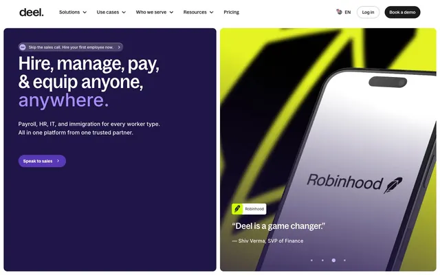
Global command split-screen — a war-room purple panel beside a neon product showcase, then warm cream scrolls below.
Color palette
Hero section background — the darkest brand surface, houses white headlines and violet accent text
CTA buttons in hero context, pill backgrounds — saturated mid-violet bridges cosmos and accent
Headline accent text ('anywhere.') in dark hero — vivid violet pops against #201547
Soft violet surface tint, used as background on secondary dark panels
Deep violet body text or decorative elements within dark sections
Product screenshot accent, border highlights — the neon counterpoint to deep purple creating visual tension
Icon fills and body-level accent color in light sections — warm, confident
Light amber for icon strokes, decorative fills — softer version of Amber Core
Button and panel backgrounds in light sections — very pale blue-gray tint
UI illustration fill in product screenshots
Primary text, icon fills, borders — near-universal dark token
Body text, nav labels, CTA button background (dark pill), footer text
Dark section backgrounds, deepest surface in light-theme stacks
Mid-dark surface, secondary panel backgrounds
Secondary body text, metadata, captions
Tertiary text, muted labels
Disabled states, light icon tones
Border separators, input outlines, card dividers
Warm-toned rule lines and subtle separators in cream body sections
Page body background — warm off-white gives light sections a tactile, paper-like quality vs pure white
Card surfaces, nav background, input backgrounds, button text on dark
High-contrast body text alternative to pure black
Success state chip background (e.g. green checkmark on Crypto selection chip)
Typography
- Weights
- 500
- Sizes
- 16px, 24px, 28px, 44px, 60px
- Line height
- 1
- Letter spacing
- -0.005em
Primary display and hero headlines — the condensed cut lets oversized text fill wide containers without breaking; the -0.005em tracking tightens the text mass. This is Deel's most distinctive typographic voice: large, dense, confident headlines that compress horizontal space.
- Weights
- 600
- Sizes
- 30px, 64px
- Line height
- 1
- Letter spacing
- 0.005em
Section headers where width is the feature — extended cut fills horizontal space at large sizes, used for spread-out banner headlines like 'The Global People Platform'
- Weights
- 500, 600
- Sizes
- 12px, 14px, 16px
- Line height
- 1.5
- Letter spacing
- 0.015em
UI labels, badge text, small captions — the workhorse standard cut at utility sizes
- Weights
- 500
- Sizes
- 15px
- Line height
- 1.6
- Letter spacing
- 0.025em
Navigation items and button labels — variable-font version allows optical tuning at this critical interactive size
- Weights
- 400, 460, 500, 560, 600, 700
- Sizes
- 10px, 12px, 13px, 14px, 15px, 16px, 17px, 18px, 20px, 24px, 60px
- Line height
- 1.4
- Letter spacing
- varies: -0.01em at large sizes, +0.006em to +0.025em at small sizes, +0.06em for all-caps labels
- Fallback
- Inter (Google Fonts)
All body copy, subheadings, stats, footer text, input values — Inter handles everything below headline level. The wide weight range (400–700) creates internal hierarchy without switching families. ss01/ss02 features keep it feeling designed rather than default.
Spacing & shape
Elevation
Components
Pill-shaped button (200px radius), background #5938b7, white text, Inter or BagossStandardVF 15px weight 500, padding 8px 16px. Small right-facing arrow icon. On #201547 backgrounds only.
Transparent background, #1b1b1b text, 200px border-radius, padding 8px 12px, BagossStandardVF 15px weight 500, letter-spacing 0.025em. Includes chevron icon at 12px. No border in default state.
Background #1b1b1b, white text, 200px border-radius, padding 8px 16px, BagossStandardVF 15px weight 500. The highest-contrast nav element — only solid-fill nav button.
Transparent background, #1b1b1b text, no border-radius (0px), padding 8px 0px, no horizontal padding. Arrow character appended. Signals navigation without visual weight.
Background #ffffff, border rgba(27,27,27,0.16) 1px, border-radius 200px, padding 1px 54px 1px 24px. Right-side icon or button inset at 54px. Inter 14px weight 400 placeholder text in #767676.
Background #fffbf4 (warm cream), border-radius 24px, no shadow, padding 24px. Contains a bold label in BagossCondensedFont 24px weight 500, descriptor in Inter 16px weight 400 #5f5f5f, and a product screenshot cropped at bottom. Border: 1px solid #dbdbdb.
Background rgba(255,255,255,0.05) — frosted white tint at 5% on dark surfaces. Border-radius 24px. No shadow. Contains bold stat in BagossCondensedFont 44px weight 500, descriptor in Inter 15px #d9d0ca.
Background #ffffff or rgba(255,255,255,0.9), border 1px solid #dbdbdb, border-radius 200px, padding 8px 16px. Flag emoji + currency code in Inter 16px weight 500 #1b1b1b. Active state adds green checkmark badge (#53a945).
Background #ffffff, border-radius 16px, padding 6px 12px, contains company logo image at 16px height + company name in Inter 13px weight 500 #1b1b1b. Subtle box-shadow: rgba(27,27,27,0.16) 0px 16px 32px.
Flat company wordmarks rendered in #a4a4a4 or #dbdbdb on #ffffff background. 16px vertical spacing between label ('TRUSTED BY 40,000+...') and logos. Labels use Inter 10px weight 600 letter-spacing 0.06em in Slate. Logos at approximately 80px wide, 24px tall.
Inter 12px weight 600, letter-spacing 0.06em, all-caps, color #5f5f5f. No background. Left-aligned above the section heading. Creates category context without visual mass.
Dark background (#141414 or #1b1b1b), three equal columns each with bold lead text in BagossCondensedFont 24px weight 500 #ffffff, body in Inter 15px weight 400 #d9d0ca. 'Learn more →' or 'Book a demo →' ghost links at bottom of each column.
Left panel: background #201547, padding 64px 48px. Right panel: background vivid product image with #ffcf25 accent border elements, no padding. Two-column 50/50 split at viewport width. Left contains BagossCondensedFont 60px headline in #ffffff with 'anywhere.' in #a98df6.
Guidelines
- Use BagossCondensedFont at 44-60px weight 500 with -0.005em letter-spacing for all primary hero headlines inside dark (#201547) sections.
- Apply 200px border-radius to all pill buttons, search inputs, and currency chips — this is the system's defining shape token.
- Use #fffbf4 (Warm Cream) as the page body background, never pure white (#ffffff), for all light-theme content sections below the hero.
- Accent the single most emotionally charged word in each hero headline with #a98df6 (Lavender Pulse) — one word only, never a phrase.
- Pair dark (#141414 or #201547) section backgrounds with Inter body text in #d9d0ca (Linen) — not pure white — for softer contrast on extended reading.
- Use rgba(27,27,27,0.16) as the standard border color for inputs and card outlines in light sections — never a solid opaque gray.
- Reserve #ffcf25 (Electric Lime) strictly for product screenshots and graphic accents — never apply it as a button or text color.
- Don't use BagossCondensedFont below 16px — at small sizes switch to BagossStandardFont or Inter for legibility.
- Don't use 8px or 16px border-radius on primary CTA buttons — those radii belong only to secondary badges and icon containers.
- Don't use #5938b7 (Violet Mid) or any saturated violet in light (cream) body sections — violet is hero-zone-only.
- Don't apply box shadows to feature product cards — the system uses border (1px #dbdbdb) as the only card boundary in light sections; shadows appear only on floating overlays.
- Don't mix BagossExtendedFont and BagossCondensedFont in the same heading — choose one cut per section based on available width.
- Don't use pure white (#ffffff) as the page background — the system's warm cream (#fffbf4) distinguishes Deel's light theme from generic white-page SaaS.
- Don't apply letter-spacing to BagossCondensedFont display headlines — the -0.005em is already set; adding positive tracking breaks the compressed silhouette.
About this system
ShowHide
Deel operates in contrasting registers — a deep purple-black (#201547) hero punched through with electric yellow-green product shots, then a cream-warm (#fffbf4) body that stretches through the rest of the page. The dual-zone layout is the signature move: dark/vivid left panel with serif-weight condensed Bagoss headlines, fluorescent product imagery on the right, then warmth and space below. Accent violet (#a98df6 to #5938b7) appears only within the dark hero for the word 'anywhere.' and CTAs — never in the light body sections. Pill-shaped buttons (200px radius) coexist with 24px-radius cards, creating a soft geometry throughout. The custom Bagoss family — in Condensed, Extended, Standard, and VF cuts — gives the brand typographic range unavailable through any system font.
Max-width approximately 1280px centered, but the hero breaks this rule — it runs full viewport width as a 50/50 split: left panel (#201547) contains text + CTA, right panel is full-bleed product imagery with no padding. Below the hero, content resets to max-width contained with 80-120px vertical section gaps. Sections alternate: white/cream light bands with card grids (3-column feature cards), then full-width dark (#141414) bands with 3-column stat rows, then a full-bleed photo section with floating UI chips overlaid. Navigation is a fixed top bar — pure white background, logo left, dropdown nav center, language + log in + CTA pill right. Hero is not full-viewport-height but a defined panel (~480px). The brand logo section (trust strip) uses a horizontal scrolling row of gray logos on white, 2 rows, separated by a light rule. Feature product cards use a 3-column equal grid with 16px gaps.
Deel mixes two distinct image registers: dark-panel graphic design (geometric yellow-green forms as abstract background shapes on the right hero panel, pure graphic, no photography) and real-world lifestyle photography (hands holding a purple iPhone over a table with an orange mug — warm, candid, slightly editorial). Product screenshots are rendered as phone mockups or flat UI crops embedded in cards, contained with 24px radius. The hero right panel uses a dramatic high-contrast shot — black angular shapes over electric yellow-green (#ffcf25), iPhone floating in front — this is purely product showcase, not human context. Below the hero, photography shifts to warm, natural-light scenes that feel ambient rather than staged. Icons are outlined, monochrome (#1b1b1b or white depending on surface), consistent 16-20px stroke-weight SVGs. Customer logos are rendered as flat gray silhouettes at reduced opacity to avoid visual competition. The overall ratio is approximately 40% imagery, 60% text+UI.
Reminiscent of Rippling, Stripe, Remote.com, Workday, Gusto.
# Deel — Style Reference
> Global command split-screen — a war-room purple panel beside a neon product showcase, then warm cream scrolls below.

**Theme:** mixed

**Site:** https://deel.com

Deel operates in contrasting registers — a deep purple-black (#201547) hero punched through with electric yellow-green product shots, then a cream-warm (#fffbf4) body that stretches through the rest of the page. The dual-zone layout is the signature move: dark/vivid left panel with serif-weight condensed Bagoss headlines, fluorescent product imagery on the right, then warmth and space below. Accent violet (#a98df6 to #5938b7) appears only within the dark hero for the word 'anywhere.' and CTAs — never in the light body sections. Pill-shaped buttons (200px radius) coexist with 24px-radius cards, creating a soft geometry throughout. The custom Bagoss family — in Condensed, Extended, Standard, and VF cuts — gives the brand typographic range unavailable through any system font.

## Tokens — Colors

| Name | Value | Token | Role |
|------|------|------|------|
| Deep Cosmos | `#201547` | `--color-deep-cosmos` | Hero section background — the darkest brand surface, houses white headlines and violet accent text |
| Violet Mid | `#5938b7` | `--color-violet-mid` | CTA buttons in hero context, pill backgrounds — saturated mid-violet bridges cosmos and accent |
| Lavender Pulse | `#a98df6` | `--color-lavender-pulse` | Headline accent text ('anywhere.') in dark hero — vivid violet pops against #201547 |
| Pale Amethyst | `#c4b1f9` | `--color-pale-amethyst` | Soft violet surface tint, used as background on secondary dark panels |
| Indigo Shadow | `#381f89` | `--color-indigo-shadow` | Deep violet body text or decorative elements within dark sections |
| Electric Lime | `#ffcf25` | `--color-electric-lime` | Product screenshot accent, border highlights — the neon counterpoint to deep purple creating visual tension |
| Amber Core | `#faaf00` | `--color-amber-core` | Icon fills and body-level accent color in light sections — warm, confident |
| Butter Glow | `#ffe27c` | `--color-butter-glow` | Light amber for icon strokes, decorative fills — softer version of Amber Core |
| Sky Mist | `#d8ebff` | `--color-sky-mist` | Button and panel backgrounds in light sections — very pale blue-gray tint |
| Powder Blue | `#b1d8fc` | `--color-powder-blue` | UI illustration fill in product screenshots |
| Midnight Ink | `#000000` | `--color-midnight-ink` | Primary text, icon fills, borders — near-universal dark token |
| Graphite | `#1b1b1b` | `--color-graphite` | Body text, nav labels, CTA button background (dark pill), footer text |
| Obsidian | `#141414` | `--color-obsidian` | Dark section backgrounds, deepest surface in light-theme stacks |
| Charcoal | `#404040` | `--color-charcoal` | Mid-dark surface, secondary panel backgrounds |
| Slate | `#5f5f5f` | `--color-slate` | Secondary body text, metadata, captions |
| Fog | `#767676` | `--color-fog` | Tertiary text, muted labels |
| Ash | `#a4a4a4` | `--color-ash` | Disabled states, light icon tones |
| Bone | `#dbdbdb` | `--color-bone` | Border separators, input outlines, card dividers |
| Linen | `#d9d0ca` | `--color-linen` | Warm-toned rule lines and subtle separators in cream body sections |
| Warm Cream | `#fffbf4` | `--color-warm-cream` | Page body background — warm off-white gives light sections a tactile, paper-like quality vs pure white |
| Pure White | `#ffffff` | `--color-pure-white` | Card surfaces, nav background, input backgrounds, button text on dark |
| Near Black | `#101828` | `--color-near-black` | High-contrast body text alternative to pure black |
| Celadon Check | `#53a945` | `--color-celadon-check` | Success state chip background (e.g. green checkmark on Crypto selection chip) |

## Tokens — Typography

### BagossCondensedFont
- **Weights:** 500
- **Sizes:** 16px, 24px, 28px, 44px, 60px
- **Line height:** 1
- **Letter spacing:** -0.005em
- **Role:** Primary display and hero headlines — the condensed cut lets oversized text fill wide containers without breaking; the -0.005em tracking tightens the text mass. This is Deel's most distinctive typographic voice: large, dense, confident headlines that compress horizontal space.

### BagossExtendedFont
- **Weights:** 600
- **Sizes:** 30px, 64px
- **Line height:** 1
- **Letter spacing:** 0.005em
- **Role:** Section headers where width is the feature — extended cut fills horizontal space at large sizes, used for spread-out banner headlines like 'The Global People Platform'

### BagossStandardFont
- **Weights:** 500, 600
- **Sizes:** 12px, 14px, 16px
- **Line height:** 1.5
- **Letter spacing:** 0.015em
- **Role:** UI labels, badge text, small captions — the workhorse standard cut at utility sizes

### BagossStandardVF
- **Weights:** 500
- **Sizes:** 15px
- **Line height:** 1.6
- **Letter spacing:** 0.025em
- **Role:** Navigation items and button labels — variable-font version allows optical tuning at this critical interactive size

### Inter
- **Substitute:** Inter (Google Fonts)
- **Weights:** 400, 460, 500, 560, 600, 700
- **Sizes:** 10px, 12px, 13px, 14px, 15px, 16px, 17px, 18px, 20px, 24px, 60px
- **Line height:** 1.4
- **Letter spacing:** varies: -0.01em at large sizes, +0.006em to +0.025em at small sizes, +0.06em for all-caps labels
- **Role:** All body copy, subheadings, stats, footer text, input values — Inter handles everything below headline level. The wide weight range (400–700) creates internal hierarchy without switching families. ss01/ss02 features keep it feeling designed rather than default.

## Tokens — Type Scale

Perfect Fourth (1.333) from 15px base.

| Role | Size | Line height | Letter spacing |
|------|------|------|------|
| caption | 10px | 1.5 | — |
| body | 15px | 1.6 | 0.375px |
| subheading | 18px | 1.5 | — |
| heading-sm | 24px | 1.2 | — |
| heading | 44px | 1.05 | -0.22px |
| heading-lg | 60px | 1 | -0.3px |
| display | 64px | 1 | 0.32px |

## Tokens — Spacing

- **Max width:** 1280px
- **Section gap:** 80-120px
- **Card padding:** 24px
- **Element gap:** 8-16px

## Tokens — Radius

- **Buttons:** 200px
- **Inputs:** 200px
- **Cards:** 24px
- **buttonsMedium:** 16px
- **chips:** 100px
- **icons:** 5px
- **panels:** 12px
- **tags:** 200px

## Tokens — Elevation

- **Floating Overlay Card (testimonial badge, currency chip group):** `rgba(27, 27, 27, 0.16) 0px 16px 32px 0px, rgba(27, 27, 27, 0.05) 0px 2px 32px 0px`

## Layout

Max-width approximately 1280px centered, but the hero breaks this rule — it runs full viewport width as a 50/50 split: left panel (#201547) contains text + CTA, right panel is full-bleed product imagery with no padding. Below the hero, content resets to max-width contained with 80-120px vertical section gaps. Sections alternate: white/cream light bands with card grids (3-column feature cards), then full-width dark (#141414) bands with 3-column stat rows, then a full-bleed photo section with floating UI chips overlaid. Navigation is a fixed top bar — pure white background, logo left, dropdown nav center, language + log in + CTA pill right. Hero is not full-viewport-height but a defined panel (~480px). The brand logo section (trust strip) uses a horizontal scrolling row of gray logos on white, 2 rows, separated by a light rule. Feature product cards use a 3-column equal grid with 16px gaps.

## Imagery

Deel mixes two distinct image registers: dark-panel graphic design (geometric yellow-green forms as abstract background shapes on the right hero panel, pure graphic, no photography) and real-world lifestyle photography (hands holding a purple iPhone over a table with an orange mug — warm, candid, slightly editorial). Product screenshots are rendered as phone mockups or flat UI crops embedded in cards, contained with 24px radius. The hero right panel uses a dramatic high-contrast shot — black angular shapes over electric yellow-green (#ffcf25), iPhone floating in front — this is purely product showcase, not human context. Below the hero, photography shifts to warm, natural-light scenes that feel ambient rather than staged. Icons are outlined, monochrome (#1b1b1b or white depending on surface), consistent 16-20px stroke-weight SVGs. Customer logos are rendered as flat gray silhouettes at reduced opacity to avoid visual competition. The overall ratio is approximately 40% imagery, 60% text+UI.

## Components

### Hero CTA Button Group

### Feature Product Cards

### Dark Stat Callout Row

### Dark Hero CTA Button
*Primary call-to-action within the dark hero panel*

Pill-shaped button (200px radius), background #5938b7, white text, Inter or BagossStandardVF 15px weight 500, padding 8px 16px. Small right-facing arrow icon. On #201547 backgrounds only.

### Ghost Pill Navigation Button
*Nav items with dropdown indicators*

Transparent background, #1b1b1b text, 200px border-radius, padding 8px 12px, BagossStandardVF 15px weight 500, letter-spacing 0.025em. Includes chevron icon at 12px. No border in default state.

### Dark Filled Pill Button
*'Book a demo' CTA in the top nav*

Background #1b1b1b, white text, 200px border-radius, padding 8px 16px, BagossStandardVF 15px weight 500. The highest-contrast nav element — only solid-fill nav button.

### Ghost Underline Button
*Text-level inline CTAs like 'Learn more →'*

Transparent background, #1b1b1b text, no border-radius (0px), padding 8px 0px, no horizontal padding. Arrow character appended. Signals navigation without visual weight.

### Pill Input with Search
*Search and email capture fields*

Background #ffffff, border rgba(27,27,27,0.16) 1px, border-radius 200px, padding 1px 54px 1px 24px. Right-side icon or button inset at 54px. Inter 14px weight 400 placeholder text in #767676.

### Feature Product Card
*Product feature cards (Deel Payroll, Deel HR, Deel IT)*

Background #fffbf4 (warm cream), border-radius 24px, no shadow, padding 24px. Contains a bold label in BagossCondensedFont 24px weight 500, descriptor in Inter 16px weight 400 #5f5f5f, and a product screenshot cropped at bottom. Border: 1px solid #dbdbdb.

### Dark Stats Panel
*Stat callout panels on dark background sections*

Background rgba(255,255,255,0.05) — frosted white tint at 5% on dark surfaces. Border-radius 24px. No shadow. Contains bold stat in BagossCondensedFont 44px weight 500, descriptor in Inter 15px #d9d0ca.

### Currency Selection Chip
*Illustrative UI chips showing selectable options (ARS, CAD, USD, etc.)*

Background #ffffff or rgba(255,255,255,0.9), border 1px solid #dbdbdb, border-radius 200px, padding 8px 16px. Flag emoji + currency code in Inter 16px weight 500 #1b1b1b. Active state adds green checkmark badge (#53a945).

### Customer Logo Badge
*Testimonial attribution chip (e.g. Robinhood badge on carousel)*

Background #ffffff, border-radius 16px, padding 6px 12px, contains company logo image at 16px height + company name in Inter 13px weight 500 #1b1b1b. Subtle box-shadow: rgba(27,27,27,0.16) 0px 16px 32px.

### Trust Logo Strip
*Social proof logo row below hero*

Flat company wordmarks rendered in #a4a4a4 or #dbdbdb on #ffffff background. 16px vertical spacing between label ('TRUSTED BY 40,000+...') and logos. Labels use Inter 10px weight 600 letter-spacing 0.06em in Slate. Logos at approximately 80px wide, 24px tall.

### Section Eyebrow Label
*Pre-heading category label (e.g. 'WHAT DEEL DOES')*

Inter 12px weight 600, letter-spacing 0.06em, all-caps, color #5f5f5f. No background. Left-aligned above the section heading. Creates category context without visual mass.

### Stat Callout Row
*Three-column feature stat blocks in dark sections*

Dark background (#141414 or #1b1b1b), three equal columns each with bold lead text in BagossCondensedFont 24px weight 500 #ffffff, body in Inter 15px weight 400 #d9d0ca. 'Learn more →' or 'Book a demo →' ghost links at bottom of each column.

### Hero Split Panel
*Primary homepage hero container*

Left panel: background #201547, padding 64px 48px. Right panel: background vivid product image with #ffcf25 accent border elements, no padding. Two-column 50/50 split at viewport width. Left contains BagossCondensedFont 60px headline in #ffffff with 'anywhere.' in #a98df6.

## Guidelines

### Do

- Use BagossCondensedFont at 44-60px weight 500 with -0.005em letter-spacing for all primary hero headlines inside dark (#201547) sections.
- Apply 200px border-radius to all pill buttons, search inputs, and currency chips — this is the system's defining shape token.
- Use #fffbf4 (Warm Cream) as the page body background, never pure white (#ffffff), for all light-theme content sections below the hero.
- Accent the single most emotionally charged word in each hero headline with #a98df6 (Lavender Pulse) — one word only, never a phrase.
- Pair dark (#141414 or #201547) section backgrounds with Inter body text in #d9d0ca (Linen) — not pure white — for softer contrast on extended reading.
- Use rgba(27,27,27,0.16) as the standard border color for inputs and card outlines in light sections — never a solid opaque gray.
- Reserve #ffcf25 (Electric Lime) strictly for product screenshots and graphic accents — never apply it as a button or text color.

### Don't

- Don't use BagossCondensedFont below 16px — at small sizes switch to BagossStandardFont or Inter for legibility.
- Don't use 8px or 16px border-radius on primary CTA buttons — those radii belong only to secondary badges and icon containers.
- Don't use #5938b7 (Violet Mid) or any saturated violet in light (cream) body sections — violet is hero-zone-only.
- Don't apply box shadows to feature product cards — the system uses border (1px #dbdbdb) as the only card boundary in light sections; shadows appear only on floating overlays.
- Don't mix BagossExtendedFont and BagossCondensedFont in the same heading — choose one cut per section based on available width.
- Don't use pure white (#ffffff) as the page background — the system's warm cream (#fffbf4) distinguishes Deel's light theme from generic white-page SaaS.
- Don't apply letter-spacing to BagossCondensedFont display headlines — the -0.005em is already set; adding positive tracking breaks the compressed silhouette.

## Agent Prompt Guide

**Quick Color Reference**
- Text (primary): #1b1b1b
- Page background (light): #fffbf4
- Hero background: #201547
- CTA button (dark): #1b1b1b
- CTA button (violet, hero): #5938b7
- Accent headline: #a98df6
- Border / divider: rgba(27,27,27,0.16)
- Secondary text: #5f5f5f

**Example Component Prompts**

1. **Hero Section (dark left panel):** Full-viewport-width, 50/50 split. Left: #201547 background, padding 64px 48px. Headline in BagossCondensedFont 60px weight 500, #ffffff, line-height 1.00, letter-spacing -0.005em — final word 'anywhere.' in #a98df6. Subtext Inter 17px weight 400 #d9d0ca. Pill CTA: background #5938b7, white text, 200px radius, padding 8px 16px, BagossStandardVF 15px. Right: full-bleed product photo, no padding.

2. **Feature Product Card (3-column grid):** Background #fffbf4, border 1px solid #dbdbdb, border-radius 24px, padding 24px. Title: BagossCondensedFont 24px weight 500 #1b1b1b. Description: Inter 16px weight 400 #5f5f5f. Product screenshot image cropped at card bottom.

3. **Dark Stat Row Section:** Background #141414, full width. Three equal columns, 48px vertical padding, 80px horizontal. Each column: stat headline BagossCondensedFont 44px weight 500 #ffffff, descriptor Inter 15px weight 400 #d9d0ca, ghost CTA 'Learn more →' Inter 14px #a98df6 below.

4. **Top Navigation Bar:** Background #ffffff, height 64px, 1280px max-width centered. Logo left (Deel wordmark, #1b1b1b). Center: Ghost pill nav items (200px radius, 8px 12px padding, BagossStandardVF 15px #1b1b1b) with chevron. Right: 'Log in' ghost button + 'Book a demo' filled dark pill (#1b1b1b bg, #ffffff text, 200px radius, 8px 16px padding).

5. **Currency Selector Chip:** Background #ffffff, border 1px solid #dbdbdb, border-radius 200px, padding 8px 16px. Flag icon 20px + currency code Inter 16px weight 500 #1b1b1b. Active state: green badge (#53a945) checkmark at trailing edge.

## Bagoss Typeface System

Deel uses a proprietary 4-cut type family (BagossCondensedFont, BagossExtendedFont, BagossStandardFont, BagossStandardVF) as its typographic identity. Each cut has a defined role: Condensed at 44-60px for compressed hero headlines; Extended at 64px for wide-spread section banners; Standard at 12-16px for UI labels and badges; StandardVF for interactive elements (nav, buttons) where variable-font optical sizing matters. All cuts share ss01/ss02 OpenType features that enable stylistic alternate glyphs — these must remain active for authentic brand rendering. Do NOT substitute Bagoss with a condensed system font at headline sizes — the proportions are distinct enough to visually break the design. If Bagoss is unavailable, use Barlow Condensed (Google Fonts, weight 500) as a structural proxy while noting it lacks the custom OpenType personality.
More like this





Keep what you find
A free account saves references to boards and can send you a weekly email of picks based on what you save.
To see every result, go Pro.