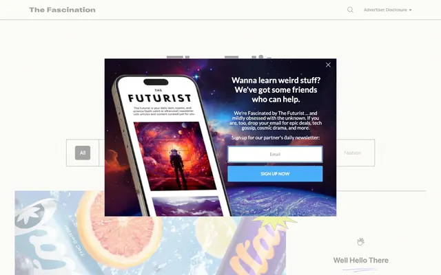
Preview image. Unlock full-res
Editorial content on a crisp canvas
Color palette
Prominent sectional headings, brand specific elements — a strong, deep violet that signals important content blocks
Secondary brand links, interactive states for less prominent actions — a slightly warmer violet for supporting interactive components
Interactive link text, outlined button borders, image highlights — the primary accent for clickable elements and visual emphasis
Violet text accent for links, tags, and emphasized short phrases.
Primary text, strong borders, solid button backgrounds, icon fills — provides high contrast for readability and defines interactive elements
Secondary text, muted borders, subtle background tints — offers slightly softer contrast for longer body copy and supporting information
Dark borders and separators for elevated surfaces and inverted UI. Do not promote it to the primary CTA color
Neutral form states, badge text, and quiet UI feedback where color should stay understated. Do not promote it to the primary CTA color
Primary canvas background, card backgrounds — maintains a bright, airy aesthetic for content presentation
Typography
- Weights
- 100, 400, 500, 700
- Sizes
- 12px, 14px, 16px, 18px, 20px, 24px, 30px, 96px
- Line height
- 0.8, 1, 1.02, 1.2, 1.33, 1.5, 1.53, 1.7, 1.91, 2.19, 2.55
- Letter spacing
- normal
- Fallback
- system-ui, sans-serif
Primary content font for body text, links, buttons, and most headings — its clean, modern sans-serif character ensures legibility across various scales. The wide range of weights supports a clear typographic hierarchy.
- Weights
- 400
- Sizes
- 48px, 60px
- Letter spacing
- normal
- Fallback
- cursive
Decorative display font used for distinctive headings and brand-specific callouts — its script style adds a unique, artisanal flair to key textual elements, counterbalancing the utilitarian Graphik.
Spacing & shape
Components
Solid Midnight (#000000) background, Ghost White (#fbfbf7) text. Border-radius 6px. Padding 8px vertical, 16px horizontal. White border for visual separation.
Transparent background, Neon Purple (#9333ea) text. No visible border, zero padding.
Sky Blue (#2ea3f2) text. No underline by default, uses color alone for affordance.
Transparent background, Graphite (#1f2937) text, Silver Ash (#767676) 1px border. No border-radius. No explicit padding provided but visually appears to have some internal spacing.
Background is transparent. No border-radius or box-shadow, appearing as raw content on the canvas.
Transparent background, Midnight (#000000) text. No border-radius or explicit padding is set for these, appearing as simple text labels.
Guidelines
- Prioritize Midnight (#000000) for all primary body text and main headings to maintain readability.
- Use Sky Blue (#2ea3f2) exclusively for interactive elements such as links and button outlines, ensuring it serves as a clear call to action.
- Apply Graphik font for all UI text, content, and body copy, utilizing its various weights for hierarchy.
- Reserve Qwitcher Grypen for decorative, prominent headings to introduce brand character, always at larger sizes (48px or 60px).
- Ensure all primary filled buttons use a Midnight (#000000) background with Ghost White (#fbfbf7) text and a 6px border-radius.
- Maintain comfortable density using 16px for element gaps and 32px for section gaps, facilitating easy content scanning.
- Keep card backgrounds transparent with no radius or shadow, allowing content to blend seamlessly with the canvas.
- Do not introduce new vibrant colors without a clear functional purpose; maintain the restrained chromatic palette.
- Avoid applying box-shadows or border-radii to content cards or basic containers; these elements should remain flat on the canvas.
- Do not use highly saturated brand colors for extensive paragraphs or body text; they are reserved for accents and headings.
- Do not deviate from the 6px border-radius for buttons and links; consistency in subtle roundedness is key.
- Avoid excessive use of the script font Qwitcher Grypen; it is a decorative accent, not a general heading or body font.
- Do not add heavy borders or backgrounds to basic input fields; they should blend into the interface using Silver Ash (#767676) 1px borders.
- Never use text colors other than Midnight (#000000) or Storm Gray (#1a202c) for long-form content to ensure optimal contrast and readability.
About this system
ShowHide
The Fascination employs a narrative-driven blog aesthetic with ample white space and a clear hierarchy. Typography centers around a robust sans-serif for content and a distinctive script font for thematic accents, creating a balance of utility and branded personality. Interaction is defined by crisp, subtle borders and a singular vivid blue for active states, keeping the focus on editorial content rather than complex UI elements. Most surfaces remain light and neutral, allowing text and imagery to take precedence without visual interruption.
The page primarily uses a max-width contained layout, though the exact max-width is not consistently defined, suggesting a flexible approach within a comfortable reading measure. The hero section often features a large image or graphic with a centered headline in text, sometimes using the decorative script font. Content sections alternate between visually distinct blocks, typically featuring text-left, image-right compositions or stacked sections. Article listings usually appear in multi-column grids (like the observed 3-column article structure), with consistent vertical spacing between elements. Navigation is a minimal top bar, suggesting a focus on content discovery within the page.
The site uses a mix of high-quality product photography and lifestyle imagery. Product shots are typically tight crops on clean or subtly textured backgrounds, focusing on the item itself. Lifestyle photos are staged, often featuring hands interacting with products or conveying a sense of aspiration. Imagery is typically contained within content blocks, without full-bleed or overlapping treatments. Icons are minimal, outlined, and monochromatic, primarily serving functional UI purposes like search or navigation rather than decorative illustration. The overall density is balanced, allowing images to punctuate text sections without overwhelming the content.
Reminiscent of Wirecutter, Gear Patrol, Food52, The Strategist (NYMag).
# The Fascination The Fascination — Style Reference
> Editorial content on a crisp canvas

**Theme:** light

**Site:** https://thefascination.com

The Fascination employs a narrative-driven blog aesthetic with ample white space and a clear hierarchy. Typography centers around a robust sans-serif for content and a distinctive script font for thematic accents, creating a balance of utility and branded personality. Interaction is defined by crisp, subtle borders and a singular vivid blue for active states, keeping the focus on editorial content rather than complex UI elements. Most surfaces remain light and neutral, allowing text and imagery to take precedence without visual interruption.

## Tokens — Colors

| Name | Value | Token | Role |
|------|------|------|------|
| Twilight Violet | `#454ad3` | `--color-twilight-violet` | Prominent sectional headings, brand specific elements — a strong, deep violet that signals important content blocks |
| Plum Hue | `#4c40e0` | `--color-plum-hue` | Secondary brand links, interactive states for less prominent actions — a slightly warmer violet for supporting interactive components |
| Sky Blue | `#2ea3f2` | `--color-sky-blue` | Interactive link text, outlined button borders, image highlights — the primary accent for clickable elements and visual emphasis |
| Neon Purple | `#9333ea` | `--color-neon-purple` | Violet text accent for links, tags, and emphasized short phrases. |
| Midnight | `#000000` | `--color-midnight` | Primary text, strong borders, solid button backgrounds, icon fills — provides high contrast for readability and defines interactive elements |
| Storm Gray | `#1a202c` | `--color-storm-gray` | Secondary text, muted borders, subtle background tints — offers slightly softer contrast for longer body copy and supporting information |
| Graphite | `#1f2937` | `--color-graphite` | Dark borders and separators for elevated surfaces and inverted UI. Do not promote it to the primary CTA color |
| Silver Ash | `#767676` | `--color-silver-ash` | Neutral form states, badge text, and quiet UI feedback where color should stay understated. Do not promote it to the primary CTA color |
| Ghost White | `#fbfbf7` | `--color-ghost-white` | Primary canvas background, card backgrounds — maintains a bright, airy aesthetic for content presentation |

## Tokens — Typography

### Graphik
- **Substitute:** system-ui, sans-serif
- **Weights:** 100, 400, 500, 700
- **Sizes:** 12px, 14px, 16px, 18px, 20px, 24px, 30px, 96px
- **Line height:** 0.8, 1, 1.02, 1.2, 1.33, 1.5, 1.53, 1.7, 1.91, 2.19, 2.55
- **Letter spacing:** normal
- **Role:** Primary content font for body text, links, buttons, and most headings — its clean, modern sans-serif character ensures legibility across various scales. The wide range of weights supports a clear typographic hierarchy.

### Qwitcher Grypen
- **Substitute:** cursive
- **Weights:** 400
- **Sizes:** 48px, 60px
- **Letter spacing:** normal
- **Role:** Decorative display font used for distinctive headings and brand-specific callouts — its script style adds a unique, artisanal flair to key textual elements, counterbalancing the utilitarian Graphik.

## Tokens — Type Scale

Perfect Fourth (1.333) from 16px base.

| Role | Size | Line height | Letter spacing |
|------|------|------|------|
| caption | 12px | 1.5 | — |
| body-sm | 14px | 1.5 | — |
| body | 16px | 1.5 | — |
| body-lg | 18px | 1.5 | — |
| heading-sm | 20px | 1.5 | — |
| heading | 24px | 1.3 | — |
| heading-lg | 30px | 1.3 | — |
| display-sm | 96px | 1.3 | — |

## Tokens — Spacing

- **Section gap:** 32px
- **Card padding:** 16px
- **Element gap:** 16px

## Tokens — Radius

- **Buttons:** 6px
- **links:** 6px

## Layout

The page primarily uses a max-width contained layout, though the exact max-width is not consistently defined, suggesting a flexible approach within a comfortable reading measure. The hero section often features a large image or graphic with a centered headline in text, sometimes using the decorative script font. Content sections alternate between visually distinct blocks, typically featuring text-left, image-right compositions or stacked sections. Article listings usually appear in multi-column grids (like the observed 3-column article structure), with consistent vertical spacing between elements. Navigation is a minimal top bar, suggesting a focus on content discovery within the page.

## Imagery

The site uses a mix of high-quality product photography and lifestyle imagery. Product shots are typically tight crops on clean or subtly textured backgrounds, focusing on the item itself. Lifestyle photos are staged, often featuring hands interacting with products or conveying a sense of aspiration. Imagery is typically contained within content blocks, without full-bleed or overlapping treatments. Icons are minimal, outlined, and monochromatic, primarily serving functional UI purposes like search or navigation rather than decorative illustration. The overall density is balanced, allowing images to punctuate text sections without overwhelming the content.

## Components

### Primary Filled Button
*Call-to-action button for core interactions.*

Solid Midnight (#000000) background, Ghost White (#fbfbf7) text. Border-radius 6px. Padding 8px vertical, 16px horizontal. White border for visual separation.

### Ghost Accent Button
*Secondary action button for less prominent interactions.*

Transparent background, Neon Purple (#9333ea) text. No visible border, zero padding.

### Text Link
*Inline navigation and contextual links.*

Sky Blue (#2ea3f2) text. No underline by default, uses color alone for affordance.

### Input Field
*Standard text input element.*

Transparent background, Graphite (#1f2937) text, Silver Ash (#767676) 1px border. No border-radius. No explicit padding provided but visually appears to have some internal spacing.

### Card Item
*Container for individual content pieces like articles or product listings.*

Background is transparent. No border-radius or box-shadow, appearing as raw content on the canvas.

### Category Tag
*Small, descriptive labels for content categorization.*

Transparent background, Midnight (#000000) text. No border-radius or explicit padding is set for these, appearing as simple text labels.

## Guidelines

### Do

- Prioritize Midnight (#000000) for all primary body text and main headings to maintain readability.
- Use Sky Blue (#2ea3f2) exclusively for interactive elements such as links and button outlines, ensuring it serves as a clear call to action.
- Apply Graphik font for all UI text, content, and body copy, utilizing its various weights for hierarchy.
- Reserve Qwitcher Grypen for decorative, prominent headings to introduce brand character, always at larger sizes (48px or 60px).
- Ensure all primary filled buttons use a Midnight (#000000) background with Ghost White (#fbfbf7) text and a 6px border-radius.
- Maintain comfortable density using 16px for element gaps and 32px for section gaps, facilitating easy content scanning.
- Keep card backgrounds transparent with no radius or shadow, allowing content to blend seamlessly with the canvas.

### Don't

- Do not introduce new vibrant colors without a clear functional purpose; maintain the restrained chromatic palette.
- Avoid applying box-shadows or border-radii to content cards or basic containers; these elements should remain flat on the canvas.
- Do not use highly saturated brand colors for extensive paragraphs or body text; they are reserved for accents and headings.
- Do not deviate from the 6px border-radius for buttons and links; consistency in subtle roundedness is key.
- Avoid excessive use of the script font Qwitcher Grypen; it is a decorative accent, not a general heading or body font.
- Do not add heavy borders or backgrounds to basic input fields; they should blend into the interface using Silver Ash (#767676) 1px borders.
- Never use text colors other than Midnight (#000000) or Storm Gray (#1a202c) for long-form content to ensure optimal contrast and readability.

## Agent Prompt Guide

Quick Color Reference:
text: #000000
background: #fbfbf7
border: #000000
accent: #2ea3f2
primary action: #2ea3f2 (outlined action border)

Example Component Prompts:
1. Create an Outlined Primary Action: Transparent background, #2ea3f2 border and text, 9999px radius, compact pill padding. Use it for the main CTA instead of a filled button.
2. Design a blog article card: Transparent background, no border-radius. Headline in Graphik weight 500 at 24px, #000000. Body text in Graphik weight 400 at 16px, #1a202c.
3. Implement an input field: Transparent background, 1px Silver Ash (#767676) border. Placeholder text in Graphite (#1f2937), Graphik font, 16px.
4. Create a prominent section header: Text 'Well Hello There' in Qwitcher Grypen weight 400 at 60px, color Twilight Violet (#454ad3).
More like this







Keep what you find
A free account saves references to boards and can send you a weekly email of picks based on what you save.
To see every result, go Pro.