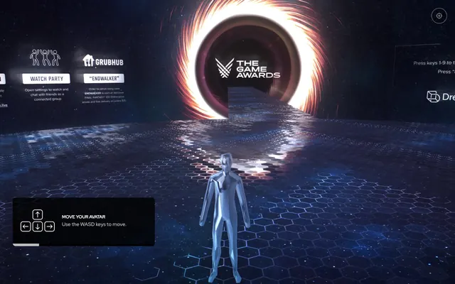
Preview image. Unlock full-res
Midnight Command Center
Color palette
Immersive backgrounds, primary text, prominent borders, icons
Hairline borders, dividers, input outlines, and card edges on light surfaces. Do not promote it to the primary CTA color
Subtle UI backgrounds, secondary borders, less prominent textual elements
Background for translucent cards and panels, creating a sense of layered depth
Typography
- Weights
- 400, 600
- Sizes
- 10px, 14px, 16px
- Line height
- 1.2
- Letter spacing
- normal
- Fallback
- Open Sans
Primary UI text, labels, interactive elements, card content. Its compact nature supports dense information within a constrained UI.
Spacing & shape
Components
Cards have a background of rgba(0, 0, 0, 0.8), a border radius of 10px, and padding of 38px on top/bottom and 24px on left/right. They carry no shadow, suggesting they are part of the main visual plane.
Buttons are typically all-caps text with a weight of 600, `Ghost White` text on a `Void Black` translucent background. They have a subtle `Ghost White` border and a border radius of 10px, providing a clear interactive hit area.
Small, dark panels with `Void Black` background and `Ghost White` text for instructions. They use the 10px border radius and minimal padding to stay concise.
Guidelines
- Use `Void Black` for primary backgrounds and text for maximum contrast and an immersive dark atmosphere.
- Apply `Ghost White` for all interactive text and icons to ensure visibility against dark backgrounds.
- Prefer `Red Hat Display` for all UI text, utilizing weights 400 and 600 for hierarchy.
- Maintain a consistent border-radius of `10px` for all interactive elements and contained content like cards.
- Implement card padding of `38px` vertical and `24px` horizontal, using rgba(0, 0, 0, 0.8) for the background to create translucent layers.
- Utilize `System UI Gray` for subtle background elements or less prominent text to introduce visual variety without distracting from the immersive dark theme.
- Ensure headings and calls to action are presented in all-caps using `Red Hat Display` weight 600 for emphasis.
- Avoid using bright or highly saturated colors for large background areas; color should be reserved for functional accents or atmospheric elements.
- Do not introduce complex shadows or extreme elevation; the design relies on subtle layering effects with translucent backgrounds.
- Do not deviate from the `Red Hat Display` font family; font consistency is key to the system's precise feel.
- Do not use generic button styles; interactive elements should echo the Ghost UI Button aesthetic with translucent backgrounds and subtle borders.
- Avoid varying component radii; `10px` is the signature shape for all defined components.
- Do not use letter-spacing other than 'normal' for `Red Hat Display` to maintain its intended compact readability.
- Do not embed images or graphics that break the dark, immersive aesthetic with incongruent brightness or style.
About this system
ShowHide
The Game Awards Microverse immerses users in a dark, atmospheric virtual environment. Its design language is driven by luminous UI elements floating within a deep, inky canvas. Typography is compact and precise, often used in all-caps for labels and navigation. Components are subtle, translucent overlays, appearing as frosted glass panels that provide contextual information without breaking the immersive dark aesthetic. The system prioritizes functional clarity amidst a visually rich, low-light setting.
The layout is full-bleed, with a deeply immersive background occupying the entire viewport. Informational cards and instructional overlays are positioned contextually, often floating against the dark, detailed environment. The hero pattern is a central, luminous visual element (the vortex) with primary branding embedded within. Content is arranged in compact, self-contained panels, often centered or left-aligned within a smaller logical content area. There is no visible grid for features; individual UI elements are placed functionally. Navigation is minimal, likely consisting of small, contextual icons or text links that appear as needed. The density is spacious, allowing the background environment to dominate.
This design system primarily uses dark, immersive, 3D rendered environments as its visual backdrop rather than traditional imagery. The 'game awards' logo itself is integrated into a central swirling vortex graphic. UI elements rely on simple icons with a subtle outlined style and 'Ghost White' fills. Product screenshots are absent, with the environment itself serving as the primary visual content. Density is low; large areas of the dark environment are juxtaposed with small, functional UI elements.
Reminiscent of Decentraland, Fortnite (UI), Roblox (Game UI), Otherworld (VR experiences).
# The Game Awards Microverse — Style Reference
> Midnight Command Center

**Theme:** dark

**Site:** https://thegameawards.dreamwave.live

The Game Awards Microverse immerses users in a dark, atmospheric virtual environment. Its design language is driven by luminous UI elements floating within a deep, inky canvas. Typography is compact and precise, often used in all-caps for labels and navigation. Components are subtle, translucent overlays, appearing as frosted glass panels that provide contextual information without breaking the immersive dark aesthetic. The system prioritizes functional clarity amidst a visually rich, low-light setting.

## Tokens — Colors

| Name | Value | Token | Role |
|------|------|------|------|
| Void Black | `#000000` | `--color-void-black` | Immersive backgrounds, primary text, prominent borders, icons |
| Ghost White | `#ffffff` | `--color-ghost-white` | Hairline borders, dividers, input outlines, and card edges on light surfaces. Do not promote it to the primary CTA color |
| System UI Gray | `#f4f4f4` | `--color-system-ui-gray` | Subtle UI backgrounds, secondary borders, less prominent textual elements |
| Panel Dark | `#313131` | `--color-panel-dark` | Background for translucent cards and panels, creating a sense of layered depth |

## Tokens — Typography

### Red Hat Display
- **Substitute:** Open Sans
- **Weights:** 400, 600
- **Sizes:** 10px, 14px, 16px
- **Line height:** 1.2
- **Letter spacing:** normal
- **Role:** Primary UI text, labels, interactive elements, card content. Its compact nature supports dense information within a constrained UI.

## Tokens — Type Scale

Major Third (1.25) from 16px base.

| Role | Size | Line height | Letter spacing |
|------|------|------|------|
| caption | 10px | 1.2 | — |
| body-sm | 14px | 1.2 | — |
| body | 16px | 1.2 | — |

## Tokens — Spacing

- **Max width:** 200px
- **Section gap:** 60px
- **Card padding:** 24px
- **Element gap:** 10px

## Tokens — Radius

- **Buttons:** 10px
- **Cards:** 10px

## Layout

The layout is full-bleed, with a deeply immersive background occupying the entire viewport. Informational cards and instructional overlays are positioned contextually, often floating against the dark, detailed environment. The hero pattern is a central, luminous visual element (the vortex) with primary branding embedded within. Content is arranged in compact, self-contained panels, often centered or left-aligned within a smaller logical content area. There is no visible grid for features; individual UI elements are placed functionally. Navigation is minimal, likely consisting of small, contextual icons or text links that appear as needed. The density is spacious, allowing the background environment to dominate.

## Imagery

This design system primarily uses dark, immersive, 3D rendered environments as its visual backdrop rather than traditional imagery. The 'game awards' logo itself is integrated into a central swirling vortex graphic. UI elements rely on simple icons with a subtle outlined style and 'Ghost White' fills. Product screenshots are absent, with the environment itself serving as the primary visual content. Density is low; large areas of the dark environment are juxtaposed with small, functional UI elements.

## Components

### Microverse Card
*Contextual information display.*

Cards have a background of rgba(0, 0, 0, 0.8), a border radius of 10px, and padding of 38px on top/bottom and 24px on left/right. They carry no shadow, suggesting they are part of the main visual plane.

### Ghost UI Button
*Interactive controls within the immersive environment.*

Buttons are typically all-caps text with a weight of 600, `Ghost White` text on a `Void Black` translucent background. They have a subtle `Ghost White` border and a border radius of 10px, providing a clear interactive hit area.

### Help Overlay Panel
*Instructional text and control displays.*

Small, dark panels with `Void Black` background and `Ghost White` text for instructions. They use the 10px border radius and minimal padding to stay concise.

## Guidelines

### Do

- Use `Void Black` for primary backgrounds and text for maximum contrast and an immersive dark atmosphere.
- Apply `Ghost White` for all interactive text and icons to ensure visibility against dark backgrounds.
- Prefer `Red Hat Display` for all UI text, utilizing weights 400 and 600 for hierarchy.
- Maintain a consistent border-radius of `10px` for all interactive elements and contained content like cards.
- Implement card padding of `38px` vertical and `24px` horizontal, using rgba(0, 0, 0, 0.8) for the background to create translucent layers.
- Utilize `System UI Gray` for subtle background elements or less prominent text to introduce visual variety without distracting from the immersive dark theme.
- Ensure headings and calls to action are presented in all-caps using `Red Hat Display` weight 600 for emphasis.

### Don't

- Avoid using bright or highly saturated colors for large background areas; color should be reserved for functional accents or atmospheric elements.
- Do not introduce complex shadows or extreme elevation; the design relies on subtle layering effects with translucent backgrounds.
- Do not deviate from the `Red Hat Display` font family; font consistency is key to the system's precise feel.
- Do not use generic button styles; interactive elements should echo the Ghost UI Button aesthetic with translucent backgrounds and subtle borders.
- Avoid varying component radii; `10px` is the signature shape for all defined components.
- Do not use letter-spacing other than 'normal' for `Red Hat Display` to maintain its intended compact readability.
- Do not embed images or graphics that break the dark, immersive aesthetic with incongruent brightness or style.

## Agent Prompt Guide

Quick Color Reference:
text: #ffffff
background: #000000
border: #ffffff
accent: no distinct accent color
primary action: no distinct CTA color

Example Component Prompts:
1. Create a primary instruction panel: Use `Panel Dark` background, `10px` border radius, `38px` vertical and `24px` horizontal padding. The main text should be `Ghost White` using `Red Hat Display` weight 400, size 16px, line-height 1.2. Include a secondary all-caps label: `Ghost White`, `Red Hat Display` weight 600, size 10px.
2. Design a `Ghost UI Button`: `Void Black` background at 80% opacity, `Ghost White` 2px border, `10px` border radius. The button text should be all-caps `Ghost White`, `Red Hat Display` weight 600, size 14px.
3. Build a small data display card: Background `Panel Dark`, with a `Ghost White` 2px border, and `10px` radius. Content text should be `Ghost White`, `Red Hat Display` weight 400, size 14px. Inner padding should be `24px` horizontal and `38px` vertical.
More like this




Keep what you find
A free account saves references to boards and can send you a weekly email of picks based on what you save.
To see every result, go Pro.