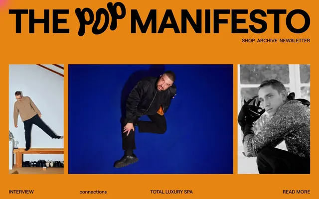
Preview image. Unlock full-res
digital zine, high contrast
Color palette
Primary background for various sections, providing a high-energy stage for content
Alternate background color, creating distinct content blocks and providing visual interest
Dark borders and separators for elevated surfaces and inverted UI. Do not promote it to the primary CTA color
Typography
- Weights
- 400
- Sizes
- 12px, 15px, 22px, 33px
- Line height
- 0.7, 1.2
- Letter spacing
- normal
- Fallback
- Inter
Body text, navigation, and subheadings; its geometric, sharp quality contributes to the editorial feel.
- Weights
- 400
- Sizes
- 15px
- Line height
- 1.2
- Letter spacing
- normal
- Fallback
- Inter Bold
Small headings and emphasis; provides a more opinionated version of the primary typeface without increasing visual weight with a heavier font weight.
Spacing & shape
Components
Text uses Roobert at 33px, weight 400, color Midnight Ink (#000000), line height 0.70.
Text uses Roobert at 15px, weight 400, color Midnight Ink (#000000), line height 1.20. No distinct background or border.
An image with no border-radius, followed by Roobert text at 15px, color Midnight Ink (#000000) for caption, and 25px top/bottom padding.
Background is highly saturated (e.g., Neon Pink #ff29f1 or Electric Blue #287aea), text uses Roobert at 15px or 22px, weight 400, color Midnight Ink (#000000), with 25px top/bottom padding.
Text uses Roobert at 12px, weight 400, color Midnight Ink (#000000), line height 1.20, with 5px left padding and 9px top padding.
Guidelines
- Use Midnight Ink (#000000) for all text and interactive borders to ensure maximum contrast.
- Implement Roobert 400 as the sole typeface, varying size and line height for hierarchy.
- Employ highly saturated, single-color backgrounds like Neon Pink (#ff29f1) or Electric Blue (#287aea) for distinct content blocks, ensuring visual separation.
- Maintain hard, 0px border-radius for all elements, including images and interactive areas.
- Utilize 291px for vertical section gaps to create generous negative space and a spacious feel.
- Apply 20px as the standard horizontal and vertical gap between related elements.
- Assume all interactivity is communicated through text link styles or color block background changes, not subtle hover states or shadows.
- Do not use subtle background gradients or textures; stick to flat, vibrant color blocks.
- Avoid softer, desaturated or pastel colors, which would dilute the high-contrast aesthetic.
- Do not introduce rounded corners; all shapes should be sharp 0px radius to preserve the crisp, editorial look.
- Refrain from using drop shadows or complex elevation schemes; rely on color blocking for visual hierarchy.
- Do not use varied typography weights; Roobert 400 is the only weight. Change text size and line height for hierarchy.
- Do not use excessive white space within content blocks; reserve large spacing values for section separation only.
- Do not introduce decorative icons unless they are bold, single-color, and contribute explicitly to the high-contrast identity.
About this system
ShowHide
The Pop Manifesto's visual language is a bold, high-contrast digital zine. It features stark black typography against vibrant, saturated backgrounds, often utilizing a single dominant color per section. The typography leans into a strong, editorial aesthetic with precise tracking and a clear hierarchy. Components are minimal, relying on color blocking and crisp text to define interactions rather than subtle shadows or rounded forms.
The page uses a full-bleed layout, where content sections stretch the full viewport width. The hero section features a prominent, centered headline over a vibrant background. Content frequently uses a multi-column grid, prominently a 3-column layout for images and associated text. Sections are separated by large vertical gaps (291px) and distinct, solid color changes, creating a strong, block-like rhythm. Navigation is minimal, likely a fixed top bar or simple links within the header and footer.
This site features a mix of photography styles: studio portraits with bold, single-color backdrops (like electric blue), candid lifestyle shots, and black-and-white portraits. Images are mostly contained within rectangular frames, with sharp edges, functioning as content rather than decorative backgrounds. They are high-density, taking up significant visual space to act as focal points.
Reminiscent of 032c, Paper Magazine, Dazed Digital, SSENSE.
# The Pop Manifesto — Style Reference
> digital zine, high contrast

**Theme:** dark

**Site:** https://thepopmanifesto.com

The Pop Manifesto's visual language is a bold, high-contrast digital zine. It features stark black typography against vibrant, saturated backgrounds, often utilizing a single dominant color per section. The typography leans into a strong, editorial aesthetic with precise tracking and a clear hierarchy. Components are minimal, relying on color blocking and crisp text to define interactions rather than subtle shadows or rounded forms.

## Tokens — Colors

| Name | Value | Token | Role |
|------|------|------|------|
| Neon Pink | `#ff29f1` | `--color-neon-pink` | Primary background for various sections, providing a high-energy stage for content |
| Electric Blue | `#287aea` | `--color-electric-blue` | Alternate background color, creating distinct content blocks and providing visual interest |
| Midnight Ink | `#000000` | `--color-midnight-ink` | Dark borders and separators for elevated surfaces and inverted UI. Do not promote it to the primary CTA color |

## Tokens — Typography

### Roobert
- **Substitute:** Inter
- **Weights:** 400
- **Sizes:** 12px, 15px, 22px, 33px
- **Line height:** 0.7, 1.2
- **Letter spacing:** normal
- **Role:** Body text, navigation, and subheadings; its geometric, sharp quality contributes to the editorial feel.

### Roobert Bold
- **Substitute:** Inter Bold
- **Weights:** 400
- **Sizes:** 15px
- **Line height:** 1.2
- **Letter spacing:** normal
- **Role:** Small headings and emphasis; provides a more opinionated version of the primary typeface without increasing visual weight with a heavier font weight.

## Tokens — Type Scale

Augmented Fourth (1.414) from 22px base.

| Role | Size | Line height | Letter spacing |
|------|------|------|------|
| caption | 12px | 1.2 | — |
| body-sm | 15px | 1.2 | — |
| body | 22px | 1.2 | — |
| body-lg | 33px | 1.2 | — |

## Tokens — Spacing

- **Card padding:** 25px
- **Element gap:** 20px

## Tokens — Radius

- **none:** 0px

## Layout

The page uses a full-bleed layout, where content sections stretch the full viewport width. The hero section features a prominent, centered headline over a vibrant background. Content frequently uses a multi-column grid, prominently a 3-column layout for images and associated text. Sections are separated by large vertical gaps (291px) and distinct, solid color changes, creating a strong, block-like rhythm. Navigation is minimal, likely a fixed top bar or simple links within the header and footer.

## Imagery

This site features a mix of photography styles: studio portraits with bold, single-color backdrops (like electric blue), candid lifestyle shots, and black-and-white portraits. Images are mostly contained within rectangular frames, with sharp edges, functioning as content rather than decorative backgrounds. They are high-density, taking up significant visual space to act as focal points.

## Components

### Section Headline
*Main content headings for distinct page sections.*

Text uses Roobert at 33px, weight 400, color Midnight Ink (#000000), line height 0.70.

### Navigation Link
*Top-level navigation items.*

Text uses Roobert at 15px, weight 400, color Midnight Ink (#000000), line height 1.20. No distinct background or border.

### Image Card
*Displays photographic content with prominent captions.*

An image with no border-radius, followed by Roobert text at 15px, color Midnight Ink (#000000) for caption, and 25px top/bottom padding.

### Interactive Link Block
*Clickable blocks usually containing descriptive text.*

Background is highly saturated (e.g., Neon Pink #ff29f1 or Electric Blue #287aea), text uses Roobert at 15px or 22px, weight 400, color Midnight Ink (#000000), with 25px top/bottom padding.

### Sub-Navigation Link
*Secondary navigation or category links.*

Text uses Roobert at 12px, weight 400, color Midnight Ink (#000000), line height 1.20, with 5px left padding and 9px top padding.

## Guidelines

### Do

- Use Midnight Ink (#000000) for all text and interactive borders to ensure maximum contrast.
- Implement Roobert 400 as the sole typeface, varying size and line height for hierarchy.
- Employ highly saturated, single-color backgrounds like Neon Pink (#ff29f1) or Electric Blue (#287aea) for distinct content blocks, ensuring visual separation.
- Maintain hard, 0px border-radius for all elements, including images and interactive areas.
- Utilize 291px for vertical section gaps to create generous negative space and a spacious feel.
- Apply 20px as the standard horizontal and vertical gap between related elements.
- Assume all interactivity is communicated through text link styles or color block background changes, not subtle hover states or shadows.

### Don't

- Do not use subtle background gradients or textures; stick to flat, vibrant color blocks.
- Avoid softer, desaturated or pastel colors, which would dilute the high-contrast aesthetic.
- Do not introduce rounded corners; all shapes should be sharp 0px radius to preserve the crisp, editorial look.
- Refrain from using drop shadows or complex elevation schemes; rely on color blocking for visual hierarchy.
- Do not use varied typography weights; Roobert 400 is the only weight. Change text size and line height for hierarchy.
- Do not use excessive white space within content blocks; reserve large spacing values for section separation only.
- Do not introduce decorative icons unless they are bold, single-color, and contribute explicitly to the high-contrast identity.

## Agent Prompt Guide

Quick Color Reference:
text: #000000
background: #ff29f1
border: #000000
accent: #287aea
primary action: no distinct CTA color

Example Component Prompts:
Create a hero section with a Neon Pink background, a main headline 'THE POP MANIFESTO' in Midnight Ink, Roobert 33px weight 400, line height 0.70. Below it, a sub-navigation link 'SHOP' in Midnight Ink, Roobert 15px weight 400, line height 1.20.
Create a content block with an Electric Blue background, featuring three image cards laid out horizontally. Each card has a full-bleed image and a caption 'Interview' in Midnight Ink, Roobert 15px, weight 400, with 25px padding above and below.
More like this



Keep what you find
A free account saves references to boards and can send you a weekly email of picks based on what you save.
To see every result, go Pro.