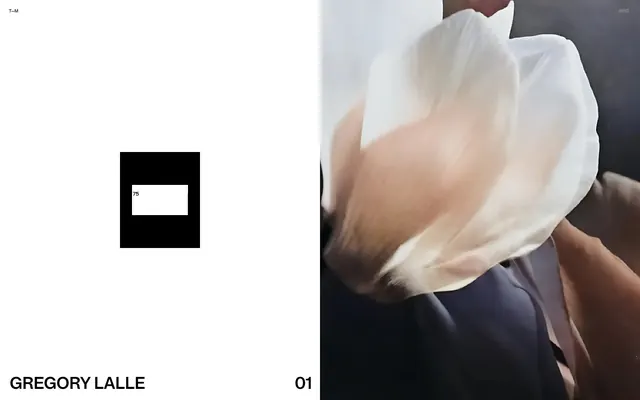
Preview image. Unlock full-res
monochrome digital canvas, refined with precise typography.
Color palette
Hairline borders, dividers, input outlines, and card edges on light surfaces. Do not promote it to the primary CTA color
Dark borders and separators for elevated surfaces and inverted UI. Do not promote it to the primary CTA color
Typography
- Weights
- 500, 600
- Sizes
- 10px, 16px, 38px
- Line height
- 1, 1.5
- Letter spacing
- -0.0300em
- Fallback
- Inter
All textual elements from headings to body text and navigation. Its custom geometric form, often at a very tight letter-spacing, is central to the brand's sharp, modern identity.
Spacing & shape
Components
Uses Lay Grotesk, 10px, weight 500, with Midnight Black text color. No background or border, allowing for a lightweight, modular navigation structure.
Lay Grotesk, 38px, weight 600, Midnight Black text on Canvas White background. Characterized by extremely tight line-height (1.0) and letter-spacing (-0.0300em) to create dense, impactful text blocks.
A square block of Midnight Black with a Canvas White inner rectangle. Contains '75' (example) in Lay Grotesk, white. The outer block itself has a 4px border of Midnight Black.
Uses Lay Grotesk, 16px, weight 500, Midnight Black text color. Appears on Canvas White backgrounds. No specific padding or border defined for individual text entries, relying on layout for spacing.
Guidelines
- Adhere strictly to a monochrome palette using only Canvas White (#ffffff) and Midnight Black (#000000).
- Employ Lay Grotesk for all text, maintaining precise letter-spacing of -0.0300em for character density and visual consistency.
- Utilize 20px for all significant internal padding and element separation within components and content blocks.
- Ensure all interactive elements, even if not explicitly defined with background, have a clear border or text color change for state representation.
- Treat images and visual content as abstract blocks, often framed by Midnight Black or given a rigid position within the Canvas White background.
- Maintain a rigid, explicit grid system for all layout decisions, emphasizing clear divisions and precise alignment.
- Prioritize typography as the primary visual communication tool, favoring density and stark contrast over decorative elements.
- Introduce any chromatic colors; the system is strictly black and white.
- Use variable spacing for internal elements; adhere to the 20px unit for consistency.
- Apply any border-radius; all corners should be sharp and geometric (0px radius).
- Use drop shadows or elevation effects; the design emphasizes flat surfaces and sharp contrasts.
- Employ any font families other than Lay Grotesk.
- Allow text to flow loosely; maintain the tight line-height and letter-spacing for all Lay Grotesk instances.
- Introduce complex graphical elements; visual content should be minimalist and abstract, often expressed as solid black blocks or high-contrast imagery.
About this system
ShowHide
The Thomas Monavon design system creates a stark, high-contrast visual experience using only black and white. Typography is the primary visual element, dominating layouts with precise letter-spacing and strong geometric forms. The aesthetic is extremely minimalist, focusing on clarity and directness through a rigid grid and controlled visual density. Visual elements like images are treated as abstract blocks within this monochrome framework.
The page uses a strict split-screen or multi-column layout, favoring a fixed, responsive width for content. The hero often features a dramatic two-column split: one side a large abstract image, the other white space with minimal branding. Vertical rhythm is created by consistent, often large, spacing between content blocks, with sections feeling very distinct. Content arrangement is typically left-aligned text against a dominant white background, sometimes juxtaposed with solid black blocks or imagery. There is no traditional card grid and navigation is very minimal, often just corner links.
The visual language focuses on high-contrast, minimalist imagery. Photography, when present, is often monochromatic or desaturated, featuring abstract forms or close-up textures, and is treated as a contained block or a portion of a split-screen layout. There are no illustrations. Icons are text-based or implied through stark black and white blocks. Imagery serves to create atmosphere or abstract interest rather than detailed explanation, and density is low, making imagery a significant visual anchor when used.
Reminiscent of Awwwards Nominees, B&W Portfolio Sites, Basic/Dept.
# Thomas Monavon — Style Reference
> monochrome digital canvas, refined with precise typography.

**Theme:** light

**Site:** https://www.thomasmonavon.com

The Thomas Monavon design system creates a stark, high-contrast visual experience using only black and white. Typography is the primary visual element, dominating layouts with precise letter-spacing and strong geometric forms. The aesthetic is extremely minimalist, focusing on clarity and directness through a rigid grid and controlled visual density. Visual elements like images are treated as abstract blocks within this monochrome framework.

## Tokens — Colors

| Name | Value | Token | Role |
|------|------|------|------|
| Canvas White | `#ffffff` | `--color-canvas-white` | Hairline borders, dividers, input outlines, and card edges on light surfaces. Do not promote it to the primary CTA color |
| Midnight Black | `#000000` | `--color-midnight-black` | Dark borders and separators for elevated surfaces and inverted UI. Do not promote it to the primary CTA color |

## Tokens — Typography

### Lay Grotesk
- **Substitute:** Inter
- **Weights:** 500, 600
- **Sizes:** 10px, 16px, 38px
- **Line height:** 1, 1.5
- **Letter spacing:** -0.0300em
- **Role:** All textual elements from headings to body text and navigation. Its custom geometric form, often at a very tight letter-spacing, is central to the brand's sharp, modern identity.

## Tokens — Type Scale

| Role | Size | Line height | Letter spacing |
|------|------|------|------|
| caption | 10px | 1.5 | -0.48px |
| body | 16px | 1.5 | -0.48px |
| heading | 38px | 1 | -1.14px |

## Tokens — Spacing

- **Card padding:** 20px
- **Element gap:** 20px

## Tokens — Radius

- **Default:** 0px

## Layout

The page uses a strict split-screen or multi-column layout, favoring a fixed, responsive width for content. The hero often features a dramatic two-column split: one side a large abstract image, the other white space with minimal branding. Vertical rhythm is created by consistent, often large, spacing between content blocks, with sections feeling very distinct. Content arrangement is typically left-aligned text against a dominant white background, sometimes juxtaposed with solid black blocks or imagery. There is no traditional card grid and navigation is very minimal, often just corner links.

## Imagery

The visual language focuses on high-contrast, minimalist imagery. Photography, when present, is often monochromatic or desaturated, featuring abstract forms or close-up textures, and is treated as a contained block or a portion of a split-screen layout. There are no illustrations. Icons are text-based or implied through stark black and white blocks. Imagery serves to create atmosphere or abstract interest rather than detailed explanation, and density is low, making imagery a significant visual anchor when used.

## Components

### Navigation Link
*Top-level navigation and informational links.*

Uses Lay Grotesk, 10px, weight 500, with Midnight Black text color. No background or border, allowing for a lightweight, modular navigation structure.

### Headline Block
*Primary textual brand presence.*

Lay Grotesk, 38px, weight 600, Midnight Black text on Canvas White background. Characterized by extremely tight line-height (1.0) and letter-spacing (-0.0300em) to create dense, impactful text blocks.

### Interactive Number Box
*Contextual navigation or content indicators.*

A square block of Midnight Black with a Canvas White inner rectangle. Contains '75' (example) in Lay Grotesk, white. The outer block itself has a 4px border of Midnight Black.

### Basic Text Entry
*General content and informational text.*

Uses Lay Grotesk, 16px, weight 500, Midnight Black text color. Appears on Canvas White backgrounds. No specific padding or border defined for individual text entries, relying on layout for spacing.

## Guidelines

### Do

- Adhere strictly to a monochrome palette using only Canvas White (#ffffff) and Midnight Black (#000000).
- Employ Lay Grotesk for all text, maintaining precise letter-spacing of -0.0300em for character density and visual consistency.
- Utilize 20px for all significant internal padding and element separation within components and content blocks.
- Ensure all interactive elements, even if not explicitly defined with background, have a clear border or text color change for state representation.
- Treat images and visual content as abstract blocks, often framed by Midnight Black or given a rigid position within the Canvas White background.
- Maintain a rigid, explicit grid system for all layout decisions, emphasizing clear divisions and precise alignment.
- Prioritize typography as the primary visual communication tool, favoring density and stark contrast over decorative elements.

### Don't

- Introduce any chromatic colors; the system is strictly black and white.
- Use variable spacing for internal elements; adhere to the 20px unit for consistency.
- Apply any border-radius; all corners should be sharp and geometric (0px radius).
- Use drop shadows or elevation effects; the design emphasizes flat surfaces and sharp contrasts.
- Employ any font families other than Lay Grotesk.
- Allow text to flow loosely; maintain the tight line-height and letter-spacing for all Lay Grotesk instances.
- Introduce complex graphical elements; visual content should be minimalist and abstract, often expressed as solid black blocks or high-contrast imagery.

## Agent Prompt Guide

Quick Color Reference:
text: #000000
background: #ffffff
border: #000000
accent: no distinct accent color
primary action: no distinct CTA color

Example Component Prompts:
1. Create a primary headline: 'GREGORY LALLE' using Lay Grotesk, 38px, weight 600, #000000, line-height 1.0, letter-spacing -0.0300em, on a Canvas White background.
2. Design a minimalist navigation link: 'T—M' using Lay Grotesk, 10px, weight 500, #000000.
3. Build an 'Interactive Number Box' with a 4px #000000 border, filled with #000000, containing a #ffffff rectangle, and the number '75' inside the rectangle in #ffffff, Lay Grotesk, 16px, weight 500, letter-spacing -0.0300em.
4. Produce a large content block that is 50% screen width, filled with Midnight Black, with no visible text or imagery.
More like this









Keep what you find
A free account saves references to boards and can send you a weekly email of picks based on what you save.
To see every result, go Pro.