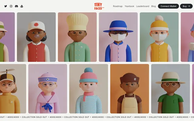
Preview image. Unlock full-res
Whimsical collectibles on pastel canvas
Color palette
Accent color for interactive elements, links, and decorative strokes – evokes warmth and playfulness
Dominant background for hero sections, conveying depth and seriousness to balance the whimsical characters
Card backgrounds for content grouping, lending an organic, muted tone
Card backgrounds for content grouping, offering a cool, muted tone
Card backgrounds for content grouping, providing a soft, warm tone contrasting with the minty greens
Decorative highlights, especially for section titles and borders, adding a vintage feel
Primary text, button backgrounds, strong borders
General page background, light button text, subtle borders
Subtle section dividers, hairline borders
Inverted text, button text on dark backgrounds, icon fills
Typography
- Weights
- 300, 400, 500
- Sizes
- 14px, 16px, 20px, 24px
- Line height
- 1.5, 2.25, 2.88
- Letter spacing
- 0.0790em
- Fallback
- system-ui, sans-serif
Body text, navigation links, button labels, and small informational text. The slightly wide letter-spacing gives it an open, approachable feel.
- Weights
- 500
- Sizes
- 50px, 64px, 187px
- Line height
- 1, 1.1, 1.3
- Letter spacing
- normal
- Fallback
- serif
Headlines and prominent display text. The unique, almost stencil-like quality of this custom typeface is a core brand identifier, making headings visually distinctive and playful.
- Weights
- 400
- Sizes
- 13px
- Line height
- 1.2
- Letter spacing
- normal
- Fallback
- system-ui, sans-serif
Small functional text, often within buttons or icons where space is at a premium and legibility at small sizes is critical.
Spacing & shape
Components
Text link using Inter, weight 400, color Midnight Ink (#212529). No distinct background or padding, emphasizing text hierarchy over contained elements.
Background: Midnight Ink (#212529), text: White Smoke (#ffffff). Rounded with a 23px border-radius, 20px horizontal padding. Uses Inter, weight 400.
Transparent background, text: White Smoke (#ffffff), with a 22px border-radius. Uses Inter, weight 400. Primarily used against dark backgrounds like Deep Ocean.
Transparent background, text: Midnight Ink (#212529). No explicit border-radius or padding. Uses Inter, weight 400.
Background: Sky Patch (#a0b1cd), with a 10px border-radius. No shadow. Content padding is determined by `cardPadding`.
Background: Rose Bloom (#e5cce0), with a 10px border-radius. No shadow. Content padding is determined by `cardPadding`.
Background: Sage Whisper (#8d9876), with a 10px border-radius. No shadow. Content padding is determined by `cardPadding`.
Guidelines
- Use Migra (500) for all main headings to assert brand identity, prioritizing its unique character over conventional readability for large text.
- Apply Deep Ocean (#142855) as a background for high-impact hero sections to ground the whimsical 3D art.
- Container components such as cards should consistently use a 10px border-radius, maintaining a soft visual system.
- Utilize Coral Charm (#ed4a29) exclusively for interactive elements like links and active states where a clear, vibrant accent is needed.
- Maintain a clear visual hierarchy by limiting saturated colors to accents and content distinctions, keeping the main UI in neutrals and pastels.
- Implement the Inter font family with 0.0790em letter-spacing for all body and UI text, contributing to an open and spacious textual presentation.
- Ensure buttons adhere to a 23px border-radius when filled and 22px when ghosted, creating a consistent pill-shaped aesthetic.
- Do not use saturated colors for large background areas unless it is a specific accent card background from the defined pastel palette.
- Avoid applying heavy shadows or complex gradients; the system relies on flat surfaces and minimal depth.
- Do not vary border-radius arbitrarily; stick to 10px for cards and 23px or 22px for buttons to maintain shape consistency.
- Avoid using more than one brand accent color (Coral Charm) for interactive states on a single screen to prevent visual clutter.
- Do not use system fonts other than Arial (13px) for specific functional text; Inter or Migra should cover the primary typographic needs.
- Do not clutter layouts; aim for a compact density with 8px element gaps and 64px section gaps, allowing content and characters to breathe.
- Do not introduce strong, contrasting borders on elements unless it is specifically part of a defined component variant.
About this system
ShowHide
The TinyFaces NFT design system presents a playful, yet grounded aesthetic, blending softly muted pastels with strong, grounded typography. Its visual identity revolves around distinctive 3D character illustrations. The UI, while text-dominant, uses color sparingly for section distinction and branding, creating a sense of collectible rarity and nostalgic charm.
The page primarily uses a full-bleed layout for sections, with content often centered or arranged in multi-column grids. The hero section features a dense grid of 3D characters against a Deep Ocean (#142855) background, establishing a digital showroom feel. Subsequent sections alternate background colors, such as Cloud Canvas (#f4f4f2) or specific accent pastels (Sky Patch, Rose Bloom, Sage Whisper) for cards, creating a rhythmic visual flow. Content blocks often appear in a two-column text-left/image-right pattern or as centered stacks within these colored sections. Navigation is handled by a compact top bar that is sticky, featuring text links and distinct pill-shaped buttons.
The site heavily features illustrative, generative 3D characters. These are treated with soft lighting and vintage color schemes, presented centrally within cards or as hero elements. Graphics are the primary content, often full-bleed within sections or displayed in a grid, with minimal masking or complex treatments. Icons are simple, monochromatic, and outlined, appearing in navigation and social links, keeping the focus on the product imagery. Image density is high, with characters occupying significant visual space.
Reminiscent of Cool Cats NFT, Doodles NFT, The Sandbox Game, Loot NFT.
# TinyFaces NFT — Style Reference
> Whimsical collectibles on pastel canvas

**Theme:** light

**Site:** https://nft.tinyfac.es

The TinyFaces NFT design system presents a playful, yet grounded aesthetic, blending softly muted pastels with strong, grounded typography. Its visual identity revolves around distinctive 3D character illustrations. The UI, while text-dominant, uses color sparingly for section distinction and branding, creating a sense of collectible rarity and nostalgic charm.

## Tokens — Colors

| Name | Value | Token | Role |
|------|------|------|------|
| Coral Charm | `#ed4a29` | `--color-coral-charm` | Accent color for interactive elements, links, and decorative strokes – evokes warmth and playfulness |
| Deep Ocean | `#142855` | `--color-deep-ocean` | Dominant background for hero sections, conveying depth and seriousness to balance the whimsical characters |
| Sage Whisper | `#8d9876` | `--color-sage-whisper` | Card backgrounds for content grouping, lending an organic, muted tone |
| Sky Patch | `#a0b1cd` | `--color-sky-patch` | Card backgrounds for content grouping, offering a cool, muted tone |
| Rose Bloom | `#e5cce0` | `--color-rose-bloom` | Card backgrounds for content grouping, providing a soft, warm tone contrasting with the minty greens |
| Sandstone Highlight | `#f4ddbe` | `--color-sandstone-highlight` | Decorative highlights, especially for section titles and borders, adding a vintage feel |
| Midnight Ink | `#212529` | `--color-midnight-ink` | Primary text, button backgrounds, strong borders |
| Cloud Canvas | `#f4f4f2` | `--color-cloud-canvas` | General page background, light button text, subtle borders |
| Silver Mist | `#d4d5d4` | `--color-silver-mist` | Subtle section dividers, hairline borders |
| White Smoke | `#ffffff` | `--color-white-smoke` | Inverted text, button text on dark backgrounds, icon fills |

## Tokens — Typography

### Inter
- **Substitute:** system-ui, sans-serif
- **Weights:** 300, 400, 500
- **Sizes:** 14px, 16px, 20px, 24px
- **Line height:** 1.5, 2.25, 2.88
- **Letter spacing:** 0.0790em
- **Role:** Body text, navigation links, button labels, and small informational text. The slightly wide letter-spacing gives it an open, approachable feel.

### Migra
- **Substitute:** serif
- **Weights:** 500
- **Sizes:** 50px, 64px, 187px
- **Line height:** 1, 1.1, 1.3
- **Letter spacing:** normal
- **Role:** Headlines and prominent display text. The unique, almost stencil-like quality of this custom typeface is a core brand identifier, making headings visually distinctive and playful.

### Arial
- **Substitute:** system-ui, sans-serif
- **Weights:** 400
- **Sizes:** 13px
- **Line height:** 1.2
- **Letter spacing:** normal
- **Role:** Small functional text, often within buttons or icons where space is at a premium and legibility at small sizes is critical.

## Tokens — Type Scale

| Role | Size | Line height | Letter spacing |
|------|------|------|------|
| caption | 13px | 1.2 | — |
| subheading | 20px | 1.5 | 0.079em |
| heading | 50px | 1.1 | — |
| heading-lg | 64px | 1.1 | — |
| display | 187px | 1 | — |

## Tokens — Spacing

- **Section gap:** 64px
- **Card padding:** 20px
- **Element gap:** 8px

## Tokens — Radius

- **Default:** 10px
- **Buttons:** 23px
- **small:** 2px

## Layout

The page primarily uses a full-bleed layout for sections, with content often centered or arranged in multi-column grids. The hero section features a dense grid of 3D characters against a Deep Ocean (#142855) background, establishing a digital showroom feel. Subsequent sections alternate background colors, such as Cloud Canvas (#f4f4f2) or specific accent pastels (Sky Patch, Rose Bloom, Sage Whisper) for cards, creating a rhythmic visual flow. Content blocks often appear in a two-column text-left/image-right pattern or as centered stacks within these colored sections. Navigation is handled by a compact top bar that is sticky, featuring text links and distinct pill-shaped buttons.

## Imagery

The site heavily features illustrative, generative 3D characters. These are treated with soft lighting and vintage color schemes, presented centrally within cards or as hero elements. Graphics are the primary content, often full-bleed within sections or displayed in a grid, with minimal masking or complex treatments. Icons are simple, monochromatic, and outlined, appearing in navigation and social links, keeping the focus on the product imagery. Image density is high, with characters occupying significant visual space.

## Components

### Navigation Link
*Header and footer links*

Text link using Inter, weight 400, color Midnight Ink (#212529). No distinct background or padding, emphasizing text hierarchy over contained elements.

### Filled Primary Button
*Main call-to-action*

Background: Midnight Ink (#212529), text: White Smoke (#ffffff). Rounded with a 23px border-radius, 20px horizontal padding. Uses Inter, weight 400.

### Ghost Primary Button
*Secondary call-to-action*

Transparent background, text: White Smoke (#ffffff), with a 22px border-radius. Uses Inter, weight 400. Primarily used against dark backgrounds like Deep Ocean.

### Text Button
*Tertiary actions, links within sentences or phrases*

Transparent background, text: Midnight Ink (#212529). No explicit border-radius or padding. Uses Inter, weight 400.

### Muted Pastel Card (Sky Patch)
*Content container for features or thematic sections*

Background: Sky Patch (#a0b1cd), with a 10px border-radius. No shadow. Content padding is determined by `cardPadding`.

### Muted Pastel Card (Rose Bloom)
*Content container for features or thematic sections*

Background: Rose Bloom (#e5cce0), with a 10px border-radius. No shadow. Content padding is determined by `cardPadding`.

### Muted Pastel Card (Sage Whisper)
*Content container for features or thematic sections*

Background: Sage Whisper (#8d9876), with a 10px border-radius. No shadow. Content padding is determined by `cardPadding`.

## Guidelines

### Do

- Use Migra (500) for all main headings to assert brand identity, prioritizing its unique character over conventional readability for large text.
- Apply Deep Ocean (#142855) as a background for high-impact hero sections to ground the whimsical 3D art.
- Container components such as cards should consistently use a 10px border-radius, maintaining a soft visual system.
- Utilize Coral Charm (#ed4a29) exclusively for interactive elements like links and active states where a clear, vibrant accent is needed.
- Maintain a clear visual hierarchy by limiting saturated colors to accents and content distinctions, keeping the main UI in neutrals and pastels.
- Implement the Inter font family with 0.0790em letter-spacing for all body and UI text, contributing to an open and spacious textual presentation.
- Ensure buttons adhere to a 23px border-radius when filled and 22px when ghosted, creating a consistent pill-shaped aesthetic.

### Don't

- Do not use saturated colors for large background areas unless it is a specific accent card background from the defined pastel palette.
- Avoid applying heavy shadows or complex gradients; the system relies on flat surfaces and minimal depth.
- Do not vary border-radius arbitrarily; stick to 10px for cards and 23px or 22px for buttons to maintain shape consistency.
- Avoid using more than one brand accent color (Coral Charm) for interactive states on a single screen to prevent visual clutter.
- Do not use system fonts other than Arial (13px) for specific functional text; Inter or Migra should cover the primary typographic needs.
- Do not clutter layouts; aim for a compact density with 8px element gaps and 64px section gaps, allowing content and characters to breathe.
- Do not introduce strong, contrasting borders on elements unless it is specifically part of a defined component variant.

## Agent Prompt Guide

Quick Color Reference:
text: #212529
background: #f4f4f2
border: #d4d5d4
accent: #ed4a29
primary action: #212529 (filled action)

Example Component Prompts:
1. Create a Primary Action Button: #212529 background, #ffffff text, 9999px radius, compact pill padding. Use this filled treatment for the main CTA.
2. Create a content card: background Sky Patch (#a0b1cd), 10px border radius. Headline '4000 unique TinyFaces' at 24px Inter 500, Midnight Ink (#212529). Body text at 14px Inter 400, Midnight Ink (#212529), line-height 1.5, letter-spacing 0.079em.
3. Create a primary call to action button: Filled Primary Button with text 'Buy', Midnight Ink (#212529) background, White Smoke (#ffffff) text, 23px border-radius, 20px horizontal padding, using Inter 400.
More like this







Keep what you find
A free account saves references to boards and can send you a weekly email of picks based on what you save.
To see every result, go Pro.