Preview image. Unlock full-res
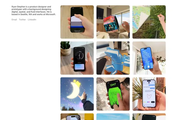
Gallery Grid on White Canvas
Color palette
Page backgrounds, card surfaces, primary content areas
Primary text, strong borders, foundational UI elements that demand high contrast
Body text, secondary headings, providing a softer alternative to Ink Black without sacrificing readability
Medium-contrast borders, control outlines, and structural separators. Do not promote it to the primary CTA color
Typography
- Weights
- 400
- Sizes
- 12px
- Line height
- 1.2
- Fallback
- Arial, Helvetica, 'sans-serif'
Descriptive labels, image captions, and detailed footer text, serving as the small-print element of the system.
- Weights
- 500
- Sizes
- 16px
- Line height
- 1.2
- Fallback
- Segoe UI, Roboto, Ubuntu, Cantarell, 'Noto Sans', sans-serif
Primary body text, link text, and short descriptions, offering clarity and a slightly robust presence in the UI.
Spacing & shape
Components
A focused text block for personal or project descriptions. Text uses Graphite Text (#404040) at 16px/500 weight, with links using Ash Gray (#8b8b94) at the same size and weight. Contains no explicit padding but is isolated by surrounding spaces.
Individual square image containers within a grid layout. Each image has a 10px border-radius, giving it a soft, rounded appearance. Content within the grid item is an image, bordered implicitly by the grid spacing using a 15px gap (row and column).
Text links rendered in Ash Gray (#8b8b94) at 16px/500 weight, primarily for secondary actions or related content. There is no explicit hover or active state specified in the data, implying a subtle interaction or reliance on browser defaults.
Guidelines
- Prioritize Canvas White (#ffffff) for all large background areas to maintain a spacious, gallery-like feel.
- Use Ink Black (#000000) strictly for primary headings and critical UI elements where maximum contrast is essential, like primary text.
- Apply a consistent 10px border-radius to all image containers and card-like components to ensure a cohesive, softened aesthetic.
- Maintain a visual hierarchy where body text uses Graphite Text (#404040) for readability and softer links use Ash Gray (#8b8b94).
- Structure layouts with a generous 100px section gap for clear delineation between major content blocks, creating an airy feel.
- Employ a base element gap of 20px for consistent spacing between distinct UI components.
- Utilize 15px spacing for items within image grids or compact lists to keep related content visually grouped but distinct.
- Do not introduce strong, saturated colors unless they are part of the image content itself; the UI must remain monochrome.
- Avoid sharp corners or square edges on any interactive or content card-like element; always adhere to the 10px radius.
- Do not deviate from the specified typography hierarchy; avoid using 12px for body content or 16px for captions.
- Do not overcrowd sections; preserve the spacious feel by respecting the 100px section gap.
- Avoid heavy borders or strong shadows; the design relies on stark white space and soft radii for definition.
- Do not use generic system font weights other than 400 or 500; the UI's subtle nature depends on these choices.
- Do not use bright or animated hover states for links; interactions should be understated or rely on browser defaults.
About this system
ShowHide
Ryan Stephen's design system evokes a clean, gallery-like presentation with a strong emphasis on content and minimal UI distraction. It utilizes a spacious, high-contrast monochrome palette to make imagery pop, ensuring the focus remains on the product designs showcased. Typography is understated and functional, blending into the background to support the visual work. Components are highly softened with generous corner radii, creating a friendly, approachable feel for an otherwise stark layout.
The site's imagery consists solely of product screenshots, often depicting hands interacting with phone-based interfaces. The treatment is primarily isolated shots, with little environmental context, putting the product UI itself at the forefront. There's an absence of photography or graphic illustrations, emphasizing actual design output. The role of imagery is demonstrative and portfolio-oriented, serving as the core content rather than decorative elements. The density is image-heavy, forming a dense, uniform grid that dominates the page.
Reminiscent of Are.na, Read.cv, Bēhance, Figma's community pages.
# Ryan Stephen — Style Reference
> Gallery Grid on White Canvas

**Theme:** light

**Site:** https://www.ryanstephen.co

Ryan Stephen's design system evokes a clean, gallery-like presentation with a strong emphasis on content and minimal UI distraction. It utilizes a spacious, high-contrast monochrome palette to make imagery pop, ensuring the focus remains on the product designs showcased. Typography is understated and functional, blending into the background to support the visual work. Components are highly softened with generous corner radii, creating a friendly, approachable feel for an otherwise stark layout.

## Tokens — Colors

| Name | Value | Token | Role |
|------|------|------|------|
| Canvas White | `#ffffff` | `--color-canvas-white` | Page backgrounds, card surfaces, primary content areas |
| Ink Black | `#000000` | `--color-ink-black` | Primary text, strong borders, foundational UI elements that demand high contrast |
| Graphite Text | `#404040` | `--color-graphite-text` | Body text, secondary headings, providing a softer alternative to Ink Black without sacrificing readability |
| Ash Gray | `#8b8b94` | `--color-ash-gray` | Medium-contrast borders, control outlines, and structural separators. Do not promote it to the primary CTA color |

## Tokens — Typography

### sans-serif
- **Substitute:** Arial, Helvetica, 'sans-serif'
- **Weights:** 400
- **Sizes:** 12px
- **Line height:** 1.2
- **Role:** Descriptive labels, image captions, and detailed footer text, serving as the small-print element of the system.

### system-ui
- **Substitute:** Segoe UI, Roboto, Ubuntu, Cantarell, 'Noto Sans', sans-serif
- **Weights:** 500
- **Sizes:** 16px
- **Line height:** 1.2
- **Role:** Primary body text, link text, and short descriptions, offering clarity and a slightly robust presence in the UI.

## Tokens — Type Scale

| Role | Size | Line height | Letter spacing |
|------|------|------|------|
| caption | 12px | 1.2 | — |
| body | 16px | 1.2 | — |

## Tokens — Spacing

- **Section gap:** 100px
- **Card padding:** 40px
- **Element gap:** 20px

## Tokens — Radius

- **Images:** 10px
- **components:** 10px

## Imagery

The site's imagery consists solely of product screenshots, often depicting hands interacting with phone-based interfaces. The treatment is primarily isolated shots, with little environmental context, putting the product UI itself at the forefront. There's an absence of photography or graphic illustrations, emphasizing actual design output. The role of imagery is demonstrative and portfolio-oriented, serving as the core content rather than decorative elements. The density is image-heavy, forming a dense, uniform grid that dominates the page.

## Components

### Profile Description Block
*Informational text block*

A focused text block for personal or project descriptions. Text uses Graphite Text (#404040) at 16px/500 weight, with links using Ash Gray (#8b8b94) at the same size and weight. Contains no explicit padding but is isolated by surrounding spaces.

### Image Gallery Grid Item
*Displaying visual work*

Individual square image containers within a grid layout. Each image has a 10px border-radius, giving it a soft, rounded appearance. Content within the grid item is an image, bordered implicitly by the grid spacing using a 15px gap (row and column).

### Interactive Link
*Navigational or actionable text*

Text links rendered in Ash Gray (#8b8b94) at 16px/500 weight, primarily for secondary actions or related content. There is no explicit hover or active state specified in the data, implying a subtle interaction or reliance on browser defaults.

## Guidelines

### Do

- Prioritize Canvas White (#ffffff) for all large background areas to maintain a spacious, gallery-like feel.
- Use Ink Black (#000000) strictly for primary headings and critical UI elements where maximum contrast is essential, like primary text.
- Apply a consistent 10px border-radius to all image containers and card-like components to ensure a cohesive, softened aesthetic.
- Maintain a visual hierarchy where body text uses Graphite Text (#404040) for readability and softer links use Ash Gray (#8b8b94).
- Structure layouts with a generous 100px section gap for clear delineation between major content blocks, creating an airy feel.
- Employ a base element gap of 20px for consistent spacing between distinct UI components.
- Utilize 15px spacing for items within image grids or compact lists to keep related content visually grouped but distinct.

### Don't

- Do not introduce strong, saturated colors unless they are part of the image content itself; the UI must remain monochrome.
- Avoid sharp corners or square edges on any interactive or content card-like element; always adhere to the 10px radius.
- Do not deviate from the specified typography hierarchy; avoid using 12px for body content or 16px for captions.
- Do not overcrowd sections; preserve the spacious feel by respecting the 100px section gap.
- Avoid heavy borders or strong shadows; the design relies on stark white space and soft radii for definition.
- Do not use generic system font weights other than 400 or 500; the UI's subtle nature depends on these choices.
- Do not use bright or animated hover states for links; interactions should be understated or rely on browser defaults.

## Agent Prompt Guide

Quick Color Reference:
text: #000000
background: #ffffff
border: #8b8b94
accent: no distinct accent color
primary action: no distinct CTA color

Example Component Prompts:
Create a profile introduction: 16px system-ui weight 500, #404040 for body text; links in #8b8b94, 16px system-ui weight 500. Wrap the content in 40px padding.
Create an image grid item: A square container for an image, with a 10px border-radius. Internally, the image fills the container. Grid items should be separated by 15px elementGap.
Create a ghost link: Text 'Link Text' in #8b8b94, 16px system-ui weight 500. This link is for secondary actions.
More like this









Keep what you find
A free account saves references to boards and can send you a weekly email of picks based on what you save.
To see every result, go Pro.