Preview image. Unlock full-res
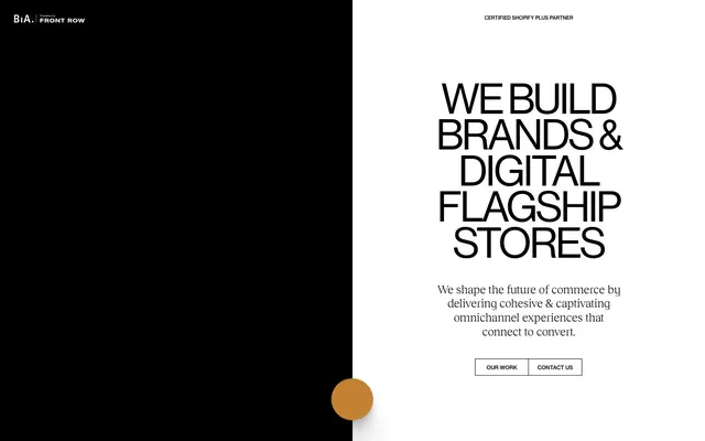
High-contrast geometric minimalism, accented by a single rich gold. It feels like a meticulously crafted architectural drawing, where every line and plane holds intentional weight.
Color palette
Subtle decorative element found in abstract shapes; signifies a valuable, hidden detail.
Background for specific navigation items on hover or active states, provides a vibrant interactive cue.
Primary text, headline text, button borders, background for navigation blocks on the dark side of the split layout.
Page backgrounds, primary container backgrounds, text on dark backgrounds.
Used for navigation backgrounds and subtle section differentiation, a softer alternative to pure white.
Typography
- Weights
- 400
- Sizes
- 11px, 16px
- Line height
- 1.2
- Letter spacing
- normal
- Fallback
- Helvetica Neue
Body copy, button labels, and general UI text. Its precise, legible forms support the overall clean aesthetic.
- Weights
- 500
- Sizes
- 10px, 11px, 12px, 16px
- Line height
- 1.2
- Letter spacing
- normal
- Fallback
- Helvetica Neue
Used for navigation links and secondary body text, providing a slightly heavier visual presence than the Roman weight without being bold, for hierarchy while maintaining lightness.
- Weights
- 400
- Sizes
- 86px
- Line height
- 0.85
- Letter spacing
- -3.44
- Fallback
- Helvetica Neue
Primary display headlines. The normal weight at such a large size, combined with highly compressed letter-spacing, creates a monumental yet airy presence, commanding attention through scale rather than heaviness.
- Weights
- 400
- Sizes
- 24px
- Line height
- 1.2
- Letter spacing
- -0.24
- Fallback
- Playfair Display
Used for subheadings and descriptive text where a more expressive, serif touch is desired. The unique stylistic sets (ss04, ss06, etc.) add an unexpected, crafted detail amidst the geometric sans-serifs.
Spacing & shape
Components
Minimalist button with no background, black text, and a thin black border. Padding values are not explicitly defined as a block but individual CSS properties are applied, implying custom sizing: 9px top, 11px bottom, 14px left/right. Has 0px border-radius, maintaining a sharp, precise edge.
Text in NHaasGroteskTXPro, weight 500, size 16px. Background #f2efe6 for `nav` elements, with a `Deep Indigo` background #3c4cc7 on hover for interactive elements.
Guidelines
- Prioritize stark black (#000000) and arctic white (#ffffff) for backgrounds and main text, leveraging extreme contrast.
- Use NHaasGroteskDSPro (weight 400, 86px, -0.04em letter-spacing) for all primary display headlines to maintain a monumental yet light appearance.
- Apply 0px border-radius to all buttons and interactive elements, favoring sharp, geometric forms.
- Reserve RecklessNeue-Book with its specific stylistic sets for moments requiring elevated, expressive typography, such as subheadings.
- Introduce Ancient Gold (#c38133) only as a subtle, low-frequency accent, for decorative elements rather than functional ones.
- Ensure letter-spacing is applied precisely as defined for each typographic role, especially the compressed display headings.
- Do not introduce any shades of gray as background or text colors; maintain the pure black and white dichotomy.
- Avoid rounded corners on any primary UI elements unless explicitly specified for a specific component (e.g., custom form elements not seen here).
- Do not use Ancient Gold (#c38133) for text or primary interactive elements; its role is purely decorative.
- Do not use generic sans-serif fonts; strict adherence to NeueHaasGrotesk and RecklessNeue is crucial for the brand identity.
- Do not vary line heights from the specified 1.20 for body and 0.85 for display heading, to preserve the tight typographic rhythm.
- Avoid adding box-shadows or significant elevation effects; depth derives primarily from color contrast and typography.
About this system
ShowHide
This design system is a study in stark binary opposition: pure black meets true white. The strong contrast, devoid of grays, creates an assertive and dramatic stage. Typography is the primary vehicle for visual interest, with a tight letter-spacing and varied weights creating a dynamic yet refined presentation. The single pop of 'Ancient Gold' is a subtle, almost luxurious, counterpoint to the monochromatic foundation, hinting at a hidden richness beneath the surface.
The page employs a strong split-screen vertical layout, dividing the viewport into contrasting black and white sections. The hero section specifically features a prominent two-column split, with strong vertical alignment. The main content area also uses a max-width container for text. Section rhythm is created through direct color transitions (black to white, or off-white to white) rather than explicit dividers or consistent padding. Content is often stacked centrally or arranged in direct text-left/image-right configurations within implied column grids. Navigation is a sticky top bar with interactive elements.
The site uses minimal imagery, primarily relying on abstract, solid-color shapes (like the 'Ancient Gold' circle) to introduce decorative elements. The overall aesthetic is image-light, focusing heavily on typography and layout. When imagery is present, it appears to be either abstract or a focused product shot, often integrated without complex masking, maintaining a contained and precise treatment.
Reminiscent of AIGA, Basic agency, Locomotive, Cuberto.
# Buildinamsterdam — Style Reference
> High-contrast geometric minimalism, accented by a single rich gold. It feels like a meticulously crafted architectural drawing, where every line and plane holds intentional weight.

**Theme:** mixed

**Site:** https://buildinamsterdam.com

This design system is a study in stark binary opposition: pure black meets true white. The strong contrast, devoid of grays, creates an assertive and dramatic stage. Typography is the primary vehicle for visual interest, with a tight letter-spacing and varied weights creating a dynamic yet refined presentation. The single pop of 'Ancient Gold' is a subtle, almost luxurious, counterpoint to the monochromatic foundation, hinting at a hidden richness beneath the surface.

## Tokens — Colors

| Name | Value | Token | Role |
|------|------|------|------|
| Ancient Gold | `#c38133` | `--color-ancient-gold` | Subtle decorative element found in abstract shapes; signifies a valuable, hidden detail. |
| Deep Indigo | `#3c4cc7` | `--color-deep-indigo` | Background for specific navigation items on hover or active states, provides a vibrant interactive cue. |
| Midnight Ink | `#000000` | `--color-midnight-ink` | Primary text, headline text, button borders, background for navigation blocks on the dark side of the split layout. |
| Arctic White | `#ffffff` | `--color-arctic-white` | Page backgrounds, primary container backgrounds, text on dark backgrounds. |
| Canvas Off-White | `#f2efe6` | `--color-canvas-off-white` | Used for navigation backgrounds and subtle section differentiation, a softer alternative to pure white. |

## Tokens — Typography

### NeueHaasGrotesk-Roman
- **Substitute:** Helvetica Neue
- **Weights:** 400
- **Sizes:** 11px, 16px
- **Line height:** 1.2
- **Letter spacing:** normal
- **Role:** Body copy, button labels, and general UI text. Its precise, legible forms support the overall clean aesthetic.

### NHaasGroteskTXPro
- **Substitute:** Helvetica Neue
- **Weights:** 500
- **Sizes:** 10px, 11px, 12px, 16px
- **Line height:** 1.2
- **Letter spacing:** normal
- **Role:** Used for navigation links and secondary body text, providing a slightly heavier visual presence than the Roman weight without being bold, for hierarchy while maintaining lightness.

### NHaasGroteskDSPro
- **Substitute:** Helvetica Neue
- **Weights:** 400
- **Sizes:** 86px
- **Line height:** 0.85
- **Letter spacing:** -3.44
- **Role:** Primary display headlines. The normal weight at such a large size, combined with highly compressed letter-spacing, creates a monumental yet airy presence, commanding attention through scale rather than heaviness.

### RecklessNeue-Book
- **Substitute:** Playfair Display
- **Weights:** 400
- **Sizes:** 24px
- **Line height:** 1.2
- **Letter spacing:** -0.24
- **Role:** Used for subheadings and descriptive text where a more expressive, serif touch is desired. The unique stylistic sets (ss04, ss06, etc.) add an unexpected, crafted detail amidst the geometric sans-serifs.

## Tokens — Type Scale

| Role | Size | Line height | Letter spacing |
|------|------|------|------|
| caption | 10px | 1.2 | — |
| body | 16px | 1.2 | — |
| subheading | 24px | 1.2 | -0.24px |
| display | 86px | 0.85 | -3.44px |

## Tokens — Spacing

- **Element gap:** 12px

## Tokens — Radius

- **Buttons:** 0px
- **nav:** 4px

## Layout

The page employs a strong split-screen vertical layout, dividing the viewport into contrasting black and white sections. The hero section specifically features a prominent two-column split, with strong vertical alignment. The main content area also uses a max-width container for text. Section rhythm is created through direct color transitions (black to white, or off-white to white) rather than explicit dividers or consistent padding. Content is often stacked centrally or arranged in direct text-left/image-right configurations within implied column grids. Navigation is a sticky top bar with interactive elements.

## Imagery

The site uses minimal imagery, primarily relying on abstract, solid-color shapes (like the 'Ancient Gold' circle) to introduce decorative elements. The overall aesthetic is image-light, focusing heavily on typography and layout. When imagery is present, it appears to be either abstract or a focused product shot, often integrated without complex masking, maintaining a contained and precise treatment.

## Components

### Outlined CTA Button Group

### Hero Headline Block

### Navigation Bar

### Outlined CTA Button
*Primary call to action*

Minimalist button with no background, black text, and a thin black border. Padding values are not explicitly defined as a block but individual CSS properties are applied, implying custom sizing: 9px top, 11px bottom, 14px left/right. Has 0px border-radius, maintaining a sharp, precise edge.

### Navigation Link
*Top-level navigation*

Text in NHaasGroteskTXPro, weight 500, size 16px. Background #f2efe6 for `nav` elements, with a `Deep Indigo` background #3c4cc7 on hover for interactive elements.

## Guidelines

### Do

- Prioritize stark black (#000000) and arctic white (#ffffff) for backgrounds and main text, leveraging extreme contrast.
- Use NHaasGroteskDSPro (weight 400, 86px, -0.04em letter-spacing) for all primary display headlines to maintain a monumental yet light appearance.
- Apply 0px border-radius to all buttons and interactive elements, favoring sharp, geometric forms.
- Reserve RecklessNeue-Book with its specific stylistic sets for moments requiring elevated, expressive typography, such as subheadings.
- Introduce Ancient Gold (#c38133) only as a subtle, low-frequency accent, for decorative elements rather than functional ones.
- Ensure letter-spacing is applied precisely as defined for each typographic role, especially the compressed display headings.

### Don't

- Do not introduce any shades of gray as background or text colors; maintain the pure black and white dichotomy.
- Avoid rounded corners on any primary UI elements unless explicitly specified for a specific component (e.g., custom form elements not seen here).
- Do not use Ancient Gold (#c38133) for text or primary interactive elements; its role is purely decorative.
- Do not use generic sans-serif fonts; strict adherence to NeueHaasGrotesk and RecklessNeue is crucial for the brand identity.
- Do not vary line heights from the specified 1.20 for body and 0.85 for display heading, to preserve the tight typographic rhythm.
- Avoid adding box-shadows or significant elevation effects; depth derives primarily from color contrast and typography.

## Agent Prompt Guide

Quick Color Reference:
- Text: #000000
- Background: #ffffff
- CTA text: #000000
- CTA border: #000000
- Accent (decorative): #c38133

Example Component Prompts:
1. Create a hero section with a vertical split layout: left side black background, right side white background. On the white side, add a headline 'WE BUILD BRANDS & DIGITAL FLAGSHIP STORES' using NHaasGroteskDSPro, weight 400, size 86px, #000000, line-height 0.85, letter-spacing -3.44px. Below, add subtext 'We shape the future of commerce by delivering cohesive & captivating omnichannel experiences that connect to convert.' using RecklessNeue-Book, weight 400, size 24px, #000000, line-height 1.20, letter-spacing -0.24px. Include two 'Outlined CTA Button' components below the subtext, with text 'OUR WORK' and 'CONTACT US' respectively.
2. Design an 'Outlined CTA Button': background-color transparent, color #000000, border-color #000000, border-width 1px, border-radius 0px, padding-top 9px, padding-bottom 11px, padding-left 14px, padding-right 14px, font-family NeueHaasGrotesk-Roman, weight 400, size 16px, line-height 1.20.
3. Create a header navigation bar: background-color #f2efe6. Include a logo to the left. On the right, include navigation links using NHaasGroteskTXPro, weight 500, size 16px, #000000, line-height 1.20, border-radius 4px for interactive elements.
More like this

Keep what you find
A free account saves references to boards and can send you a weekly email of picks based on what you save.
To see every result, go Pro.