Preview image. Unlock full-res
Architectural blueprint on white marble
Color palette
Page backgrounds, heading text against dark elements, primary surface
Neutral form states, badge text, and quiet UI feedback where color should stay understated. Do not promote it to the primary CTA color
Secondary text, subtle borders, fills for certain icons. A purer black for added punch where needed
Muted text, hairline borders, and subtle link text for less emphasized information. This is the lightest functional gray
Typography
- Weights
- 400
- Sizes
- 11px, 15px, 21px, 32px, 62px
- Line height
- 0.8, 1.2, 1.35, 1.4, 1.44
- Letter spacing
- -0.0500em at 62px, -0.0100em at 21px, 0.0400em at 11-15px
- Fallback
- Inter
The primary typeface for headings, body text, and general interface elements. Its generous sizing and variable letter-spacing convey a deliberate, unhurried presence.
- Weights
- 400
- Sizes
- 21px
- Line height
- 0.8
- Letter spacing
- -0.0100em
- Fallback
- Space Mono
Used sparingly for time displays and other code-like or data-driven content, providing a distinct, technical counterpoint to the primary serif.
Spacing & shape
Components
Text in NCDA Black (#191919) at 21px with a lineHeight of 0.8. On hover, a subtle border may appear, also in NCDA Black, but the text remains the defining feature. No background or padding.
Text in NCDA Black (#191919) or Absolute Zero (#000000) at 21px (or smaller) with default letter-spacing. Minimalistic, relying solely on typography and position for recognition.
Uses TWK Everett, 400 weight, 15px size, 1.2 lineHeight, and 0.0400em letter-spacing. Color is usually NCDA Black (#191919) or Ghost Gray (#808080) for less critical information. Generous marginBottom of 15px separates paragraphs.
Uses TWK Everett, 400 weight, sizes 32px or 62px, with a lineHeight of 1.35 or 0.8 and letter-spacing of -0.0100em or -0.0500em respectively. Color is NCDA Black (#191919). Features notable horizontal margins (e.g., 59px paddingLeft, 64px marginRight) to define its placement.
Uses TWK Everett Mono, 400 weight, 21px size, 0.8 lineHeight, and -0.0100em letter-spacing. Color is Absolute Zero (#000000). Distinctive mono font provides clear separation from other text.
Guidelines
- Prioritize typography as the primary driver of visual hierarchy, leveraging TWK Everett's weight 400 for both headings and body text.
- Use Canvas White (#ffffff) for all large background planes to maintain a spacious and luminous feel.
- Define interactive states and section breaks with subtle borders using NCDA Black (#191919) or Ghost Gray (#808080), avoiding filled backgrounds for navigation.
- Apply generous vertical spacing between sections, adhering to the 150px marginBottom and 28px/53px padding and margins to create a sense of calm.
- Employ the negative letter-spacing values (-0.0500em at 62px, -0.0100em at 21px) for headings and specific elements to enhance legibility and unique character.
- Use Absolute Zero (#000000) for high-impact text or fills, and Ghost Gray (#808080) for de-emphasized elements, always against Canvas White.
- Ensure all components have a radius of 0px for sharp, architectural edges.
- Avoid using drop shadows or complex elevation schemes; the design relies on flat surfaces and high contrast.
- Do not introduce new colors; adhere strictly to the established black, white, and gray palette.
- Refrain from using heavily decorative elements or ornate graphics; the focus is on content and clean structure.
- Do not use letter-spacing outside the defined values (0.0400em, -0.0100em, -0.0500em) as it is a core aspect of the brand's typographic identity.
- Do not use background colors for interactive elements; opt for text color changes or subtle border treatments instead.
- Avoid crowded layouts or tight spacing; maintain the spacious, minimalist aesthetic with ample whitespace.
- Do not apply rounded corners to any UI elements; all shapes should be sharp and rectilinear.
About this system
ShowHide
NCDA projects an architectural blueprint on white marble aesthetic: a minimalist, high-contrast system built on stark black and white surfaces. Typography is the primary visual element, meticulously spaced and sized to create a sense of expansive calm. Subtle visual hierarchy is achieved through variations in text color and the generous use of whitespace, rather than heavy borders or shadows. Components are understated, relying on inherent typographic weight and precise positioning.
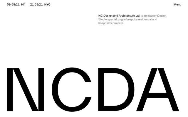
The page structure is full-bleed horizontally, but content feels contained and centered within implied columns. The hero section is characterized by a very large, prominent typographic logo (NCDA) taking up significant vertical space, offset by smaller, concise branding text. Subsequent sections alternate between large, impactful headings and sparse body copy, with consistent wide vertical gaps. The layout avoids complex grids for content, favoring a single-column flow or simple two-column splits (text-left/image-right or vice versa if imagery existed) that emphasize whitespace. Navigation is minimal, consisting of a sticky top bar with time displays and a 'Menu' trigger, suggesting an off-canvas or overlay menu system.
The site's visual language is characterized by an absence of photography or complex illustrations. Instead, it relies on pure typography and a stark, almost architectural, grid system. If any imagery (beyond project showcases) were to be introduced, it would likely be technical diagrams or abstract geometric shapes, treated with high contrast and minimal color, serving as explanatory content rather than decorative atmosphere. Icons (e.g., the 'Menu' hamburger) are minimal, outlined, monochromatic (Absolute Zero), and blend seamlessly with the typographic focus.
Reminiscent of Awwwards, Certain graphic design portfolios, Brutalism-inspired agencies.
# NCDA — Style Reference
> Architectural blueprint on white marble

**Theme:** light

**Site:** https://ncda.biz

NCDA projects an architectural blueprint on white marble aesthetic: a minimalist, high-contrast system built on stark black and white surfaces. Typography is the primary visual element, meticulously spaced and sized to create a sense of expansive calm. Subtle visual hierarchy is achieved through variations in text color and the generous use of whitespace, rather than heavy borders or shadows. Components are understated, relying on inherent typographic weight and precise positioning.

## Tokens — Colors

| Name | Value | Token | Role |
|------|------|------|------|
| Canvas White | `#ffffff` | `--color-canvas-white` | Page backgrounds, heading text against dark elements, primary surface |
| NCDA Black | `#191919` | `--color-ncda-black` | Neutral form states, badge text, and quiet UI feedback where color should stay understated. Do not promote it to the primary CTA color |
| Absolute Zero | `#000000` | `--color-absolute-zero` | Secondary text, subtle borders, fills for certain icons. A purer black for added punch where needed |
| Ghost Gray | `#808080` | `--color-ghost-gray` | Muted text, hairline borders, and subtle link text for less emphasized information. This is the lightest functional gray |

## Tokens — Typography

### TWK Everett
- **Substitute:** Inter
- **Weights:** 400
- **Sizes:** 11px, 15px, 21px, 32px, 62px
- **Line height:** 0.8, 1.2, 1.35, 1.4, 1.44
- **Letter spacing:** -0.0500em at 62px, -0.0100em at 21px, 0.0400em at 11-15px
- **Role:** The primary typeface for headings, body text, and general interface elements. Its generous sizing and variable letter-spacing convey a deliberate, unhurried presence.

### TWK Everett Mono
- **Substitute:** Space Mono
- **Weights:** 400
- **Sizes:** 21px
- **Line height:** 0.8
- **Letter spacing:** -0.0100em
- **Role:** Used sparingly for time displays and other code-like or data-driven content, providing a distinct, technical counterpoint to the primary serif.

## Tokens — Type Scale

| Role | Size | Line height | Letter spacing |
|------|------|------|------|
| caption | 11px | 1.35 | — |
| body-sm | 15px | 1.35 | — |
| body | 21px | 1.35 | — |
| body-lg | 32px | 1.3 | — |
| heading-sm | 62px | 1.3 | — |

## Tokens — Spacing

- **Section gap:** 64px
- **Card padding:** 28px
- **Element gap:** 15px

## Tokens — Radius

- **none:** 0px

## Layout

The page structure is full-bleed horizontally, but content feels contained and centered within implied columns. The hero section is characterized by a very large, prominent typographic logo (NCDA) taking up significant vertical space, offset by smaller, concise branding text. Subsequent sections alternate between large, impactful headings and sparse body copy, with consistent wide vertical gaps. The layout avoids complex grids for content, favoring a single-column flow or simple two-column splits (text-left/image-right or vice versa if imagery existed) that emphasize whitespace. Navigation is minimal, consisting of a sticky top bar with time displays and a 'Menu' trigger, suggesting an off-canvas or overlay menu system.

## Imagery

The site's visual language is characterized by an absence of photography or complex illustrations. Instead, it relies on pure typography and a stark, almost architectural, grid system. If any imagery (beyond project showcases) were to be introduced, it would likely be technical diagrams or abstract geometric shapes, treated with high contrast and minimal color, serving as explanatory content rather than decorative atmosphere. Icons (e.g., the 'Menu' hamburger) are minimal, outlined, monochromatic (Absolute Zero), and blend seamlessly with the typographic focus.

## Components

### Navigation Link
*Primary navigation item*

Text in NCDA Black (#191919) at 21px with a lineHeight of 0.8. On hover, a subtle border may appear, also in NCDA Black, but the text remains the defining feature. No background or padding.

### Menu Link
*Menu trigger and secondary navigation*

Text in NCDA Black (#191919) or Absolute Zero (#000000) at 21px (or smaller) with default letter-spacing. Minimalistic, relying solely on typography and position for recognition.

### Body Text Block
*Standard paragraph content*

Uses TWK Everett, 400 weight, 15px size, 1.2 lineHeight, and 0.0400em letter-spacing. Color is usually NCDA Black (#191919) or Ghost Gray (#808080) for less critical information. Generous marginBottom of 15px separates paragraphs.

### Section Heading
*Major content section titles*

Uses TWK Everett, 400 weight, sizes 32px or 62px, with a lineHeight of 1.35 or 0.8 and letter-spacing of -0.0100em or -0.0500em respectively. Color is NCDA Black (#191919). Features notable horizontal margins (e.g., 59px paddingLeft, 64px marginRight) to define its placement.

### Monospace Time Display
*Displaying time or highly precise data*

Uses TWK Everett Mono, 400 weight, 21px size, 0.8 lineHeight, and -0.0100em letter-spacing. Color is Absolute Zero (#000000). Distinctive mono font provides clear separation from other text.

## Guidelines

### Do

- Prioritize typography as the primary driver of visual hierarchy, leveraging TWK Everett's weight 400 for both headings and body text.
- Use Canvas White (#ffffff) for all large background planes to maintain a spacious and luminous feel.
- Define interactive states and section breaks with subtle borders using NCDA Black (#191919) or Ghost Gray (#808080), avoiding filled backgrounds for navigation.
- Apply generous vertical spacing between sections, adhering to the 150px marginBottom and 28px/53px padding and margins to create a sense of calm.
- Employ the negative letter-spacing values (-0.0500em at 62px, -0.0100em at 21px) for headings and specific elements to enhance legibility and unique character.
- Use Absolute Zero (#000000) for high-impact text or fills, and Ghost Gray (#808080) for de-emphasized elements, always against Canvas White.
- Ensure all components have a radius of 0px for sharp, architectural edges.

### Don't

- Avoid using drop shadows or complex elevation schemes; the design relies on flat surfaces and high contrast.
- Do not introduce new colors; adhere strictly to the established black, white, and gray palette.
- Refrain from using heavily decorative elements or ornate graphics; the focus is on content and clean structure.
- Do not use letter-spacing outside the defined values (0.0400em, -0.0100em, -0.0500em) as it is a core aspect of the brand's typographic identity.
- Do not use background colors for interactive elements; opt for text color changes or subtle border treatments instead.
- Avoid crowded layouts or tight spacing; maintain the spacious, minimalist aesthetic with ample whitespace.
- Do not apply rounded corners to any UI elements; all shapes should be sharp and rectilinear.

## Agent Prompt Guide

Quick Color Reference:
- text: #191919
- background: #ffffff
- border: #191919
- accent: no distinct accent color
- primary action: no distinct CTA color

Example Component Prompts:
- Create a page header with '09:58:21 HK' in TWK Everett Mono, 21px, 0.8 lineHeight, -0.0100em letter-spacing, #000000. Right-aligned 'Menu' link in TWK Everett, 21px, 0.8 lineHeight, #191919.
- Design a primary content heading: 'NCDA' in TWK Everett, 62px, 0.8 lineHeight, -0.0500em letter-spacing, #191919. Positioned 59px from the left edge.
- Create a descriptive text block: 'NC Design and Architecture Ltd. is an Interior Design Studio specializing in bespoke residential and hospitality projects.' in TWK Everett, 15px, 1.2 lineHeight, 0.0400em letter-spacing, #808080. Ensure a 15px marginBottom.
More like this









Keep what you find
A free account saves references to boards and can send you a weekly email of picks based on what you save.
To see every result, go Pro.