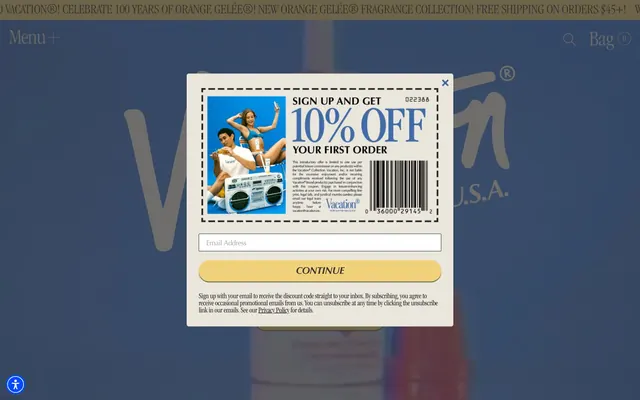
Preview image. Unlock full-res
Sun-kissed retro comfort
Color palette
Primary action background, decorative borders, selected states — a warm, inviting yellow that evokes sunshine and retro leisure
Outlined button borders, link text, decorative accents — a cool blue providing contrast and secondary interactive cues
Outlined button borders, decorative strokes
Decorative borders and backgrounds
Small functional indicators, button backgrounds for specific contexts
Primary text, strong borders, icons, and significant UI elements. Provides strong contrast against lighter backgrounds
Page background, significant surface background, muted borders — a creamy off-white that softens the overall presentation
Input backgrounds, elevated card surfaces, strong UI highlights
Surface background for specific elements, subtle button backgrounds
Subtle card borders and dividers
Card background for secondary content areas
Card background for tertiary content areas
Typography
- Weights
- 400, 700
- Sizes
- 16px, 18px, 30px
- Line height
- 0.8, 1.33, 1.5
- Letter spacing
- -0.0300em at 30px, -0.0270em at 18px, -0.0160em at 16px
- Fallback
- Helvetica Neue, Arial
Primary sans-serif for body text, navigation, and some headings. Its clean lines provide readability amidst the more decorative serifs.
- Weights
- 300, 400, 500, 700
- Sizes
- 14px, 16px, 18px, 20px, 30px, 32px, 36px, 48px, 64px, 120px
- Line height
- 0.8, 0.86, 0.9, 1, 1.1, 1.11, 1.2, 1.33, 1.38, 1.5, 1.78
- Letter spacing
- -0.0800em at 120px, -0.0400em at 64px, -0.0300em at 48px, -0.0270em at 36px, -0.0240em at 32px, -0.0200em at 30px, -0.0160em at 20px, -0.0130em at 18px, -0.0100em at 14px
- Fallback
- Garamond, serif
Distinctive serif for display headings and section titles. Its condensed and light weights create an editorial, almost classic magazine feel, making a statement without shouting.
- Weights
- 400, 500
- Sizes
- 10px, 12px, 13px, 16px, 18px, 23px
- Line height
- 1, 1.04, 1.2, 1.33, 1.5, 1.85
- Letter spacing
- -0.0480em at 23px, -0.0400em at 18px, -0.0370em at 16px, -0.0300em at 13px, -0.0270em at 12px, 0.0400em at 10px
- Fallback
- Optima, serif
Secondary serif for smaller supporting text, labels, and some button text. Its subtle humanist lines add warmth and detail at smaller sizes.
- Weights
- 500
- Sizes
- 22px
- Line height
- 1, 1.36
- Letter spacing
- -0.0300em, -0.0250em
- Fallback
- Arial, sans-serif
Italic sans-serif used for specific callouts and decorative body text, adding a casual, handwritten feel.
- Weights
- 500
- Sizes
- 14px
- Line height
- 1.14
- Letter spacing
- -0.0040em
- Fallback
- Arial, sans-serif
Specific supporting text.
- Weights
- 400
- Sizes
- 13px
- Line height
- 1.2
Arial — detected in extracted data but not described by AI
- Weights
- 400
- Sizes
- 16px
- Line height
- 1.2
Times — detected in extracted data but not described by AI
Spacing & shape
Elevation
Components
Filled with Midday Sand (#f1d27a), text is Graphite (#333333). Has a 9999px border-radius creating a pill shape. Padding is 4px top, 30px horizontal, 0px bottom.
Transparent background, text and border in Parchment White (#e5e7eb) with 0px radius. No padding specified, acts as text link.
Parchment White (#e5e7eb) background with 5px border-radius. Features a -2px -2px 0px 0px inset shadow of Faded Cinder (#76736e) giving a paper-like, slightly curled edge effect. Padded 27px on all sides.
White background with Graphite (#333333) text. Features a 2px border-radius and an input border of Graphite (#333333). Padded 6px top, 16px horizontal, 0px bottom.
Transparent background with Parchment White (#e5e7eb) text. Border is Pale Ash (#e5e7eb). Padded 4px top, 20px horizontal, 0px bottom. Placeholder text would inherit Parchment White for visibility.
Filled with Electric Violet (#0048ff) with 50% border-radius for a perfect circle. Has a 2px 2px 2px 0px shadow from rgba(0,0,0,0.75).
Transparent background, Graphite (#333333) text and border (0px radius). Acts as a text link with an explicit border-bottom for styling.
Guidelines
- Use Midday Sand (#f1d27a) for all primary interactive elements, including button backgrounds and accent borders.
- Apply ITCGaramondStd-LtCond for display-level text to maintain the editorial, nostalgic feel, varying weights and letter-spacing as per type scale.
- Utilize a 9999px border-radius for all primary buttons and tags to create soft, pill-shaped components.
- Implement the -2px -2px 0px 0px inset shadow on elements requiring a 'physical' or 'coupon-like' visual edge.
- Maintain a comfortable density with element gaps of 20px and card padding of 27px, ensuring visual breathing room.
- For subtle accents, use Ocean Blue (#23659f) and Coral Sunset (#d1796d) as border colors for ghost buttons or link underlines.
- Prioritize Graphite (#333333) for all primary text content to ensure high contrast and readability on light backgrounds.
- Avoid using stark white backgrounds (#ffffff) unless for specific input fields or elevated surfaces; prefer Parchment White (#e5e7eb) for general canvas.
- Do not use highly saturated, modern gradients; the system relies on solid colors and subtle vintage-inspired effects.
- Refrain from sharp, angular corners; components should generally feature rounded corners (5px for cards, 9999px for buttons).
- Do not choose system default fonts for headings or body text; always use the specified custom font families.
- Avoid heavy drop shadows for general elevation; use the subtle inset shadows or the specific rgba(0,0,0,0.75) 0px 1.5px 1.5px 0px shadow for buttons.
- Do not introduce new vibrant colors outside the defined accent palette; color should be used sparingly for specific functional or nostalgic emphasis.
About this system
ShowHide
Vacation® embraces a nostalgic, playful aesthetic, evoking mid-century leisure with a modern e-commerce functional layer. Its visual language balances warm, sun-kissed neutrals with a single prominent yellow-gold accent for primary interactions. Typography is a key differentiator, combining a variety of custom serif and sans-serif fonts to create a distinct, editorial feel. Components are generally soft and rounded, with subtle shadow details that nod to physical objects rather than stark digital interfaces.
The page primarily utilizes a fluid, full-bleed layout rather than a fixed maximum width. The hero section often features large, impactful imagery or typography, sometimes with elements extending to the edges. Content sections tend to have consistent vertical spacing, often with alternating light/dark background bands that create a clear visual rhythm. Content arrangement frequently uses centered stacks for headlines and calls to action, or occasionally a text-left/image-right alternating pattern within sections. Navigation is a minimalist top bar with 'Menu' and 'Bag' links, avoiding dropdowns or complex mega-menus.
This site uses an eclectic mix of vintage-inspired photography and product shots, often with a golden-hour, sun-drenched aesthetic. Product photography is clean, typically showing items in isolated vignettes. Illustrations lean into a playful retro style, sometimes mimicking graphic elements from the 60s-80s (e.g., the coupon's barcode and dashed border). Icons are primarily simple, outlined, and monochromatic, matching the surrounding text. Imagery serves both decorative and explanatory roles, evoking a sense of nostalgia and aspiration for leisure.
Reminiscent of Glossier, Summer Fridays, Madewell, Harry's.
# Vacation® — Style Reference
> Sun-kissed retro comfort

**Theme:** light

**Site:** https://www.vacation.inc

Vacation® embraces a nostalgic, playful aesthetic, evoking mid-century leisure with a modern e-commerce functional layer. Its visual language balances warm, sun-kissed neutrals with a single prominent yellow-gold accent for primary interactions. Typography is a key differentiator, combining a variety of custom serif and sans-serif fonts to create a distinct, editorial feel. Components are generally soft and rounded, with subtle shadow details that nod to physical objects rather than stark digital interfaces.

## Tokens — Colors

| Name | Value | Token | Role |
|------|------|------|------|
| Midday Sand | `#f1d27a` | `--color-midday-sand` | Primary action background, decorative borders, selected states — a warm, inviting yellow that evokes sunshine and retro leisure |
| Ocean Blue | `#23659f` | `--color-ocean-blue` | Outlined button borders, link text, decorative accents — a cool blue providing contrast and secondary interactive cues |
| Coral Sunset | `#d1796d` | `--color-coral-sunset` | Outlined button borders, decorative strokes |
| Breezy Teal | `#39aaa7` | `--color-breezy-teal` | Decorative borders and backgrounds |
| Electric Violet | `#0048ff` | `--color-electric-violet` | Small functional indicators, button backgrounds for specific contexts |
| Graphite | `#333333` | `--color-graphite` | Primary text, strong borders, icons, and significant UI elements. Provides strong contrast against lighter backgrounds |
| Parchment White | `#e5e7eb` | `--color-parchment-white` | Page background, significant surface background, muted borders — a creamy off-white that softens the overall presentation |
| Cloud Cover | `#ffffff` | `--color-cloud-cover` | Input backgrounds, elevated card surfaces, strong UI highlights |
| Faded Cinder | `#6a6966` | `--color-faded-cinder` | Surface background for specific elements, subtle button backgrounds |
| Pale Ash | `#dddddd` | `--color-pale-ash` | Subtle card borders and dividers |
| Slate Cloud | `#778899` | `--color-slate-cloud` | Card background for secondary content areas |
| Sky Haze | `#b0c4de` | `--color-sky-haze` | Card background for tertiary content areas |

## Tokens — Typography

### Helvetica Neue LT Std
- **Substitute:** Helvetica Neue, Arial
- **Weights:** 400, 700
- **Sizes:** 16px, 18px, 30px
- **Line height:** 0.8, 1.33, 1.5
- **Letter spacing:** -0.0300em at 30px, -0.0270em at 18px, -0.0160em at 16px
- **Role:** Primary sans-serif for body text, navigation, and some headings. Its clean lines provide readability amidst the more decorative serifs.

### ITCGaramondStd-LtCond
- **Substitute:** Garamond, serif
- **Weights:** 300, 400, 500, 700
- **Sizes:** 14px, 16px, 18px, 20px, 30px, 32px, 36px, 48px, 64px, 120px
- **Line height:** 0.8, 0.86, 0.9, 1, 1.1, 1.11, 1.2, 1.33, 1.38, 1.5, 1.78
- **Letter spacing:** -0.0800em at 120px, -0.0400em at 64px, -0.0300em at 48px, -0.0270em at 36px, -0.0240em at 32px, -0.0200em at 30px, -0.0160em at 20px, -0.0130em at 18px, -0.0100em at 14px
- **Role:** Distinctive serif for display headings and section titles. Its condensed and light weights create an editorial, almost classic magazine feel, making a statement without shouting.

### OptimaLTP
- **Substitute:** Optima, serif
- **Weights:** 400, 500
- **Sizes:** 10px, 12px, 13px, 16px, 18px, 23px
- **Line height:** 1, 1.04, 1.2, 1.33, 1.5, 1.85
- **Letter spacing:** -0.0480em at 23px, -0.0400em at 18px, -0.0370em at 16px, -0.0300em at 13px, -0.0270em at 12px, 0.0400em at 10px
- **Role:** Secondary serif for smaller supporting text, labels, and some button text. Its subtle humanist lines add warmth and detail at smaller sizes.

### sansItalic
- **Substitute:** Arial, sans-serif
- **Weights:** 500
- **Sizes:** 22px
- **Line height:** 1, 1.36
- **Letter spacing:** -0.0300em, -0.0250em
- **Role:** Italic sans-serif used for specific callouts and decorative body text, adding a casual, handwritten feel.

### Metropolis
- **Substitute:** Arial, sans-serif
- **Weights:** 500
- **Sizes:** 14px
- **Line height:** 1.14
- **Letter spacing:** -0.0040em
- **Role:** Specific supporting text.

### Arial
- **Weights:** 400
- **Sizes:** 13px
- **Line height:** 1.2
- **Role:** Arial — detected in extracted data but not described by AI

### Times
- **Weights:** 400
- **Sizes:** 16px
- **Line height:** 1.2
- **Role:** Times — detected in extracted data but not described by AI

## Tokens — Type Scale

Perfect Fifth (1.5) from 16px base.

| Role | Size | Line height | Letter spacing |
|------|------|------|------|
| caption | 10px | 1 | 0.4px |
| body | 16px | 1.5 | -0.256px |
| subheading | 20px | 1.33 | -0.32px |
| heading-sm | 30px | 1.1 | -0.6px |
| heading | 36px | 0.9 | -0.972px |
| heading-lg | 48px | 0.8 | -1.44px |
| display | 120px | 0.86 | -9.6px |

## Tokens — Spacing

- **Section gap:** 30px
- **Card padding:** 27px
- **Element gap:** 20px

## Tokens — Radius

- **Buttons:** 9999px
- **Inputs:** 2px
- **Cards:** 5px
- **badges:** 0px

## Tokens — Elevation

- **Button - Midday Sand:** `rgba(0, 0, 0, 0.75) 0px 1.5px 1.5px 0px`
- **Circular Electric Violet Button:** `rgba(0, 0, 0, 0.75) 2px 2px 2px 0px`
- **Coupon Card:** `rgba(0, 0, 0, 0.5) -2px -2px 0px 0px inset`

## Layout

The page primarily utilizes a fluid, full-bleed layout rather than a fixed maximum width. The hero section often features large, impactful imagery or typography, sometimes with elements extending to the edges. Content sections tend to have consistent vertical spacing, often with alternating light/dark background bands that create a clear visual rhythm. Content arrangement frequently uses centered stacks for headlines and calls to action, or occasionally a text-left/image-right alternating pattern within sections. Navigation is a minimalist top bar with 'Menu' and 'Bag' links, avoiding dropdowns or complex mega-menus.

## Imagery

This site uses an eclectic mix of vintage-inspired photography and product shots, often with a golden-hour, sun-drenched aesthetic. Product photography is clean, typically showing items in isolated vignettes. Illustrations lean into a playful retro style, sometimes mimicking graphic elements from the 60s-80s (e.g., the coupon's barcode and dashed border). Icons are primarily simple, outlined, and monochromatic, matching the surrounding text. Imagery serves both decorative and explanatory roles, evoking a sense of nostalgia and aspiration for leisure.

## Components

### Pill Button - Midday Sand
*Primary call to action button.*

Filled with Midday Sand (#f1d27a), text is Graphite (#333333). Has a 9999px border-radius creating a pill shape. Padding is 4px top, 30px horizontal, 0px bottom.

### Ghost Button - Light Text
*Secondary navigation or subtle actions on dark backgrounds.*

Transparent background, text and border in Parchment White (#e5e7eb) with 0px radius. No padding specified, acts as text link.

### Coupon Card
*Promotional modal or featured content display.*

Parchment White (#e5e7eb) background with 5px border-radius. Features a -2px -2px 0px 0px inset shadow of Faded Cinder (#76736e) giving a paper-like, slightly curled edge effect. Padded 27px on all sides.

### Text Input - Light
*Form text input field on light backgrounds.*

White background with Graphite (#333333) text. Features a 2px border-radius and an input border of Graphite (#333333). Padded 6px top, 16px horizontal, 0px bottom.

### Text Input - Dark
*Form text input field on dark backgrounds.*

Transparent background with Parchment White (#e5e7eb) text. Border is Pale Ash (#e5e7eb). Padded 4px top, 20px horizontal, 0px bottom. Placeholder text would inherit Parchment White for visibility.

### Circular Electric Violet Button
*Small, distinct interactive element, potentially for accessibility or unique actions.*

Filled with Electric Violet (#0048ff) with 50% border-radius for a perfect circle. Has a 2px 2px 2px 0px shadow from rgba(0,0,0,0.75).

### Underlined Navigation Button
*Header or footer navigation items.*

Transparent background, Graphite (#333333) text and border (0px radius). Acts as a text link with an explicit border-bottom for styling.

## Guidelines

### Do

- Use Midday Sand (#f1d27a) for all primary interactive elements, including button backgrounds and accent borders.
- Apply ITCGaramondStd-LtCond for display-level text to maintain the editorial, nostalgic feel, varying weights and letter-spacing as per type scale.
- Utilize a 9999px border-radius for all primary buttons and tags to create soft, pill-shaped components.
- Implement the -2px -2px 0px 0px inset shadow on elements requiring a 'physical' or 'coupon-like' visual edge.
- Maintain a comfortable density with element gaps of 20px and card padding of 27px, ensuring visual breathing room.
- For subtle accents, use Ocean Blue (#23659f) and Coral Sunset (#d1796d) as border colors for ghost buttons or link underlines.
- Prioritize Graphite (#333333) for all primary text content to ensure high contrast and readability on light backgrounds.

### Don't

- Avoid using stark white backgrounds (#ffffff) unless for specific input fields or elevated surfaces; prefer Parchment White (#e5e7eb) for general canvas.
- Do not use highly saturated, modern gradients; the system relies on solid colors and subtle vintage-inspired effects.
- Refrain from sharp, angular corners; components should generally feature rounded corners (5px for cards, 9999px for buttons).
- Do not choose system default fonts for headings or body text; always use the specified custom font families.
- Avoid heavy drop shadows for general elevation; use the subtle inset shadows or the specific rgba(0,0,0,0.75) 0px 1.5px 1.5px 0px shadow for buttons.
- Do not introduce new vibrant colors outside the defined accent palette; color should be used sparingly for specific functional or nostalgic emphasis.

## Agent Prompt Guide

Quick Color Reference:
text: #333333
background: #e5e7eb
border: #333333
accent: #f1d27a
primary action: #f1d27a (filled action)

Example Component Prompts:
1. Create a large display heading: '“The World's Best-Smelling Sunscreen”' using ITCGaramondStd-LtCond, weight 400, size 48px, line-height 0.8, letter-spacing -1.44px, color Graphite (#333333).
2. Create a Primary Action Button: #f1d27a background, #000000 text, 9999px radius, compact pill padding. Use this filled treatment for the main CTA.
3. Design a promotional coupon card: Parchment White (#e5e7eb) background in 5px radius, with a -2px -2px 0px 0px inset shadow of Faded Cinder (#76736e), and 27px padding on all sides. Include a text input field inside: transparent background, Parchment White (#e5e7eb) text, Pale Ash (#e5e7eb) border, 2px border-radius, 4px top, 20px horizontal, 0px bottom padding.
4. Create a ghost navigation button: 'Menu' with transparent background, Graphite (#333333) text in Helvetica Neue LT Std weight 400, 0px border-radius, and a 2px solid Graphite (#333333) bottom border.
More like this








Keep what you find
A free account saves references to boards and can send you a weekly email of picks based on what you save.
To see every result, go Pro.