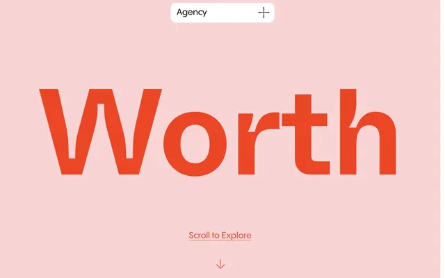
Preview image. Unlock full-res
Vibrant canvas, bold statements.
Color palette
Primary heading color, icon fills, and accent borders. Creates a focal point
Prominent background sections, button and link borders, decorative fills
Background for specific cards or sections, adding a subtle visual break
Page and card backgrounds, primary container surfaces
Subtle background for UI elements, very light surface differentiation
Primary body text, default icon color, and content borders. Provides strong contrast against light backgrounds
Link text, strong borders, and some icon elements. Used for maximum contrast
Typography
- Weights
- 400
- Sizes
- 16px
- Line height
- 1
- Fallback
- system-ui
System fallback for general text, ensures platform consistency when custom fonts are unavailable.
- Weights
- 400, 500, 600
- Sizes
- 16px, 22px, 28px, 42px, 52px
- Line height
- 1, 1.14, 1.27, 1.29, 1.31, 1.33, 1.44, 1.45, 1.5, 2.5
- Letter spacing
- -0.0060em
- Fallback
- Poppins, Montserrat
Primary typeface for body text, links, and most headings. Its varied weights support a subtle hierarchy while maintaining brand voice.
- Weights
- 400
- Sizes
- 400px
- Line height
- 0.75
- Letter spacing
- -0.0110em
- Fallback
- Bebas Neue, Impact
Display font for hero sections and large impactful headlines. Its extreme size and tight letter spacing deliver a bold, artistic statement.
Spacing & shape
Components
Uses 'custom_47178' at 400px, weight 400, color 'Zest Orange' (#eb4726), with a line height of 0.75 and letter spacing of -0.0110em.
Uses 'custom_47163' at 16px, weight 400, color 'Midnight Text' (#282828), with a line height of 1.0 and letter spacing of -0.0060em.
Uses 'custom_47163' at 16px, weight 400, color 'Zest Orange' (#eb4726), with a line height of 1.0, letter spacing of -0.0060em, and a 1px 'Blush Pink' (#f8d4d4) border on active/hover states.
Background 'Canvas White' (#ffffff), text 'Pitch Black' (#000000), border 1px solid 'Pitch Black' (#000000), 20px border-radius, with minimal padding.
Background 'Canvas White' (#ffffff), 16px border-radius, no box shadow, 0px padding. Content elements within use 'Midnight Text' (#282828).
Background 'Muted Sage' (#d2fdd1), 16px border-radius, no box shadow, 0px padding. Content elements within use 'Midnight Text' (#282828).
Text 'Zest Orange' (#eb4726) for link text, centered, with a light 1px 'Blush Pink' (#f8d4d4) border below the text, implicitly indicating a scroll action. Uses 'custom_47163' at 22px, weight 400.
Guidelines
- Prioritize 'Zest Orange' (#eb4726) for all primary headings to establish immediate visual hierarchy.
- Use 'Canvas White' (#ffffff) as the dominant background color for most sections, ensuring generous negative space.
- Apply 'Midnight Text' (#282828) for all body text for clear readability against light backgrounds.
- Maintain a clear visual distinction between text and background with a minimum contrast ratio of 14.7:1 (e.g. 'Midnight Text' on 'Canvas White').
- Employ a 16px border-radius for all card-like containers, providing a consistent soft aesthetic.
- Use bold, large typography from 'custom_47178' (400px) and 'custom_47163' (52px) for impactful statements in hero and key headings.
- Accentuate interactive elements like links and subtle ghost buttons with 'Blush Pink' (#f8d4d4) borders.
- Avoid using multiple chromatic colors in close proximity; the palette should remain focused on 'Zest Orange' and 'Blush Pink' as accents.
- Do not introduce strong shadows or complex gradients; rely on color and typography for emphasis.
- Refrain from drastically altering font sizes or weights outside the defined type scale to maintain typographic rhythm.
- Do not use dark backgrounds for large content blocks; the system is designed around a light-mode aesthetic.
- Avoid using radii smaller than 12px for interactive elements or 16px for cards, as this conflicts with the rounded visual identity.
- Do not rely on small text sizes for critical information; prioritize readability with defined body text sizes.
- Avoid generic system-default blue for links; use 'Zest Orange' (#eb4726) or 'Pitch Black' (#000000) for all interactive text.
About this system
ShowHide
Worth Agency employs a vibrant, confident design language using bold typography and a limited, high-contrast color palette. Dominant bright surfaces are punctuated by a vivid orange-red for headings and accent elements, creating an energetic yet clean feel. Components are light, with subtle bordering and pronounced roundness, allowing the strong typography and accent colors to define the brand's presence.
The page primarily uses a full-bleed layout for hero sections, immediately engaging the user with a large, centered headline. Subsequent sections, while appearing full-width in background, contain content within an implied max-width, maintaining a clean, centered stack for text and visual elements. The section rhythm is primarily seamless, flowing without hard dividers, relying on background color changes for distinction, as seen with alternating white and blush pink sections. Navigation is minimal, often appearing as a small, rounded tag in the top right, discreetly placed to not distract from the main content. Density is moderate, with ample whitespace surrounding key elements, ensuring clarity of the bold statements.
This site features product-centric imagery with tight crops and no lifestyle context. The primary focus is on displaying the core subject, often text-based brand names or service offerings, acting as a direct product showcase. Icons are simple, filled, and primarily monochromatic with occasional 'Zest Orange' accents, serving to clarify actions or decorative elements rather than convey complex information. Imagery is sparse; the design is text-dominant, with large, bold typography and color choices defining the visual weight.
Reminiscent of AIGA, Pentagram, Work & Co.
# Worth Agency — Style Reference
> Vibrant canvas, bold statements.

**Theme:** light

**Site:** https://worth.agency

Worth Agency employs a vibrant, confident design language using bold typography and a limited, high-contrast color palette. Dominant bright surfaces are punctuated by a vivid orange-red for headings and accent elements, creating an energetic yet clean feel. Components are light, with subtle bordering and pronounced roundness, allowing the strong typography and accent colors to define the brand's presence.

## Tokens — Colors

| Name | Value | Token | Role |
|------|------|------|------|
| Zest Orange | `#eb4726` | `--color-zest-orange` | Primary heading color, icon fills, and accent borders. Creates a focal point |
| Blush Pink | `#f8d4d4` | `--color-blush-pink` | Prominent background sections, button and link borders, decorative fills |
| Muted Sage | `#d2fdd1` | `--color-muted-sage` | Background for specific cards or sections, adding a subtle visual break |
| Canvas White | `#ffffff` | `--color-canvas-white` | Page and card backgrounds, primary container surfaces |
| Whisper Gray | `#f9f9f9` | `--color-whisper-gray` | Subtle background for UI elements, very light surface differentiation |
| Midnight Text | `#282828` | `--color-midnight-text` | Primary body text, default icon color, and content borders. Provides strong contrast against light backgrounds |
| Pitch Black | `#000000` | `--color-pitch-black` | Link text, strong borders, and some icon elements. Used for maximum contrast |

## Tokens — Typography

### -apple-system
- **Substitute:** system-ui
- **Weights:** 400
- **Sizes:** 16px
- **Line height:** 1
- **Role:** System fallback for general text, ensures platform consistency when custom fonts are unavailable.

### custom_47163
- **Substitute:** Poppins, Montserrat
- **Weights:** 400, 500, 600
- **Sizes:** 16px, 22px, 28px, 42px, 52px
- **Line height:** 1, 1.14, 1.27, 1.29, 1.31, 1.33, 1.44, 1.45, 1.5, 2.5
- **Letter spacing:** -0.0060em
- **Role:** Primary typeface for body text, links, and most headings. Its varied weights support a subtle hierarchy while maintaining brand voice.

### custom_47178
- **Substitute:** Bebas Neue, Impact
- **Weights:** 400
- **Sizes:** 400px
- **Line height:** 0.75
- **Letter spacing:** -0.0110em
- **Role:** Display font for hero sections and large impactful headlines. Its extreme size and tight letter spacing deliver a bold, artistic statement.

## Tokens — Type Scale

| Role | Size | Line height | Letter spacing |
|------|------|------|------|
| body | 16px | 1 | 0.096em |
| subheading | 22px | 1 | 0.132px |
| heading | 28px | 1.14 | 0.168px |
| heading-lg | 42px | 1.27 | 0.252px |
| display | 400px | 0.75 | -4.4px |

## Tokens — Spacing

- **Section gap:** 64px
- **Card padding:** 16px
- **Element gap:** 16px

## Tokens — Radius

- **Default:** 20px
- **Cards:** 16px
- **large:** 30px
- **small:** 12px

## Layout

The page primarily uses a full-bleed layout for hero sections, immediately engaging the user with a large, centered headline. Subsequent sections, while appearing full-width in background, contain content within an implied max-width, maintaining a clean, centered stack for text and visual elements. The section rhythm is primarily seamless, flowing without hard dividers, relying on background color changes for distinction, as seen with alternating white and blush pink sections. Navigation is minimal, often appearing as a small, rounded tag in the top right, discreetly placed to not distract from the main content. Density is moderate, with ample whitespace surrounding key elements, ensuring clarity of the bold statements.

## Imagery

This site features product-centric imagery with tight crops and no lifestyle context. The primary focus is on displaying the core subject, often text-based brand names or service offerings, acting as a direct product showcase. Icons are simple, filled, and primarily monochromatic with occasional 'Zest Orange' accents, serving to clarify actions or decorative elements rather than convey complex information. Imagery is sparse; the design is text-dominant, with large, bold typography and color choices defining the visual weight.

## Components

### Primary Heading Display
*Large, eye-catching text for hero sections.*

Uses 'custom_47178' at 400px, weight 400, color 'Zest Orange' (#eb4726), with a line height of 0.75 and letter spacing of -0.0110em.

### Body Text
*Standard paragraph text.*

Uses 'custom_47163' at 16px, weight 400, color 'Midnight Text' (#282828), with a line height of 1.0 and letter spacing of -0.0060em.

### Accent Link
*Interactive text links for navigation and calls to action.*

Uses 'custom_47163' at 16px, weight 400, color 'Zest Orange' (#eb4726), with a line height of 1.0, letter spacing of -0.0060em, and a 1px 'Blush Pink' (#f8d4d4) border on active/hover states.

### Navigation Tag
*Small, rounded tags for categorical navigation or labels.*

Background 'Canvas White' (#ffffff), text 'Pitch Black' (#000000), border 1px solid 'Pitch Black' (#000000), 20px border-radius, with minimal padding.

### Content Card - Default White
*Standard content containers for features or portfolio items.*

Background 'Canvas White' (#ffffff), 16px border-radius, no box shadow, 0px padding. Content elements within use 'Midnight Text' (#282828).

### Content Card - Muted Sage
*Alternative content container for visual variation.*

Background 'Muted Sage' (#d2fdd1), 16px border-radius, no box shadow, 0px padding. Content elements within use 'Midnight Text' (#282828).

### Ghost Button - Scroll
*Subtle call-to-action to guide users down the page.*

Text 'Zest Orange' (#eb4726) for link text, centered, with a light 1px 'Blush Pink' (#f8d4d4) border below the text, implicitly indicating a scroll action. Uses 'custom_47163' at 22px, weight 400.

## Guidelines

### Do

- Prioritize 'Zest Orange' (#eb4726) for all primary headings to establish immediate visual hierarchy.
- Use 'Canvas White' (#ffffff) as the dominant background color for most sections, ensuring generous negative space.
- Apply 'Midnight Text' (#282828) for all body text for clear readability against light backgrounds.
- Maintain a clear visual distinction between text and background with a minimum contrast ratio of 14.7:1 (e.g. 'Midnight Text' on 'Canvas White').
- Employ a 16px border-radius for all card-like containers, providing a consistent soft aesthetic.
- Use bold, large typography from 'custom_47178' (400px) and 'custom_47163' (52px) for impactful statements in hero and key headings.
- Accentuate interactive elements like links and subtle ghost buttons with 'Blush Pink' (#f8d4d4) borders.

### Don't

- Avoid using multiple chromatic colors in close proximity; the palette should remain focused on 'Zest Orange' and 'Blush Pink' as accents.
- Do not introduce strong shadows or complex gradients; rely on color and typography for emphasis.
- Refrain from drastically altering font sizes or weights outside the defined type scale to maintain typographic rhythm.
- Do not use dark backgrounds for large content blocks; the system is designed around a light-mode aesthetic.
- Avoid using radii smaller than 12px for interactive elements or 16px for cards, as this conflicts with the rounded visual identity.
- Do not rely on small text sizes for critical information; prioritize readability with defined body text sizes.
- Avoid generic system-default blue for links; use 'Zest Orange' (#eb4726) or 'Pitch Black' (#000000) for all interactive text.

## Agent Prompt Guide

Quick Color Reference:
text: #282828
background: #ffffff
border: #f8d4d4
accent: #eb4726
primary action: #f8d4d4 (outlined action border)

Example Component Prompts:
1. Create a hero section: 'Blush Pink' (#f8d4d4) full-bleed background. Center the headline "Worth" using 'custom_47178' at 400px, weight 400, 'Zest Orange' (#eb4726), letter-spacing -4.4px. Below it, add a link "Scroll to Explore" in 'Zest Orange' (#eb4726) using 'custom_47163' at 22px, weight 400, with a 1px 'Blush Pink' (#f8d4d4) bottom border.
2. Create a content card for a feature: 'Muted Sage' (#d2fdd1) background, 16px radius. Place the headline "Merry Berry" using 'custom_47163' at 52px, weight 400, 'Zest Orange' (#eb4726), letter-spacing 0.312px. Below the headline, add body text "A coffee franchise with almost a decade of history." in 'Midnight Text' (#282828) using 'custom_47163' at 16px, weight 400, letter-spacing 0.096px.
3. Design a top-right navigation tag: 'Canvas White' (#ffffff) background, 1px 'Pitch Black' (#000000) border, 20px radius. Inside, place the text "Agency" in 'Pitch Black' (#000000) using 'custom_47163' at 16px, weight 400, letter-spacing 0.096px, and a '+' icon in 'Pitch Black' (#000000).
More like this









Keep what you find
A free account saves references to boards and can send you a weekly email of picks based on what you save.
To see every result, go Pro.