Preview image. Unlock full-res
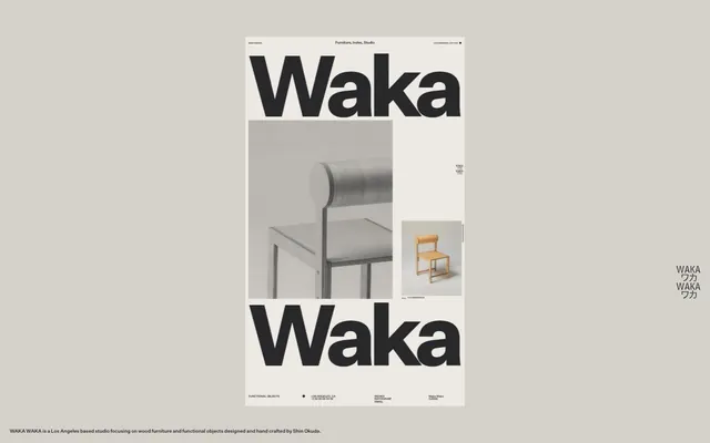
Gallery Wall Catalog: off-white canvas, stark black typography, and carefully placed product visuals.
Color palette
Page background, primary surface for content blocks
Dark borders and separators for elevated surfaces and inverted UI. Do not promote it to the primary CTA color
Typography
- Weights
- 400, 500, 700
- Sizes
- 10px, 14px, 18px, 24px, 560px
- Line height
- 0.8, 0.83, 1, 1.2, 1.6
- Letter spacing
- -0.09em at 560px, -0.03em at 24px, -0.02em at 18px
- Fallback
- Helvetica Neue
The primary typeface for all content, from monumental headings to functional body text and navigation. Its heavy weights in large sizes dominate the visual field, creating a poster-like impact, while lighter weights provide clarity for smaller text.
Spacing & shape
Components
A single content block centered on the page with 'Canvas Parchment' (#edeae4) background, constrained to a maximum width of 445px. There are no explicit borders or shadows, relying on the contrast with the page background for definition.
Uses Waka Sans at 560px, weight 700, color 'Ink Jot' (#28282a). Letter-spacing is -0.09em for dramatic visual effect against the 'Canvas Parchment' background.
Waka Sans, 14px, weight 400, color 'Ink Jot' (#28282a). These are minimal, text-only links within the header and footer.
Waka Sans, 14px, weight 400, color 'Ink Jot' (#28282a) with lineHeight 1.6.
Waka Sans, 10px, weight 400, color 'Ink Jot' (#28282a). Used for compact, informational text blocks.
Guidelines
- Prioritize 'Canvas Parchment' (#edeae4) as the main background for content areas, providing a neutral, gallery-like surface.
- Use 'Ink Jot' (#28282a) for all text and UI elements to maintain high contrast and a consistent monochrome palette.
- Employ Waka Sans at 560px with weight 700 and -0.09em letter-spacing for all prominent display headlines, creating a poster-like visual impact.
- Maintain a clear page max-width of 445px for primary content blocks to create a focused, contained reading experience.
- Utilize Waka Sans at 14px, weight 400, and lineHeight 1.6 for body text, ensuring legibility within the compact layout.
- Intersperse content with liberal white space; `elementGap` should range from 6px to 20px, and `sectionGap` between 40px and 54px.
- Maintain a strict '0px' border-radius across all elements to reinforce the sharp, editorial aesthetic.
- Avoid using any saturated colors beyond the strict 'Ink Jot' and 'Canvas Parchment' palette.
- Do not introduce shadows or complex gradients; the design relies on flat surfaces and stark contrast.
- Refrain from varying font families; Waka Sans is the exclusive typeface for the entire system.
- Do not break the page max-width containment; all primary content should adhere to the 445px constraint.
- Avoid decorative graphical elements; imagery should be product-focused and photography-based.
- Do not implement any border-radius greater than 0px; all corners must remain sharp.
- Do not use subtle neutrals to hint at hierarchy; rely on type size, weight, and spacing for visual differentiation.
About this system
ShowHide
Waka Waka employs a stark, editorial aesthetic, reminiscent of print. Its visual system centers on high-contrast typography against an off-white canvas, conveying information with an almost journalistic directness. The layout is disciplined and grid-bound, using generous negative space around bold type and product photography to lend an artifact-like quality to content. Color is minimal, primarily serving as a background for the content block, with deep charcoal black for all text and UI elements.
The page model is centered and constrained to a maximum width of 445px, creating a narrow, column-like presentation reminiscent of a printed page. The hero pattern features a monumental, centered headline 'Waka' spanning the width. Content arrangement alternates between large, impactful type elements and product photographs, often in a two-column or stacked composition within the narrow canvas. Vertical rhythm is established by distinct gaps between sections and elements, relying on negative space rather than explicit dividers. Navigation is minimal, consisting of text links in a fixed header and footer.
Imagery consists exclusively of product photography, primarily showcasing furniture. The treatment is stark and isolated: tightly cropped subjects against neutral, often studio-like backgrounds, with a focus on form and material. Photos are contained within layout blocks, maintaining sharp, unmasked edges. There are no lifestyle shots, illustrations, or iconography beyond simple text-based interactives; the objects themselves convey the aesthetic and brand. Images are high-contrast and often monochromatic, mirroring the color palette.
Reminiscent of AIGA Eye on Design, The Brand Identity, Norm Architects.
# Waka Waka — Style Reference
> Gallery Wall Catalog: off-white canvas, stark black typography, and carefully placed product visuals.

**Theme:** light

**Site:** https://wakawaka.world

Waka Waka employs a stark, editorial aesthetic, reminiscent of print. Its visual system centers on high-contrast typography against an off-white canvas, conveying information with an almost journalistic directness. The layout is disciplined and grid-bound, using generous negative space around bold type and product photography to lend an artifact-like quality to content. Color is minimal, primarily serving as a background for the content block, with deep charcoal black for all text and UI elements.

## Tokens — Colors

| Name | Value | Token | Role |
|------|------|------|------|
| Canvas Parchment | `#edeae4` | `--color-canvas-parchment` | Page background, primary surface for content blocks |
| Ink Jot | `#28282a` | `--color-ink-jot` | Dark borders and separators for elevated surfaces and inverted UI. Do not promote it to the primary CTA color |

## Tokens — Typography

### Waka Sans
- **Substitute:** Helvetica Neue
- **Weights:** 400, 500, 700
- **Sizes:** 10px, 14px, 18px, 24px, 560px
- **Line height:** 0.8, 0.83, 1, 1.2, 1.6
- **Letter spacing:** -0.09em at 560px, -0.03em at 24px, -0.02em at 18px
- **Role:** The primary typeface for all content, from monumental headings to functional body text and navigation. Its heavy weights in large sizes dominate the visual field, creating a poster-like impact, while lighter weights provide clarity for smaller text.

## Tokens — Type Scale

| Role | Size | Line height | Letter spacing |
|------|------|------|------|
| caption | 10px | 1 | — |
| body-sm | 14px | 1 | — |
| body | 18px | 1 | — |
| body-lg | 24px | 1 | — |
| heading-sm | 560px | 1 | — |

## Tokens — Spacing

- **Max width:** 445px
- **Section gap:** 40-54px
- **Card padding:** 20px
- **Element gap:** 6-20px

## Tokens — Radius

- **Default:** 0px

## Layout

The page model is centered and constrained to a maximum width of 445px, creating a narrow, column-like presentation reminiscent of a printed page. The hero pattern features a monumental, centered headline 'Waka' spanning the width. Content arrangement alternates between large, impactful type elements and product photographs, often in a two-column or stacked composition within the narrow canvas. Vertical rhythm is established by distinct gaps between sections and elements, relying on negative space rather than explicit dividers. Navigation is minimal, consisting of text links in a fixed header and footer.

## Imagery

Imagery consists exclusively of product photography, primarily showcasing furniture. The treatment is stark and isolated: tightly cropped subjects against neutral, often studio-like backgrounds, with a focus on form and material. Photos are contained within layout blocks, maintaining sharp, unmasked edges. There are no lifestyle shots, illustrations, or iconography beyond simple text-based interactives; the objects themselves convey the aesthetic and brand. Images are high-contrast and often monochromatic, mirroring the color palette.

## Components

### Page Canvas
*The primary content container*

A single content block centered on the page with 'Canvas Parchment' (#edeae4) background, constrained to a maximum width of 445px. There are no explicit borders or shadows, relying on the contrast with the page background for definition.

### Hero Headline
*Prominent display text*

Uses Waka Sans at 560px, weight 700, color 'Ink Jot' (#28282a). Letter-spacing is -0.09em for dramatic visual effect against the 'Canvas Parchment' background.

### Navigation Link
*Site navigation*

Waka Sans, 14px, weight 400, color 'Ink Jot' (#28282a). These are minimal, text-only links within the header and footer.

### Body Text
*:Standard paragraph and descriptive text*

Waka Sans, 14px, weight 400, color 'Ink Jot' (#28282a) with lineHeight 1.6.

### Functional Details
*Metadata, timestamps, and smaller labels*

Waka Sans, 10px, weight 400, color 'Ink Jot' (#28282a). Used for compact, informational text blocks.

## Guidelines

### Do

- Prioritize 'Canvas Parchment' (#edeae4) as the main background for content areas, providing a neutral, gallery-like surface.
- Use 'Ink Jot' (#28282a) for all text and UI elements to maintain high contrast and a consistent monochrome palette.
- Employ Waka Sans at 560px with weight 700 and -0.09em letter-spacing for all prominent display headlines, creating a poster-like visual impact.
- Maintain a clear page max-width of 445px for primary content blocks to create a focused, contained reading experience.
- Utilize Waka Sans at 14px, weight 400, and lineHeight 1.6 for body text, ensuring legibility within the compact layout.
- Intersperse content with liberal white space; `elementGap` should range from 6px to 20px, and `sectionGap` between 40px and 54px.
- Maintain a strict '0px' border-radius across all elements to reinforce the sharp, editorial aesthetic.

### Don't

- Avoid using any saturated colors beyond the strict 'Ink Jot' and 'Canvas Parchment' palette.
- Do not introduce shadows or complex gradients; the design relies on flat surfaces and stark contrast.
- Refrain from varying font families; Waka Sans is the exclusive typeface for the entire system.
- Do not break the page max-width containment; all primary content should adhere to the 445px constraint.
- Avoid decorative graphical elements; imagery should be product-focused and photography-based.
- Do not implement any border-radius greater than 0px; all corners must remain sharp.
- Do not use subtle neutrals to hint at hierarchy; rely on type size, weight, and spacing for visual differentiation.

## Motion Philosophy

The system utilizes subtle motion, primarily for interaction feedback on opacity and transform, with `ease` timing functions. Durations are generally fast to moderate (0.3s to 0.4s), ensuring responsiveness without drawing excessive attention. Transitions are sparingly used, reinforcing the static, editorial feel of the design. Long duration transitions (0.6s) suggest more significant state changes, but the overall approach prioritizes quick and direct feedback over elaborate animations.

## Agent Prompt Guide

primary action: no distinct CTA color
More like this









Keep what you find
A free account saves references to boards and can send you a weekly email of picks based on what you save.
To see every result, go Pro.