Preview image. Unlock full-res
Startup Canvas, Clean Bold Type
Color palette
Dark section backgrounds, decorative icon fills
Decorative link backgrounds for specific content blocks
Soft accent card backgrounds, subtle background washes
Red outline accent for tags, dividers, and focused UI edges. Use as a supporting accent, not as a status color
Specific link backgrounds, decorative accents
Orange outline accent for tags, dividers, and focused UI edges. Use as a supporting accent, not as a status color
Subtle background tones, light decorative elements
Page backgrounds, card surfaces, ghost button backgrounds
Primary text, main CTA backgrounds, dark card surfaces, navigation text
Muted borders, inactive button borders, hero element borders
Secondary text, link text, image border details
Navigation text in dark sections
Typography
- Weights
- 400, 500, 600
- Sizes
- 14px, 16px, 17px, 21px, 22px, 24px, 30px, 40px, 72px, 100px
- Line height
- 0.82, 1, 1.13, 1.14, 1.27, 1.3, 1.36, 1.4, 1.43, 1.5, 1.71
- Letter spacing
- -0.0200em at 100px, -0.0160em at 40px, -0.0130em at 30px
- Fallback
- Inter
Primary typeface for all headings, body text, and UI elements. Its strong, geometric character provides a confident, direct voice. The wide range of weights supports extensive hierarchy.
- Weights
- 400
- Sizes
- 14px
- Line height
- 1.4
- Letter spacing
- -0.0200em at 40px, normal at 14px
- Fallback
- Space Mono
Used for specific button text and decorative headings, providing a distinct geometric feel compared to Graphik.
- Weights
- 400, 700
- Sizes
- 40px
- Line height
- 1.3
- Letter spacing
- -0.02
Aeonikfono — detected in extracted data but not described by AI
Spacing & shape
Components
Background: Midnight Ink (#051316). Text: Canvas White (#ffffff). Radius: 12px. Padding: 8px vertical, 24px horizontal. Border: none.
Background: transparent. Text: Canvas White (#ffffff). Border: 1px solid rgba(255, 255, 255, 0.25). Radius: 12px. Padding: 14px vertical, 24px horizontal.
Background: Canvas White (#ffffff). Text: Midnight Ink (#051316). Border: 1px solid Smoke Gray (#d8d8d8). Radius: 12px. Padding: 14px vertical, 24px horizontal.
Background: Rose Blush (#fff4f6). Radius: 16px. Padding: 40px. No box-shadow.
Background: Canvas White (#ffffff). Radius: 16px. Padding: 40px. No box-shadow.
Background: Canvas White (#ffffff). Text: Midnight Ink (#051316). Border: 1px solid Smoke Gray (#d8d8d8). Radius: 1000px (pill shape). Padding: 14px vertical, 24px horizontal. Has a soft shadow on interaction.
Background: Canvas White (#ffffff). Text: Midnight Ink (#051316). Border: 1px solid Smoke Gray (#d8d8d8). Radius: 12px. Padding: 14px vertical, 24px horizontal.
Guidelines
- Prioritize Midnight Ink (#051316) for primary text and main calls to action on light backgrounds, ensuring strong contrast.
- Use a 12px border-radius for interactive elements like buttons and navigation items for a consistent rounded aesthetic.
- Apply Rose Blush (#fff4f6) as a subtle background for feature cards to differentiate them from the main Canvas White (#ffffff) surface.
- Maintain generous padding; apply at least 20px padding around content within cards and elements, and a 40px section gap between major content blocks.
- Employ the Graphik typeface for all text elements, utilizing its multiple weights to establish clear typographic hierarchy.
- Use pill-shaped tags with a 1000px border-radius for interactive filters and categorizations, styled with Canvas White (#ffffff) background and Smoke Gray (#d8d8d8) border.
- Introduce a subtle shadow (rgba(0, 0, 0, 0.06) 0px 9px 20px 0px) on interactive elements like buttons to indicate hover or active states.
- Avoid using multiple accent colors in close proximity; restrict their use to single highlights or functional elements.
- Do not extend Deep Plum (#210d25) to text or borders; reserve it exclusively for background sections or large decorative elements.
- Prevent excessive use of borders; use them sparingly for separation or interactive states rather than for all container elements.
- Do not deviate from the established type scale; maintain consistent font sizes and line heights defined for each semantic role.
- Avoid decorative gradients for UI elements; keep a flat aesthetic with solid colors for all buttons and panels.
- Do not introduce new shadow styles; adhere to the specified button shadow or refrain from using additional shadows.
About this system
ShowHide
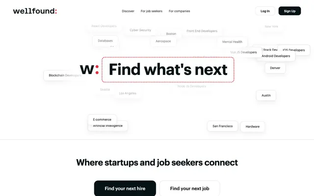
Wellfound projects a functional, modern job market feel with a dominant light theme punctuated by dark, almost black, sections for emphasis. The design emphasizes clear navigation and content presentation using a structured layout and a clean typographic hierarchy. Subtle touches of vibrant accent colors are used sparingly to highlight interactive elements and brand identity, rather than for decorative flourishes. Components are generally lightweight, favoring soft borders over heavy shadows.
The page primarily follows a max-width contained model (1400px), centered on the screen. The hero section features a prominent, centered headline with interactive tags over a large, dynamically generated background. Sections alternate between Canvas White (#ffffff) and Deep Plum (#210d25) backgrounds for visual rhythm. Content is arranged in either centered stacks or symmetrical two-column text-left/image-right configurations for feature explanations. Navigation consists of a sticky top bar with 'Log In' and 'Sign Up' buttons, and sub-navigation with compact links. Overall density is comfortable, with ample breathing room between elements and sections.
The site uses minimal imagery, primarily focusing on UI and typographic presentation. When present, images are tightly cropped product shots or abstract, illustrative icons rather than photography. Icons are generally outlined, matching the lightweight UI aesthetic. The overall density is text-dominant, with imagery serving as functional complements rather than decorative elements. Abstract graphics like the 'Find what's next' dotted outline are simple, linear, and serve to highlight key phrases.
Reminiscent of Linear, Supabase, Vercel, Figma.
# Wellfound — Style Reference
> Startup Canvas, Clean Bold Type

**Theme:** light

**Site:** https://wellfound.com

Wellfound projects a functional, modern job market feel with a dominant light theme punctuated by dark, almost black, sections for emphasis. The design emphasizes clear navigation and content presentation using a structured layout and a clean typographic hierarchy. Subtle touches of vibrant accent colors are used sparingly to highlight interactive elements and brand identity, rather than for decorative flourishes. Components are generally lightweight, favoring soft borders over heavy shadows.

## Tokens — Colors

| Name | Value | Token | Role |
|------|------|------|------|
| Deep Plum | `#210d25` | `--color-deep-plum` | Dark section backgrounds, decorative icon fills |
| Burgundy Bloom | `#541142` | `--color-burgundy-bloom` | Decorative link backgrounds for specific content blocks |
| Rose Blush | `#fff4f6` | `--color-rose-blush` | Soft accent card backgrounds, subtle background washes |
| Vermillion Red | `#ec2e3a` | `--color-vermillion-red` | Red outline accent for tags, dividers, and focused UI edges. Use as a supporting accent, not as a status color |
| Marigold Gold | `#f4b640` | `--color-marigold-gold` | Specific link backgrounds, decorative accents |
| Fiery Orange | `#e32e19` | `--color-fiery-orange` | Orange outline accent for tags, dividers, and focused UI edges. Use as a supporting accent, not as a status color |
| Peach Fuzz | `#ffdfda` | `--color-peach-fuzz` | Subtle background tones, light decorative elements |
| Canvas White | `#ffffff` | `--color-canvas-white` | Page backgrounds, card surfaces, ghost button backgrounds |
| Midnight Ink | `#051316` | `--color-midnight-ink` | Primary text, main CTA backgrounds, dark card surfaces, navigation text |
| Smoke Gray | `#d8d8d8` | `--color-smoke-gray` | Muted borders, inactive button borders, hero element borders |
| Charcoal | `#333333` | `--color-charcoal` | Secondary text, link text, image border details |
| Off-Black | `#222222` | `--color-off-black` | Navigation text in dark sections |

## Tokens — Typography

### Graphik
- **Substitute:** Inter
- **Weights:** 400, 500, 600
- **Sizes:** 14px, 16px, 17px, 21px, 22px, 24px, 30px, 40px, 72px, 100px
- **Line height:** 0.82, 1, 1.13, 1.14, 1.27, 1.3, 1.36, 1.4, 1.43, 1.5, 1.71
- **Letter spacing:** -0.0200em at 100px, -0.0160em at 40px, -0.0130em at 30px
- **Role:** Primary typeface for all headings, body text, and UI elements. Its strong, geometric character provides a confident, direct voice. The wide range of weights supports extensive hierarchy.

### Aeonik Fono
- **Substitute:** Space Mono
- **Weights:** 400
- **Sizes:** 14px
- **Line height:** 1.4
- **Letter spacing:** -0.0200em at 40px, normal at 14px
- **Role:** Used for specific button text and decorative headings, providing a distinct geometric feel compared to Graphik.

### Aeonikfono
- **Weights:** 400, 700
- **Sizes:** 40px
- **Line height:** 1.3
- **Letter spacing:** -0.02
- **Role:** Aeonikfono — detected in extracted data but not described by AI

## Tokens — Type Scale

Augmented Fourth (1.414) from 14px base.

| Role | Size | Line height | Letter spacing |
|------|------|------|------|
| caption | 14px | 1.4 | — |
| body-sm | 16px | 1.4 | — |
| subheading | 21px | 1.36 | — |
| heading | 30px | 1.3 | -0.39px |
| heading-lg | 40px | 1.13 | -0.64px |
| display | 72px | 1 | -1.44px |
| display-lg | 100px | 0.82 | -2px |

## Tokens — Spacing

- **Max width:** 1400px
- **Section gap:** 40px
- **Card padding:** 22px
- **Element gap:** 20px

## Tokens — Radius

- **Buttons:** 12px
- **Cards:** 16px
- **largeElements:** 40px
- **tags:** 1000px

## Layout

The page primarily follows a max-width contained model (1400px), centered on the screen. The hero section features a prominent, centered headline with interactive tags over a large, dynamically generated background. Sections alternate between Canvas White (#ffffff) and Deep Plum (#210d25) backgrounds for visual rhythm. Content is arranged in either centered stacks or symmetrical two-column text-left/image-right configurations for feature explanations. Navigation consists of a sticky top bar with 'Log In' and 'Sign Up' buttons, and sub-navigation with compact links. Overall density is comfortable, with ample breathing room between elements and sections.

## Imagery

The site uses minimal imagery, primarily focusing on UI and typographic presentation. When present, images are tightly cropped product shots or abstract, illustrative icons rather than photography. Icons are generally outlined, matching the lightweight UI aesthetic. The overall density is text-dominant, with imagery serving as functional complements rather than decorative elements. Abstract graphics like the 'Find what's next' dotted outline are simple, linear, and serve to highlight key phrases.

## Components

### Primary Filled Button (Dark)
*Call to action button for primary actions.*

Background: Midnight Ink (#051316). Text: Canvas White (#ffffff). Radius: 12px. Padding: 8px vertical, 24px horizontal. Border: none.

### Ghost Button (Light Border)
*Secondary action or navigational buttons, visually lighter.*

Background: transparent. Text: Canvas White (#ffffff). Border: 1px solid rgba(255, 255, 255, 0.25). Radius: 12px. Padding: 14px vertical, 24px horizontal.

### Ghost Button (Dark Border)
*Secondary action button on light backgrounds.*

Background: Canvas White (#ffffff). Text: Midnight Ink (#051316). Border: 1px solid Smoke Gray (#d8d8d8). Radius: 12px. Padding: 14px vertical, 24px horizontal.

### Feature Card (Rose Blush)
*Used for presenting key features or benefits.*

Background: Rose Blush (#fff4f6). Radius: 16px. Padding: 40px. No box-shadow.

### Information Card (White)
*Standard card for content blocks and lists.*

Background: Canvas White (#ffffff). Radius: 16px. Padding: 40px. No box-shadow.

### Job Tag Button
*Interactive tags for filtering or categorization.*

Background: Canvas White (#ffffff). Text: Midnight Ink (#051316). Border: 1px solid Smoke Gray (#d8d8d8). Radius: 1000px (pill shape). Padding: 14px vertical, 24px horizontal. Has a soft shadow on interaction.

### Log In Button (Header)
*Navigation button for user authentication.*

Background: Canvas White (#ffffff). Text: Midnight Ink (#051316). Border: 1px solid Smoke Gray (#d8d8d8). Radius: 12px. Padding: 14px vertical, 24px horizontal.

## Guidelines

### Do

- Prioritize Midnight Ink (#051316) for primary text and main calls to action on light backgrounds, ensuring strong contrast.
- Use a 12px border-radius for interactive elements like buttons and navigation items for a consistent rounded aesthetic.
- Apply Rose Blush (#fff4f6) as a subtle background for feature cards to differentiate them from the main Canvas White (#ffffff) surface.
- Maintain generous padding; apply at least 20px padding around content within cards and elements, and a 40px section gap between major content blocks.
- Employ the Graphik typeface for all text elements, utilizing its multiple weights to establish clear typographic hierarchy.
- Use pill-shaped tags with a 1000px border-radius for interactive filters and categorizations, styled with Canvas White (#ffffff) background and Smoke Gray (#d8d8d8) border.
- Introduce a subtle shadow (rgba(0, 0, 0, 0.06) 0px 9px 20px 0px) on interactive elements like buttons to indicate hover or active states.

### Don't

- Avoid using multiple accent colors in close proximity; restrict their use to single highlights or functional elements.
- Do not extend Deep Plum (#210d25) to text or borders; reserve it exclusively for background sections or large decorative elements.
- Prevent excessive use of borders; use them sparingly for separation or interactive states rather than for all container elements.
- Do not deviate from the established type scale; maintain consistent font sizes and line heights defined for each semantic role.
- Avoid decorative gradients for UI elements; keep a flat aesthetic with solid colors for all buttons and panels.
- Do not introduce new shadow styles; adhere to the specified button shadow or refrain from using additional shadows.

## Agent Prompt Guide

Quick Color Reference:
text: #051316
background: #ffffff
border: #d8d8d8
accent: #fff4f6
primary action: #051316 (filled action)

Example Component Prompts:
1. Create a Primary Filled Button: background #051316, text #ffffff, radius 12px, padding 8px vertical 24px horizontal, text in Graphik weight 600, size 16px.
2. Create a Feature Card: background #fff4f6, radius 16px, padding 40px, no shadow. Inside, include a heading (Graphik weight 600, size 24px, #051316) and body text (Graphik weight 400, size 17px, #333333).
3. Create a Job Tag Button: background #ffffff, text #051316, border 1px solid #d8d8d8, radius 1000px, padding 14px vertical 24px horizontal, text in Graphik weight 400, size 14px.
4. Design a dark content section: background #210d25, padding 40px vertical. Display a heading (Graphik weight 500, size 72px, #ffffff) and a secondary ghost button (transparent background, #ffffff text, 1px solid rgba(255, 255, 255, 0.25) border, 12px radius, 14px vertical 24px horizontal padding).
More like this







Keep what you find
A free account saves references to boards and can send you a weekly email of picks based on what you save.
To see every result, go Pro.