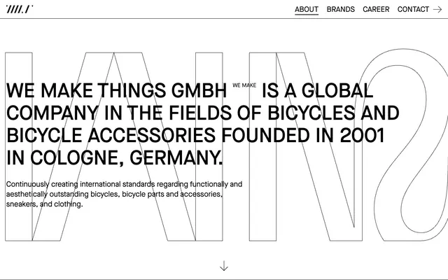
Preview image. Unlock full-res
monochrome architectural blueprint
Color palette
Page background, card surfaces, button backgrounds
Primary text, prominent borders, button text — defines the core high-contrast aesthetic
Typography
- Weights
- 400, 500
- Sizes
- 16px, 18px, 24px, 43px, 65px
- Line height
- 1.11, 1.2, 1.33, 2.5
- Letter spacing
- normal
- Fallback
- Inter
Body text, navigation, interactive elements, headings. Used for all functional text components.
- Weights
- 400
- Sizes
- 58px
- Line height
- 1.2
- Letter spacing
- normal
- Fallback
- Playfair Display
Large decorative text links.
- Weights
- 400
- Sizes
- 864px
- Line height
- 0.83
- Letter spacing
- normal
- Fallback
- Bebas Neue
Massive, outlined background text elements, serving as a graphic motif that integrates with the layout.
Spacing & shape
Components
Black text (#000000) on white background, uppercase Maison Neue at 16px. Underlined on hover or active state, creating emphasis through a 1px solid black border. Padding of 10px vertical and 14px horizontal.
White background (#ffffff) with black text and a 1px black border (#000000). Uses Maison Neue, size 16px, weight 400. No border-radius, maintaining a sharp, rectangular form. Padding is 0px vertical and 20px horizontal.
A downward arrow graphic in Headline Black (#000000), acting as a subtle call to action for scrolling, styled with Unzyale font for 'WE MAKE' adjacent to it.
Guidelines
- Maintain a strict black and white color palette (#000000 and #ffffff) for all UI elements.
- Use Maison Neue for all functional text elements, varying weights (400, 500) and sizes to create hierarchy.
- Incorporate large BASEBLOOM outlines as background graphic motifs, as seen in the hero section, to reinforce brand identity.
- Ensure all interactive elements, such as buttons and links, use strong 1px borders of Headline Black (#000000).
- Utilize a rigid 0px border-radius for all rectilinear components like buttons and containers.
- Apply 20px of padding regularly around elements and inside cards to maintain comfortable density.
- Arrange content with clear visual separation, often framed by the implicit 1px borders or explicit blank space around elements.
- Avoid introducing any additional colors beyond the pure black and white palette.
- Do not use rounded corners or soft edges on any UI elements; maintain sharp, angular forms.
- Refrain from using drop shadows or complex elevation techniques; rely on borders and spatial separation for visual hierarchy.
- Do not use generic system fonts; always specify Maison Neue, Unzyale, or BASEBLOOM for their distinct characteristics.
- Avoid decorative images or illustrations; the primary visual language is driven by typography and structure.
- Do not use subtle color changes for interactive states; rely on underlines, border changes, or text weight adjustments.
- Do not break the high-contrast aesthetic with low-contrast text-to-background combinations.
About this system
ShowHide
Wemakethings uses a high-contrast, stark contemporary language, built on a pure black-and-white canvas that functions both as background and prominent border. Type is central to the identity, featuring two custom display fonts for impact and a contemporary sans-serif for content. The design relies on bold outlines, large-scale typography, and tight visual compositions to convey presence without relying on color or complex layouts.
The page primarily uses a full-bleed model, allowing content and large typographic elements to stretch across the viewport, rather than conforming to a strict max-width container. The hero features a large, horizontally stretching headline and subtext, with a massive outlined typography graphic ('BASEBLOOM') in the background, anchoring the visual style. Sections divide content vertically with consistent spacing (e.g., 60px section gap) and often feature large-scale text as a dominant visual. Content arrangement is primarily stacked centrally or in simple 2-column structures, with a notable exception being the 'Brands' section which uses a 10-column, vertically oriented title card grid, each flanked by a narrow outline. Navigation is a minimalist top bar, fixed to the top of the viewport, with textual links and a subtle arrow icon.
The site uses no traditional imagery (photography, illustration, or product shots). Instead, large-scale, outlines of custom typography, specifically 'BASEBLOOM WE MAKE', serve as the primary visual elements. These typographic 'images' are full-bleed (or near full-bleed), integrated into the background structure of sections, providing a strong, graphic, and highly branded visual identity. Icons, when present, are minimal and outlined, like the arrow scroll indicator, keeping true to the monochrome, high-contrast aesthetic.
Reminiscent of AIGA Design Archives, Babel, Offscreen Magazine, Actual Source.
# Wemakethings — Style Reference
> monochrome architectural blueprint

**Theme:** light

**Site:** https://wemakethings.de

Wemakethings uses a high-contrast, stark contemporary language, built on a pure black-and-white canvas that functions both as background and prominent border. Type is central to the identity, featuring two custom display fonts for impact and a contemporary sans-serif for content. The design relies on bold outlines, large-scale typography, and tight visual compositions to convey presence without relying on color or complex layouts.

## Tokens — Colors

| Name | Value | Token | Role |
|------|------|------|------|
| Canvas White | `#ffffff` | `--color-canvas-white` | Page background, card surfaces, button backgrounds |
| Headline Black | `#000000` | `--color-headline-black` | Primary text, prominent borders, button text — defines the core high-contrast aesthetic |

## Tokens — Typography

### Maison Neue
- **Substitute:** Inter
- **Weights:** 400, 500
- **Sizes:** 16px, 18px, 24px, 43px, 65px
- **Line height:** 1.11, 1.2, 1.33, 2.5
- **Letter spacing:** normal
- **Role:** Body text, navigation, interactive elements, headings. Used for all functional text components.

### Unzyale
- **Substitute:** Playfair Display
- **Weights:** 400
- **Sizes:** 58px
- **Line height:** 1.2
- **Letter spacing:** normal
- **Role:** Large decorative text links.

### BASEBLOOM
- **Substitute:** Bebas Neue
- **Weights:** 400
- **Sizes:** 864px
- **Line height:** 0.83
- **Letter spacing:** normal
- **Role:** Massive, outlined background text elements, serving as a graphic motif that integrates with the layout.

## Tokens — Type Scale

| Role | Size | Line height | Letter spacing |
|------|------|------|------|
| body | 16px | 2.5 | — |
| body-lg | 18px | 1.33 | — |
| heading-sm | 24px | 1.2 | — |
| heading | 43px | 1.11 | — |
| heading-lg | 58px | 1.2 | — |
| display | 65px | 1.11 | — |
| hero | 864px | 0.83 | — |

## Tokens — Spacing

- **Section gap:** 60px
- **Card padding:** 20px
- **Element gap:** 20px

## Tokens — Radius

- **none:** 0px

## Layout

The page primarily uses a full-bleed model, allowing content and large typographic elements to stretch across the viewport, rather than conforming to a strict max-width container. The hero features a large, horizontally stretching headline and subtext, with a massive outlined typography graphic ('BASEBLOOM') in the background, anchoring the visual style. Sections divide content vertically with consistent spacing (e.g., 60px section gap) and often feature large-scale text as a dominant visual. Content arrangement is primarily stacked centrally or in simple 2-column structures, with a notable exception being the 'Brands' section which uses a 10-column, vertically oriented title card grid, each flanked by a narrow outline. Navigation is a minimalist top bar, fixed to the top of the viewport, with textual links and a subtle arrow icon.

## Imagery

The site uses no traditional imagery (photography, illustration, or product shots). Instead, large-scale, outlines of custom typography, specifically 'BASEBLOOM WE MAKE', serve as the primary visual elements. These typographic 'images' are full-bleed (or near full-bleed), integrated into the background structure of sections, providing a strong, graphic, and highly branded visual identity. Icons, when present, are minimal and outlined, like the arrow scroll indicator, keeping true to the monochrome, high-contrast aesthetic.

## Components

### Navigation Link
*Primary navigation element*

Black text (#000000) on white background, uppercase Maison Neue at 16px. Underlined on hover or active state, creating emphasis through a 1px solid black border. Padding of 10px vertical and 14px horizontal.

### Outlined Button
*Call to action for external links*

White background (#ffffff) with black text and a 1px black border (#000000). Uses Maison Neue, size 16px, weight 400. No border-radius, maintaining a sharp, rectangular form. Padding is 0px vertical and 20px horizontal.

### Scroll Indicator
*Visual cue for more content*

A downward arrow graphic in Headline Black (#000000), acting as a subtle call to action for scrolling, styled with Unzyale font for 'WE MAKE' adjacent to it.

## Guidelines

### Do

- Maintain a strict black and white color palette (#000000 and #ffffff) for all UI elements.
- Use Maison Neue for all functional text elements, varying weights (400, 500) and sizes to create hierarchy.
- Incorporate large BASEBLOOM outlines as background graphic motifs, as seen in the hero section, to reinforce brand identity.
- Ensure all interactive elements, such as buttons and links, use strong 1px borders of Headline Black (#000000).
- Utilize a rigid 0px border-radius for all rectilinear components like buttons and containers.
- Apply 20px of padding regularly around elements and inside cards to maintain comfortable density.
- Arrange content with clear visual separation, often framed by the implicit 1px borders or explicit blank space around elements.

### Don't

- Avoid introducing any additional colors beyond the pure black and white palette.
- Do not use rounded corners or soft edges on any UI elements; maintain sharp, angular forms.
- Refrain from using drop shadows or complex elevation techniques; rely on borders and spatial separation for visual hierarchy.
- Do not use generic system fonts; always specify Maison Neue, Unzyale, or BASEBLOOM for their distinct characteristics.
- Avoid decorative images or illustrations; the primary visual language is driven by typography and structure.
- Do not use subtle color changes for interactive states; rely on underlines, border changes, or text weight adjustments.
- Do not break the high-contrast aesthetic with low-contrast text-to-background combinations.

## Agent Prompt Guide

Quick Color Reference:
text: #000000
background: #ffffff
border: #000000
accent: no distinct accent color
primary action: no distinct CTA color

Example Component Prompts:
1. Create a primary navigation item: 'About' text in Maison Neue weight 400, size 16px, color #000000. Underline on hover with a 1px solid #000000 border-bottom.
No distinct primary action color was observed; use the extracted neutral button treatments instead of inventing a filled CTA color.
3. Implement a section headline: 'WE MAKE THINGS GmbH WE MAKE is a global company in the fields of bicycles and bi' using Maison Neue, weight 500, size 65px, color #000000. Include a background graphic of 'WE MAKE' in BASEBLOOM font, outlined in #000000, scaled to 864px size, positioned partially off-screen.
4. Produce a brand listing item: 'WETHEPEOPLE' and 'WE MAKE' text in Maison Neue weight 400, size 43px, color #000000, stacked vertically. This list item should be bordered by a 1px solid #000000 on its left and top sides, forming a grid card.
More like this









Keep what you find
A free account saves references to boards and can send you a weekly email of picks based on what you save.
To see every result, go Pro.