Preview image. Unlock full-res
Type-driven Gallery Wall
Color palette
Light accent, potentially for subtle backgrounds or inactive states
Entire page background. A clean, almost clinical white, serving as a high-contrast backdrop
Primary text, headings, and most UI borders, specifically for list items and images. The deep, rich black ensures high legibility and strong visual presence against the white canvas
Secondary text or muted elements
Tertiary text or subtle dividers
Typography
- Weights
- 400, 700
- Sizes
- 14px, 70px, 133px
- Line height
- 1, 1.1
- Letter spacing
- -0.05em
- Fallback
- system-ui, sans-serif
The primary display font for headlines, titles, and prominent textual blocks. Its bold and condensed nature, combined with tight letter-spacing, creates an assertive and editorial feel that defines the brand's voice.
- Weights
- 400
- Sizes
- 16px
- Line height
- 1.2
- Letter spacing
- normal
- Fallback
- serif
Body copy and ancillary text, providing a classic, readable counterpoint to the display font. It establishes a sense of traditional editorial content.
Spacing & shape
Components
A card with no background color (rgba(0, 0, 0, 0)), no border, no shadow, and 0px border-radius. It effectively serves as a structural wrapper without visual adornment, relying on content spacing for definition. Has 20px horizontal padding.
Standard 16px Times font, #1f1f1f color. The focus state is defined by the Magento Focus color (#e84782).
Guidelines
- Prioritize ObjectSans for all main headings and titles, using its tight letter-spacing (-0.05em) and bold weights (400, 700) to create immediate impact.
- Maintain a stark, high-contrast palette: use Inkwell Black (#1f1f1f) for all primary text and Canvas White (#fcfcfc) for backgrounds.
- Apply 0px border-radius universally to maintain sharp, unadorned edges for all components and images.
- Use a base unit of 20px for horizontal padding within content blocks and for spacing between main elements.
- Introduce clear section breaks with a 90px vertical gap between distinct content groups.
- Reserved colorful emojis (e.g., 🤠, 👀) should be used judiciously within headlines or key phrases, adding personality directly into the typographic system.
- Border images and list items with a 1px solid Inkwell Black (#1f1f1f) stroke to subtly define their edges.
- Avoid using decorative shadows or gradients; the design relies on flat surfaces and high contrast.
- Do not introduce rounded corners; maintain 0px radius for all elements.
- Do not deviate from the core color palette; avoid introducing additional saturated or muted tones for UI elements.
- Avoid excessive use of imagery that distracts from the core content; imagery should be integrated directly into the layout as focal points.
- Do not use generic system fonts for display text; 'ObjectSans' is fundamental to the brand's visual identity.
- Do not overcrowd the layout; maintain significant white space and use defined spacing tokens to create breathing room.
- Avoid adding unnecessary dividers or visual embellishments; let typography and imagery speak for themselves.
About this system
ShowHide
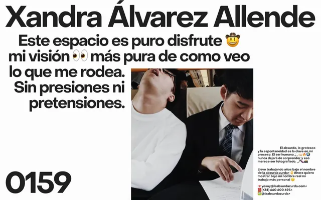
Xandra Álvarez Allende's visual system evokes a raw, direct artistic portfolio presentation. Bold, oversized typography dominates the canvas, creating visual tension and immediate impact. The aesthetic is stark: high-contrast black text on a pure white background, with imagery integrated as key focal points rather than decorative elements. There are no soft shadows or gradients, just direct visual statements with minimal component styling.
The page employs a full-bleed layout without a fixed maximum width, allowing content to stretch across the viewport. The hero section features oversized, centered headlines against a white background, creating immediate visual dominance. Content is arranged in large, asymmetric blocks, often with a dominant text block on one side and an accompanying image on the other. Vertical rhythm is established through generous 90px section gaps. The grid usage is implicit, with large content areas defining their own boundaries rather than adhering to a strict column grid. The navigation is minimal, likely restricted to a footer or implied by the direct content flow.
The visual language is photographic, featuring candid or art-directed shots of people. Images are treated as embedded content blocks, bordered by a thin Inkwell Black (#1f1f1f) stroke rather than blending into the background, and have sharp, unrounded edges. They serve as direct visual statements, often showcasing human emotion or interaction, and occupy significant visual space relative to the text. The treatment is naturalistic; there are no heavy filters or overt stylistic manipulations, allowing the intrinsic mood of the photography to convey atmosphere.
Reminiscent of Saul Bass, Braulio Amado, David Carson (Ray Gun), Paula Scher (Public Theater).
# Xandraalvarezallende — Style Reference
> Type-driven Gallery Wall

**Theme:** light

**Site:** https://www.xandraalvarezallende.com

Xandra Álvarez Allende's visual system evokes a raw, direct artistic portfolio presentation. Bold, oversized typography dominates the canvas, creating visual tension and immediate impact. The aesthetic is stark: high-contrast black text on a pure white background, with imagery integrated as key focal points rather than decorative elements. There are no soft shadows or gradients, just direct visual statements with minimal component styling.

## Tokens — Colors

| Name | Value | Token | Role |
|------|------|------|------|
| Lavender Mist | `#c5c6f9` | `--color-lavender-mist` | Light accent, potentially for subtle backgrounds or inactive states |
| Canvas White | `#fcfcfc` | `--color-canvas-white` | Entire page background. A clean, almost clinical white, serving as a high-contrast backdrop |
| Inkwell Black | `#1f1f1f` | `--color-inkwell-black` | Primary text, headings, and most UI borders, specifically for list items and images. The deep, rich black ensures high legibility and strong visual presence against the white canvas |
| Soft Graphite | `#666666` | `--color-soft-graphite` | Secondary text or muted elements |
| Smoke Gray | `#999999` | `--color-smoke-gray` | Tertiary text or subtle dividers |

## Tokens — Typography

### ObjectSans
- **Substitute:** system-ui, sans-serif
- **Weights:** 400, 700
- **Sizes:** 14px, 70px, 133px
- **Line height:** 1, 1.1
- **Letter spacing:** -0.05em
- **Role:** The primary display font for headlines, titles, and prominent textual blocks. Its bold and condensed nature, combined with tight letter-spacing, creates an assertive and editorial feel that defines the brand's voice.

### Times
- **Substitute:** serif
- **Weights:** 400
- **Sizes:** 16px
- **Line height:** 1.2
- **Letter spacing:** normal
- **Role:** Body copy and ancillary text, providing a classic, readable counterpoint to the display font. It establishes a sense of traditional editorial content.

## Tokens — Type Scale

| Role | Size | Line height | Letter spacing |
|------|------|------|------|
| caption | 14px | 1 | -0.7px |
| body | 16px | 1.2 | — |
| heading | 70px | 1.1 | -3.5px |
| display | 133px | 1 | -6.65px |

## Tokens — Spacing

- **Section gap:** 90px
- **Card padding:** 20px
- **Element gap:** 20px

## Tokens — Radius

- **none:** 0px

## Layout

The page employs a full-bleed layout without a fixed maximum width, allowing content to stretch across the viewport. The hero section features oversized, centered headlines against a white background, creating immediate visual dominance. Content is arranged in large, asymmetric blocks, often with a dominant text block on one side and an accompanying image on the other. Vertical rhythm is established through generous 90px section gaps. The grid usage is implicit, with large content areas defining their own boundaries rather than adhering to a strict column grid. The navigation is minimal, likely restricted to a footer or implied by the direct content flow.

## Imagery

The visual language is photographic, featuring candid or art-directed shots of people. Images are treated as embedded content blocks, bordered by a thin Inkwell Black (#1f1f1f) stroke rather than blending into the background, and have sharp, unrounded edges. They serve as direct visual statements, often showcasing human emotion or interaction, and occupy significant visual space relative to the text. The treatment is naturalistic; there are no heavy filters or overt stylistic manipulations, allowing the intrinsic mood of the photography to convey atmosphere.

## Components

### Bare Card
*Container for content, particularly images or text blocks.*

A card with no background color (rgba(0, 0, 0, 0)), no border, no shadow, and 0px border-radius. It effectively serves as a structural wrapper without visual adornment, relying on content spacing for definition. Has 20px horizontal padding.

### Call-to-Action Link
*Interactive text links for navigation or contact information.*

Standard 16px Times font, #1f1f1f color. The focus state is defined by the Magento Focus color (#e84782).

## Guidelines

### Do

- Prioritize ObjectSans for all main headings and titles, using its tight letter-spacing (-0.05em) and bold weights (400, 700) to create immediate impact.
- Maintain a stark, high-contrast palette: use Inkwell Black (#1f1f1f) for all primary text and Canvas White (#fcfcfc) for backgrounds.
- Apply 0px border-radius universally to maintain sharp, unadorned edges for all components and images.
- Use a base unit of 20px for horizontal padding within content blocks and for spacing between main elements.
- Introduce clear section breaks with a 90px vertical gap between distinct content groups.
- Reserved colorful emojis (e.g., 🤠, 👀) should be used judiciously within headlines or key phrases, adding personality directly into the typographic system.
- Border images and list items with a 1px solid Inkwell Black (#1f1f1f) stroke to subtly define their edges.

### Don't

- Avoid using decorative shadows or gradients; the design relies on flat surfaces and high contrast.
- Do not introduce rounded corners; maintain 0px radius for all elements.
- Do not deviate from the core color palette; avoid introducing additional saturated or muted tones for UI elements.
- Avoid excessive use of imagery that distracts from the core content; imagery should be integrated directly into the layout as focal points.
- Do not use generic system fonts for display text; 'ObjectSans' is fundamental to the brand's visual identity.
- Do not overcrowd the layout; maintain significant white space and use defined spacing tokens to create breathing room.
- Avoid adding unnecessary dividers or visual embellishments; let typography and imagery speak for themselves.

## Agent Prompt Guide

Quick Color Reference:
text: #1f1f1f
background: #fcfcfc
border: #1f1f1f
accent: #c5c6f9
primary action: no distinct CTA color

Example Component Prompts:
Create a hero section with a centered main headline: use ObjectSans, size 133px, weight 700, #1f1f1f, lineHeight 1.0, letterSpacing -6.65px. Below it, add a body text block using ObjectSans, size 70px, weight 400, #1f1f1f, lineHeight 1.1, letterSpacing -3.5px.

Create a basic text link: use Times, size 16px, weight 400, #1f1f1f. Ensure it uses Magenta Focus (#e84782) on hover.

Create a content card featuring an image: Use a Bare Card component (no background, 0px radius, 20px horizontal padding). Inside, place an image with a 1px #1f1f1f border and 0px radius. Below the image, add a descriptive text block using Times, size 16px, weight 400, #1f1f1f, lineHeight 1.2.
More like this









Keep what you find
A free account saves references to boards and can send you a weekly email of picks based on what you save.
To see every result, go Pro.