Preview image. Unlock full-res
Joyful maximalism with graphic rhythm
Color palette
Main accent color for graphic elements, dynamic backgrounds, and thematic blocks. Creates high-energy contrast
Secondary accent color for graphic elements and background patterns. Often paired with Passion Pink for dynamic visual interplay
Supporting palette color for small decorative accents when the core palette needs contrast. Do not promote it to the primary CTA color
Primary text, navigation links, borders, icon fills. Provides high contrast against vibrant and light backgrounds
Primary page background, card surfaces, footer background. A soft, light canvas for high-chroma elements
Typography
- Weights
- 400, 500
- Sizes
- 120px
- Line height
- 1.1
- Letter spacing
- 4px at 120px
- Fallback
- Bebas Neue
Primary display typeface for large, impactful headlines. Its bold, geometric character defines the brand's expressive visual voice.
- Weights
- 400, 500
- Sizes
- 14px, 20px, 120px
- Line height
- 1, 1.05, 1.3, 1.5
- Letter spacing
- normal
- Fallback
- Public Sans
General text, navigation, and smaller headings. Provides clarity and legibility, contrasting with the more stylized display font. Its use at 120px for some headings suggests versatility in its application.
Spacing & shape
Components
Text link in Ink (#000000), Haas Grotesk Display R Web, weight 400 at 20px, with normal line height. Bordered in Ink (#000000) at 3px on hover/active states for a subtle yet distinct interaction cue. Right margin of 30px.
Yinka Sans Ultra, weight 400, 120px size, line height 1.1, letter spacing 4px. Color is Ink (#000000) or Canvas Blush (#f5e5e5) depending on background contrast. Appears centered and prominent.
A 3px solid border in Ink (#000000) used as a horizontal rule (HR element) to visually break up content blocks.
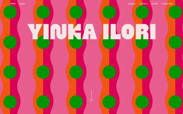
Large-scale, repeating organic shapes composed of Passion Pink (#d9698c), Zesty Orange (#ee6d22), and Lush Green (#1f8029) circles. These patterns fill entire sections, serving as the expressive backdrop for minimal UI. Features smooth transform and filter animations over 0.35s with an ease timing function. Radius is 9999px for the circular shapes.
Typically Canvas Blush (#f5e5e5) for most content sections, with occasional sections using Passion Pink (#d9698c) as a solid background.
Guidelines
- Prioritize high visual contrast between text and background, typically using Ink (#000000) on Canvas Blush (#f5e5e5) or on vibrant accent colors.
- Use Yinka Sans Ultra exclusively for large, primary headlines to maintain the brand's distinct typographic identity and visual impact.
- Employ Haas Grotesk Display R Web for all body text, navigation elements, and secondary headings, ensuring readability.
- Utilize Passion Pink (#d9698c), Zesty Orange (#ee6d22), and Lush Green (#1f8029) as primary colors for large, abstract, and often animated graphic backgrounds.
- Maintain minimal UI elements—navigation, text, and icons—to allow the vibrant background graphics to dominate the visual field.
- Apply a 3px solid border in Ink (#000000) for subtle emphasis on interactive elements or as content section dividers.
- Use 15px for small element spacing, 30px for padding and column gaps in denser layouts, and 175px for vertical section separation.
- Do not introduce new color hues beyond the established palette of Ink, Canvas Blush, Passion Pink, Zesty Orange, and Lush Green.
- Avoid using Yinka Sans Ultra for body text or small elements, as its design is optimized for large scale and impact, not extended readability.
- Do not use thin or low-contrast borders; all borders should be a distinct 3px Ink (#000000) for clarity.
- Resist adding unnecessary decorative shadows or complex gradients to UI elements, as the visual dynamism comes from colors and graphic patterns.
- Do not deviate from the established spacing system; consistent use of 15px, 30px, and 175px values will maintain the comfortable density.
- Avoid using imagery with realistic or photographic styles; the visual language relies on abstract, graphic, and highly stylized forms.
- Do not use subtle motion or slow transitions; elements that move should do so with an expressive, often energetic, ease timing function over 0.35s.
About this system
ShowHide
Yinka Ilori Studio operates with a vibrant, playful maximalism, driven by bold color contrasts and an expressive, geometric typeface for headlines. The core palette is built around high-saturation pinks, oranges, and greens, creating an energetic and optimistic atmosphere. Typography balances a striking display sans-serif with a more conventional, readable sans for body text. Layouts embrace large, often abstract, graphic elements as backgrounds, with UI elements remaining minimal and functional against the lively backdrops.
The page adheres to a mostly full-bleed model, especially for hero sections and abstract graphic backgrounds, with content generally centered or spanning the full width. The hero section often features a large, dynamic graphic background with a centrally placed, impactful headline. Sections flow vertically with comfortable spacing (175px), occasionally alternating background colors between Canvas Blush and Passion Pink. Within content blocks, text and minimal UI elements are stacked centrally or arranged in simple column configurations. Navigation is a split header with 'Work' and 'About' on the left, and 'Journal', 'Contact', 'Store', 'Foundation' on the right, all in Ink (#000000).
The site uses a strong, abstract graphic language instead of traditional imagery. Visuals consist of large-scale, repeating organic shapes (waves, circles) rendered in the brand's vibrant color palette (Passion Pink, Zesty Orange, Lush Green). These act as dynamic, full-bleed backgrounds often with fluid animation, creating an immersive, playful atmosphere. There are no photographs or product shots in the conventional sense; the focus is on graphic composition and color interaction. Icons are minimal, filled geometric shapes, primarily in Ink (#000000), acting as functional UI elements rather than detailed illustrations.
Reminiscent of Sagmeister & Walsh, Pantone Color Institute, Memphis Group (design movement), Stefan Sagmeister.
# Yinka Ilori Studio — Style Reference
> Joyful maximalism with graphic rhythm

**Theme:** light

**Site:** https://yinkailori.com

Yinka Ilori Studio operates with a vibrant, playful maximalism, driven by bold color contrasts and an expressive, geometric typeface for headlines. The core palette is built around high-saturation pinks, oranges, and greens, creating an energetic and optimistic atmosphere. Typography balances a striking display sans-serif with a more conventional, readable sans for body text. Layouts embrace large, often abstract, graphic elements as backgrounds, with UI elements remaining minimal and functional against the lively backdrops.

## Tokens — Colors

| Name | Value | Token | Role |
|------|------|------|------|
| Passion Pink | `#d9698c` | `--color-passion-pink` | Main accent color for graphic elements, dynamic backgrounds, and thematic blocks. Creates high-energy contrast |
| Zesty Orange | `#ee6d22` | `--color-zesty-orange` | Secondary accent color for graphic elements and background patterns. Often paired with Passion Pink for dynamic visual interplay |
| Lush Green | `#1f8029` | `--color-lush-green` | Supporting palette color for small decorative accents when the core palette needs contrast. Do not promote it to the primary CTA color |
| Ink | `#000000` | `--color-ink` | Primary text, navigation links, borders, icon fills. Provides high contrast against vibrant and light backgrounds |
| Canvas Blush | `#f5e5e5` | `--color-canvas-blush` | Primary page background, card surfaces, footer background. A soft, light canvas for high-chroma elements |

## Tokens — Typography

### Yinka Sans Ultra
- **Substitute:** Bebas Neue
- **Weights:** 400, 500
- **Sizes:** 120px
- **Line height:** 1.1
- **Letter spacing:** 4px at 120px
- **Role:** Primary display typeface for large, impactful headlines. Its bold, geometric character defines the brand's expressive visual voice.

### Haas Grotesk Display R Web
- **Substitute:** Public Sans
- **Weights:** 400, 500
- **Sizes:** 14px, 20px, 120px
- **Line height:** 1, 1.05, 1.3, 1.5
- **Letter spacing:** normal
- **Role:** General text, navigation, and smaller headings. Provides clarity and legibility, contrasting with the more stylized display font. Its use at 120px for some headings suggests versatility in its application.

## Tokens — Type Scale

| Role | Size | Line height | Letter spacing |
|------|------|------|------|
| caption | 14px | 1.5 | — |
| body | 20px | 1.3 | — |
| heading | 120px | 1.1 | 4px |

## Tokens — Spacing

- **Section gap:** 175px
- **Card padding:** 30px
- **Element gap:** 15px

## Tokens — Radius

- **Default:** 0px

## Layout

The page adheres to a mostly full-bleed model, especially for hero sections and abstract graphic backgrounds, with content generally centered or spanning the full width. The hero section often features a large, dynamic graphic background with a centrally placed, impactful headline. Sections flow vertically with comfortable spacing (175px), occasionally alternating background colors between Canvas Blush and Passion Pink. Within content blocks, text and minimal UI elements are stacked centrally or arranged in simple column configurations. Navigation is a split header with 'Work' and 'About' on the left, and 'Journal', 'Contact', 'Store', 'Foundation' on the right, all in Ink (#000000).

## Imagery

The site uses a strong, abstract graphic language instead of traditional imagery. Visuals consist of large-scale, repeating organic shapes (waves, circles) rendered in the brand's vibrant color palette (Passion Pink, Zesty Orange, Lush Green). These act as dynamic, full-bleed backgrounds often with fluid animation, creating an immersive, playful atmosphere. There are no photographs or product shots in the conventional sense; the focus is on graphic composition and color interaction. Icons are minimal, filled geometric shapes, primarily in Ink (#000000), acting as functional UI elements rather than detailed illustrations.

## Components

### Primary Navigation Link
*Main site navigation*

Text link in Ink (#000000), Haas Grotesk Display R Web, weight 400 at 20px, with normal line height. Bordered in Ink (#000000) at 3px on hover/active states for a subtle yet distinct interaction cue. Right margin of 30px.

### Hero Headline
*Large central title*

Yinka Sans Ultra, weight 400, 120px size, line height 1.1, letter spacing 4px. Color is Ink (#000000) or Canvas Blush (#f5e5e5) depending on background contrast. Appears centered and prominent.

### Text Section Divider
*Visual separator for content sections*

A 3px solid border in Ink (#000000) used as a horizontal rule (HR element) to visually break up content blocks.

### Animated Background Pattern
*Dynamic visual element*

Large-scale, repeating organic shapes composed of Passion Pink (#d9698c), Zesty Orange (#ee6d22), and Lush Green (#1f8029) circles. These patterns fill entire sections, serving as the expressive backdrop for minimal UI. Features smooth transform and filter animations over 0.35s with an ease timing function. Radius is 9999px for the circular shapes.

### Sectional Background
*Alternating background fills for distinct content blocks*

Typically Canvas Blush (#f5e5e5) for most content sections, with occasional sections using Passion Pink (#d9698c) as a solid background.

## Guidelines

### Do

- Prioritize high visual contrast between text and background, typically using Ink (#000000) on Canvas Blush (#f5e5e5) or on vibrant accent colors.
- Use Yinka Sans Ultra exclusively for large, primary headlines to maintain the brand's distinct typographic identity and visual impact.
- Employ Haas Grotesk Display R Web for all body text, navigation elements, and secondary headings, ensuring readability.
- Utilize Passion Pink (#d9698c), Zesty Orange (#ee6d22), and Lush Green (#1f8029) as primary colors for large, abstract, and often animated graphic backgrounds.
- Maintain minimal UI elements—navigation, text, and icons—to allow the vibrant background graphics to dominate the visual field.
- Apply a 3px solid border in Ink (#000000) for subtle emphasis on interactive elements or as content section dividers.
- Use 15px for small element spacing, 30px for padding and column gaps in denser layouts, and 175px for vertical section separation.

### Don't

- Do not introduce new color hues beyond the established palette of Ink, Canvas Blush, Passion Pink, Zesty Orange, and Lush Green.
- Avoid using Yinka Sans Ultra for body text or small elements, as its design is optimized for large scale and impact, not extended readability.
- Do not use thin or low-contrast borders; all borders should be a distinct 3px Ink (#000000) for clarity.
- Resist adding unnecessary decorative shadows or complex gradients to UI elements, as the visual dynamism comes from colors and graphic patterns.
- Do not deviate from the established spacing system; consistent use of 15px, 30px, and 175px values will maintain the comfortable density.
- Avoid using imagery with realistic or photographic styles; the visual language relies on abstract, graphic, and highly stylized forms.
- Do not use subtle motion or slow transitions; elements that move should do so with an expressive, often energetic, ease timing function over 0.35s.

## Agent Prompt Guide

Quick Color Reference: text: #000000, background: #f5e5e5, border: #000000, accent: #d9698c, primary action: no distinct CTA color

Example Component Prompts:
1. Create a Hero Section: full-bleed background uses `Passion Pink` (#d9698c), `Zesty Orange` (#ee6d22), and `Lush Green` (#1f8029) in an animated organic pattern with 9999px radius shapes. Centered `Hero Headline` text is 'Never Stop Dreaming' in `Canvas Blush` (#f5e5e5), `Yinka Sans Ultra` weight 400, 120px size, line height 1.1, letter spacing 4px.
2. Design a Footer: background color `Canvas Blush` (#f5e5e5), primary text `Ink` (#000000) using `Haas Grotesk Display R Web` weight 400 at 20px. Elements should have a vertical `elementGap` of 15px. Navigational links use `Ink` (#000000) with a 3px solid border on hover.
3. Build a Text Content Block: background `Canvas Blush` (#f5e5e5). Headline 'Reflection in Numbers' using `Haas Grotesk Display R Web` weight 500 at 120px, color `Ink` (#000000). Body text in `Ink` (#000000), `Haas Grotesk Display R Web` weight 400 at 20px. Horizontal separation uses a `Text Section Divider`.
More like this









Keep what you find
A free account saves references to boards and can send you a weekly email of picks based on what you save.
To see every result, go Pro.