Preview image. Unlock full-res
Sculpted forms, digital canvas
Color palette
New content indicators, active states, key call-to-action fills
Primary text, deep backgrounds, strong borders
Page backgrounds, card surfaces, ghost button text
Layered backgrounds, strong text, dark element borders
Placeholder text, subtle borders, inactive elements
Subtle dividers, light backgrounds
Secondary backgrounds, subtle UI element backgrounds
Secondary text, muted borders, navigation accents
Very light backgrounds, subtle highlight accents
Muted text, less prominent borders
Typography
- Weights
- 400, 500, 600, 700
- Sizes
- 13px, 14px, 15px, 16px, 20px, 32px, 40px, 64px, 128px
- Line height
- 1, 1.15, 1.2, 1.35, 1.4, 1.5
- Letter spacing
- -0.04em
- Fallback
- system-ui
Primary UI font for headings, body text, buttons, and navigation. Its slightly condensed, geometric structure reinforces the futuristic and engineered brand image. The uniform tight letter-spacing across all sizes maintains a consistent compact feel.
- Weights
- 400, 600
- Sizes
- 12px, 14px
- Line height
- 1, 1.35, 1.5
- Letter spacing
- normal
- Fallback
- monospace
Used for code-like snippets, product IDs, and secondary information where a technical, precise tone is desired. Its monospaced nature provides visual distinction from the primary typeface.
- Weights
- 400
- Sizes
- 13px
- Line height
- 1.2
Arial — detected in extracted data but not described by AI
Spacing & shape
Components
Filled with `Electric Blue` (#000aff) on a `Canvas White` text. Rounded corners at `10px`. Internal padding of `16px` vertical and `32px` horizontal.
Transparent background, `Midnight Ink` (#111111) text and border. No border radius. No padding.
Transparent background, `Midnight Ink` (#111111) text, `Stone Gray` (#a1a4aa) border. No border radius. No padding.
Semi-transparent `rgba(116, 114, 114, 0.5)` background with `Canvas White` text and border. `10px` border radius. Internal padding of `16px` vertical and `32px` horizontal.
Solid `Surface Gray` (#ecedee) background with `Shadow` (#000000) text. `10px` border radius. Internal padding of `16px` vertical and `32px` horizontal.
Semi-transparent `rgba(255, 255, 255, 0.5)` background with `Shadow` (#000000) text. `10px` border radius. Internal padding of `16px`.
Solid `Midnight Ink` (#111111) background with `10px` border radius. Vertical padding of `48px`, no horizontal padding.
Uses transparent background and no box shadow. `10px` border radius when it includes an image. Features a `Stone Gray` (#a1a4aa) border for structure.
Semi-transparent `rgba(255, 255, 255, 0.5)` background with `10px` border radius. Internal padding of `16px`.
Filled with `Electric Blue` (#000aff) and `Canvas White` text. Highly rounded corners at `30px`. Padding `4px` vertical and `16px` horizontal.
Guidelines
- Use Roobert with a letter-spacing of -0.04em for all primary text elements to maintain a compact, engineered aesthetic.
- Apply `10px` border radius consistently to buttons, product images, and cards for a subtly softened but deliberate edge.
- Reserve `Electric Blue` (#000aff) strictly for 'new' badges, active states, and primary call-to-action buttons to ensure maximum functional emphasis.
- Adhere to the `16px` unit for `elementGap` and `cardPadding` to establish a comfortable yet structured density.
- Utilize `Stone Gray` (#a1a4aa) for subtle borders and placeholders, creating a tiered visual hierarchy for non-interactive elements.
- Establish clear visual separation between sections by using `48px` for `sectionGap` and alternating `Canvas White` and `Surface Gray` (#ecedee) backgrounds.
- Incorporate `Space Mono` for small, numeric, or technical details, setting it apart with its monospaced character and normal letter-spacing.
- Do not deviate from the standardized letter-spacing of -0.04em for Roobert, as it defines the text's character.
- Avoid using `Electric Blue` (#000aff) for purely decorative elements; its purpose is functional emphasis.
- Do not introduce heavy drop shadows, as the system relies on subtle background shifts and high-contrast borders for depth.
- Do not use generic system fonts where Roobert or Space Mono are specified; the custom typography is a core brand identifier.
- Avoid arbitrary padding or margin values; stick to the `4px` base unit and specified `elementGap` and `cardPadding`.
- Do not round corners excessively beyond `10px` for cards and buttons, except for `30px` on badges, to maintain a solid, architectural feel.
- Do not use highly saturated colors outside the defined accent color; the palette is primarily neutral to highlight products.
About this system
ShowHide
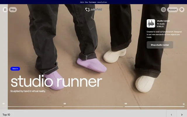
Zellerfeld's visual style is a 'concrete brutalism meets digital futurism' aesthetic. It pairs stark, unadorned typography with substantial, well-defined components, often set against a cool gray canvas. There's a deliberate lack of decorative elements, keeping the focus on solid forms and product imagery. Elevation is minimal, often relying on subtle background shifts or high-contrast borders rather than deep shadows. A single vibrant blue acts as a functional highlight, drawing attention to active states and new content.
The page adheres to a max-width `1440px` centered container for most content, with occasional full-bleed sections. The hero consistently presents a large, visually dominant product image or render, often with overlaid text. Section rhythm is driven by generous vertical spacing (`48px`) and alternating background colors (primarily `Canvas White` and `Surface Gray`) to differentiate content blocks. Content is typically arranged in adaptive grid layouts (e.g., 4-column product grids) or symmetrical centered stacks, with an emphasis on visual balance. Navigation features a subtle top bar and a sticky header, suggesting a lightweight and clean user experience.
Imagery primarily features product shots: 3D rendered shoes on plain, often monolithic backgrounds, sometimes featuring stylized human elements (legs, poses) but always framing the product as the central hero. Photography is high-key, with bright, even lighting and minimal shadows to showcase texture and form. The focus is on the object itself, often with a slightly desaturated overall tone to the environment, allowing vibrant product colors (like the purple shoe) to pop. Icons are minimal, utilitarian, and use outlined or filled styles, typically in `Midnight Ink`.
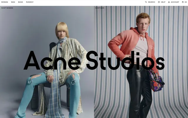
Reminiscent of A-COLD-WALL*, Balenciaga (website), The Row, Acne Studios.
# Zellerfeld — Style Reference
> Sculpted forms, digital canvas

**Theme:** light

**Site:** https://www.zellerfeld.com

Zellerfeld's visual style is a 'concrete brutalism meets digital futurism' aesthetic. It pairs stark, unadorned typography with substantial, well-defined components, often set against a cool gray canvas. There's a deliberate lack of decorative elements, keeping the focus on solid forms and product imagery. Elevation is minimal, often relying on subtle background shifts or high-contrast borders rather than deep shadows. A single vibrant blue acts as a functional highlight, drawing attention to active states and new content.

## Tokens — Colors

| Name | Value | Token | Role |
|------|------|------|------|
| Electric Blue | `#000aff` | `--color-electric-blue` | New content indicators, active states, key call-to-action fills |
| Midnight Ink | `#111111` | `--color-midnight-ink` | Primary text, deep backgrounds, strong borders |
| Canvas White | `#ffffff` | `--color-canvas-white` | Page backgrounds, card surfaces, ghost button text |
| Shadow | `#000000` | `--color-shadow` | Layered backgrounds, strong text, dark element borders |
| Stone Gray | `#a1a4aa` | `--color-stone-gray` | Placeholder text, subtle borders, inactive elements |
| Fog | `#d7d7d7` | `--color-fog` | Subtle dividers, light backgrounds |
| Surface Gray | `#ecedee` | `--color-surface-gray` | Secondary backgrounds, subtle UI element backgrounds |
| Stonewash | `#444955` | `--color-stonewash` | Secondary text, muted borders, navigation accents |
| Sky Tint | `#e5e7ff` | `--color-sky-tint` | Very light backgrounds, subtle highlight accents |
| Subtle Slate | `#737780` | `--color-subtle-slate` | Muted text, less prominent borders |

## Tokens — Typography

### Roobert
- **Substitute:** system-ui
- **Weights:** 400, 500, 600, 700
- **Sizes:** 13px, 14px, 15px, 16px, 20px, 32px, 40px, 64px, 128px
- **Line height:** 1, 1.15, 1.2, 1.35, 1.4, 1.5
- **Letter spacing:** -0.04em
- **Role:** Primary UI font for headings, body text, buttons, and navigation. Its slightly condensed, geometric structure reinforces the futuristic and engineered brand image. The uniform tight letter-spacing across all sizes maintains a consistent compact feel.

### Space Mono
- **Substitute:** monospace
- **Weights:** 400, 600
- **Sizes:** 12px, 14px
- **Line height:** 1, 1.35, 1.5
- **Letter spacing:** normal
- **Role:** Used for code-like snippets, product IDs, and secondary information where a technical, precise tone is desired. Its monospaced nature provides visual distinction from the primary typeface.

### Arial
- **Weights:** 400
- **Sizes:** 13px
- **Line height:** 1.2
- **Role:** Arial — detected in extracted data but not described by AI

## Tokens — Type Scale

Augmented Fourth (1.414) from 14px base.

| Role | Size | Line height | Letter spacing |
|------|------|------|------|
| caption | 12px | 1 | — |
| body | 14px | 1.35 | — |
| body-lg | 16px | 1.4 | — |
| heading-sm | 20px | 1.4 | — |
| heading | 32px | 1.15 | — |
| heading-lg | 40px | 1.15 | — |
| display-sm | 64px | 1 | — |
| display | 128px | 1 | — |

## Tokens — Spacing

- **Max width:** 1440px
- **Section gap:** 48px
- **Card padding:** 16px
- **Element gap:** 16px

## Tokens — Radius

- **Buttons:** 10px
- **Inputs:** 10px
- **Cards:** 10px
- **Images:** 10px
- **badges:** 30px

## Layout

The page adheres to a max-width `1440px` centered container for most content, with occasional full-bleed sections. The hero consistently presents a large, visually dominant product image or render, often with overlaid text. Section rhythm is driven by generous vertical spacing (`48px`) and alternating background colors (primarily `Canvas White` and `Surface Gray`) to differentiate content blocks. Content is typically arranged in adaptive grid layouts (e.g., 4-column product grids) or symmetrical centered stacks, with an emphasis on visual balance. Navigation features a subtle top bar and a sticky header, suggesting a lightweight and clean user experience.

## Imagery

Imagery primarily features product shots: 3D rendered shoes on plain, often monolithic backgrounds, sometimes featuring stylized human elements (legs, poses) but always framing the product as the central hero. Photography is high-key, with bright, even lighting and minimal shadows to showcase texture and form. The focus is on the object itself, often with a slightly desaturated overall tone to the environment, allowing vibrant product colors (like the purple shoe) to pop. Icons are minimal, utilitarian, and use outlined or filled styles, typically in `Midnight Ink`.

## Components

### Primary Action Button
*Main call-to-action button*

Filled with `Electric Blue` (#000aff) on a `Canvas White` text. Rounded corners at `10px`. Internal padding of `16px` vertical and `32px` horizontal.

### Ghost Button (Dark)
*Secondary action on dark backgrounds*

Transparent background, `Midnight Ink` (#111111) text and border. No border radius. No padding.

### Ghost Button (Light)
*Secondary actions on light backgrounds*

Transparent background, `Midnight Ink` (#111111) text, `Stone Gray` (#a1a4aa) border. No border radius. No padding.

### Faded Button
*Tertiary or disabled button states*

Semi-transparent `rgba(116, 114, 114, 0.5)` background with `Canvas White` text and border. `10px` border radius. Internal padding of `16px` vertical and `32px` horizontal.

### Light Opaque Button
*Standard button on neutral backgrounds*

Solid `Surface Gray` (#ecedee) background with `Shadow` (#000000) text. `10px` border radius. Internal padding of `16px` vertical and `32px` horizontal.

### Glass Input
*Input fields on light backgrounds*

Semi-transparent `rgba(255, 255, 255, 0.5)` background with `Shadow` (#000000) text. `10px` border radius. Internal padding of `16px`.

### Dark Overlay Card
*Prominent content sections or overlays*

Solid `Midnight Ink` (#111111) background with `10px` border radius. Vertical padding of `48px`, no horizontal padding.

### Neutral Product Card
*Default display for product listings*

Uses transparent background and no box shadow. `10px` border radius when it includes an image. Features a `Stone Gray` (#a1a4aa) border for structure.

### Glass Product Card
*Product card with a subtle transparent background*

Semi-transparent `rgba(255, 255, 255, 0.5)` background with `10px` border radius. Internal padding of `16px`.

### New In Badge
*Highlights new items or features*

Filled with `Electric Blue` (#000aff) and `Canvas White` text. Highly rounded corners at `30px`. Padding `4px` vertical and `16px` horizontal.

## Guidelines

### Do

- Use Roobert with a letter-spacing of -0.04em for all primary text elements to maintain a compact, engineered aesthetic.
- Apply `10px` border radius consistently to buttons, product images, and cards for a subtly softened but deliberate edge.
- Reserve `Electric Blue` (#000aff) strictly for 'new' badges, active states, and primary call-to-action buttons to ensure maximum functional emphasis.
- Adhere to the `16px` unit for `elementGap` and `cardPadding` to establish a comfortable yet structured density.
- Utilize `Stone Gray` (#a1a4aa) for subtle borders and placeholders, creating a tiered visual hierarchy for non-interactive elements.
- Establish clear visual separation between sections by using `48px` for `sectionGap` and alternating `Canvas White` and `Surface Gray` (#ecedee) backgrounds.
- Incorporate `Space Mono` for small, numeric, or technical details, setting it apart with its monospaced character and normal letter-spacing.

### Don't

- Do not deviate from the standardized letter-spacing of -0.04em for Roobert, as it defines the text's character.
- Avoid using `Electric Blue` (#000aff) for purely decorative elements; its purpose is functional emphasis.
- Do not introduce heavy drop shadows, as the system relies on subtle background shifts and high-contrast borders for depth.
- Do not use generic system fonts where Roobert or Space Mono are specified; the custom typography is a core brand identifier.
- Avoid arbitrary padding or margin values; stick to the `4px` base unit and specified `elementGap` and `cardPadding`.
- Do not round corners excessively beyond `10px` for cards and buttons, except for `30px` on badges, to maintain a solid, architectural feel.
- Do not use highly saturated colors outside the defined accent color; the palette is primarily neutral to highlight products.

## Agent Prompt Guide

Quick Color Reference:
text: #111111
background: #ffffff
border: #a1a4aa
accent: #000aff
primary action: #000aff (filled action)

Example Component Prompts:
1. Create a Hero Section: Background image of a shoe. Headline: 'studio runner' using Roobert, size 128px, weight 400, color #111111, letter-spacing -0.04em. Subtext 'Sculpted by hand in virtual reality.' using Roobert, size 20px, weight 400, color #111111, letter-spacing -0.04em. Overlay a 'New In' badge at the top left of the text block: background #000aff, text #ffffff, border-radius 30px, padding 4px vertical, 16px horizontal.
2. Create a Product Card for 'studio runner': Transparent background, border-radius 10px. Image of shoe. Below the image, text 'studio runner' in Roobert, size 16px, weight 400, color #111111. Below that, 'By studio' in Roobert, size 14px, weight 400, color #444955. Price '€189,00' in Roobert, size 16px, weight 400, color #111111. Inner padding of 16px.
3. Create a Primary Action Button: 'Shop studio runner'. Background #000aff, text #ffffff, border-radius 10px, padding 16px vertical, 32px horizontal. Use Roobert, size 16px, weight 500, letter-spacing -0.04em.
4. Create a Ghost Navigation Link for 'Shop': Transparent background, text #111111, no border, no padding. Use Roobert, size 16px, weight 500, letter-spacing -0.04em.
More like this







Keep what you find
A free account saves references to boards and can send you a weekly email of picks based on what you save.
To see every result, go Pro.