Preview image. Unlock full-res
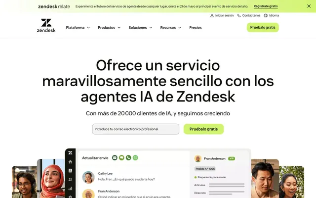
Lime signal in a forest clearing — precision SaaS dressed in warm organic ink, where the single electric-green accent cuts through like a backlit leaf.
Color palette
Primary CTA buttons, active indicators, accent highlights — the only saturated color on the page, so it carries 100% of the interactive signaling weight
Event/announcement banner backgrounds — deep forest green that creates visual separation from page content without using darkness alone
Secondary dark-green surfaces, card backgrounds in dark sections
Decorative fade effects, scroll-indicator overlays in lime-to-transparent direction
Primary text, nav labels, body copy, button labels — warm near-black with green undertone instead of pure black
Page backgrounds, card surfaces, section fills — one step off pure white, giving the page an organic warmth
Hero section background, button text on dark surfaces, icon fills on dark backgrounds
Icon fills, SVG strokes, high-contrast borders in dark contexts
Subtle borders and divider lines between sections
Typography
- Weights
- 300, 400, 500, 600, 700
- Sizes
- 14px, 15px, 16px, 18px, 26px, 32px, 42px, 48px, 68px, 74px
- Line height
- 1, 1.39
- Letter spacing
- 0.054em (applied globally across sizes)
- Fallback
- Inter, DM Sans
Single typeface for the entire system — custom humanist sans with slightly organic curves. Used at weight 300 for large hero headlines (anti-convention whisper-weight at 68–74px), weight 400–500 for body and subheadings, weight 600–700 for UI labels and nav items. The 0.054em letter-spacing appears as a global tracking value applied broadly, giving the UI a slightly airy, premium feel at smaller sizes.
Spacing & shape
Components
backgroundColor #d1f470, color #11110d, borderRadius 16px, padding 10px 20px, Vanilla Sans weight 600, font-size 16px. On dark backgrounds the color switches to #ffffff text but keeps the same #d1f470 background. Border matches background color (invisible border pattern).
backgroundColor transparent, color #11110d, borderTopColor rgba(17,17,13,0.11) — the near-invisible bottom border at 11% opacity creates an underline-style affordance without a full visible border. borderRadius 0px, paddingTop 12px, paddingRight 12px, paddingBottom 0px, paddingLeft 12px. No fill, no background on hover state implied.
backgroundColor transparent, color #11110d, border 1px solid #11110d, borderRadius 100% (perfect circle), padding 16px all sides. Used in pairs (← →) flanking carousel content.
backgroundColor #f5f5f2, borderRadius 0px, boxShadow none, padding 32px 24px. Zero border radius is the signature — cards are flush-cornered rectangles, distinguished from page background by the warm off-white surface, not by elevation or shadow.
backgroundColor rgba(17,17,13,0.05) — a 5% tint of near-black over the white hero, creating a barely-there warm gray fill. borderRadius 12px, padding 12px all sides, color #11110d, border 1px solid #11110d. Placeholder text in body-sm Vanilla Sans weight 400.
Full-width bar, backgroundColor #000000 (top global bar) or #203524 (event section). Text in Vanilla Sans 14px weight 400, white (#ffffff). Contains a 'Regístrate gratis' link in #d1f470 with underline. Dismiss X icon right-aligned. Separate from main nav by visual weight contrast.
backgroundColor #203524 (Forest Canopy), borderRadius 40px, contains logotype in white, body text at 15px weight 400 white, two stacked CTAs: a lime-fill button (16px radius) and an outlined ghost button. Right side contains a full-bleed photo of a speaker cropped into the rounded card. Padding approximately 32px 40px on text side.
White or #f5f5f2 background, logos rendered in #11110d (monochrome). No borders, no cards. Overline label in 14px weight 600 Vanilla Sans, letter-spacing 0.054em, uppercase. Logos arranged in single horizontal row with 24-32px gaps.
backgroundColor #f5f5f2 page background, quote in Vanilla Sans 26-32px weight 300, color #11110d. Attribution in 15px weight 500. Customer photo in a square with 16px border-radius. Arrow navigation using Circular Icon Buttons. Customer logos displayed below in a horizontal row at 50% opacity.
White card surface, borderRadius 16px, contains a realistic representation of the Zendesk agent interface. Displayed as a floating panel over the hero section, partially overlapping the fold. Accompanied by lifestyle photography strips on left and right edges with rounded corners.
Guidelines
- Use #d1f470 exclusively for interactive CTAs and key data highlights — its scarcity on the page is the source of its stopping power
- Apply 0px borderRadius to all content cards; elevation comes from the #f5f5f2 surface against a white background, not from shadows or rounded corners
- Use Vanilla Sans weight 300 at 48px and above — the lightweight headline at large scale is the primary typographic signature
- Set global letter-spacing to 0.054em across all Vanilla Sans usage to maintain the airy spacing that distinguishes it from default Inter or DM Sans
- Pair the lime CTA (#d1f470) button with a transparent/ghost secondary button at equal visual weight — never stack two filled buttons
- Use #11110d (near-black with warm undertone) instead of pure #000000 for all body text and UI labels
- Reserve #203524 Forest Canopy for event/announcement surfaces only — it signals 'special context', not general UI
- Never add box-shadow to cards — the design intentionally uses surface color contrast (#f5f5f2 vs #ffffff) for elevation, not shadows
- Never use borderRadius above 16px on buttons or 40px on event cards — no full-pill (9999px) shapes appear in this system
- Never introduce secondary accent colors — #d1f470 is the sole chromatic accent; adding blue, orange, or purple breaks the one-color system
- Never use Vanilla Sans at weight 700 for headlines — heavy weight at display sizes contradicts the restraint-authority balance of this system
- Never use pure #000000 for body text on light backgrounds — #11110d is the correct near-black that preserves the warm organic undertone
- Never apply border-radius to flat content cards (the 0px radius is intentional, not an omission)
- Never place two lime-background elements adjacent to each other — the accent works through isolation
About this system
ShowHide
Zendesk's homepage projects warmth and authority through an unusual pairing: near-black almost-green ink (#11110d) on warm off-white (#f5f5f2), punctuated by a single electric lime (#d1f470) that reads as both verdant and technological. The dark forest-green event banner (#203524) at the top immediately signals brand confidence — deep, earthy, not the expected corporate blue. Body text lives in near-black #11110d rather than pure black, giving the page a slightly warm, organic undertone that softens what could otherwise feel austere. The signature move is the lime CTA: vivid enough to stop the eye, yet grounded enough to feel like a product choice rather than a marketing trick. Card surfaces use #f5f5f2 — a shade away from white — so card lifts happen through warm contrast rather than shadows.
Max-width approximately 1200px centered on all sections. Hero is full-viewport white with centered headline stack (Vanilla Sans weight 300 at 68–74px), a single email input + lime CTA row below, and a product UI screenshot that bleeds downward past the fold — the screenshot extends vertically to create scroll anticipation. Beneath the hero: a full-width logo trust bar on white, then alternating content bands at #f5f5f2 and white. The Zendesk Relate event promo occupies a full-width card with 40px radius set into the #f5f5f2 band. Testimonial section uses a centered single-column layout with flanking arrow navigation. Overall rhythm: spacious — section gaps 80-120px, content never feels compressed. Navigation is a sticky top bar with two rows: a global announcement bar above, then the primary nav with logo left, items center-right, and the lime CTA button far right.
Mixed photography and product UI. Photography appears as lifestyle portrait strips — real customers and agents in warm, candid moments (smiling, mid-conversation, casual workplace contexts). Images are cropped tightly and appear as vertical strips flanking the central product UI embed, or as full bleeds within the event promo card. The product UI screenshot is the true hero visual: a detailed, realistic rendering of the Zendesk agent interface shown at natural scale, white background, 16px rounded card. Lifestyle photos sit adjacent with visible rounded corners matching the card system. No illustration. Icons are minimal outlined mono-weight in #11110d. Customer/partner logos are monochrome, displayed at reduced opacity on light backgrounds. Image density is moderate — photography is purposeful punctuation around the product screenshot, not wallpaper.
Reminiscent of Intercom, Notion, Linear, Freshdesk, Webflow.
# Zendesk — Style Reference
> Lime signal in a forest clearing — precision SaaS dressed in warm organic ink, where the single electric-green accent cuts through like a backlit leaf.

**Theme:** light

**Site:** https://zendesk.com

Zendesk's homepage projects warmth and authority through an unusual pairing: near-black almost-green ink (#11110d) on warm off-white (#f5f5f2), punctuated by a single electric lime (#d1f470) that reads as both verdant and technological. The dark forest-green event banner (#203524) at the top immediately signals brand confidence — deep, earthy, not the expected corporate blue. Body text lives in near-black #11110d rather than pure black, giving the page a slightly warm, organic undertone that softens what could otherwise feel austere. The signature move is the lime CTA: vivid enough to stop the eye, yet grounded enough to feel like a product choice rather than a marketing trick. Card surfaces use #f5f5f2 — a shade away from white — so card lifts happen through warm contrast rather than shadows.

## Tokens — Colors

| Name | Value | Token | Role |
|------|------|------|------|
| Electric Lime | `#d1f470` | `--color-electric-lime` | Primary CTA buttons, active indicators, accent highlights — the only saturated color on the page, so it carries 100% of the interactive signaling weight |
| Forest Canopy | `#203524` | `--color-forest-canopy` | Event/announcement banner backgrounds — deep forest green that creates visual separation from page content without using darkness alone |
| Deep Grove | `#2d4c33` | `--color-deep-grove` | Secondary dark-green surfaces, card backgrounds in dark sections |
| Lime Fade | `#d1f470` | `--color-lime-fade` | Decorative fade effects, scroll-indicator overlays in lime-to-transparent direction |
| Near-Black Ink | `#11110d` | `--color-near-black-ink` | Primary text, nav labels, body copy, button labels — warm near-black with green undertone instead of pure black |
| Warm White | `#f5f5f2` | `--color-warm-white` | Page backgrounds, card surfaces, section fills — one step off pure white, giving the page an organic warmth |
| Pure White | `#ffffff` | `--color-pure-white` | Hero section background, button text on dark surfaces, icon fills on dark backgrounds |
| Midnight | `#000000` | `--color-midnight` | Icon fills, SVG strokes, high-contrast borders in dark contexts |
| Stone Divider | `#90918c` | `--color-stone-divider` | Subtle borders and divider lines between sections |

## Tokens — Typography

### Vanilla Sans
- **Substitute:** Inter, DM Sans
- **Weights:** 300, 400, 500, 600, 700
- **Sizes:** 14px, 15px, 16px, 18px, 26px, 32px, 42px, 48px, 68px, 74px
- **Line height:** 1, 1.39
- **Letter spacing:** 0.054em (applied globally across sizes)
- **Role:** Single typeface for the entire system — custom humanist sans with slightly organic curves. Used at weight 300 for large hero headlines (anti-convention whisper-weight at 68–74px), weight 400–500 for body and subheadings, weight 600–700 for UI labels and nav items. The 0.054em letter-spacing appears as a global tracking value applied broadly, giving the UI a slightly airy, premium feel at smaller sizes.

## Tokens — Type Scale

Perfect Fourth (1.333) from 16px base.

| Role | Size | Line height | Letter spacing |
|------|------|------|------|
| caption | 14px | 1.44 | — |
| body | 16px | 1.56 | — |
| subheading | 18px | 1.4 | — |
| heading-sm | 26px | 1.3 | — |
| heading | 32px | 1.25 | — |
| heading-lg | 48px | 1.15 | — |
| display | 74px | 1 | — |

## Tokens — Spacing

- **Max width:** 1200px
- **Section gap:** 80-120px
- **Element gap:** 8-16px

## Tokens — Radius

- **Buttons:** 16px
- **Inputs:** 12px
- **Cards:** 0px
- **eventBannerCards:** 40px
- **iconButtons:** 100%
- **tags:** 4px

## Layout

Max-width approximately 1200px centered on all sections. Hero is full-viewport white with centered headline stack (Vanilla Sans weight 300 at 68–74px), a single email input + lime CTA row below, and a product UI screenshot that bleeds downward past the fold — the screenshot extends vertically to create scroll anticipation. Beneath the hero: a full-width logo trust bar on white, then alternating content bands at #f5f5f2 and white. The Zendesk Relate event promo occupies a full-width card with 40px radius set into the #f5f5f2 band. Testimonial section uses a centered single-column layout with flanking arrow navigation. Overall rhythm: spacious — section gaps 80-120px, content never feels compressed. Navigation is a sticky top bar with two rows: a global announcement bar above, then the primary nav with logo left, items center-right, and the lime CTA button far right.

## Imagery

Mixed photography and product UI. Photography appears as lifestyle portrait strips — real customers and agents in warm, candid moments (smiling, mid-conversation, casual workplace contexts). Images are cropped tightly and appear as vertical strips flanking the central product UI embed, or as full bleeds within the event promo card. The product UI screenshot is the true hero visual: a detailed, realistic rendering of the Zendesk agent interface shown at natural scale, white background, 16px rounded card. Lifestyle photos sit adjacent with visible rounded corners matching the card system. No illustration. Icons are minimal outlined mono-weight in #11110d. Customer/partner logos are monochrome, displayed at reduced opacity on light backgrounds. Image density is moderate — photography is purposeful punctuation around the product screenshot, not wallpaper.

## Components

### Email Signup CTA with Input

### Zendesk Relate Event Promo Card

### Testimonial Carousel Block

### Primary Lime CTA Button
*Main conversion action — email signup, trial start*

backgroundColor #d1f470, color #11110d, borderRadius 16px, padding 10px 20px, Vanilla Sans weight 600, font-size 16px. On dark backgrounds the color switches to #ffffff text but keeps the same #d1f470 background. Border matches background color (invisible border pattern).

### Ghost Link Button
*Secondary actions — 'Ver en línea', 'Más información'*

backgroundColor transparent, color #11110d, borderTopColor rgba(17,17,13,0.11) — the near-invisible bottom border at 11% opacity creates an underline-style affordance without a full visible border. borderRadius 0px, paddingTop 12px, paddingRight 12px, paddingBottom 0px, paddingLeft 12px. No fill, no background on hover state implied.

### Circular Icon Button
*Navigation arrows in testimonial carousels*

backgroundColor transparent, color #11110d, border 1px solid #11110d, borderRadius 100% (perfect circle), padding 16px all sides. Used in pairs (← →) flanking carousel content.

### Flat Content Card
*Feature and content grouping blocks*

backgroundColor #f5f5f2, borderRadius 0px, boxShadow none, padding 32px 24px. Zero border radius is the signature — cards are flush-cornered rectangles, distinguished from page background by the warm off-white surface, not by elevation or shadow.

### Email Input Field
*Primary lead capture — email collection in hero*

backgroundColor rgba(17,17,13,0.05) — a 5% tint of near-black over the white hero, creating a barely-there warm gray fill. borderRadius 12px, padding 12px all sides, color #11110d, border 1px solid #11110d. Placeholder text in body-sm Vanilla Sans weight 400.

### Announcement Banner
*Top-of-page event or promotional strip*

Full-width bar, backgroundColor #000000 (top global bar) or #203524 (event section). Text in Vanilla Sans 14px weight 400, white (#ffffff). Contains a 'Regístrate gratis' link in #d1f470 with underline. Dismiss X icon right-aligned. Separate from main nav by visual weight contrast.

### Event Promo Card
*Zendesk Relate event block — image + text + CTA*

backgroundColor #203524 (Forest Canopy), borderRadius 40px, contains logotype in white, body text at 15px weight 400 white, two stacked CTAs: a lime-fill button (16px radius) and an outlined ghost button. Right side contains a full-bleed photo of a speaker cropped into the rounded card. Padding approximately 32px 40px on text side.

### Logo Trust Bar
*Social proof — partner/customer logo strip*

White or #f5f5f2 background, logos rendered in #11110d (monochrome). No borders, no cards. Overline label in 14px weight 600 Vanilla Sans, letter-spacing 0.054em, uppercase. Logos arranged in single horizontal row with 24-32px gaps.

### Testimonial Carousel Block
*Customer quote with photo and attribution*

backgroundColor #f5f5f2 page background, quote in Vanilla Sans 26-32px weight 300, color #11110d. Attribution in 15px weight 500. Customer photo in a square with 16px border-radius. Arrow navigation using Circular Icon Buttons. Customer logos displayed below in a horizontal row at 50% opacity.

### Product UI Screenshot Embed
*Hero visual — showing product interface in context*

White card surface, borderRadius 16px, contains a realistic representation of the Zendesk agent interface. Displayed as a floating panel over the hero section, partially overlapping the fold. Accompanied by lifestyle photography strips on left and right edges with rounded corners.

## Guidelines

### Do

- Use #d1f470 exclusively for interactive CTAs and key data highlights — its scarcity on the page is the source of its stopping power
- Apply 0px borderRadius to all content cards; elevation comes from the #f5f5f2 surface against a white background, not from shadows or rounded corners
- Use Vanilla Sans weight 300 at 48px and above — the lightweight headline at large scale is the primary typographic signature
- Set global letter-spacing to 0.054em across all Vanilla Sans usage to maintain the airy spacing that distinguishes it from default Inter or DM Sans
- Pair the lime CTA (#d1f470) button with a transparent/ghost secondary button at equal visual weight — never stack two filled buttons
- Use #11110d (near-black with warm undertone) instead of pure #000000 for all body text and UI labels
- Reserve #203524 Forest Canopy for event/announcement surfaces only — it signals 'special context', not general UI

### Don't

- Never add box-shadow to cards — the design intentionally uses surface color contrast (#f5f5f2 vs #ffffff) for elevation, not shadows
- Never use borderRadius above 16px on buttons or 40px on event cards — no full-pill (9999px) shapes appear in this system
- Never introduce secondary accent colors — #d1f470 is the sole chromatic accent; adding blue, orange, or purple breaks the one-color system
- Never use Vanilla Sans at weight 700 for headlines — heavy weight at display sizes contradicts the restraint-authority balance of this system
- Never use pure #000000 for body text on light backgrounds — #11110d is the correct near-black that preserves the warm organic undertone
- Never apply border-radius to flat content cards (the 0px radius is intentional, not an omission)
- Never place two lime-background elements adjacent to each other — the accent works through isolation

## Agent Prompt Guide

**Quick Color Reference**
- Text (primary): #11110d
- Background (page): #ffffff
- Background (cards/sections): #f5f5f2
- CTA / accent: #d1f470
- Event/dark surface: #203524
- Subtle border: rgba(17,17,13,0.11)

**Example Component Prompts**

1. **Hero Section**: White (#ffffff) background. Centered headline in Vanilla Sans (substitute: Inter) weight 300, 68px, color #11110d, line-height 1.05, letter-spacing 0.054em. Below: a row with a 12px-radius input (background rgba(17,17,13,0.05), border 1px solid #11110d, padding 12px, placeholder in #11110d at 16px weight 400) and a lime button (background #d1f470, color #11110d, border-radius 16px, padding 10px 20px, weight 600). Below the row, a product UI screenshot card with 16px radius bleeding downward.

2. **Flat Feature Card**: backgroundColor #f5f5f2, borderRadius 0px, no box-shadow, padding 32px 24px. Overline label in Vanilla Sans 14px weight 600, #11110d, letter-spacing 0.054em. Body text 16px weight 400, color #11110d, line-height 1.56. No CTA in card body — link is plain text with bottom border.

3. **Event Promo Card**: backgroundColor #203524, borderRadius 40px, padding 32px 40px on text side. Logo in white SVG top-left. Headline in Vanilla Sans 32px weight 600, white. Body text 15px weight 400, white. Two CTAs: primary (background #d1f470, color #11110d, borderRadius 16px, padding 10px 20px) and ghost (background transparent, color #ffffff, border 1px solid #ffffff, borderRadius 16px, padding 10px 20px). Right half: lifestyle portrait photo flush-cropped into the rounded card.

4. **Testimonial Block**: Background #f5f5f2. Quote text in Vanilla Sans 26px weight 300, color #11110d, line-height 1.3. Attribution: 15px weight 500. Customer photo: 160px square, borderRadius 16px. Flanked by circular arrow buttons (40px diameter, transparent background, border 1px solid #11110d, borderRadius 100%). Customer logos below in a single row, monochrome #11110d, 60% opacity.

5. **Navigation Bar**: White background, max-width 1200px centered. Logo left. Nav items center in Vanilla Sans 16px weight 500, #11110d, no underline, 0.054em letter-spacing. Far right: lime button (background #d1f470, color #11110d, borderRadius 16px, padding 10px 20px, weight 600). Above it: a full-width announcement strip in #000000 background, 14px white text, with #d1f470 linked text for the CTA.

## Gradient System

Two lime gradients used for decorative scroll/fade effects only — never as button fills or section backgrounds.
1. Fade-in: linear-gradient(to right, rgba(0,0,0,0), #d1f470) — used as a right-edge overlay on scrolling logo strips to indicate more content.
2. Dashed highlight: linear-gradient(90deg, #d1f470 0%, #d1f470 40%, rgba(0,0,0,0) 40%, rgba(0,0,0,0) 60%, #d1f470 60%, #d1f470 100%) — used for animated underline or segmented indicator patterns. Both gradients terminate in #d1f470 — they are extensions of the single accent, not additional colors.
More like this






Keep what you find
A free account saves references to boards and can send you a weekly email of picks based on what you save.
To see every result, go Pro.