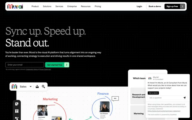
Preview image. Unlock full-res
Blackboard flipping to whiteboard — same hand, same authority, opposite ground.
Color palette
Primary CTA buttons, active links, key interactive highlights — jade against black in the hero and against white in body sections maintains equal visual force without changing hue
Card backgrounds, feature highlight areas — pastel counterpoint to jade that reads as 'selected' or 'active' without the full saturation of CTA jade
Card accent backgrounds, deep green surface variant
Blog/category badge backgrounds — near-white green tint that signals categorization without demanding attention
Badge text and border on leaf background — dark enough on #d5f8e0 to pass contrast without going full black
Hero background, primary text, button borders, icon fills — the dominant surface and text color simultaneously; this dual role is the system's core tension
Section backgrounds, card surfaces, nav background
Secondary button fill, subtle input backgrounds
Card background variant, divider surfaces
Borders, nav dividers, separator lines
Subheadings, secondary headings, muted heading text
Body secondary text, muted links
Input border color (dark variant)
Link text, image overlay text
Nav secondary elements, supplementary UI chrome
Typography
- Weights
- 300
- Sizes
- 32px, 40px, 54px, 70px, 80px, 100px
- Line height
- 1
- Letter spacing
- -0.04em at 54-70px, -0.05em at 80-100px
- Fallback
- Barlow Condensed Light, or Helvetica Neue Light
All display and hero headlines exclusively. Weight 300 at 70-100px with -0.04 to -0.05em tracking is the signature voice — letters crowd each other at scale, creating mass through density rather than weight. Nothing else in the system uses this font.
- Weights
- 300, 400, 500, 600
- Sizes
- 11px, 12px, 14px, 16px, 18px, 20px, 22px, 26px, 40px
- Line height
- 1
- Letter spacing
- -0.02em at larger sizes (26px+), +0.175em and +0.25em for uppercase eyebrow labels at 11-12px
- Fallback
- Inter, DM Sans
Everything else: nav (14px/500), body copy (16-18px/400), buttons (14-16px/500-600), badges (12px/500), eyebrow labels (11px/500 at +0.175em tracking). The +0.175-0.25em tracking on small caps/eyebrows is the only place the system opens up letter-spacing — everywhere else it's tight or default.
Spacing & shape
Components
Background #00c27a, color #000000, border #000000 1px solid, border-radius 8px, padding 9px 52px 9px 16px (asymmetric — wide right for icon/arrow). ABC Social 500, 14-16px. The black border on a green button is unconventional — it adds weight and keeps jade from floating.
Background transparent, color #000000, border #000000 1px solid, border-radius 8px, padding 8px 16px. ABC Social 500. Sits beside CTA buttons as the 'no-commitment' option.
Background transparent, color #ffffff, border #ffffff 1px solid, border-radius 0px, padding 0. Zero radius and zero padding — these appear as inline underlined-style links styled as ghost buttons in the hero, not pill or block shapes.
Background #f3f3f3, color #000000, no border, border-radius 8px, padding 23px 44px. ABC Social 500 at 16px. Large padding (23px vertical) creates a tall, substantial button used for primary section navigation choices.
Background #000000, color #ffffff, border #4f5457 1px solid, border-radius 8px, padding 8px 16px. Dark input on dark background — distinguishable only by the #4f5457 border. Placeholder text in #808080.
Background #d5f8e0, color #007b3b, border-radius 26px, padding 2px 16px 1px 16px. ABC Social 500 at 12px. The 26px radius creates a true pill. Leaf green background with forest text — the only colored text element in the body sections.
Background #ffffff, border-radius 24px, no border, shadow rgba(0,0,0,0.08) 0px 4px 4px 0px. Padding 0 (image fills top, text below with internal padding). The 24px radius softens what is otherwise a sharp-edged system — cards are the site's only round affordance.
Background #eeeeee, border-radius 7-8px, no border, no shadow. Padding 40px 5-6px. The extreme vertical padding with minimal horizontal padding creates a tall narrow container used for icon-led feature columns.
Background #ffffff, border-radius 24px, no box-shadow, full-bleed image content inside. Floated over the dark hero section to create contrast between the product and the marketing context.
Background #ffffff, border-radius 16px, shadow rgba(11,41,70,0.32) 0px 0px 1px 0px, rgba(42,82,121,0.08) 0px 24px 20px 0px. Contains avatar, name, role label, conversation text, CTA button (#00c27a, 8px radius), and text input. The blue-tinted shadow (rgba(11,41,70)) is the only non-monochrome shadow in the system.
Color #8c8c8c or #000000, ABC Social 500 at 11px, letter-spacing +0.175em, uppercase transform. No background, no border. Acts as a whispered section tag before the STK Bureau headline drops.
White or light-grey background strip, grayscale brand logos (Microsoft, IBM, etc.) at medium opacity. ABC Social 500 at 11px uppercase label 'TRUSTED BY BRANDS AROUND THE WORLD' at +0.175em tracking centered above. No border, no card, flush horizontal scroll.
Guidelines
- Use STK Bureau weight 300 exclusively for all display and hero headlines at -0.04em to -0.05em tracking. Never use it at body or UI sizes.
- Apply #00c27a only to primary CTA buttons (with 1px #000000 border) and active link states. Do not use it for decorative color blocks or illustrations.
- Use 26px border-radius for all pill badges and 8px for all buttons and inputs. Keep 24px for large content cards only.
- Open letter-spacing to +0.175em only for uppercase eyebrow labels in ABC Social at 11-12px. All other sizes track at -0.02em or default.
- Establish section separation through background-color switching (#000000 → #ffffff → #eeeeee) rather than dividers or shadows between sections.
- Use the blue-tinted shadow (rgba(11,41,70,0.32) 0px 0px 1px 0px, rgba(42,82,121,0.08) 0px 24px 20px 0px) exclusively for overlaying floating elements like the chat widget.
- Keep photography on cards full-bleed to the card edge with no internal padding — let the 24px card radius clip the image corners.
- Do not use STK Bureau for body copy, UI labels, or anything below 32px — the tight tracking at small sizes becomes illegible.
- Do not add colored backgrounds using the extended CSS token palette (--lavender, --flamingo, --mural-blue, etc.) on any marketing page — those are reserved for in-canvas product contexts only.
- Do not use shadows for card grouping or section organization — use background-color differences instead. Shadows are only for floating overlays.
- Do not apply #00c27a to text on white backgrounds as a body link color — it only appears as a button background or hover state on black backgrounds.
- Do not use border-radius values other than 8px, 16px, 24px, or 26px. In particular, avoid pill shapes (9999px) on buttons — Mural uses 8px squared buttons, not pill buttons.
- Do not mix STK Bureau with any weight other than 300 — the light-weight display type is the deliberate choice; heavier weights destroy the contrast with the dense tracking.
- Do not use the #dce1e5 Cool Grey as text — it is a border and divider color only.
About this system
ShowHide
Mural hits like a blackboard in a bright studio — the hero opens pitch-black with oversized serif-adjacent display type bleeding edge to edge, then the page snaps into clinical white with the same confidence. The dual-font system is the signature move: STK Bureau (weight 300 only) handles all display and headline work with tight negative tracking (-0.04 to -0.05em), while ABC Social runs everything from captions to body in a humanist groove. Electric jade (#00c27a) is the single chromatic anchor — appearing on CTAs and key links against both black and white backgrounds, creating identical urgency in both contexts. Cards live in a borderless, shadow-free world where containment comes from background-color switches (#eeeeee, #ffffff) rather than depth. The Mural logomark's rainbow-spectrum identity is carefully quarantined from the page palette — the product itself runs monochromatic with jade as its only relief valve.
Max-width approximately 1280px, centered. Hero is full-bleed black spanning 100vh with left-aligned STK Bureau display headline, left-aligned email capture row, and product screenshot cards overlapping the hero bottom edge into the next white section — creating a cinematic cut between dark and light. Section rhythm alternates: black hero → white feature section → white with ash card grid → white trust bar → back to feature sections. No alternating dark/light bands beyond the opening hero. Content arrangement is primarily left-text + right-visual (2-column) for feature sections, and 3-column card grids for blog/resource content. Navigation is a fixed top bar: logo left, centered horizontal nav links, login + two CTA buttons right. No mega-menu visible — nav links expand to dropdowns. The left-edge vertical tool palette (appearing in product screenshots) is a product UI element shown for demo context, not page navigation.
Three distinct image modes coexist: (1) Product UI screenshots presented as floating white-background cards with 24px radius, cropped tightly to show the canvas tool in use — no lifestyle context around the product itself. (2) Photography on blog cards: candid workplace scenes, high-key natural light, people in conversation — desaturated to near-grayscale with warm midtones, full-bleed to card edge with no internal padding. (3) In-canvas illustration within product screenshots: hand-drawn circle annotations in saturated reds and blues, avatar photos in circular crops with colored ring borders, sticky-note callout boxes — these are product content, not brand illustration. Icons in the left-rail tool palette are outlined, single-color (white on black), approximately 18-20px with ~1.5px stroke weight. The brand palette (jade green) appears only in UI chrome and CTAs, never in photography or illustration.
Reminiscent of Figma (figma.com), Notion (notion.so), Miro (miro.com), Loom (loom.com), Linear (linear.app).
# Mural — Style Reference
> Blackboard flipping to whiteboard — same hand, same authority, opposite ground.

**Theme:** mixed

**Site:** https://mural.co

Mural hits like a blackboard in a bright studio — the hero opens pitch-black with oversized serif-adjacent display type bleeding edge to edge, then the page snaps into clinical white with the same confidence. The dual-font system is the signature move: STK Bureau (weight 300 only) handles all display and headline work with tight negative tracking (-0.04 to -0.05em), while ABC Social runs everything from captions to body in a humanist groove. Electric jade (#00c27a) is the single chromatic anchor — appearing on CTAs and key links against both black and white backgrounds, creating identical urgency in both contexts. Cards live in a borderless, shadow-free world where containment comes from background-color switches (#eeeeee, #ffffff) rather than depth. The Mural logomark's rainbow-spectrum identity is carefully quarantined from the page palette — the product itself runs monochromatic with jade as its only relief valve.

## Tokens — Colors

| Name | Value | Token | Role |
|------|------|------|------|
| Jade CTA | `#00c27a` | `--color-jade-cta` | Primary CTA buttons, active links, key interactive highlights — jade against black in the hero and against white in body sections maintains equal visual force without changing hue |
| Mint Surface | `#b4f5c8` | `--color-mint-surface` | Card backgrounds, feature highlight areas — pastel counterpoint to jade that reads as 'selected' or 'active' without the full saturation of CTA jade |
| Forest | `#00843f` | `--color-forest` | Card accent backgrounds, deep green surface variant |
| Badge Leaf | `#d5f8e0` | `--color-badge-leaf` | Blog/category badge backgrounds — near-white green tint that signals categorization without demanding attention |
| Badge Text | `#007b3b` | `--color-badge-text` | Badge text and border on leaf background — dark enough on #d5f8e0 to pass contrast without going full black |
| Void | `#000000` | `--color-void` | Hero background, primary text, button borders, icon fills — the dominant surface and text color simultaneously; this dual role is the system's core tension |
| Paper | `#ffffff` | `--color-paper` | Section backgrounds, card surfaces, nav background |
| Fog | `#f3f3f3` | `--color-fog` | Secondary button fill, subtle input backgrounds |
| Ash | `#eeeeee` | `--color-ash` | Card background variant, divider surfaces |
| Cool Grey | `#dce1e5` | `--color-cool-grey` | Borders, nav dividers, separator lines |
| Slate | `#8c8c8c` | `--color-slate` | Subheadings, secondary headings, muted heading text |
| Stone | `#808080` | `--color-stone` | Body secondary text, muted links |
| Graphite | `#4f5457` | `--color-graphite` | Input border color (dark variant) |
| Ink | `#333333` | `--color-ink` | Link text, image overlay text |
| Charcoal | `#626262` | `--color-charcoal` | Nav secondary elements, supplementary UI chrome |

## Tokens — Typography

### STK Bureau
- **Substitute:** Barlow Condensed Light, or Helvetica Neue Light
- **Weights:** 300
- **Sizes:** 32px, 40px, 54px, 70px, 80px, 100px
- **Line height:** 1
- **Letter spacing:** -0.04em at 54-70px, -0.05em at 80-100px
- **Role:** All display and hero headlines exclusively. Weight 300 at 70-100px with -0.04 to -0.05em tracking is the signature voice — letters crowd each other at scale, creating mass through density rather than weight. Nothing else in the system uses this font.

### ABC Social
- **Substitute:** Inter, DM Sans
- **Weights:** 300, 400, 500, 600
- **Sizes:** 11px, 12px, 14px, 16px, 18px, 20px, 22px, 26px, 40px
- **Line height:** 1
- **Letter spacing:** -0.02em at larger sizes (26px+), +0.175em and +0.25em for uppercase eyebrow labels at 11-12px
- **Role:** Everything else: nav (14px/500), body copy (16-18px/400), buttons (14-16px/500-600), badges (12px/500), eyebrow labels (11px/500 at +0.175em tracking). The +0.175-0.25em tracking on small caps/eyebrows is the only place the system opens up letter-spacing — everywhere else it's tight or default.

## Tokens — Type Scale

Augmented Fourth (1.414) from 16px base.

| Role | Size | Line height | Letter spacing |
|------|------|------|------|
| caption | 11px | 1.5 | 1.925px |
| body | 16px | 1.5 | — |
| subheading | 18px | 1.43 | — |
| heading-sm | 26px | 1.1 | -0.52px |
| heading | 40px | 1.1 | -0.8px |
| heading-lg | 54px | 1.1 | -2.16px |
| display | 80px | 1 | -4px |

## Tokens — Spacing

- **Max width:** 1280px
- **Section gap:** 80-120px
- **Card padding:** 24-40px
- **Element gap:** 8-16px

## Tokens — Radius

- **Buttons:** 8px
- **Inputs:** 8px
- **Cards:** 8-24px
- **badges:** 26px
- **largeCards:** 24px

## Layout

Max-width approximately 1280px, centered. Hero is full-bleed black spanning 100vh with left-aligned STK Bureau display headline, left-aligned email capture row, and product screenshot cards overlapping the hero bottom edge into the next white section — creating a cinematic cut between dark and light. Section rhythm alternates: black hero → white feature section → white with ash card grid → white trust bar → back to feature sections. No alternating dark/light bands beyond the opening hero. Content arrangement is primarily left-text + right-visual (2-column) for feature sections, and 3-column card grids for blog/resource content. Navigation is a fixed top bar: logo left, centered horizontal nav links, login + two CTA buttons right. No mega-menu visible — nav links expand to dropdowns. The left-edge vertical tool palette (appearing in product screenshots) is a product UI element shown for demo context, not page navigation.

## Imagery

Three distinct image modes coexist: (1) Product UI screenshots presented as floating white-background cards with 24px radius, cropped tightly to show the canvas tool in use — no lifestyle context around the product itself. (2) Photography on blog cards: candid workplace scenes, high-key natural light, people in conversation — desaturated to near-grayscale with warm midtones, full-bleed to card edge with no internal padding. (3) In-canvas illustration within product screenshots: hand-drawn circle annotations in saturated reds and blues, avatar photos in circular crops with colored ring borders, sticky-note callout boxes — these are product content, not brand illustration. Icons in the left-rail tool palette are outlined, single-color (white on black), approximately 18-20px with ~1.5px stroke weight. The brand palette (jade green) appears only in UI chrome and CTAs, never in photography or illustration.

## Components

### Hero Email Capture CTA

### Blog / Resource Cards

### Trusted Brands Logo Bar

### Primary CTA Button
*Hero email capture submit, section CTAs*

Background #00c27a, color #000000, border #000000 1px solid, border-radius 8px, padding 9px 52px 9px 16px (asymmetric — wide right for icon/arrow). ABC Social 500, 14-16px. The black border on a green button is unconventional — it adds weight and keeps jade from floating.

### Outlined Black Button
*Secondary CTAs on white sections*

Background transparent, color #000000, border #000000 1px solid, border-radius 8px, padding 8px 16px. ABC Social 500. Sits beside CTA buttons as the 'no-commitment' option.

### Ghost White Button
*CTAs on dark/black hero sections*

Background transparent, color #ffffff, border #ffffff 1px solid, border-radius 0px, padding 0. Zero radius and zero padding — these appear as inline underlined-style links styled as ghost buttons in the hero, not pill or block shapes.

### Large Filled Grey Button
*Feature navigation tabs, section-level action buttons*

Background #f3f3f3, color #000000, no border, border-radius 8px, padding 23px 44px. ABC Social 500 at 16px. Large padding (23px vertical) creates a tall, substantial button used for primary section navigation choices.

### Email Input Field
*Hero lead capture*

Background #000000, color #ffffff, border #4f5457 1px solid, border-radius 8px, padding 8px 16px. Dark input on dark background — distinguishable only by the #4f5457 border. Placeholder text in #808080.

### Blog Badge
*Content categorization on card thumbnails*

Background #d5f8e0, color #007b3b, border-radius 26px, padding 2px 16px 1px 16px. ABC Social 500 at 12px. The 26px radius creates a true pill. Leaf green background with forest text — the only colored text element in the body sections.

### Content Card — Large Rounded
*Blog/resource listing cards*

Background #ffffff, border-radius 24px, no border, shadow rgba(0,0,0,0.08) 0px 4px 4px 0px. Padding 0 (image fills top, text below with internal padding). The 24px radius softens what is otherwise a sharp-edged system — cards are the site's only round affordance.

### Content Card — Ash Fill
*Feature comparison or info tiles*

Background #eeeeee, border-radius 7-8px, no border, no shadow. Padding 40px 5-6px. The extreme vertical padding with minimal horizontal padding creates a tall narrow container used for icon-led feature columns.

### Product UI Card
*In-page product screenshot/demo containers*

Background #ffffff, border-radius 24px, no box-shadow, full-bleed image content inside. Floated over the dark hero section to create contrast between the product and the marketing context.

### AI Chat Widget
*Muriel AI consultant persistent overlay*

Background #ffffff, border-radius 16px, shadow rgba(11,41,70,0.32) 0px 0px 1px 0px, rgba(42,82,121,0.08) 0px 24px 20px 0px. Contains avatar, name, role label, conversation text, CTA button (#00c27a, 8px radius), and text input. The blue-tinted shadow (rgba(11,41,70)) is the only non-monochrome shadow in the system.

### Section Eyebrow Label
*Pre-heading category labels above section titles*

Color #8c8c8c or #000000, ABC Social 500 at 11px, letter-spacing +0.175em, uppercase transform. No background, no border. Acts as a whispered section tag before the STK Bureau headline drops.

### Logo Bar — Trusted Brands
*Social proof strip*

White or light-grey background strip, grayscale brand logos (Microsoft, IBM, etc.) at medium opacity. ABC Social 500 at 11px uppercase label 'TRUSTED BY BRANDS AROUND THE WORLD' at +0.175em tracking centered above. No border, no card, flush horizontal scroll.

## Guidelines

### Do

- Use STK Bureau weight 300 exclusively for all display and hero headlines at -0.04em to -0.05em tracking. Never use it at body or UI sizes.
- Apply #00c27a only to primary CTA buttons (with 1px #000000 border) and active link states. Do not use it for decorative color blocks or illustrations.
- Use 26px border-radius for all pill badges and 8px for all buttons and inputs. Keep 24px for large content cards only.
- Open letter-spacing to +0.175em only for uppercase eyebrow labels in ABC Social at 11-12px. All other sizes track at -0.02em or default.
- Establish section separation through background-color switching (#000000 → #ffffff → #eeeeee) rather than dividers or shadows between sections.
- Use the blue-tinted shadow (rgba(11,41,70,0.32) 0px 0px 1px 0px, rgba(42,82,121,0.08) 0px 24px 20px 0px) exclusively for overlaying floating elements like the chat widget.
- Keep photography on cards full-bleed to the card edge with no internal padding — let the 24px card radius clip the image corners.

### Don't

- Do not use STK Bureau for body copy, UI labels, or anything below 32px — the tight tracking at small sizes becomes illegible.
- Do not add colored backgrounds using the extended CSS token palette (--lavender, --flamingo, --mural-blue, etc.) on any marketing page — those are reserved for in-canvas product contexts only.
- Do not use shadows for card grouping or section organization — use background-color differences instead. Shadows are only for floating overlays.
- Do not apply #00c27a to text on white backgrounds as a body link color — it only appears as a button background or hover state on black backgrounds.
- Do not use border-radius values other than 8px, 16px, 24px, or 26px. In particular, avoid pill shapes (9999px) on buttons — Mural uses 8px squared buttons, not pill buttons.
- Do not mix STK Bureau with any weight other than 300 — the light-weight display type is the deliberate choice; heavier weights destroy the contrast with the dense tracking.
- Do not use the #dce1e5 Cool Grey as text — it is a border and divider color only.

## Agent Prompt Guide

**Quick Color Reference**
- Text (primary): #000000
- Text (on dark): #ffffff
- Page background: #ffffff
- Hero background: #000000
- CTA button bg: #00c27a
- CTA button border: #000000
- Card surface: #eeeeee or #ffffff
- Border/divider: #dce1e5
- Badge bg: #d5f8e0, badge text: #007b3b
- Muted text: #8c8c8c

**Example Component Prompts**

1. **Hero Section**: Full-bleed black (#000000) background. Left-aligned headline in STK Bureau weight 300 at 80px, color #ffffff, letter-spacing -0.05em, line-height 1.0. Below it: body text in ABC Social weight 400 at 18px, color #ffffff, line-height 1.43, max-width 520px. Below that: horizontal row with a dark email input (background #000000, border #4f5457, border-radius 8px, padding 8px 16px, text #ffffff) and a jade CTA button (background #00c27a, color #000000, border 1px solid #000000, border-radius 8px, padding 9px 52px 9px 16px, ABC Social 500 16px). Product screenshot card overlaps bottom of section at right side.

2. **Blog Card Grid**: 3-column grid, gap 24px. Each card: background #ffffff, border-radius 24px, shadow rgba(0,0,0,0.08) 0px 4px 4px 0px. Top half: full-bleed image clipped by 24px radius. Bottom half padding 24px. Badge first: background #d5f8e0, color #007b3b, border-radius 26px, padding 2px 16px, ABC Social 500 12px. Headline: ABC Social 600 at 20px, color #000000, line-height 1.3. Body: ABC Social 400 at 14px, color #808080, line-height 1.5.

3. **Section Eyebrow + Headline**: Eyebrow label in ABC Social 500 at 11px, uppercase, letter-spacing +0.175em (1.925px), color #8c8c8c. Below it: STK Bureau weight 300 at 54px, color #000000, letter-spacing -0.04em (-2.16px), line-height 1.1. Spacing between eyebrow and headline: 12px.

4. **Feature Tab Navigation**: Row of large buttons, each background #f3f3f3, color #000000, no border, border-radius 8px, padding 23px 44px, ABC Social 500 16px. Active state: background #000000, color #ffffff. Gap between buttons: 8px.

5. **AI Chat Widget**: Floating card, background #ffffff, border-radius 16px, shadow rgba(11,41,70,0.32) 0px 0px 1px 0px + rgba(42,82,121,0.08) 0px 24px 20px 0px. Internal padding 16px. Header: avatar (32px circle) + 'Muriel' in ABC Social 600 14px + 'AI Consultant' in 400 12px #808080. Message body: ABC Social 400 14px #000000. CTA button: background #00c27a, color #000000, border-radius 8px, padding 8px 16px, ABC Social 500. Input row: border-top 1px #dce1e5, padding 8px 16px, placeholder in #808080.

## Extended Brand Color Palette (In-Canvas Use Only)

Mural's CSS tokens reveal a rich chromatic palette reserved exclusively for the in-product canvas environment and internal template colors: --lemon #ffe146, --lavender #e6bfff, --mural-blue #5887ff, --ice #bed7ff, --mural-red #ff4b4b, --indigo #195ad7, --violet #8728e6, --flamingo #ff98b4, --burgundy #c8056, --blush #ffcee0, --sky #79c1ff, --orange #ed6000, --mural-yellow #ffaa00, --canary #ffed87, --grape #be53ff, --mural-pink #fc83ff, --natural #ededdb. These colors appear as sticky note fills, annotation colors, and avatar ring borders within product screenshots. They must NOT be applied to marketing page backgrounds, typography, buttons, or navigation — doing so would break the monochromatic discipline that defines the brand's marketing presence.
More like this






Keep what you find
A free account saves references to boards and can send you a weekly email of picks based on what you save.
To see every result, go Pro.