Preview image. Unlock full-res
High-stakes monochrome printing press — a system where black and white do all the heavy lifting, Roobert's compressed weight-900 headlines stamped like bold ink on paper.
Color palette
Token-defined accent — appears as CSS variable; reserved for product-feature highlights and gradient transitions
Token-defined vivid accent — CSS variable; reserved for on-brand product UI illustrations and feature callouts
Token-defined dark magenta — CSS variable; reserved for deep accent backgrounds in product feature sections
Primary text, nav borders, button fills, card backgrounds, footer — the single dominant ink color driving the entire system's contrast logic
Body copy, secondary headings, list items — one step off pure black for long-form text
Card backgrounds, button fills (secondary), icon fills — the pure white counterpart to Press Black
Page section backgrounds, hero overlay text, badge fills — the off-white that softens full-white sections
Nav dividers, separator lines
Muted link text, de-emphasized body labels
Body text, icon strokes, link defaults — mid-gray for supporting content hierarchy
Typography
- Weights
- 400, 500, 600, 700, 900
- Sizes
- 14px, 16px, 18px, 19px, 20px, 24px, 32px, 36px, 40px, 48px, 56px, 64px, 88px
- Line height
- 1.1, 1.2, 1.3, 1.5
- Letter spacing
- -0.02em at display sizes (56px–88px), -0.01em at mid sizes (24px–48px), normal at body sizes
- Fallback
- Cabinet Grotesk, Satoshi, or Plus Jakarta Sans at matching weights
The site's entire typographic identity. Weight 900 at 56–88px drives hero headlines — the extreme weight creates impact that substitutes for color. Negative letter-spacing (-0.02em at display, -0.01em at subheading) compresses letterforms into a dense, printed-matter feel. 'ss14' feature setting activates alternate letterforms. Used for headings, nav, buttons, badges, body at every weight.
- Weights
- 400
- Sizes
- 16px, 24px, 32px
- Line height
- 1
- Fallback
- Georgia
System serif fallback — appears in nav, body, and footer contexts. Likely a browser fallback for edge cases rather than an intentional brand serif. Not a signature choice.
Spacing & shape
Components
Background #000000, text #ffffff, border-radius 8px, horizontal padding 24px. Roobert 500–600 at 16px. The hero CTA 'Get started' appears with a light border version over the dark photograph. No shadow, no gradient.
Background #ffffff, text #000000, border 1px solid #000000, border-radius 8px, horizontal padding 24px. Roobert 500 at 16px. Identical sizing to primary — distinction is fill only.
Background transparent, text #000000, no border, border-radius 0px, padding 0px. Pure text link with button semantics. Roobert 500 at 16px. Often paired with an arrow icon.
Background #ffffff, border-radius 16px, padding 48px 32px, box-shadow none. Roobert 600 heading at 24px, body at 16–18px #212121. High-padding, generous breathing room — contrasts against black section backgrounds.
Background #000000, border-radius 16px, padding 24px all sides, box-shadow none. Text in #ffffff or #f6f6f6. Tighter padding than white cards — creates a dense, punchy information block.
Background #000000, text #f6f6f6, border-radius 8px, padding 4px 8px. Roobert 500–600 at 14px. Compact, pill-adjacent but rectangular. No border.
Background #ffffff, height 40–80px, border-bottom 1px solid #d1d1d1. Nav links in Roobert 500 16px #000000. 'Get started' button uses Primary CTA style (black fill, 8px radius, 24px horizontal padding). Logo left-aligned, links center, auth+CTA right.
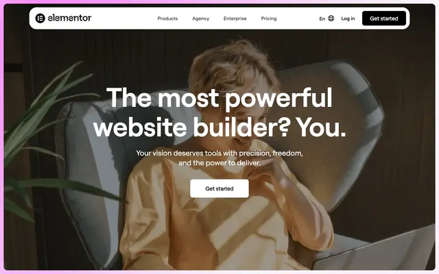
Full-bleed dark lifestyle photo background, no max-width constraint. Headline overlaid in Roobert 900 at 64–88px, #ffffff, letter-spacing -0.02em, line-height 1.10. Subtext in Roobert 400 at 18–20px, #f6f6f6. White-fill CTA button centered below text. No gradient overlay — raw photograph with text contrast achieved through image darkness.
Roobert 900 at 56–64px #000000 for the number. Supporting label in Roobert 400 16px #69727d. Displayed in a row or grid with generous column gaps. No card wrapper — floats on section background.
Background #000000 or #212121, text #f6f6f6 and #a6a6a6. Multi-column link grid with Roobert 500 14px for categories, 400 14px for links. 'Build what's next' headline in Roobert 700–900 at 40–48px white. Padding 96px top.
Guidelines
- Use Roobert 900 with letter-spacing -0.02em for all display headlines at 56px and above — never swap to a lighter weight for main hero text
- Apply 8px border-radius to all buttons and badges; apply 16px to all cards and large image containers
- Alternate section backgrounds strictly between #000000 and #f6f6f6/#ffffff — never use a third background color to break the binary rhythm
- Set white cards (padding 48px 32px) on black sections; set black cards (padding 24px) on white/light sections — always invert card color relative to section
- Keep all interactive focus to black-fill or white-fill buttons with 24px horizontal padding — no colored CTAs, no gradients on buttons
- Use #69727d for supporting body text and icon strokes — never use it for headings or primary navigation
- Apply fontFeatureSettings '"ss14"' whenever rendering Roobert to activate the intended alternate letterforms
- Never add box-shadow to any card, button, or navigation element — depth is created through surface color inversion, not elevation
- Never introduce a chromatic brand color (the CSS token pinks/magentas) into the main marketing page UI — these are reserved for product-feature illustration contexts only
- Never use weight 400 for headings at 32px and above — minimum weight for heading-sm and up is 600, display sizes require 900
- Never set a card background that matches its parent section background — every card must contrast against its container (#fff on #000, #000 on #fff or #f6f6f6)
- Never use border-radius above 16px on interactive components or cards — the 160px pill radius is exclusive to image crops, not UI elements
- Never use #69727d or #a6a6a6 for button labels or CTA copy — these gray tones are body/meta text only, never interactive labels
- Never stack multiple black sections or multiple white sections consecutively — the alternating binary rhythm must be maintained across every section boundary
About this system
ShowHide
Elementor's visual system is a high-contrast monochrome stage where black and near-white alternate as the sole performers — no brand color claims the throne, just pure #000000 and #f6f6f6 pushed to 19:1 contrast ratios. The hero is a full-bleed moody lifestyle photograph with massive weight-900 Roobert headlines in white overlay, commanding attention through scale rather than color. Roobert's 'ss14' feature and tight negative letter-spacing (-0.02em at display sizes) give the type a compressed urgency. Black-filled CTA buttons and white-filled secondary buttons create the only color distinction on the page — the entire interactive vocabulary runs on this two-tone switch. Cards flip between pure black (#000000, 16px radius, 24px padding) and pure white (#ffffff, 16px radius, 48px/32px padding), creating a checkerboard depth without any shadow or elevation.
Max-width contained at approximately 1200px, centered on page. Hero is a full-bleed dark lifestyle photograph — the container breaks the max-width to extend edge-to-edge, then the headline and CTA stack centered over the image. Below the hero, sections alternate strictly between #f6f6f6 and #000000 backgrounds with 96px vertical gaps. Feature sections use a 2–3 column card grid with white-on-black or black-on-white inversion. Stat counters appear in a single-row horizontal flex with generous spacing. Navigation is a top sticky bar with logo left, centered links, and auth+CTA right — the bar height is 40–80px. Footer is a full-width black band with a multi-column link grid (4–5 columns) and a large hero-scale headline. The overall rhythm is spacious and section-based, with no sidebar or asymmetric compositions.
Lifestyle photography at full bleed — the hero is a moody, dark-toned photograph of a person in a relaxed creative pose. High contrast, slightly underexposed feel with warm golden tones in the subject against a near-black background environment. No color grading or duotone treatment; the natural darkness of the image provides headline contrast without any overlay scrim. Images are contained within 16px-radius cards in feature sections and 160px pill-radius crops for circular or elongated thumbnail treatments. Icons appear to use thin-to-medium stroke weight, monochrome (black or white depending on surface). Imagery is sparse relative to the text-dominant layout — photography is used for emotional atmosphere in the hero and sparingly as product/UI screenshots in feature sections.
Reminiscent of Webflow, Squarespace, Framer, Cargo Collective.
# Elementor — Style Reference
> High-stakes monochrome printing press — a system where black and white do all the heavy lifting, Roobert's compressed weight-900 headlines stamped like bold ink on paper.

**Theme:** light

**Site:** https://elementor.com

Elementor's visual system is a high-contrast monochrome stage where black and near-white alternate as the sole performers — no brand color claims the throne, just pure #000000 and #f6f6f6 pushed to 19:1 contrast ratios. The hero is a full-bleed moody lifestyle photograph with massive weight-900 Roobert headlines in white overlay, commanding attention through scale rather than color. Roobert's 'ss14' feature and tight negative letter-spacing (-0.02em at display sizes) give the type a compressed urgency. Black-filled CTA buttons and white-filled secondary buttons create the only color distinction on the page — the entire interactive vocabulary runs on this two-tone switch. Cards flip between pure black (#000000, 16px radius, 24px padding) and pure white (#ffffff, 16px radius, 48px/32px padding), creating a checkerboard depth without any shadow or elevation.

## Tokens — Colors

| Name | Value | Token | Role |
|------|------|------|------|
| Pixel Blush | `#FFB8E5` | `--color-pixel-blush` | Token-defined accent — appears as CSS variable; reserved for product-feature highlights and gradient transitions |
| Neon Loop | `#ED01EE` | `--color-neon-loop` | Token-defined vivid accent — CSS variable; reserved for on-brand product UI illustrations and feature callouts |
| Codeberry | `#620856` | `--color-codeberry` | Token-defined dark magenta — CSS variable; reserved for deep accent backgrounds in product feature sections |
| Press Black | `#000000` | `--color-press-black` | Primary text, nav borders, button fills, card backgrounds, footer — the single dominant ink color driving the entire system's contrast logic |
| Charcoal Ink | `#212121` | `--color-charcoal-ink` | Body copy, secondary headings, list items — one step off pure black for long-form text |
| Blank Canvas | `#ffffff` | `--color-blank-canvas` | Card backgrounds, button fills (secondary), icon fills — the pure white counterpart to Press Black |
| Fog Sheet | `#f6f6f6` | `--color-fog-sheet` | Page section backgrounds, hero overlay text, badge fills — the off-white that softens full-white sections |
| Ash Border | `#d1d1d1` | `--color-ash-border` | Nav dividers, separator lines |
| Slate Text | `#a6a6a6` | `--color-slate-text` | Muted link text, de-emphasized body labels |
| Steel Gray | `#69727d` | `--color-steel-gray` | Body text, icon strokes, link defaults — mid-gray for supporting content hierarchy |

## Tokens — Typography

### Roobert
- **Substitute:** Cabinet Grotesk, Satoshi, or Plus Jakarta Sans at matching weights
- **Weights:** 400, 500, 600, 700, 900
- **Sizes:** 14px, 16px, 18px, 19px, 20px, 24px, 32px, 36px, 40px, 48px, 56px, 64px, 88px
- **Line height:** 1.1, 1.2, 1.3, 1.5
- **Letter spacing:** -0.02em at display sizes (56px–88px), -0.01em at mid sizes (24px–48px), normal at body sizes
- **Role:** The site's entire typographic identity. Weight 900 at 56–88px drives hero headlines — the extreme weight creates impact that substitutes for color. Negative letter-spacing (-0.02em at display, -0.01em at subheading) compresses letterforms into a dense, printed-matter feel. 'ss14' feature setting activates alternate letterforms. Used for headings, nav, buttons, badges, body at every weight.

### Times
- **Substitute:** Georgia
- **Weights:** 400
- **Sizes:** 16px, 24px, 32px
- **Line height:** 1
- **Role:** System serif fallback — appears in nav, body, and footer contexts. Likely a browser fallback for edge cases rather than an intentional brand serif. Not a signature choice.

## Tokens — Type Scale

Perfect Fourth (1.333) from 18px base.

| Role | Size | Line height | Letter spacing |
|------|------|------|------|
| caption | 14px | 1.5 | — |
| body-sm | 16px | 1.5 | — |
| body | 18px | 1.5 | — |
| subheading | 20px | 1.4 | — |
| heading-sm | 32px | 1.3 | -0.32px |
| heading | 48px | 1.2 | -0.48px |
| heading-lg | 64px | 1.2 | -1.28px |
| display | 88px | 1.1 | -1.76px |

## Tokens — Spacing

- **Max width:** 1200px
- **Section gap:** 96px
- **Element gap:** 8-16px

## Tokens — Radius

- **Buttons:** 8px
- **Inputs:** 8px
- **Cards:** 16px
- **Images:** 16px
- **badges:** 8px
- **imagePill:** 160px

## Layout

Max-width contained at approximately 1200px, centered on page. Hero is a full-bleed dark lifestyle photograph — the container breaks the max-width to extend edge-to-edge, then the headline and CTA stack centered over the image. Below the hero, sections alternate strictly between #f6f6f6 and #000000 backgrounds with 96px vertical gaps. Feature sections use a 2–3 column card grid with white-on-black or black-on-white inversion. Stat counters appear in a single-row horizontal flex with generous spacing. Navigation is a top sticky bar with logo left, centered links, and auth+CTA right — the bar height is 40–80px. Footer is a full-width black band with a multi-column link grid (4–5 columns) and a large hero-scale headline. The overall rhythm is spacious and section-based, with no sidebar or asymmetric compositions.

## Imagery

Lifestyle photography at full bleed — the hero is a moody, dark-toned photograph of a person in a relaxed creative pose. High contrast, slightly underexposed feel with warm golden tones in the subject against a near-black background environment. No color grading or duotone treatment; the natural darkness of the image provides headline contrast without any overlay scrim. Images are contained within 16px-radius cards in feature sections and 160px pill-radius crops for circular or elongated thumbnail treatments. Icons appear to use thin-to-medium stroke weight, monochrome (black or white depending on surface). Imagery is sparse relative to the text-dominant layout — photography is used for emotional atmosphere in the hero and sparingly as product/UI screenshots in feature sections.

## Components

### Button Group — Primary, Secondary, Ghost

### Stat Counter Block

### Feature Cards — White on Black

### Primary CTA Button (Black Fill)
*Main call-to-action across hero and section endings*

Background #000000, text #ffffff, border-radius 8px, horizontal padding 24px. Roobert 500–600 at 16px. The hero CTA 'Get started' appears with a light border version over the dark photograph. No shadow, no gradient.

### Secondary Button (White Fill)
*Secondary action alongside primary CTAs*

Background #ffffff, text #000000, border 1px solid #000000, border-radius 8px, horizontal padding 24px. Roobert 500 at 16px. Identical sizing to primary — distinction is fill only.

### Ghost Text Button
*Tertiary links styled as buttons — 'Learn more', 'How to start building a website'*

Background transparent, text #000000, no border, border-radius 0px, padding 0px. Pure text link with button semantics. Roobert 500 at 16px. Often paired with an arrow icon.

### White Content Card
*Feature cards on dark-background sections*

Background #ffffff, border-radius 16px, padding 48px 32px, box-shadow none. Roobert 600 heading at 24px, body at 16–18px #212121. High-padding, generous breathing room — contrasts against black section backgrounds.

### Black Content Card
*Feature or stat cards on light-background sections*

Background #000000, border-radius 16px, padding 24px all sides, box-shadow none. Text in #ffffff or #f6f6f6. Tighter padding than white cards — creates a dense, punchy information block.

### Black Badge / Label
*Brand trust badges (e.g. 'CNN'), product labels*

Background #000000, text #f6f6f6, border-radius 8px, padding 4px 8px. Roobert 500–600 at 14px. Compact, pill-adjacent but rectangular. No border.

### Top Navigation Bar
*Global site navigation — sticky, light background*

Background #ffffff, height 40–80px, border-bottom 1px solid #d1d1d1. Nav links in Roobert 500 16px #000000. 'Get started' button uses Primary CTA style (black fill, 8px radius, 24px horizontal padding). Logo left-aligned, links center, auth+CTA right.

### Hero Section
*Full-viewport opening section with lifestyle photography*

Full-bleed dark lifestyle photo background, no max-width constraint. Headline overlaid in Roobert 900 at 64–88px, #ffffff, letter-spacing -0.02em, line-height 1.10. Subtext in Roobert 400 at 18–20px, #f6f6f6. White-fill CTA button centered below text. No gradient overlay — raw photograph with text contrast achieved through image darkness.

### Stat Counter Block
*Social proof metrics — '21M+' websites built*

Roobert 900 at 56–64px #000000 for the number. Supporting label in Roobert 400 16px #69727d. Displayed in a row or grid with generous column gaps. No card wrapper — floats on section background.

### Footer
*Site-wide footer navigation grid*

Background #000000 or #212121, text #f6f6f6 and #a6a6a6. Multi-column link grid with Roobert 500 14px for categories, 400 14px for links. 'Build what's next' headline in Roobert 700–900 at 40–48px white. Padding 96px top.

## Guidelines

### Do

- Use Roobert 900 with letter-spacing -0.02em for all display headlines at 56px and above — never swap to a lighter weight for main hero text
- Apply 8px border-radius to all buttons and badges; apply 16px to all cards and large image containers
- Alternate section backgrounds strictly between #000000 and #f6f6f6/#ffffff — never use a third background color to break the binary rhythm
- Set white cards (padding 48px 32px) on black sections; set black cards (padding 24px) on white/light sections — always invert card color relative to section
- Keep all interactive focus to black-fill or white-fill buttons with 24px horizontal padding — no colored CTAs, no gradients on buttons
- Use #69727d for supporting body text and icon strokes — never use it for headings or primary navigation
- Apply fontFeatureSettings '"ss14"' whenever rendering Roobert to activate the intended alternate letterforms

### Don't

- Never add box-shadow to any card, button, or navigation element — depth is created through surface color inversion, not elevation
- Never introduce a chromatic brand color (the CSS token pinks/magentas) into the main marketing page UI — these are reserved for product-feature illustration contexts only
- Never use weight 400 for headings at 32px and above — minimum weight for heading-sm and up is 600, display sizes require 900
- Never set a card background that matches its parent section background — every card must contrast against its container (#fff on #000, #000 on #fff or #f6f6f6)
- Never use border-radius above 16px on interactive components or cards — the 160px pill radius is exclusive to image crops, not UI elements
- Never use #69727d or #a6a6a6 for button labels or CTA copy — these gray tones are body/meta text only, never interactive labels
- Never stack multiple black sections or multiple white sections consecutively — the alternating binary rhythm must be maintained across every section boundary

## Agent Prompt Guide

**Quick Color Reference**
- Text (primary): #000000 / #212121
- Background (light): #f6f6f6
- Background (dark): #000000
- CTA button: #000000 fill, #ffffff text
- Border / dividers: #d1d1d1
- Supporting text: #69727d

**Example Component Prompts**

1. Hero Section: Full-bleed dark lifestyle photograph, no overlay scrim. Center-aligned headline in Roobert 900, 88px, #ffffff, letter-spacing -1.76px, line-height 1.10. Subtext Roobert 400 20px #f6f6f6, centered below. White-fill button (background #ffffff, text #000000, border 1px solid #000000, 8px radius, 24px horizontal padding) centered below subtext.

2. Feature Card Grid (on dark section): Section background #000000. 3-column card grid, each card background #ffffff, border-radius 16px, padding 48px 32px, no shadow. Card heading Roobert 600 24px #000000, body Roobert 400 16px #212121.

3. Stat Counter Row: Section background #f6f6f6. Horizontal flex row, 3 stats. Number in Roobert 900 64px #000000, letter-spacing -1.28px. Label below in Roobert 400 16px #69727d. No card wrapper, no border.

4. Navigation Bar: Background #ffffff, border-bottom 1px #d1d1d1, height 64px. Logo left. Center links Roobert 500 16px #000000. Right side: 'Log in' ghost text button #000000 + 'Get started' filled button (#000000 bg, #ffffff text, 8px radius, 24px padding).

5. Black Badge: Background #000000, text #f6f6f6, Roobert 600 14px, border-radius 8px, padding 4px 8px. Use for brand trust marks or product labels.

## Surface System

Three active surfaces form the depth model — no shadows involved:

- **Page Light** (#f6f6f6): Default section background for light bands. Paired with black cards and black text.
- **Page Dark** (#000000): Section background for dark bands. Paired with white cards and white text.
- **Card White** (#ffffff): Card surface on dark sections. 16px radius, 48px/32px padding.
- **Card Black** (#000000): Card surface on light sections. 16px radius, 24px padding.

The rule: every card must be the inverse of its parent section. There is no 'elevated' surface in the traditional sense — contrast IS elevation.
More like this










Keep what you find
A free account saves references to boards and can send you a weekly email of picks based on what you save.
To see every result, go Pro.