Preview image. Unlock full-res
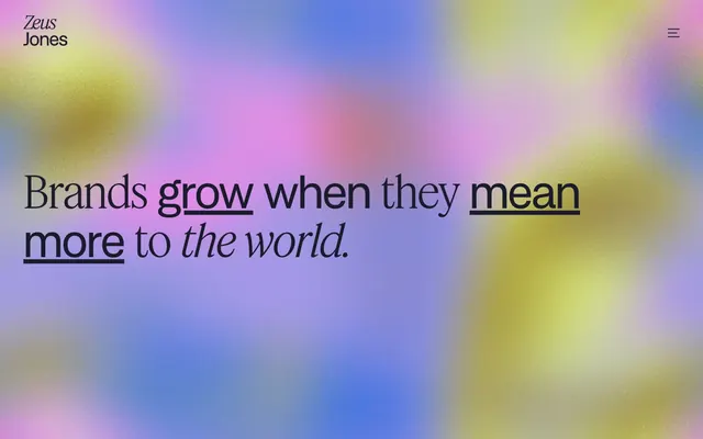
Ethereal canvas with typographic gravitas. A sun-drenched, off-white digital gallery where bold typography and artful backgrounds coalesce.
Color palette
Dominant hero section background, providing a distinct, vibrant, and atmospheric entrance to the site — contrasts with the otherwise neutral palette
Page backgrounds, navigation backgrounds, default text for dark surfaces — forms the primary backdrop of the site
Primary text, informational elements, button backgrounds, borders, link text, card text. This deep, muted gray serves as the dominant structural color
Card backgrounds, secondary surface variations, providing a subtle visual separation from the main canvas
Decorative SVG icons, occasional text elements where maximum contrast is desired, creating a sharp graphic presence
Typography
- Weights
- 400, 500
- Sizes
- 12px, 16px, 18px, 24px, 40px, 48px, 60px, 90px
- Line height
- 1, 1.07, 1.11, 1.2, 1.25, 1.3, 1.5, 1.6
- Letter spacing
- -0.0200em at large sizes, 0.0500em at smaller sizes
- Fallback
- Inter
Primary sans-serif for headings, body text, navigation items, and interactive elements. It provides a modern, confident tone.
- Weights
- 100
- Sizes
- 60px, 90px
- Line height
- 1.07, 1.11
- Letter spacing
- -0.0200em
- Fallback
- Lora Light
Hero headlines and large display text, characterized by its extremely light weight. It creates a sense of gravitas and spaciousness, conveying authority through restraint.
Spacing & shape
Components
Transparent background, 'Greyscale Architect' text (#1a1c2c), no border, no padding or radius. Used for minimalist navigation and inline links.
Filled with 'Greyscale Architect' (#1a1c2c) and 'Canvas Parchment' (#fcfaf3) text. Features an extremely high border-radius (1782px or 1584px) to create a pill shape. Padding is generous at 16px vertical, 32px horizontal or 12px vertical, 20px horizontal.
Background is 'Card Dove' (#ebe9e4) with a 20px border-radius and no box-shadow. Contains imagery and descriptive text.
Transparent background, 'Greyscale Architect' (#1a1c2c) text. Features a bottom border of 'Greyscale Architect' and no border-radius. Padding is 0px horizontal, 8px bottom.
Inherits page background and features minimal ghost links and a menu icon. It's a full-width container that uses generous spacing and aligns elements to the edges.
Guidelines
- Use 'Canvas Parchment' (#fcfaf3) as the default background for all page sections unless an accent background is specified.
- Employ 'Greyscale Architect' (#1a1c2c) for all primary body text, headlines, and interactive elements to maintain visual consistency.
- Apply ZJSansDisplay at weight 400 for most body and navigation text, with specific larger sizes for headings as defined in the type scale.
- Utilize FeatureDeckLight weight 100 for large, impactful display headings (60px, 90px) to establish a distinctive, light-weight typographic presence.
- Ensure all interactive buttons conform to the pill shape with a radius of 1584px or 1782px.
- Maintain comfortable '20px' border-radius for cards, images, and other contained UI elements.
- Incorporate a 40px section gap between major content blocks to ensure ample breathing room and a spacious layout.
- Avoid using bright, saturated colors for primary UI elements; reserve high chroma for abstract backgrounds or illustrative accents.
- Do not use box-shadows for elevation; rely on background color changes or subtle borders for surface distinction.
- Do not break the pill-shaped button aesthetic with square or slightly rounded corners; always aim for maximum curvature.
- Avoid tight, condensed layouts; emphasize spaciousness and generous internal padding for components.
- Do not use generic system fonts; always adhere to ZJSansDisplay and FeatureDeckLight for brand consistency.
- Do not introduce heavy borders or outlines; stick to ghost interactions or solid, rich dark gray fills for interactive elements.
- Never center align large blocks of text; maintain a left-aligned, spacious text presentation.
About this system
ShowHide
Zeus Jones projects a refined, artistic sensibility with a foundational off-white canvas and a rich, muted chromatic dark gray that anchors all textual and interactive elements. The design is characterized by large, confident typography that mixes serifs and sans-serifs, creating a dynamic yet sophisticated feel. Playful, pill-shaped buttons with deep curves add a touch of approachability against substantial spacing and a generally sparse layout. The hero section often features dramatic, ethereal gradient backgrounds that contrast with the otherwise understated UI.
The page primarily uses a full-bleed structure, particularly for impactful hero sections like the gradient background. Content within sections is often given ample horizontal padding, creating a comfortable breathing room. Sections maintain a consistent vertical rhythm with a 40px `sectionGap`. Layouts within sections frequently alternate between text-dominant blocks and engaging, multi-column card grids for showcasing work. The header is a sticky, full-width element, providing persistent navigation. The overall feel is spacious and uncrowded, allowing key typographic elements and imagery to stand out.
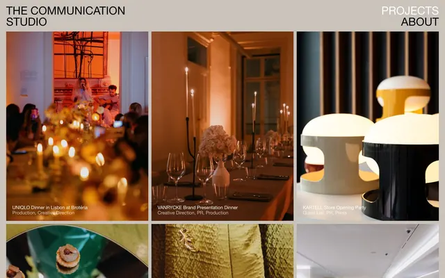
The site uses a mix of bespoke, abstract gradient backgrounds (often full-bleed in hero sections) and carefully curated product/project showcase imagery. Photography and product shots are contained within cards with 20px rounded corners, often monochromatic or with a muted color palette to blend with the overall design. Icons are minimalist, typically black (#000000) or 'Greyscale Architect' (#1a1c2c) and filled, reflecting a clean, direct visual style. Imagery functions primarily to showcase work and set an atmosphere, not as merely decorative elements. Density is medium, with images serving as visual anchors within content blocks.
Reminiscent of Huge, Fantasy, Work & Co, Locomotive.
# Zeus Jones — Style Reference
> Ethereal canvas with typographic gravitas. A sun-drenched, off-white digital gallery where bold typography and artful backgrounds coalesce.

**Theme:** light

**Site:** https://zeusjones.com

Zeus Jones projects a refined, artistic sensibility with a foundational off-white canvas and a rich, muted chromatic dark gray that anchors all textual and interactive elements. The design is characterized by large, confident typography that mixes serifs and sans-serifs, creating a dynamic yet sophisticated feel. Playful, pill-shaped buttons with deep curves add a touch of approachability against substantial spacing and a generally sparse layout. The hero section often features dramatic, ethereal gradient backgrounds that contrast with the otherwise understated UI.

## Tokens — Colors

| Name | Value | Token | Role |
|------|------|------|------|
| Hero Gradient | `#9c8ec4` | `--color-hero-gradient` | Dominant hero section background, providing a distinct, vibrant, and atmospheric entrance to the site — contrasts with the otherwise neutral palette |
| Canvas Parchment | `#fcfaf3` | `--color-canvas-parchment` | Page backgrounds, navigation backgrounds, default text for dark surfaces — forms the primary backdrop of the site |
| Greyscale Architect | `#1a1c2c` | `--color-greyscale-architect` | Primary text, informational elements, button backgrounds, borders, link text, card text. This deep, muted gray serves as the dominant structural color |
| Card Dove | `#ebe9e4` | `--color-card-dove` | Card backgrounds, secondary surface variations, providing a subtle visual separation from the main canvas |
| Night Icon | `#000000` | `--color-night-icon` | Decorative SVG icons, occasional text elements where maximum contrast is desired, creating a sharp graphic presence |

## Tokens — Typography

### ZJSansDisplay
- **Substitute:** Inter
- **Weights:** 400, 500
- **Sizes:** 12px, 16px, 18px, 24px, 40px, 48px, 60px, 90px
- **Line height:** 1, 1.07, 1.11, 1.2, 1.25, 1.3, 1.5, 1.6
- **Letter spacing:** -0.0200em at large sizes, 0.0500em at smaller sizes
- **Role:** Primary sans-serif for headings, body text, navigation items, and interactive elements. It provides a modern, confident tone.

### FeatureDeckLight
- **Substitute:** Lora Light
- **Weights:** 100
- **Sizes:** 60px, 90px
- **Line height:** 1.07, 1.11
- **Letter spacing:** -0.0200em
- **Role:** Hero headlines and large display text, characterized by its extremely light weight. It creates a sense of gravitas and spaciousness, conveying authority through restraint.

## Tokens — Type Scale

Perfect Fourth (1.333) from 18px base.

| Role | Size | Line height | Letter spacing |
|------|------|------|------|
| caption | 12px | 1.5 | 0.6px |
| body-sm | 16px | 1.5 | — |
| body | 18px | 1.5 | — |
| subheading | 24px | 1.3 | — |
| heading | 40px | 1.25 | — |
| heading-lg | 48px | 1.2 | -0.96px |
| display | 60px | 1.07 | -1.2px |

## Tokens — Spacing

- **Section gap:** 40px
- **Card padding:** 0px
- **Element gap:** 16px

## Tokens — Radius

- **Buttons:** 1584px
- **Cards:** 20px
- **all:** 20px
- **headings:** 1000px

## Layout

The page primarily uses a full-bleed structure, particularly for impactful hero sections like the gradient background. Content within sections is often given ample horizontal padding, creating a comfortable breathing room. Sections maintain a consistent vertical rhythm with a 40px `sectionGap`. Layouts within sections frequently alternate between text-dominant blocks and engaging, multi-column card grids for showcasing work. The header is a sticky, full-width element, providing persistent navigation. The overall feel is spacious and uncrowded, allowing key typographic elements and imagery to stand out.

## Imagery

The site uses a mix of bespoke, abstract gradient backgrounds (often full-bleed in hero sections) and carefully curated product/project showcase imagery. Photography and product shots are contained within cards with 20px rounded corners, often monochromatic or with a muted color palette to blend with the overall design. Icons are minimalist, typically black (#000000) or 'Greyscale Architect' (#1a1c2c) and filled, reflecting a clean, direct visual style. Imagery functions primarily to showcase work and set an atmosphere, not as merely decorative elements. Density is medium, with images serving as visual anchors within content blocks.

## Components

### Ghost Navigation Link
*Navigation item and basic textual link.*

Transparent background, 'Greyscale Architect' text (#1a1c2c), no border, no padding or radius. Used for minimalist navigation and inline links.

### Pill Button
*Primary call to action.*

Filled with 'Greyscale Architect' (#1a1c2c) and 'Canvas Parchment' (#fcfaf3) text. Features an extremely high border-radius (1782px or 1584px) to create a pill shape. Padding is generous at 16px vertical, 32px horizontal or 12px vertical, 20px horizontal.

### Work Showcase Card
*Displaying work examples.*

Background is 'Card Dove' (#ebe9e4) with a 20px border-radius and no box-shadow. Contains imagery and descriptive text.

### Underlined Input Field
*Standard text input.*

Transparent background, 'Greyscale Architect' (#1a1c2c) text. Features a bottom border of 'Greyscale Architect' and no border-radius. Padding is 0px horizontal, 8px bottom.

### Header Navigation
*Top-level site navigation.*

Inherits page background and features minimal ghost links and a menu icon. It's a full-width container that uses generous spacing and aligns elements to the edges.

## Guidelines

### Do

- Use 'Canvas Parchment' (#fcfaf3) as the default background for all page sections unless an accent background is specified.
- Employ 'Greyscale Architect' (#1a1c2c) for all primary body text, headlines, and interactive elements to maintain visual consistency.
- Apply ZJSansDisplay at weight 400 for most body and navigation text, with specific larger sizes for headings as defined in the type scale.
- Utilize FeatureDeckLight weight 100 for large, impactful display headings (60px, 90px) to establish a distinctive, light-weight typographic presence.
- Ensure all interactive buttons conform to the pill shape with a radius of 1584px or 1782px.
- Maintain comfortable '20px' border-radius for cards, images, and other contained UI elements.
- Incorporate a 40px section gap between major content blocks to ensure ample breathing room and a spacious layout.

### Don't

- Avoid using bright, saturated colors for primary UI elements; reserve high chroma for abstract backgrounds or illustrative accents.
- Do not use box-shadows for elevation; rely on background color changes or subtle borders for surface distinction.
- Do not break the pill-shaped button aesthetic with square or slightly rounded corners; always aim for maximum curvature.
- Avoid tight, condensed layouts; emphasize spaciousness and generous internal padding for components.
- Do not use generic system fonts; always adhere to ZJSansDisplay and FeatureDeckLight for brand consistency.
- Do not introduce heavy borders or outlines; stick to ghost interactions or solid, rich dark gray fills for interactive elements.
- Never center align large blocks of text; maintain a left-aligned, spacious text presentation.

## Agent Prompt Guide

### Quick Color Reference
text: #1a1c2c
background: #fcfaf3
border: #1a1c2c
accent: #9c8ec4 (Hero Gradient)
primary action: #1a1c2c (filled action)

### 3-5 Example Component Prompts
1. Create a Primary Action Button: #1a1c2c background, #fcfaf3 text, 9999px radius, compact pill padding. Use this filled treatment for the main CTA.
2. Design a work showcase card: 'Card Dove' (#ebe9e4) background, 20px border-radius, no shadow, and internal content. Headline for the card example should be 'Rural American Mindset' using ZJSansDisplay weight 500, 24px, #1a1c2c. Body text below it using ZJSansDisplay weight 400, 18px size, #1a1c2c.
3. Implement a simple navigation link: no background, 'Greyscale Architect' (#1a1c2c) text color, ZJSansDisplay weight 400, 16px size. For example, text 'Work'.
More like this









Keep what you find
A free account saves references to boards and can send you a weekly email of picks based on what you save.
To see every result, go Pro.