Preview image. Unlock full-res
Muted, precise mobility.
Color palette
Teal action color for filled buttons, selected navigation states, and focused conversion moments.
Subtle decorative elements, less prominent accent text
Decorative background gradients, abstract visual elements, creating an ethereal halo effect
Primary text, deep section backgrounds, card backgrounds, dark input borders
Page backgrounds, card surfaces, element fills, light iconography
Secondary text, footer text, placeholder text
Decorative borders, active navigation states, button outlines, subtle background tints. A distinctive near-gray that grounds the palette
Soft section backgrounds, light card surfaces, subtle dividers
Tertiary text, subtle borders
Heading subtext, less prominent body copy
Iconography, muted body text details
Badge backgrounds, subtle surface variations
Typography
- Weights
- 400, 500, 600, 700
- Sizes
- 12px, 13px, 14px, 15px, 16px, 20px, 23px, 30px, 40px, 50px
- Line height
- 0.75, 1, 1.15, 1.2, 1.25, 1.28, 1.3, 1.4, 1.5, 1.88, 2.64
- Letter spacing
- variable, ranging from -0.0020em to 0.0500em
- Fallback
- Inter
UI elements, body text, secondary headings, links, and buttons, providing consistent legibility and a compact, precise tone. Letter spacing is subtly tightened for all sizes to increase visual density.
- Weights
- 400
- Sizes
- 28px, 36px, 56px, 120px
- Line height
- 1.1, 1.15, 1.2, 1.3
- Letter spacing
- normal
- Fallback
- Outfit
Primary headings and large display text, creating impactful visual statements with their substantial size. These large sizes use normal letter spacing to maintain clarity.
Spacing & shape
Elevation
Components
Text-only button with 'Slate Green' (#34484a) border and text color for outlined or active states. Features a small radius of 12px or 16px. Padding is minimal.
Filled button with 'Teal Accent' (#64d5b3) background and 'Midnight Ink' (#0d1212) text. Features a 16px border radius, with 15px padding on all sides. Used for primary user actions.
Transparent background with text in 'Ash Gray' (#565959) or 'Midnight Ink' (#0d1212). Borders are hairline or absent, with a very large border radius (33.33%).
Transparent background, no shadow, with 20px left/right padding. Used for modular content blocks.
Background in 'Pale Mint' (#d3e4df), with a 36px border radius and no shadow. Provides 104px top padding and 40px bottom padding, creating a soft, elevated surface.
Background in 'Midnight Ink' (#0d1212) with a 36px border radius. No padding, used for full-bleed content within its boundaries.
Background in 'Slate Green' (#34484a) with no border radius. Provides 80px top and bottom padding.
White background with 'Midnight Ink' (#0d1212) text. Border color is 'Slate Green' (#34484a) or 'Stone Gray' (#7b8889), with a subtle 1px border. Features an 18px border radius and 20px horizontal padding.
Transparent background with 'Midnight Ink' (#0d1212) text. No border radius or padding, used inline for categorization.
Background in `Pale Sage` (#edf4f2) with a slight opacity (40%), and 'Midnight Ink' (#0d1212) text. Features a 20px border radius and 7px vertical, 12px horizontal padding.
Guidelines
- Use 'Gt Standard L' weight 400 for all primary headings (28px to 120px) with normal letter spacing to maximize impact.
- Apply 'Teal Accent' (#64d5b3) exclusively for primary action buttons or significant interactive highlights.
- Employ generously rounded corners (16px and 36px) on cards, buttons, and images to soften the overall aesthetic.
- Maintain high contrast between text ('Midnight Ink') and backgrounds ('Cloud Canvas', 'Pale Mint', or 'Slate Green') for optimal legibility.
- Utilize 'Pale Mint' (#d3e4df) for background sections to create soft visual breaks or subtle elevated surfaces.
- Implement 'Slate Green' (#34484a) for subtle borders, ghost button outlines, and interactive navigation elements.
- Ensure letter-spacing is consistently negative for 'Gt Standard S' typography in smaller sizes to maintain its compact appearance.
- Do not introduce new vibrant colors outside of 'Teal Accent' (#64d5b3); maintain the muted and achromatic base palette.
- Avoid heavy use of drop shadows; reserve the subtle rgba(0, 0, 0, 0.2) 0px 0px 4px 0px shadow for very specific, subtle elevation.
- Do not use generic system fonts; stick to the 'Gt Standard S' and 'Gt Standard L' families for brand consistency.
- Avoid sharp corners on interactive elements or prominent containers; maintain the established rounded aesthetic.
- Do not use highly saturated backgrounds or overwhelming gradients in full sections; keep backgrounds understated with an occasional conic gradient as a decorative element.
- Refrain from using varied letter spacing on large display type ('Gt Standard L'); keep it 'normal' for maximum clarity.
- Do not create dense, busy layouts; prioritize comfortable spacing (40px section gap, 5px element gap) and ample whitespace.
About this system
ShowHide
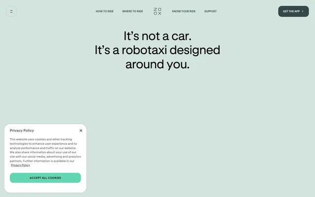
Zoox employs a sophisticated, muted aesthetic, blending an off-black and white core with subtle, cool-toned neutrals and a singular vibrant teal accent. Typography is dominant, commanding attention with generous sizing and precise control over letter-spacing. Surfaces vary between stark white, dark gray, and a soft, desaturated teal, creating distinct visual sections without harsh transitions. Components are often outlined or ghosted, relying on subtle borders and rounded corners, avoiding heavy fills or deep shadows to maintain a lightweight, intentional feel.
The page primarily uses a max-width contained layout, though specific sections like the hero or thematic backgrounds can be full-bleed. The hero often features a centered headline over a background image or a single color block (e.g., Pale Mint or Slate Green). Vertical rhythm is established through consistent section gaps, creating a comfortable density. Content is arranged using alternating text-left/image-right or image-left/text-right patterns, and in some areas, stacked centered elements. There are implicit grids for features, often two or three columns beneath larger headlines. Navigation is a persistent top bar with ghost buttons, converting to a hamburger menu on smaller viewports. Sticky headers are present, and the overall feel is spacious and organized.
The imagery features realistic photography of the Zoox robotaxi and interiors, or people interacting within the vehicle, shown in contained, often horizontally cropped or square formats. Treatment involves both full-bleed hero visuals and smaller, isolated images with substantial border-radii (16px to 36px) that soften their impact. Photography is clear, well-lit, and product-focused, showcasing the vehicle and user experience directly. Iconography is minimalist and monochrome, using black or dark gray outlines with a light stroke weight, serving primarily functional roles (e.g., play/pause button). Image density is balanced, used to break up text sections and illustrate features without overwhelming the page.
Reminiscent of Waymo, Cruise, Volocopter, Superhuman.
# Zoox — Style Reference
> Muted, precise mobility.

**Theme:** light

**Site:** https://zoox.com

Zoox employs a sophisticated, muted aesthetic, blending an off-black and white core with subtle, cool-toned neutrals and a singular vibrant teal accent. Typography is dominant, commanding attention with generous sizing and precise control over letter-spacing. Surfaces vary between stark white, dark gray, and a soft, desaturated teal, creating distinct visual sections without harsh transitions. Components are often outlined or ghosted, relying on subtle borders and rounded corners, avoiding heavy fills or deep shadows to maintain a lightweight, intentional feel.

## Tokens — Colors

| Name | Value | Token | Role |
|------|------|------|------|
| Teal Accent | `#64d5b3` | `--color-teal-accent` | Teal action color for filled buttons, selected navigation states, and focused conversion moments. |
| Muted Teal | `#5b8279` | `--color-muted-teal` | Subtle decorative elements, less prominent accent text |
| Conic Wave | `#34ffc5` | `--color-conic-wave` | Decorative background gradients, abstract visual elements, creating an ethereal halo effect |
| Midnight Ink | `#0d1212` | `--color-midnight-ink` | Primary text, deep section backgrounds, card backgrounds, dark input borders |
| Cloud Canvas | `#ffffff` | `--color-cloud-canvas` | Page backgrounds, card surfaces, element fills, light iconography |
| Ash Gray | `#565959` | `--color-ash-gray` | Secondary text, footer text, placeholder text |
| Slate Green | `#34484a` | `--color-slate-green` | Decorative borders, active navigation states, button outlines, subtle background tints. A distinctive near-gray that grounds the palette |
| Pale Mint | `#d3e4df` | `--color-pale-mint` | Soft section backgrounds, light card surfaces, subtle dividers |
| Fog | `#696969` | `--color-fog` | Tertiary text, subtle borders |
| Stone Gray | `#7b8889` | `--color-stone-gray` | Heading subtext, less prominent body copy |
| Light Mist | `#9aa3a5` | `--color-light-mist` | Iconography, muted body text details |
| Pale Sage | `#edf4f2` | `--color-pale-sage` | Badge backgrounds, subtle surface variations |

## Tokens — Typography

### Gt Standard S
- **Substitute:** Inter
- **Weights:** 400, 500, 600, 700
- **Sizes:** 12px, 13px, 14px, 15px, 16px, 20px, 23px, 30px, 40px, 50px
- **Line height:** 0.75, 1, 1.15, 1.2, 1.25, 1.28, 1.3, 1.4, 1.5, 1.88, 2.64
- **Letter spacing:** variable, ranging from -0.0020em to 0.0500em
- **Role:** UI elements, body text, secondary headings, links, and buttons, providing consistent legibility and a compact, precise tone. Letter spacing is subtly tightened for all sizes to increase visual density.

### Gt Standard L
- **Substitute:** Outfit
- **Weights:** 400
- **Sizes:** 28px, 36px, 56px, 120px
- **Line height:** 1.1, 1.15, 1.2, 1.3
- **Letter spacing:** normal
- **Role:** Primary headings and large display text, creating impactful visual statements with their substantial size. These large sizes use normal letter spacing to maintain clarity.

## Tokens — Type Scale

Minor Third (1.2) from 14px base.

| Role | Size | Line height | Letter spacing |
|------|------|------|------|
| caption | 12px | 1.28 | — |
| body-sm | 13px | 1.28 | — |
| body | 14px | 1.28 | — |
| body-lg | 15px | 1.28 | — |
| heading-sm | 20px | 1.28 | — |
| heading | 23px | 1.28 | — |
| heading-lg | 30px | 1.28 | — |
| display-sm | 40px | 1.28 | — |
| display | 50px | 1.28 | — |

## Tokens — Spacing

- **Section gap:** 40px
- **Card padding:** 20px
- **Element gap:** 5px

## Tokens — Radius

- **Buttons:** 16px
- **Inputs:** 18px
- **Cards:** 36px
- **badges:** 20px
- **links:** 12px
- **navigation:** 16px

## Tokens — Elevation

- **Cookie Policy Card:** `rgba(0, 0, 0, 0.2) 0px 0px 4px 0px`

## Layout

The page primarily uses a max-width contained layout, though specific sections like the hero or thematic backgrounds can be full-bleed. The hero often features a centered headline over a background image or a single color block (e.g., Pale Mint or Slate Green). Vertical rhythm is established through consistent section gaps, creating a comfortable density. Content is arranged using alternating text-left/image-right or image-left/text-right patterns, and in some areas, stacked centered elements. There are implicit grids for features, often two or three columns beneath larger headlines. Navigation is a persistent top bar with ghost buttons, converting to a hamburger menu on smaller viewports. Sticky headers are present, and the overall feel is spacious and organized.

## Imagery

The imagery features realistic photography of the Zoox robotaxi and interiors, or people interacting within the vehicle, shown in contained, often horizontally cropped or square formats. Treatment involves both full-bleed hero visuals and smaller, isolated images with substantial border-radii (16px to 36px) that soften their impact. Photography is clear, well-lit, and product-focused, showcasing the vehicle and user experience directly. Iconography is minimalist and monochrome, using black or dark gray outlines with a light stroke weight, serving primarily functional roles (e.g., play/pause button). Image density is balanced, used to break up text sections and illustrate features without overwhelming the page.

## Components

### Ghost Nav Button
*Navigation and secondary actions*

Text-only button with 'Slate Green' (#34484a) border and text color for outlined or active states. Features a small radius of 12px or 16px. Padding is minimal.

### Primary Action Button
*Call to action*

Filled button with 'Teal Accent' (#64d5b3) background and 'Midnight Ink' (#0d1212) text. Features a 16px border radius, with 15px padding on all sides. Used for primary user actions.

### Outline Ghost Button
*Subtle secondary actions or interactive elements.*

Transparent background with text in 'Ash Gray' (#565959) or 'Midnight Ink' (#0d1212). Borders are hairline or absent, with a very large border radius (33.33%).

### Neutral Card
*Content container*

Transparent background, no shadow, with 20px left/right padding. Used for modular content blocks.

### Elevated Card (Pale Mint)
*Prominent content container*

Background in 'Pale Mint' (#d3e4df), with a 36px border radius and no shadow. Provides 104px top padding and 40px bottom padding, creating a soft, elevated surface.

### Dark Card
*Thematic content container*

Background in 'Midnight Ink' (#0d1212) with a 36px border radius. No padding, used for full-bleed content within its boundaries.

### Header Card (Slate Green)
*Section header background*

Background in 'Slate Green' (#34484a) with no border radius. Provides 80px top and bottom padding.

### Text Input
*User data entry*

White background with 'Midnight Ink' (#0d1212) text. Border color is 'Slate Green' (#34484a) or 'Stone Gray' (#7b8889), with a subtle 1px border. Features an 18px border radius and 20px horizontal padding.

### Neutral Badge
*Informational labels*

Transparent background with 'Midnight Ink' (#0d1212) text. No border radius or padding, used inline for categorization.

### Soft Badge
*Categorization and status indicators*

Background in `Pale Sage` (#edf4f2) with a slight opacity (40%), and 'Midnight Ink' (#0d1212) text. Features a 20px border radius and 7px vertical, 12px horizontal padding.

## Guidelines

### Do

- Use 'Gt Standard L' weight 400 for all primary headings (28px to 120px) with normal letter spacing to maximize impact.
- Apply 'Teal Accent' (#64d5b3) exclusively for primary action buttons or significant interactive highlights.
- Employ generously rounded corners (16px and 36px) on cards, buttons, and images to soften the overall aesthetic.
- Maintain high contrast between text ('Midnight Ink') and backgrounds ('Cloud Canvas', 'Pale Mint', or 'Slate Green') for optimal legibility.
- Utilize 'Pale Mint' (#d3e4df) for background sections to create soft visual breaks or subtle elevated surfaces.
- Implement 'Slate Green' (#34484a) for subtle borders, ghost button outlines, and interactive navigation elements.
- Ensure letter-spacing is consistently negative for 'Gt Standard S' typography in smaller sizes to maintain its compact appearance.

### Don't

- Do not introduce new vibrant colors outside of 'Teal Accent' (#64d5b3); maintain the muted and achromatic base palette.
- Avoid heavy use of drop shadows; reserve the subtle rgba(0, 0, 0, 0.2) 0px 0px 4px 0px shadow for very specific, subtle elevation.
- Do not use generic system fonts; stick to the 'Gt Standard S' and 'Gt Standard L' families for brand consistency.
- Avoid sharp corners on interactive elements or prominent containers; maintain the established rounded aesthetic.
- Do not use highly saturated backgrounds or overwhelming gradients in full sections; keep backgrounds understated with an occasional conic gradient as a decorative element.
- Refrain from using varied letter spacing on large display type ('Gt Standard L'); keep it 'normal' for maximum clarity.
- Do not create dense, busy layouts; prioritize comfortable spacing (40px section gap, 5px element gap) and ample whitespace.

## Agent Prompt Guide

Quick Color Reference:
text: #0d1212
background: #d3e4df
border: #34484a
accent: #5b8279
primary action: #64d5b3 (filled action)

Example Component Prompts:
1. Create a Primary Action Button: #64d5b3 background, #000000 text, 9999px radius, compact pill padding. Use this filled treatment for the main CTA.
4. Design a navigation link: Text 'How To Ride' in 'Slate Green' (#34484a), 'Gt Standard S' weight 500, 15px, 0.0100em letter spacing. Ensure minimal 5px padding and a 12px border radius on hover.
More like this








Keep what you find
A free account saves references to boards and can send you a weekly email of picks based on what you save.
To see every result, go Pro.