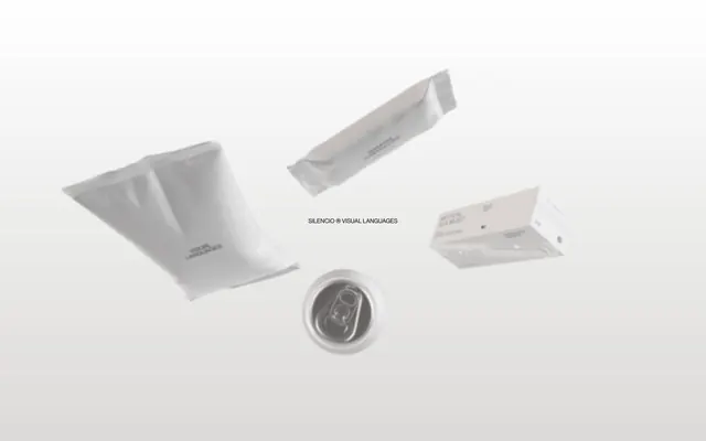
Preview image. Unlock full-res
Archival Text on White. A single page from a carefully curated, minimalist document, demanding close attention.
Color palette
Backgrounds, primary surface for content and typography.
Primary typography, outlines, and interactive states for light elements.
Subtle background for UI elements, secondary surfaces, and non-interactive button backgrounds — offers a barely-there differentiation from Canvas White.
Table borders and dividers, providing separation without high contrast.
Gradient for hero sections or subtle background transitions, creating a sense of depth without color.
Typography
- Weights
- 100, 400, 700
- Sizes
- 12px, 16px, 19px, 22px, 39px, 58px
- Line height
- 0.9, 1, 1.1, 1.2, 1.4
- Letter spacing
- normal
- Fallback
- Inter
Primary body, subtitles, and smaller headings. The range of weights and tight line heights are crucial for its precise, often compact presentation.
- Weights
- 100, 400
- Sizes
- 141px
- Line height
- 0.9, 1.2
- Letter spacing
- normal
- Fallback
- Inter
Display headings. The extremely large size and tightest possible line height emphasize impact through scale rather than color or bold weight, typical for a design agency's self-presentation.
- Weights
- 400
- Sizes
- 11px
- Line height
- 1.2
- Letter spacing
- normal
- Fallback
- PT Mono
Monospace for subtle annotations, references, and code-like elements, adding a technical, detailed footnote feel.
Spacing & shape
Components
Text-only button with Ink Black text on a Paper Gray background, transitioning to Ink Black text on transparent background with an Ink Black border on hover/active. The extremely large 129.6px border-radius makes it appear as a pill shape without added padding. Text is HaasR, weight 400, size 16px. Padding is minimal and implicitly handled by surrounding layout rather than explicit component values.
HaasR, 39px, weight 700, Ink Black. Used for prominent headings within content sections, often styled with extreme letter spacing or line breaks for visual rhythm.
HaasT, 141px, weight 100 or 400, Ink Black. Used for dramatic, large-scale typography that defines key sections or introduces themes, often featuring tight line heights of 0.9.
PT Mono, 11px, weight 400, Ink Black. Used for subtle, monospace text like reference numbers or footnotes, giving an archival feel.
Guidelines
- Prioritize Canvas White (#FFFFFF) and Ink Black (#000000) for high-contrast pairs, achieving AAA contrast.
- Use Paper Gray (#DBDAD9) sparingly for subtle background offsets or non-interactive element fills.
- Apply HaasT at 141px with weight 100 and line-height 0.9 for all display-level headings, breaking lines creatively for visual impact.
- Maintain a default border-radius of 7.2px for most container elements.
- Ensure all interactive buttons utilize a 129.6px border-radius, creating an exaggerated pill shape.
- Use PT Mono, 11px, weight 400 for any technical or metadata text.
- Employ the Subtle Fade gradient from #DBDAD9 to #FFFFFF for background transitions to introduce soft, material depth.
- Avoid introducing any chromatic colors; the system is strictly achromatic.
- Do not use explicit padding on buttons; their shape and content are implicitly spaced by the surrounding layout.
- Never use HaasR at 39px with weight 100; it's a 700 weight for that size.
- Do not use generic square or slightly rounded buttons; the 129.6px pill shape is a critical brand identifier.
- Avoid heavy drop shadows or vibrant elevation cues; depth is primarily conveyed through subtle background shifts and gradients.
- Do not use letter spacing variations unless explicitly defined for display type; stick to 'normal' for body and subheadings.
- Do not break the strict line-height values for HaasR and HaasT; they are integral to the system's precise feel.
About this system
ShowHide
This design system evokes a sense of stark, intellectual minimalism, like text on archival paper. The near-exclusive use of achromatic colors combined with extremely tight letter spacing and ultra-light font weights creates a unique atmosphere of quiet authority. Interactions are marked by subtle inversions of the monochrome palette rather than vibrant accents, directing focus with understated precision. The overall impression is one of serious, almost academic rigor, where content takes absolute precedence.
The layout is characterized by a full-bleed background model that often features the Subtle Fade gradient vertically, giving a soft, infinite canvas feel. Content is organized into distinct, expansive vertical sections marked by changes in background color from Canvas White to Paper Gray, or by the presence of large, impactful typography. The hero section often features oversized, tightly spaced type. Content arrangement within sections appears to alternate between centered headings and left-aligned text blocks, with visual elements (like product mocks) sometimes floating or partially overlapping with text areas, creating an almost gallery-like composition. There's a strong emphasis on spaciousness, with liberal use of vertical whitespace between content blocks. Navigation is likely minimal, perhaps a sticky top bar or discrete menu button, given the text-heavy and large-scale visual approach.
Imagery on this site focuses on abstract, often sculptural representations of objects or raw materials with a distinct lack of human presence. Product shots, if any, are hyper-minimalist and isolated on white or light gray backgrounds, emphasizing form and texture. The treatment is primarily isolated with soft, diffused shadows, creating an ethereal, floating effect. The visual style is highly conceptual and serves to underline the agency's focus on 'visual languages' by presenting objects as pure, unadorned forms. Density is extremely low; images are sparse and given ample white space, making them significant visual anchors when they appear.
Reminiscent of Akin Collective, Büro Union, Weissraum, Basic Type Foundry.
# Silencio — Style Reference
> Archival Text on White. A single page from a carefully curated, minimalist document, demanding close attention.

**Theme:** light

**Site:** https://silencio.es

This design system evokes a sense of stark, intellectual minimalism, like text on archival paper. The near-exclusive use of achromatic colors combined with extremely tight letter spacing and ultra-light font weights creates a unique atmosphere of quiet authority. Interactions are marked by subtle inversions of the monochrome palette rather than vibrant accents, directing focus with understated precision. The overall impression is one of serious, almost academic rigor, where content takes absolute precedence.

## Tokens — Colors

| Name | Value | Token | Role |
|------|------|------|------|
| Canvas White | `#FFFFFF` | `--color-canvas-white` | Backgrounds, primary surface for content and typography. |
| Ink Black | `#000000` | `--color-ink-black` | Primary typography, outlines, and interactive states for light elements. |
| Paper Gray | `#DBDAD9` | `--color-paper-gray` | Subtle background for UI elements, secondary surfaces, and non-interactive button backgrounds — offers a barely-there differentiation from Canvas White. |
| Border Gray | `#808080` | `--color-border-gray` | Table borders and dividers, providing separation without high contrast. |
| Subtle Fade | `#DBDAD9` | `--color-subtle-fade` | Gradient for hero sections or subtle background transitions, creating a sense of depth without color. |

## Tokens — Typography

### HaasR
- **Substitute:** Inter
- **Weights:** 100, 400, 700
- **Sizes:** 12px, 16px, 19px, 22px, 39px, 58px
- **Line height:** 0.9, 1, 1.1, 1.2, 1.4
- **Letter spacing:** normal
- **Role:** Primary body, subtitles, and smaller headings. The range of weights and tight line heights are crucial for its precise, often compact presentation.

### HaasT
- **Substitute:** Inter
- **Weights:** 100, 400
- **Sizes:** 141px
- **Line height:** 0.9, 1.2
- **Letter spacing:** normal
- **Role:** Display headings. The extremely large size and tightest possible line height emphasize impact through scale rather than color or bold weight, typical for a design agency's self-presentation.

### PT Mono
- **Substitute:** PT Mono
- **Weights:** 400
- **Sizes:** 11px
- **Line height:** 1.2
- **Letter spacing:** normal
- **Role:** Monospace for subtle annotations, references, and code-like elements, adding a technical, detailed footnote feel.

## Tokens — Type Scale

| Role | Size | Line height | Letter spacing |
|------|------|------|------|
| caption | 11px | 1.2 | — |
| body | 16px | 1.4 | — |
| subheading | 19px | 1.2 | — |
| heading | 22px | 1.2 | — |
| heading-lg | 39px | 1.1 | — |
| display | 141px | 0.9 | — |

## Tokens — Spacing

- **Card padding:** 29px
- **Element gap:** 6-14px

## Tokens — Radius

- **Default:** 7.2px
- **Buttons:** 129.6px
- **large:** 43.2px

## Layout

The layout is characterized by a full-bleed background model that often features the Subtle Fade gradient vertically, giving a soft, infinite canvas feel. Content is organized into distinct, expansive vertical sections marked by changes in background color from Canvas White to Paper Gray, or by the presence of large, impactful typography. The hero section often features oversized, tightly spaced type. Content arrangement within sections appears to alternate between centered headings and left-aligned text blocks, with visual elements (like product mocks) sometimes floating or partially overlapping with text areas, creating an almost gallery-like composition. There's a strong emphasis on spaciousness, with liberal use of vertical whitespace between content blocks. Navigation is likely minimal, perhaps a sticky top bar or discrete menu button, given the text-heavy and large-scale visual approach.

## Imagery

Imagery on this site focuses on abstract, often sculptural representations of objects or raw materials with a distinct lack of human presence. Product shots, if any, are hyper-minimalist and isolated on white or light gray backgrounds, emphasizing form and texture. The treatment is primarily isolated with soft, diffused shadows, creating an ethereal, floating effect. The visual style is highly conceptual and serves to underline the agency's focus on 'visual languages' by presenting objects as pure, unadorned forms. Density is extremely low; images are sparse and given ample white space, making them significant visual anchors when they appear.

## Components

### Ghost Button Group

### Reference / Metadata Block

### Content Section Heading with Caption

### Ghost Button
*Primary Call to Action*

Text-only button with Ink Black text on a Paper Gray background, transitioning to Ink Black text on transparent background with an Ink Black border on hover/active. The extremely large 129.6px border-radius makes it appear as a pill shape without added padding. Text is HaasR, weight 400, size 16px. Padding is minimal and implicitly handled by surrounding layout rather than explicit component values.

### Content Section Heading
*Secondary section titles*

HaasR, 39px, weight 700, Ink Black. Used for prominent headings within content sections, often styled with extreme letter spacing or line breaks for visual rhythm.

### Display Heading
*Signature large text*

HaasT, 141px, weight 100 or 400, Ink Black. Used for dramatic, large-scale typography that defines key sections or introduces themes, often featuring tight line heights of 0.9.

### Reference Text
*Metadata and small print*

PT Mono, 11px, weight 400, Ink Black. Used for subtle, monospace text like reference numbers or footnotes, giving an archival feel.

## Guidelines

### Do

- Prioritize Canvas White (#FFFFFF) and Ink Black (#000000) for high-contrast pairs, achieving AAA contrast.
- Use Paper Gray (#DBDAD9) sparingly for subtle background offsets or non-interactive element fills.
- Apply HaasT at 141px with weight 100 and line-height 0.9 for all display-level headings, breaking lines creatively for visual impact.
- Maintain a default border-radius of 7.2px for most container elements.
- Ensure all interactive buttons utilize a 129.6px border-radius, creating an exaggerated pill shape.
- Use PT Mono, 11px, weight 400 for any technical or metadata text.
- Employ the Subtle Fade gradient from #DBDAD9 to #FFFFFF for background transitions to introduce soft, material depth.

### Don't

- Avoid introducing any chromatic colors; the system is strictly achromatic.
- Do not use explicit padding on buttons; their shape and content are implicitly spaced by the surrounding layout.
- Never use HaasR at 39px with weight 100; it's a 700 weight for that size.
- Do not use generic square or slightly rounded buttons; the 129.6px pill shape is a critical brand identifier.
- Avoid heavy drop shadows or vibrant elevation cues; depth is primarily conveyed through subtle background shifts and gradients.
- Do not use letter spacing variations unless explicitly defined for display type; stick to 'normal' for body and subheadings.
- Do not break the strict line-height values for HaasR and HaasT; they are integral to the system's precise feel.

## Agent Prompt Guide

### Quick Color Reference
- **Text:** Ink Black (#000000)
- **Background:** Canvas White (#FFFFFF)
- **Secondary Background:** Paper Gray (#DBDAD9)
- **Button Background:** Paper Gray (#DBDAD9)
- **Border/Divider:** Border Gray (#808080)

### Example Component Prompts
1. **Create a hero section:** Full-bleed background with Subtle Fade gradient (linear-gradient(0deg, rgb(219, 218, 217), rgb(255, 255, 255))). Centered display headline: 'DIGITAL VISUAL LANGUAGES' using HaasT, 141px, weight 100, line-height 0.9, Ink Black (#000000).
2. **Generate a primary call-to-action button:** 'Let's talk!' using HaasR, 16px, weight 400, Ink Black (#000000) text on a Paper Gray (#DBDAD9) background, with a 129.6px border-radius. On hover, background becomes transparent with a 1px Ink Black (#000000) border.
3. **Design a content section heading:** 'Bold thinking as a basis' using HaasR, 39px, weight 700, Ink Black (#000000) text on a Canvas White (#FFFFFF) background. Center aligned, with a vertical element gap of 29px below it.
4. **Build a footer reference paragraph:** 'REF: SHH-0001' using PT Mono, 11px, weight 400, Ink Black (#000000). Left-aligned, with a 7px margin-right.
More like this








Keep what you find
A free account saves references to boards and can send you a weekly email of picks based on what you save.
To see every result, go Pro.